Visualizing coronavirus data? Consider adding a disclaimer


When you hear the word disclaimer, what comes to mind? The word sounds like legalese to many, or something you find on WebMD reminding readers that the site is meant to share information but does not give medical advice.
In the midst of a global pandemic, when people throughout the world are looking for reliable, trustworthy information about COVID-19, we have a responsibility as data designers to be clear on the intent and utility of the dashboards and graphics that we create.
Even if our work is only referenced by friends and family, we owe it to those who trust us most to be transparent in the goals and intentions of our work. Visualizations are powerful representations of information, and adding short disclaimers to our dashboards is one way we can ensure our intentions and goals are clear to our readers.
Anatomy of a helpful disclaimer
Unless you are an infectious disease epidemiologist intending to inform medical decision-making with your COVID-19 dashboard, consider including a disclaimer on your viz that discloses:
- Your expertise
- Your goal or intention in creating the visualization
- Your intended audience
- Limitations or challenges in interpreting the visualization (such as uncertainty in the data)
- Clarifying notes on how the visualization should not be used—namely for medical decision-making
- Links to sources of updated advice on what your readers can do
Looking for a bit more guidance? Here’s a template I created that you could adapt, swapping out the bold text with your own story:
I am a data visualization designer, and am not an infectious disease expert or epidemiologist. This dashboard was created to enable people living in the state of Ohio to see updated numbers of COVID-19 confirmed cases by county. The data is sourced from the NYTimes county data set, and the cases represented are only confirmed cases, which are limited by test availability. This dashboard should not be used for medical decision making; you can find updated guidelines on the Ohio response to COVID-19 and recommendations for individual actions to slow the spread from the Ohio Department of Health.
The disclaimer can be added as a footnote or other text on the page, as a tooltip, or even as a collapsible floating container that almost requires that a reader review and close the box to view the visualizations.
Examples from other health visualizations and websites
Curious what these disclaimers look like in the wild? Many COVID-19 data visualizations and websites have added disclaimers framing how the graphs and charts are meant to be used.
Let’s look to the experts: Even a model and visualization built by those who have expertise in this space have a disclaimer on the utility of this model. Dr. Allison Hill, who has dedicated expertise in infectious disease transmission modeling, created an RShiny app to enable people to interact with a model she built with colleagues.
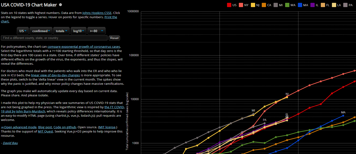
The developer behind the USA COVID-19 Chart Maker points to how the tool can be used differently by policymakers and physicians to answer different kinds of questions.
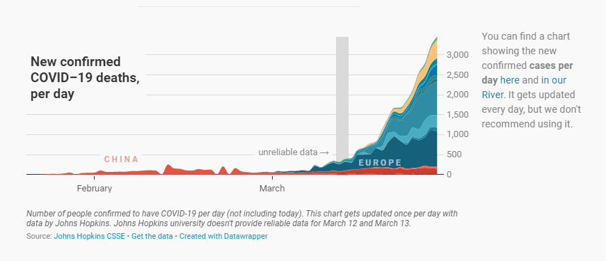
The team at Datawrapper focuses on advising which charts are reliable or not due to the uncertainty in the data. See the note to the right of their deaths data, the reference band noting where data is unreliable, and the clear link to the data source in the footnote.
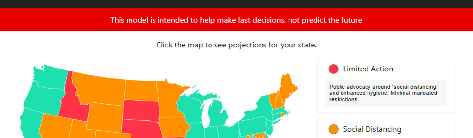
Even a single line of text clarifying how the information is presented is intended to be used can help. Here’s a one-line example from COVID Act Now that sums up the punchline of most COVID-19 models: “This model is intended to help make fast decisions, not predict the future.”
To see more information and visualizations on data and the coronavirus outbreak, visit Tableau’s COVID-19 Data Hub. This resource is constantly developing along with the situation, and we’ll be highlighting more stories the weeks to come.
Verwante verhalen
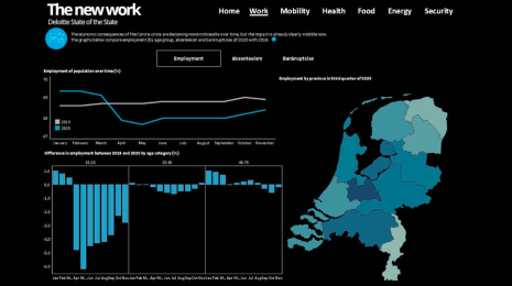
What we can learn from open data: COVID-19 in the Netherlands
 29 april, 2021

After a year of COVID-19 charts, eight data communication lessons learned
 19 april, 2021
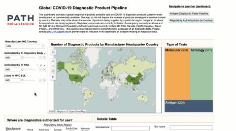
Data innovations in public health: PATH creates COVID-19 diagnostic test dashboard
2 april, 2021