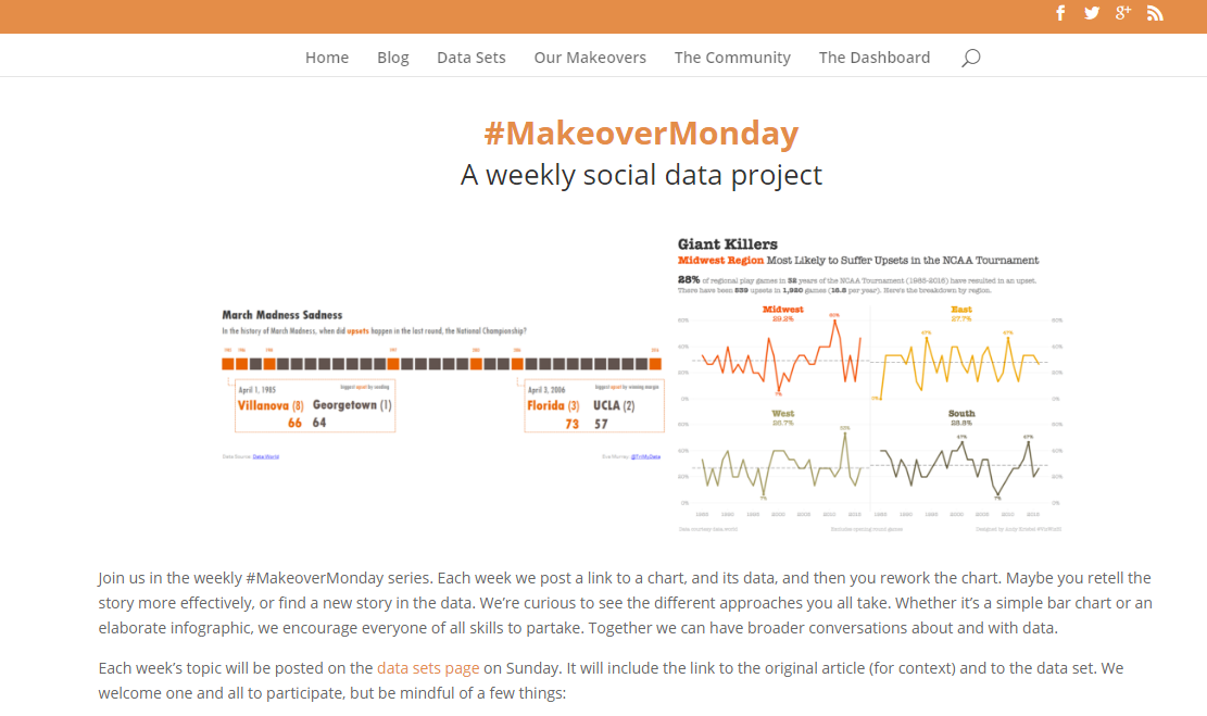
We're halfway there: Highlights from 25 weeks of #MakeoverMonday


Note: The following is a guest post by Tableau Zen Master Andy Kriebel.
And here we are, 26 weeks into Makeover Monday, a fun social data experiment that Andy Cotgreave and I have been running this year. You might wonder: Why are we doing this exercise? There are three primary reasons:
- Andy C. wanted an excuse to use Tableau more.
- We wanted an easy way for people to experiment and practice their visualisation skills.
- We wanted a variety of data sources so that people would learn how to work with unfamiliar data quickly.
But what really surprised us is the way the community has engaged with us and with each other. In 25 weeks, there have been 1,006 visualisations created by 208 unique authors! I can’t even fathom these numbers! Andy and I are so blown away by everyone’s participation and enthusiasm.

If you’d like a glance at every visualisation that was submitted, check out our Pinterest page.
Now that we’re at the halfway point of our year of Makeover Monday, I’d like to share some of the highlights. These are things that have stood out to me thus far.
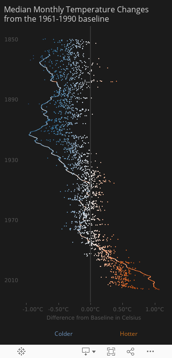
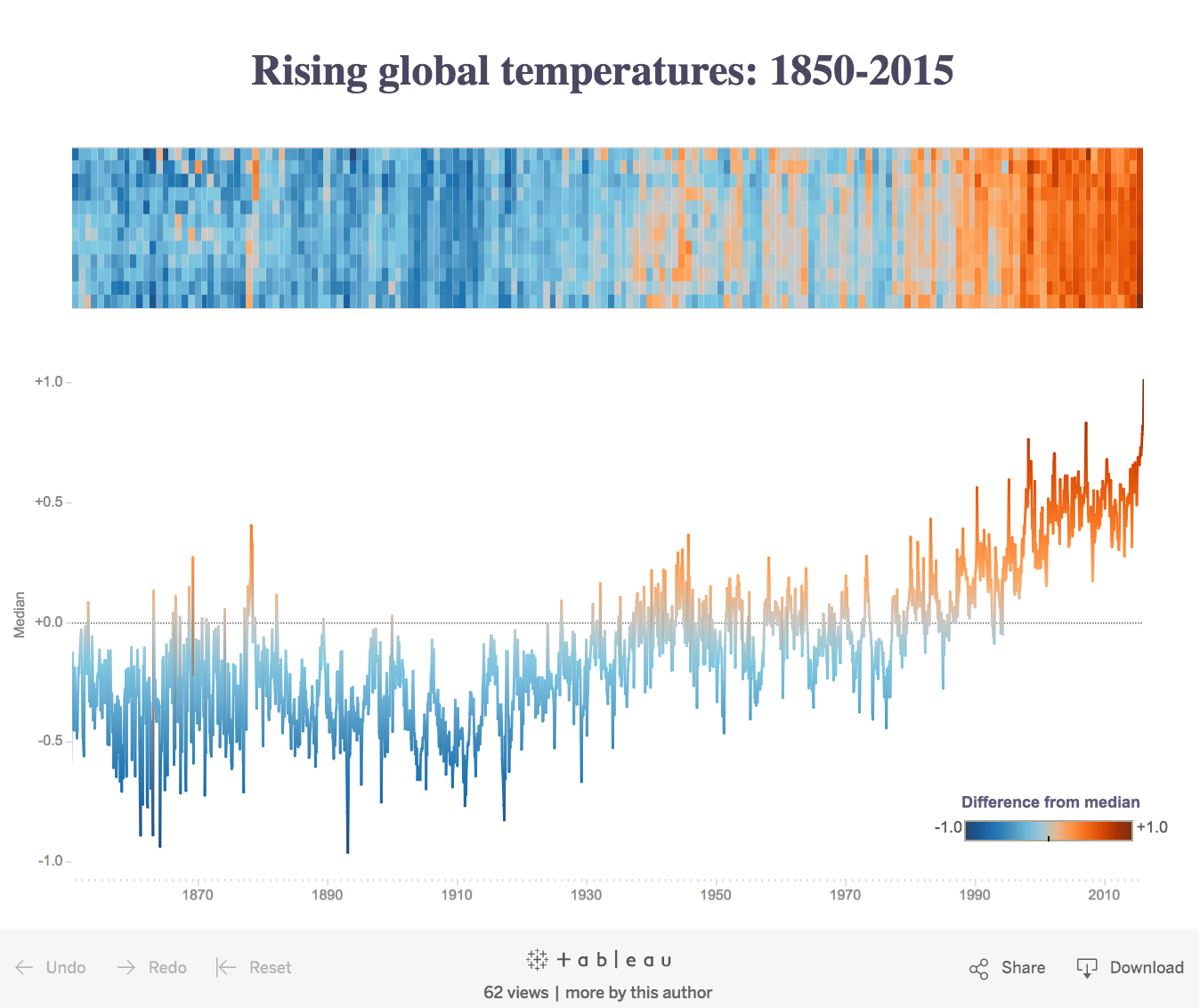
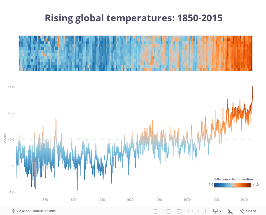
Favorite week: Week 20 - Global warming is spiraling out of control
What made this week so fascinating was the engagement of the original author, Ed Hawkins, in the makeovers.
@StatHunting Here are some earlier versions with the same data: https://t.co/qyErwxEGwR #MakeoverMonday
— Ed Hawkins (@ed_hawkins) May 16, 2016
And on a personal level, I learned how to create a spiral diagram.
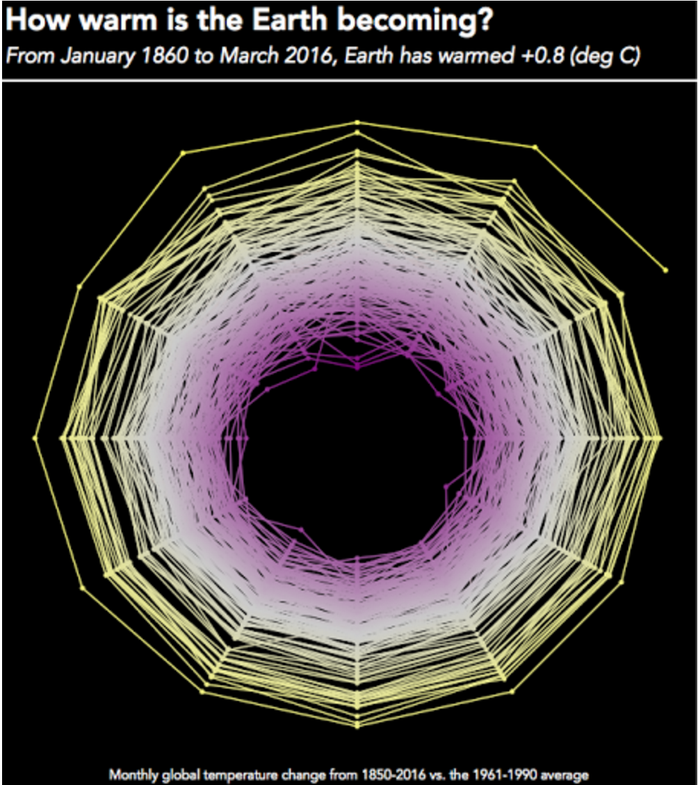
This didn’t end up being my final submission, but it goes to show how Makeover Monday is providing a great learning environment.
I was also fascinated by the variety of the visualisations. This animated GIF by Curtis Harris is simply amazing!
@acotgreave Thanks Andy, and thanks for the suggestion! Think mine works better animated.. pic.twitter.com/W7q4u4DITH
— Curtis Harris (@Harris7Curtis) May 16, 2016
And Michael Mixon created this mobile version.
My favorite for the week comes from Naledi Hollbruegge, who was influenced by Josh Tapley’s design. What I like most about Naledi’s effort is the simplicity of the design and the visual impact. I also appreciate how she saw something she liked and iterated on it. Because everyone posts their images on Twitter, you can get some great ideas and #StealLikeAnArtist.
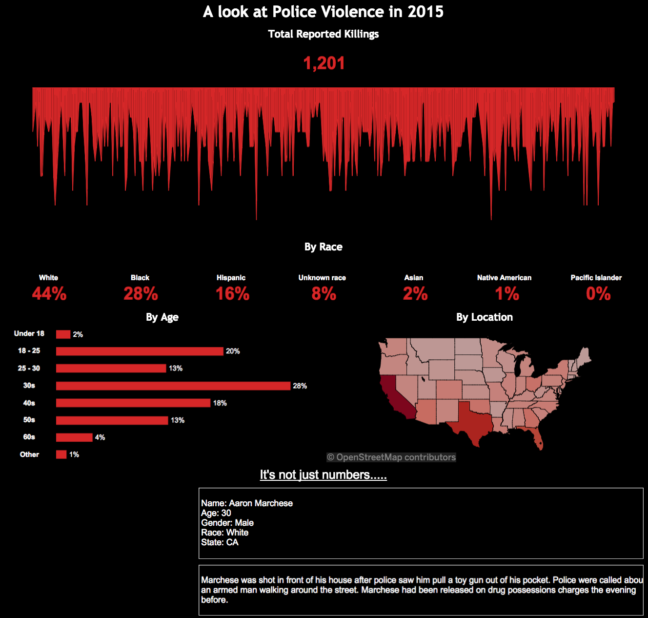
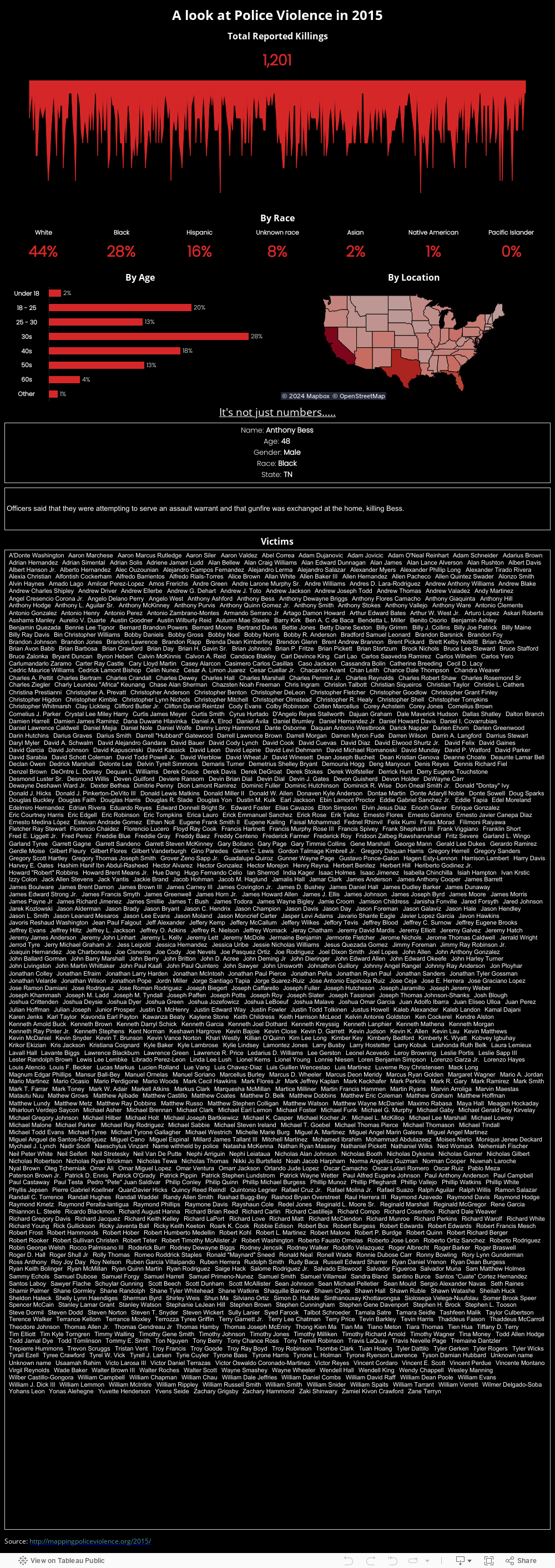
Most interesting data set: Week 6 - Mapping police violence
Sometimes Makeover Monday isn’t necessarily about a visualisation that needs tweaking. At times, the data set is what fascinates us. That was the case in week 6 when we looked at this article about police violence in America. Andy I took very different approaches this week. He chose to supplement the original:
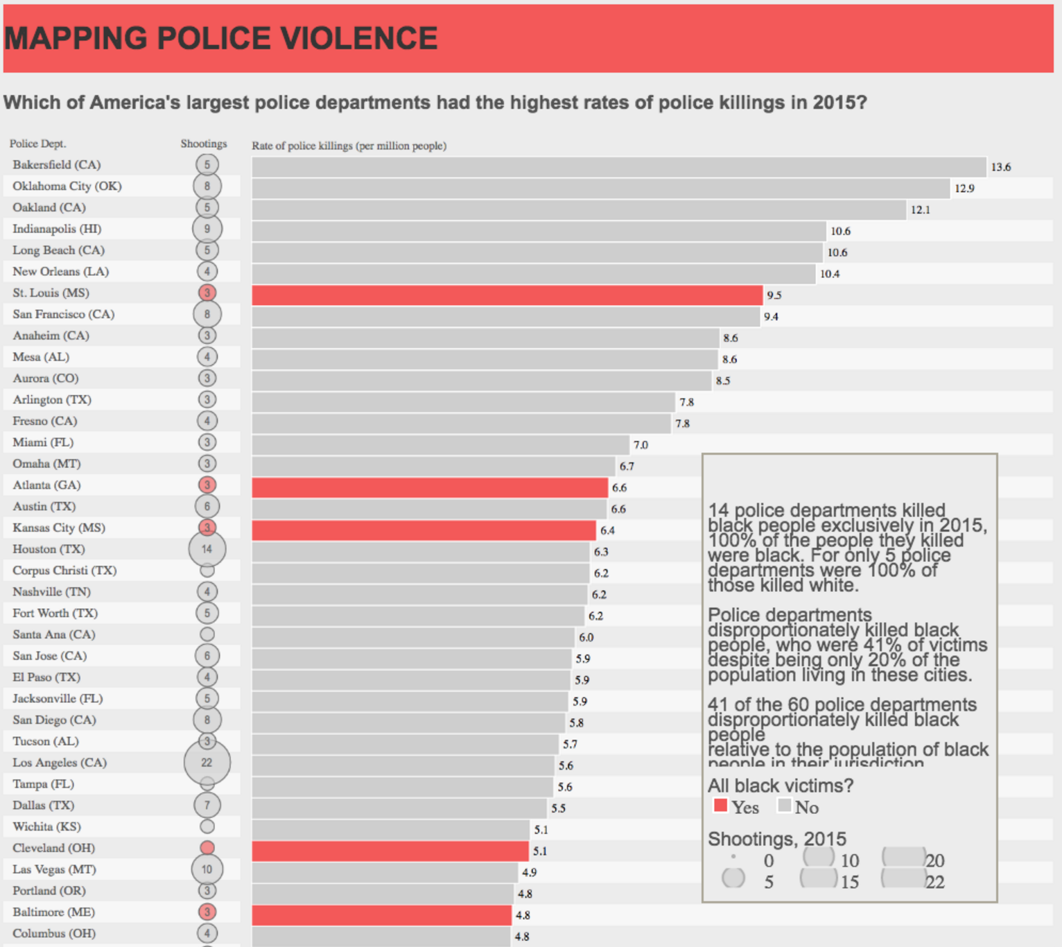
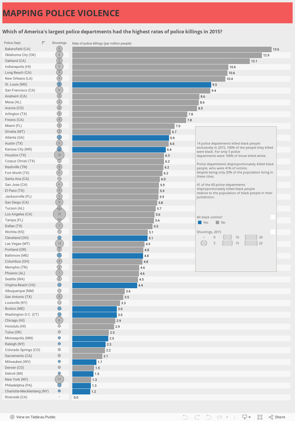
I, on the other hand, chose to create an infographic that explored the entire data set. Both are effective in their own way.
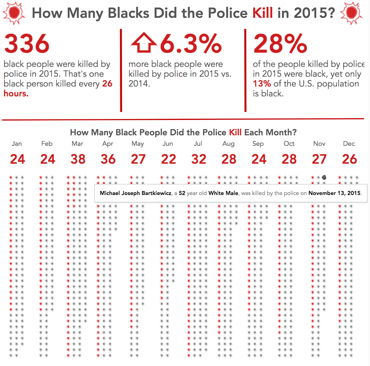

But then Rody Zakovich trumped us all by creating this version that made the issue feel very personal and quite sad. This is a terrific example of adding emotion to a visualisation.
Moving toward mobile design
A few weeks in to Makeover Monday, people started to experiment with mobile design, myself included. I don’t recall who did it first, but it caught on quickly.
For many participants, Makeover Monday has become an avenue for practicing new design skills. We’ve learned that designing for mobile is quite different from designing for a laptop. For example, there’s no such thing as “hover” on mobile. You have to pay special attention to touch controls like filtering. You really have to simplify your design.
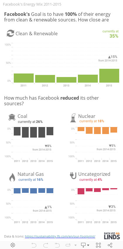
Here are a few my favorite mobile designs. First up is this design by Lindsey Poulter for week 23, when we examined Facebook’s carbon footprint.
And this design by Pooja Gandhi from week 3 is stunning to look at, easy to understand, and is a terrific example of storytelling with data.
Focusing on topical issues
At times, Andy and I have made intentional choices with the topics. Why? Because we want to bring attention to issues affecting all of us. We’ve covered topics like police violence in America, mentioned above.
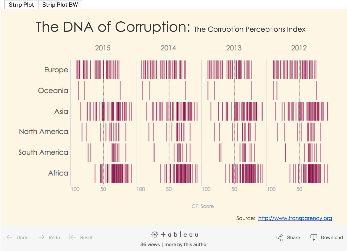
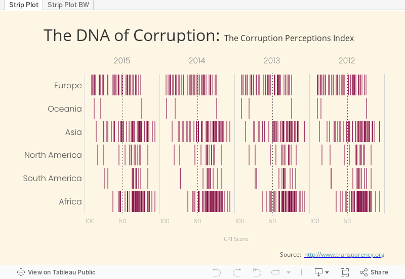
In week 11, we looked at corruption around the world. Rob Radburn created this great strip plot.
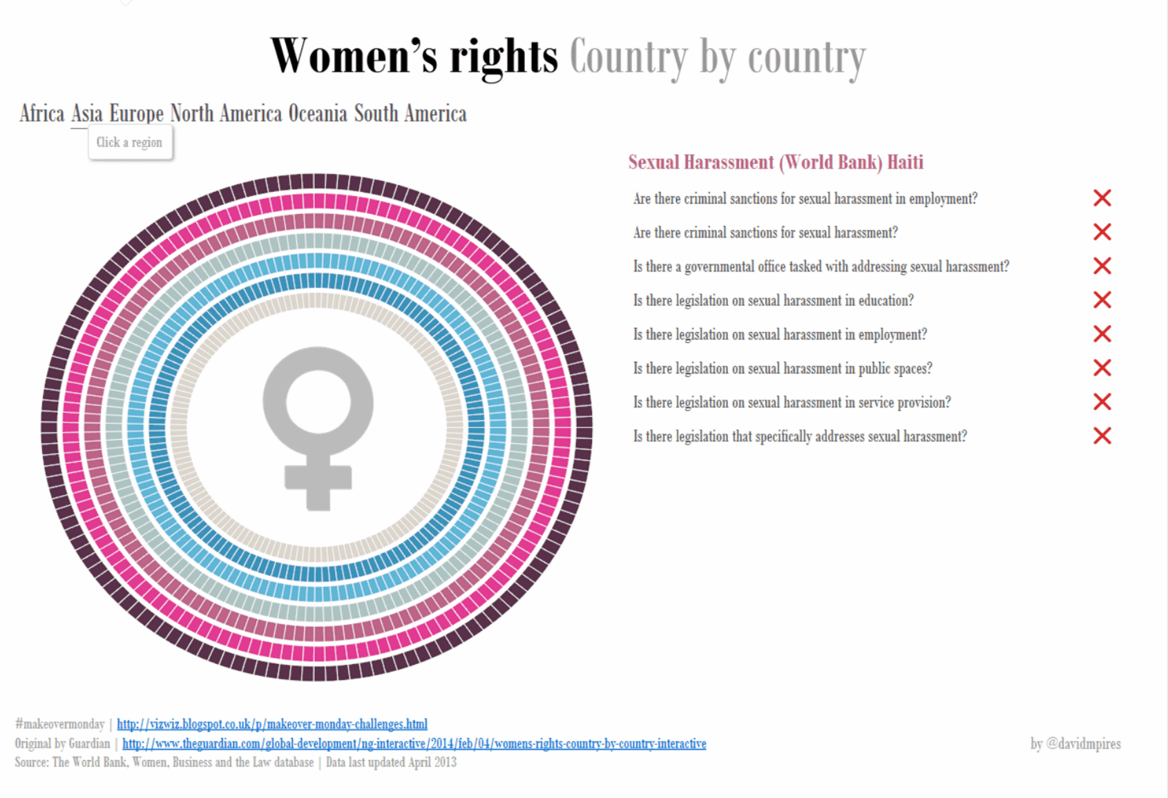
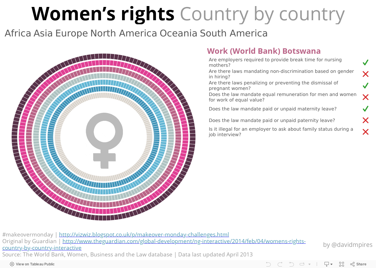
David Pires created this incredible interactive visualisation when week explored women’s rights around the world in week 12.
We’ve also covered topics like victims of the modern slave trade (week 17), the cost of tuition in the US (week 18), and women in the workplace (week 24), among others.
Join us each week as we explore the data around us, learn how to communicate more effectively with data, and have a bit of fun along the way. Remember to post an image of your work on Twitter with the hashtag #MakeoverMonday so that we can include it on the Pinterest board. Happy vizzing!
Verwante verhalen

5 Ways to Use Tableau Public to Achieve Your Goals
 11 januari, 2025

World Mental Health Day: Elevating Awareness Through Data Visualization
 10 oktober, 2024

From TV Screens to Tableau: Visualize Your Favorite Shows with IMDb
 31 augustus, 2024