What the BBC got wrong in their COVID-19 visualization


Editor’s note: the article was updated to include more detail about the difficulty of calculating a fatality rate, and added a direct link to the CCDC data source used by the BBC in the original chart that inspired this article.
In times of uncertainty such as the one we’re in now with the COVID-19 outbreak, what people want are facts and information. Often, that means data.
But as we think about how to get data into the hands of people who need it, it’s worth thinking about how we do so, and what it looks like. I recently published a reminder of how the choices we make when we do data visualization—especially on a critical subject like the COVID-19 outbreak—influence how people see, understand, and react to the data.
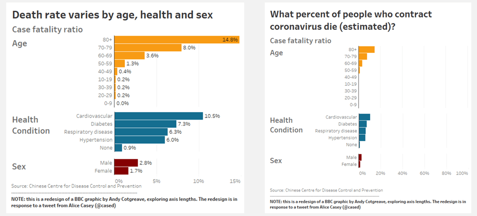
Here’s what happened. On March 1, the BBC published a viz showing the death rates due to COVID-19 by age, health condition, and gender. As you can see, people over the age of 80 have the highest death rate, at 15%.
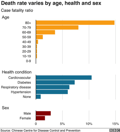
But reader Alice Casey tweeted at the BBC pointing out that the way they structured the viz, with the fatality ratio axis ending at 15% instead of 100%, makes the situation “look far worse than it is.” Even if we can read the viz and see that the highest fatality rate is 15%, we see that orange bar at the top extending all the way across the view—and that 15% looks much larger than it actually is. As I wrote in my original blog: “Our eyes stretch to the right, and the risk is we perceive that to mean 100%.”
What’s missing in this view is context. This view does not tell the full story of the data. There’s no space for us to visualize the people who survived the disease—and we don’t actually know where this data is coming from in the first place.
Our responsibility, right now, is to communicate all the data. That’s best-practice for data visualization in general, but especially important when using data to communicate about something as critical as an epidemic.
So how can we re-create the viz so it relays the necessary context for us to understand it?
One way could be adding in the percent values to the bars. Or even better, extending the fatality rate axis out to 100% so the rates are shown in context.

Looking at the chart on the right, do you feel yourself reacting differently to the data shown in this way? Most likely, yes.
But there’s still room for improvement. It’s important that visualizations, especially around crises like COVID-19, are clear on the data they represent. The title of the BBC’s chart says it describes the “Death rate” of coronavirus, but that is not true of this data: it represents the outcome of 44,000 coronavirus cases in China as reported by the Chinese Centre for Disease Control and Prevention. Calculating a fatality rate of a new disease is very difficult and prone to errors (WHO, Feb 19). We simply cannot say what the fatality rate of Coronavirus is at an early stage of an epidemic.
We can change the title of the chart to better express the narrow dataset this is drawn from, as below, in my final version of the visualization:
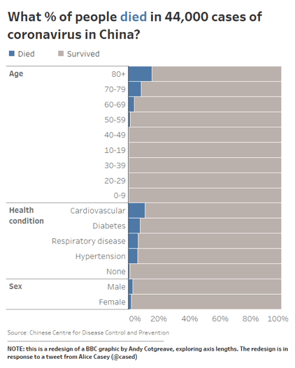
Tableau Zen Master Chris Love even suggested flipping the representation so the survivors are shown more prominently, like this:

There’s no doubt that access to data and information is critical when it comes to understanding and combating the COVID-19 outbreak. But it’s also important to keep in mind who might be looking at the data, and how they might be responding to it. Anxiety is heightened in the midst of a crisis, and the way information is communicated can interact with that in ways that are not always helpful or accurate. As data people, we have a responsibility to make sure that the information we’re presenting is clear, understandable, and reflects reality and the larger context.
You can watch me talk through my process for presenting COVID-19 data here:
Verwante verhalen
What we can learn from open data: COVID-19 in the Netherlands
 29 april, 2021

After a year of COVID-19 charts, eight data communication lessons learned
 19 april, 2021
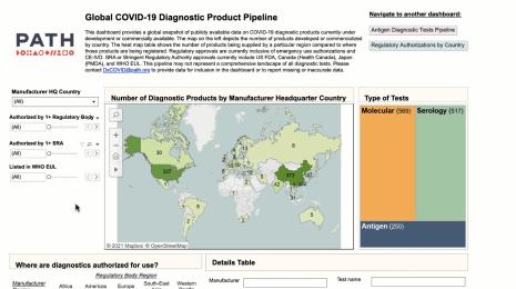
Data innovations in public health: PATH creates COVID-19 diagnostic test dashboard
2 april, 2021