Digging into Data Landscapes


Automatically creating visually coherent chart combinations
This research was presented at the IEEE VIS’22 conference. The publication and an accompanying video are available online for viewing.
What is a data landscape?
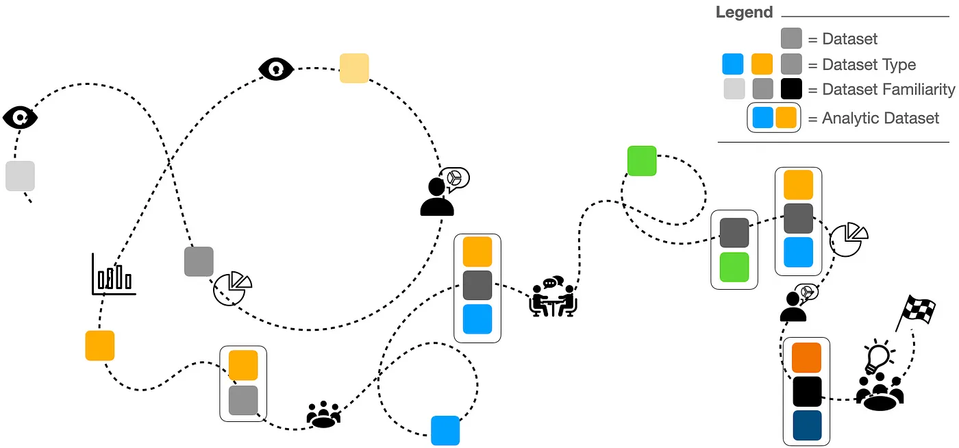
It is increasingly rare that any single dataset provides a solution to a complex question. Instead, it is incumbent on data analysts to discover and examine multiple datasets and consolidate them to form a final dataset for analysis. The consolidation process is even more complex when integrating data of different types, for example, integrating tabular data (a typical spreadsheet) with related image, text, or audio data. These varied, but interrelated datasets, exist in a landscape of all possible datasets available for analysis, some that are useful to particular data questions and some that are not. The analyst often acts like a scout on a reconnaissance mission — painstakingly crafting a map of these dataset relationships to derive actionable insights.
In prior research, we proposed that data reconnaissance is an overlooked process or lumped together with data exploration — the latter focuses on exploring an existing dataset and not creating a dataset of analysis. Importantly, we stipulated that techniques for data exploration do not work well for reconnaissance. With concern, we found that overlooking the challenges of data reconnaissance leaves many unaddressed needs that analysts are burdened to resolve for themselves.
We can automate aspects of data landscape reconnaissance
Data reconnaissance is a highly bespoke process, so what can be done to automate aspects of it and lower burdens to data analysts? One critical component of reconnaissance is to look at the data to get an initial impression of whether an individual dataset or a combination of datasets, is analytically useful. However, the iterative creation of data visualizations is not always easy, especially when attempting to combine multiple different datasets with different data types. To lower this burden, we proposed an approach for automatically creating visually coherent chart combinations.
Briefly, our approach has several steps. First, it constructs a data source graph by analyzing the data and identifying potential connections between datasets. This step makes it easier to leverage data relationships automatically without having to manually discover them or define them a priori (e.g. as a database schema). In the second step, paths in the data source graph are explored and ranked. Our default ranking mechanism prioritizes paths in the graph that connect multiple datasets. This ranking approach also incorporates prior visualization practices and the qualities of the present dataset. In the final step, our technique creates specifications for visualizations in order of the ranked paths. These specifications are just recipes telling the computer how to build the chart so that an analyst can then view it. Our approach to generating visualization specifications is our secret sauce. Our technique generates specifications for visually coherent chart combinations that allow the analysts to see and link commonalities between multiple datasets. Why is this special? Using current data visualization tools the analysts need to manually coordinate shared information between charts. Our approach automates this process and makes it easier to quickly generated visually coherent chart combinations that integrate shared data between charts.
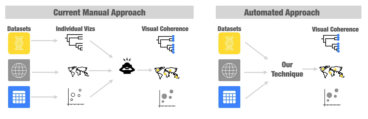
Let’s say our analyst has a dataset of sales made across different geographical regions. Exploring this data question might require combining two datasets of different types — a spreadsheet of sales and some geographic data. The analyst might make a bar chart visualization summarizing their sales per region and a separate visualization of a map that overlays the total profits per region. In this example, the ‘region’ information is shared between the bar chart and map are the same, and the analysts might want to use a common color to show the connections between these two vizzes — in our terminology, this makes the two vizzes (bar chart and map) visually coherent. With most available visualization tools today, the analyst must manually resolve the color consistencies between these vizzes. But using our approach, this is done automatically! Let’s say the analyst then wants to change up their data or include a new dataset. Right now, they would need to once again manually identify and specify shared data between vizzes. However, our approach can be quickly re-run to generate a new set of visually coherent chart combinations on the fly. Doing so helps to speed up the reconnaissance process by helping analysts quickly visualize and examine the data landscape.
The details of our approach are intentionally brief here. If you want to know more, please check out the research publication.
Automatic visualization creation was helpful for the reconnaissance
We tested our technique by collaborating with experts in the field of microbial genomic epidemiology (GenEpi). GenEpi is a field of research that, among other things, explores how disease-causing microbes (like the SARS-CoV-2 virus that causes COVID) are transmitted between people. GenEpi data is complex and integrates data from a variety of sources, such as electronic health records, digitized genetic data, geography, and contact networks (the social network of who infected whom). The data landscape that GenEpi experts have to deal with is broad and heterogeneous but also highly integrated. Beyond manual analysis, they have little support for finding the relationships between datasets in this landscape and even less for visualizing these data.
We developed a domain-specific implementation of our approach called GEViTRec in the R programming language, which is the analysis language that GenEpi experts regularly use. Leveraging R and its visualization capacities, we allow experts to perform data reconnaissance activities in the flow of their analysis without having to switch tools. Here is an example of the R code and the visualizations that are produced:

In the above visualization we see A) the code required to run GEVitRec B) the visualization of the data source graph and C) the top-ranked viz (although only one viz is shown here, we produce visualizations for each path in the data source graph). Visual coherence across the visualizations is achieved through aligning y-axis positions in the top row, alignment of color (the tree diagram and the map), and the use of common variables in the axes. Again, this visual coherence is done automatically by our technique and does not need to be specified by a data analyst.
We collaborated with ten GenEpi experts to evaluate whether the visualizations our approach recommends are useful and understandable. Here are some examples of what experts told us:
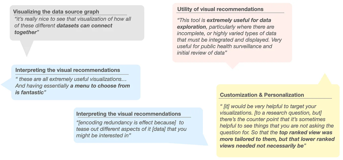
Overall, the response to our technique was positive and experts pointed to interesting further directions of linking visualizations to the hypothesis (or data questions) they have a priori. In our research paper, we also have examples using different datasets.
What’s next?
The volume and variety of data that organizations store produces more complex data landscapes that analysts must contend with. We think there is a lot of potential in continuing to explore opportunities that facilitate and support data reconnaissance through automation and visualization. Speeding up reconnaissance will help analysts surface actionable insights they can share with stakeholders to drive data-informed decision-making. We continue to explore this trajectory of research to examine its extensibility and utility to varied data landscapes and data questions.
関連ストーリー

Which Model Speaks Your Data Language? A User-Centered Approach to Evaluating LLMs for Conversational Visual Analytics
 2026/04/14
Rethinking How Data Workers Revisit Analytical Conversations and Communicate Insights
 2026/04/10
Stepping through Charted Territory: Creating Interactive Step-by-Step Dashboards Tours
 2025/06/08