Looking back at Election 2020: The power of online polling and visualization


The 2020 presidential election was two weeks ago, but in the world of election data, results are still being processed. Every election is a data story, but 2020 was especially so. As analysts pick apart the accuracy of the polls—and voters decompress from consuming the stream of data stemming from the overwhelming number of mail-in votes this year—Tableau and SurveyMonkey have taken time to reflect on the partnership launched this fall to visualize critical, public opinion data.
Through the Election 2020 partnership, SurveyMonkey continuously polled a subset of its nearly 2 million daily survey respondents on a range of topics related to the election—from candidate preference, to likelihood of voting by mail, to concerns about COVID-19. Working with such a robust data set, they were able to break down their data by a number of demographic cuts and visualize it in Tableau, so anyone could analyze the data and understand what factors could shape the outcome this year. Axios, as the exclusive media partner for the initiative, contextualized the data and offered their own analysis.
Tableau talked with Laura Wronski, research science manager at SurveyMonkey, about how their online polling data captured the eventual results of the election, the power of data visualization to showcase the complexities in demographic analysis of voter trends, and the effect that key issues—like mail-in voting and COVID-19—had on the outcome.
Tableau: As you look back on the polling data you gathered in the lead-up to the election, what is your big-picture takeaway about what your data revealed?
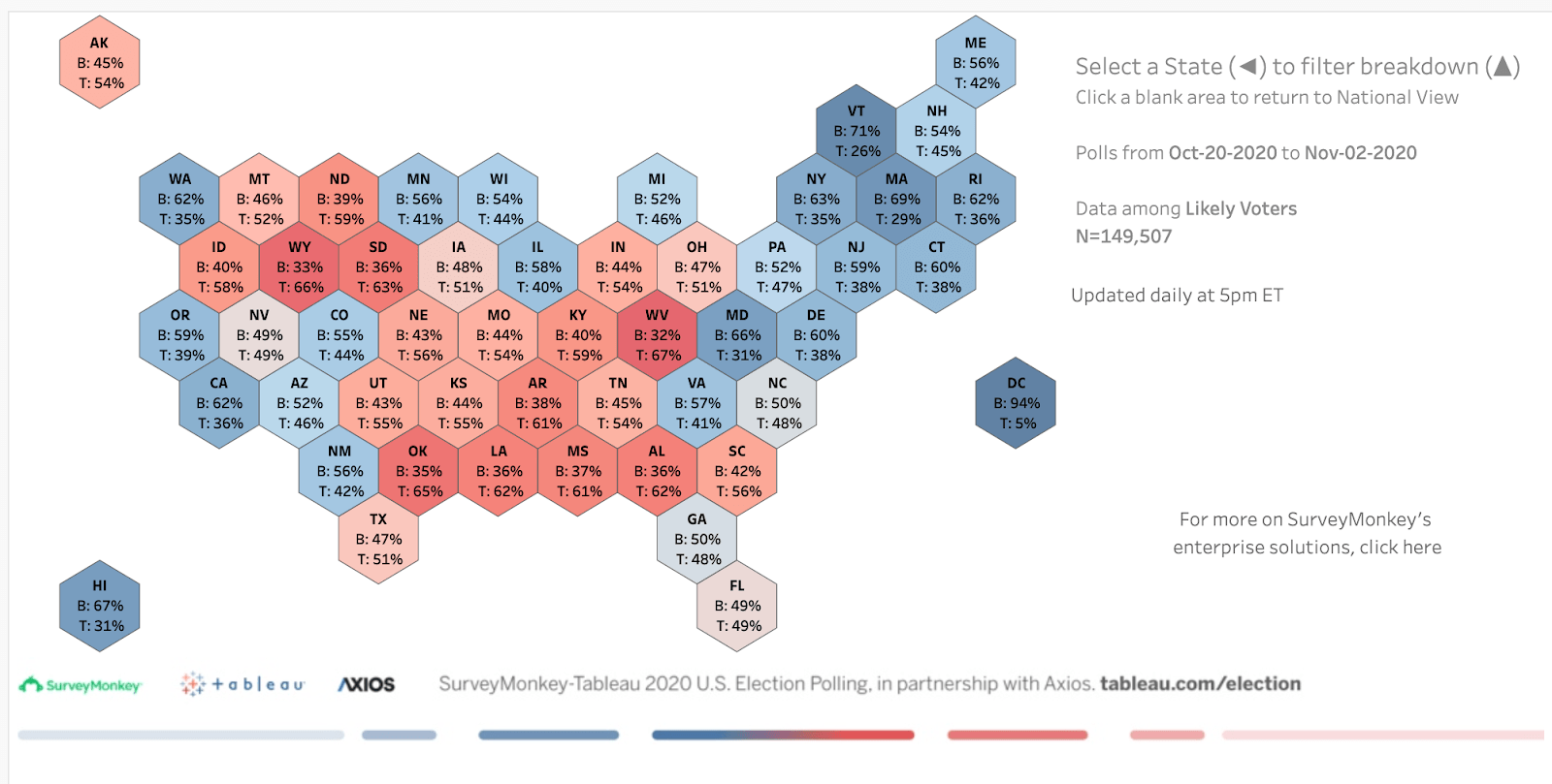
Wronski: One thing that we really came to appreciate was the value of having the 50-state Candidate Preference map to visualize our data. We actually feel that we did well in terms of directionally calling the states correctly. We were dead-on in a lot of cases, and the places where we were off, they were oftentimes less than the degree to which other pollsters were off. And when you look at our map, you can see that the states we focused on for the whole election were the ones that proved to be very pivotal. In Georgia, we had a slight Biden lead, and for Arizona as well. We had Nevada very close, though that ended up being more of a Biden state than our data predicted. What’s interesting is that the reason these states are so critical is that the demographics there are changing. The fact that Georgia was competitive and went blue for the first time in many years was fascinating. Our data showed that, but it’s something that also gave us pause as we were putting up those numbers—we really wanted to be confident in the data.
This was a year in which people’s confidence in polling data was ultimately quite shaken. But as you said, your data was pretty accurate. What does that say to you about your methodology of conducting online surveys?
That’s something that we've been talking about a lot internally. There were obviously some big errors this year when comparing all pre-election polling to the final outcomes. Wisconsin, for instance, is a state that pretty much everybody got wrong. The FiveThirtyEight polling average for Wisconsin aggregated 72 polls in the two months leading up to the election: only two had a tie, and just one—one of our polls—had a Trump lead at some point. But 69 polls had Biden winning, many of them by a wide margin, and he ended up winning by just 1%. That means nearly all of the polls overestimated Biden. That is disorienting, because while a two-point error is not a big one, if 10 pollsters all show the same error, it gives people a sense of confidence in the data that didn’t actually pan out.
One thing that we have seen through our polling efforts was that because we collect data through online surveys and operate at such a large scale, we’re able to get pretty robust data from small segments and subgroups of people. So we could look at responses just among Black Americans, and we did a story with Axios focused on young voters. A lot of times, these subsets are really hard to see in a 1,000-person national poll. So that is something that we think is an advantage to online polling going forward—particularly as what we’ve seen this year is that it’s hard to get the right mix of people in the underlying sample. The more we’re able to get to a large scale with the data, the more we’re able to look closely at respondents and cut the data by different factors to make sure we’re looking not just at who lives in rural areas, for instance, but that we’re getting the right mix of people who live in rural areas by race and education.
As you’re working with such a vast amount of data and identifying trends, why is visualizing the data so important?
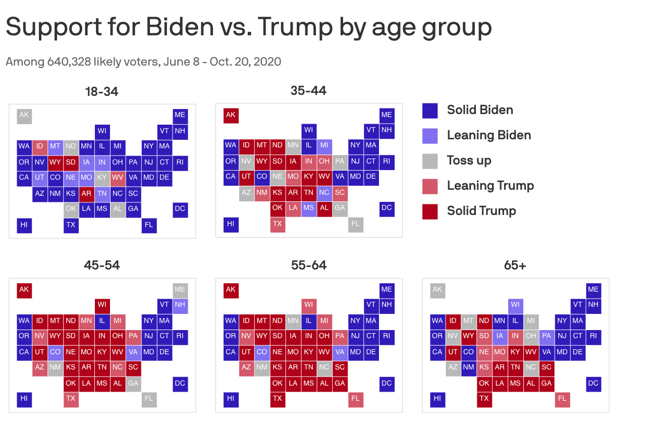
Visualization is so useful because it really allows you to see the trends, rather than look at the numbers and get a relative sense for what they’re showing. We built a dashboard that enables people to dig into different demographic groups and really understand differences among them, not just between them. In looking at Black voters, for instance, you’re able to layer in education or gender, and see how more granular subsets fall in terms of candidate preference. And looking at white voters as an entire group, they were the only ones in our dashboard to fall on the Trump side of the margin. But if you add in education, you can see that it was just white voters without a college degree who fell on that side. And if you add in gender, it’s really just men. The more cuts you can do, the more you can see that there are such overwhelming divides along so many demographic lines. There is a temptation to treat [demographic] groups like race as a monolith, but being able to visualize the data and see how different factors layer in encourages people to take a more nuanced approach to understanding voter groups.
The way this election unfolded hinged on not just the number of votes, but on the way people voted. What did your polling data reveal about the role that mail-in voting ultimately played in the election?
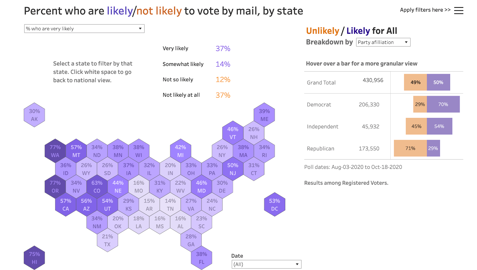
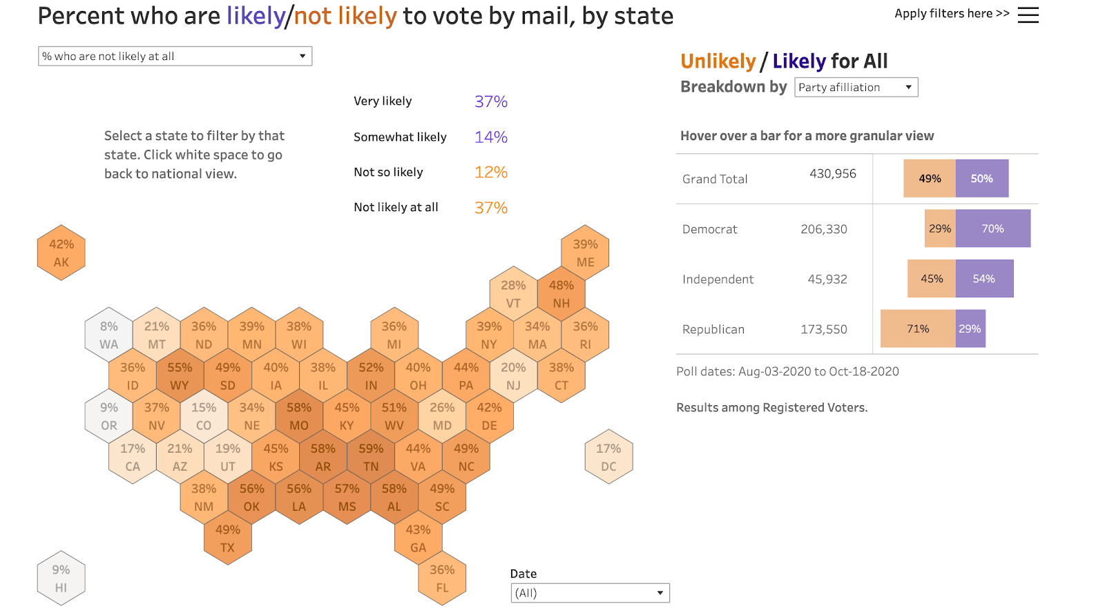
Early on in the process, our data was pointing to what would be a big divergence by party in voting by mail. If you look at our dashboard where you can explore people’s likelihood of voting by mail, you can see a dark purple map indicating the high percentage of Democrats who are very likely to vote by mail, and conversely, you can see a deep orange map of the high percentage of Republicans who are not at all likely to vote by mail. That obviously had an effect on the timeline of the election, and the way the results played out on election day and the days that followed. We’re happy that we got the data out there, and we were right on the money in the sense of how much of a story it would be. I think there’s more to think about how we tell the story around how high rates of mail-in voting can affect the timing of results. People are so used to having all the data on election day, but is there a way we can show with data and visualizations how mail-in voting can extend that timeline?
Another significant factor in this election was the context of COVID-19. As you were polling people about the election and their preferences, you were also asking respondents questions about COVID-19 and their concerns around the virus. Did you see any correlations in the data between people’s COVID responses and the way the election turned out?
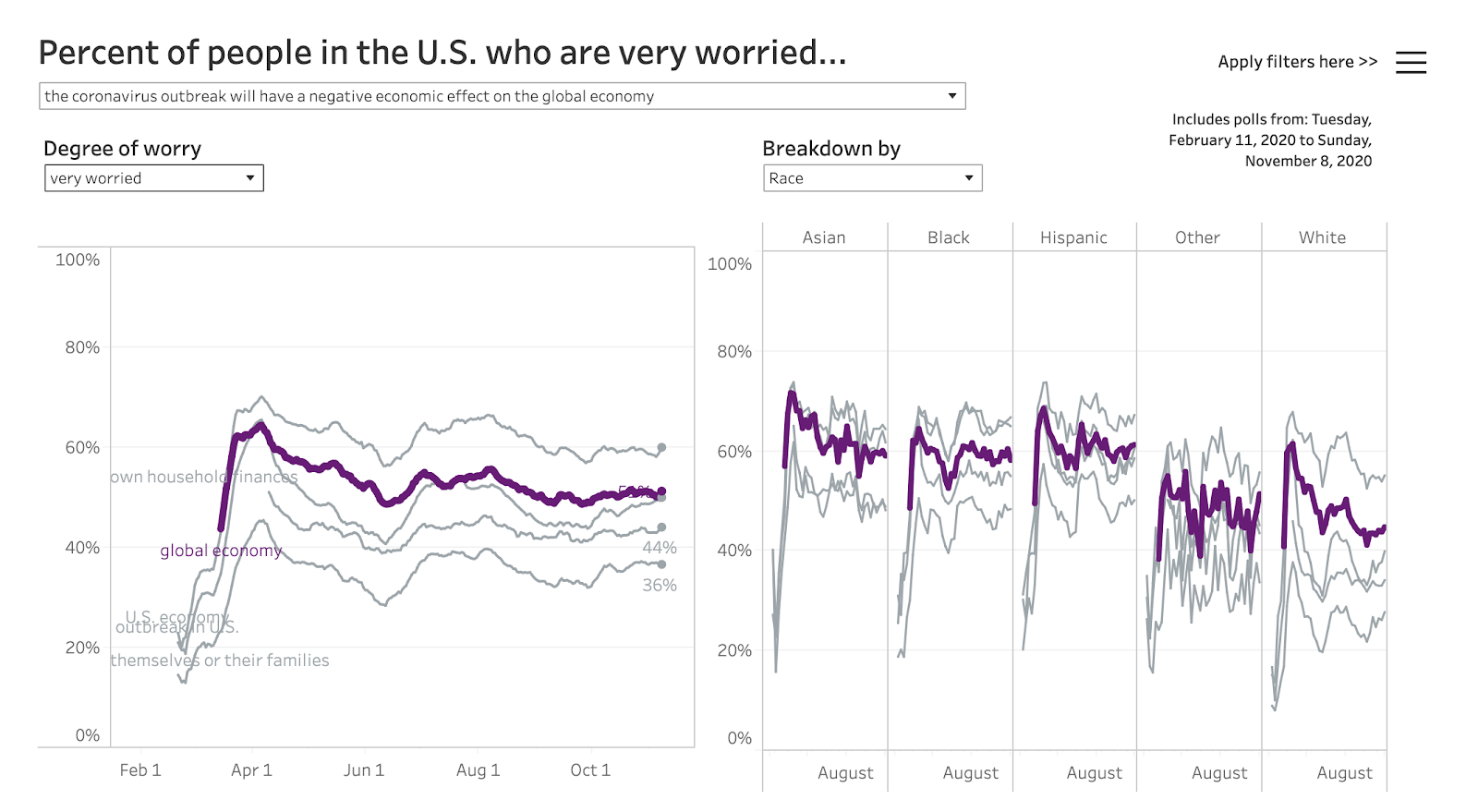
Dating back to February, we’ve asked for people’s responses to five questions that relate to their concerns about the coronavirus. And over time, what we’ve seen is that, on the whole, people are more concerned about the economic impact of COVID-19 on the country [overall]. That’s much higher than the number of people who said that they were worried about the economic impact on their own households. Usually the lowest concern is that they or someone in their family will get coronavirus. Rates of concern about the virus were also much lower among white respondents. We’ve seen in our data that, on the whole, Democratic voters were much more likely to say they were concerned about COVID, and Republicans were less likely to see it as a threat—and if they were, it was much more focused on the economy. So it’s clear that people were looking at the macro level, and that the economic impacts, even more than the health concerns, were what motivated voters. As waves of the virus move across the country, it’s useful to track what changes and what doesn’t about people’s opinions. We can see how these concerns impacted what people thought about when voting, and—when you look at mail-in voting rates—how it impacted how they voted.
To see more from Tableau, SurveyMonkey, and Axios’s Election 2020 partnership, visit the website.
Storie correlate
VizQL Data Service from Tableau: Use Your Data, Your Way
 8 Agosto, 2024

When and How to Use Multi-fact Relationships in Tableau
 1 Agosto, 2024

Top data books of 2021
 12 Dicembre, 2021