Data without Emotion Doesn't Bring about Change


Note: This piece is part of our series on storytelling with data. A version of this story first appeared in Computerworld.
"There is no evidence that anybody has been converted by a pie chart."
So said Martin Palmer, secretary general of the Alliance of Religions and Conservation, on BBC’s Beyond Belief in June.
He went on to say, "People are converted by stories, by narrative, by emotion, by an appeal to the heart."
This was a discussion about climate change and the Pope’s encyclical on the issue. Palmer's opinion is a serious indictment against those of us who try to use data to make change. As Palmer states, data analysis often doesn’t drive the change we hope it will.
Consider also the terrible Syrian refugee crisis affecting the Middle East and Europe. This tragedy had received a lot of attention from data journalists (e.g.The Economist back in January 2013), but the public didn’t truly engage until we saw the shocking photo of the drowned toddler on the beach. The impact of that single photo transformed public awareness in a way thousands of charts in news stories had not.
Here are four amazing examples that use data to create an emotional impact. Each has something you can apply to your own work.
1. Gapminder, Hans Rosling
Hans Rosling’s TED talks are incredible. He realized that in order to drive change, showing an animated chart wasn’t enough. In order to have the correct impact, he narrated over the animations himself. He did this with drama, humor, and passion. You cannot watch these videos and not be drawn into the story.
Lesson: If you care about your data and the change you’re trying to make, stand in front of the people you want to influence and narrate the story yourself.
2. Gun Deaths, Periscopic
How many people get shot and killed each year in the US? Thousands. This is a commoditized fact which, alone, will not drive change. Periscopic, a data visualization agency in Portland, Oregon, came up with a new twist in one of the most famous visualizations of 2010 (which was updated in 2013). Instead of just measuring a death, Periscopic estimated how many lost years of life each shooting represented. The agency estimated that the 11,419 fatal shootings in 2013 led to more than half a million stolen years. Each data point was animated.
Lesson: Consider commodity data in a different way. How can you change the standard view into something original?
3. How Well Do You Know Your Area? Office of National Statistics, UK
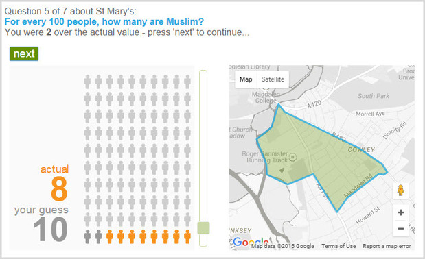
How do you get people to engage with the demographics in their neighborhood? How do you make them realize they probably overestimate the reality of immigration levels in the UK? Simple: You make it personal.
That’s what the Office of National Statistics did in this popular project. Instead of just showing the demographics of the nation or a postcode, the office turned it into a quiz about the viewer’s neighborhood. Making the project personal increased engagement. They were drawn in by being shown where they fit. Once drawn in, they are invited to look at more details.
Lesson: Make your data personal.
4. Battling Infectious Diseases in the 20th Century, <em>Wall Street Journal</em>
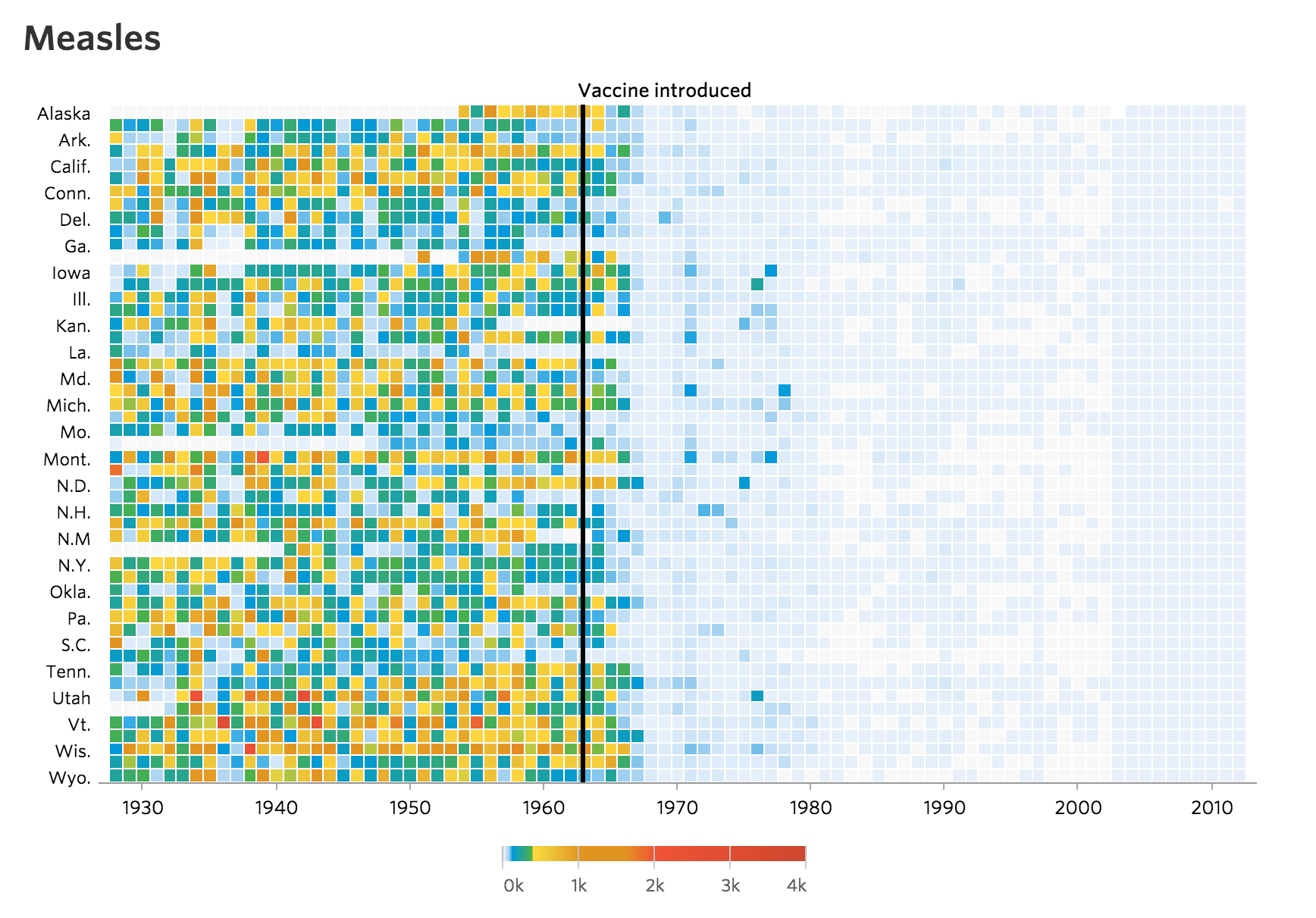
WSJ.com
Fewer people are vaccinating their children in the US, causing increased occurrences of measles. This year, the Wall Street Journal published charts highlighting the battle against infectious diseases across the US in the 20th century. The reason these became so successful was because the choice of chart had an immediate visual impact. The black line with the stark contrast on either side showed just how incredibly successful vaccination programs are.
I like this example because reaction to the chart went through a predictable cycle: wide-reaching praise followed by criticism along the lines of, “Er, wouldn’t this be better as a line chart?” No. It wouldn’t have been. The choice of chart created the impact. If the designers had drawn a line chart, it would not have stood out from the crowd. The designers’ novel choice did not deceive, but it did show time data in a novel way.
Lesson: Can you show your data in a novel way that will make people take notice?
How Will You Make Your Data Hit Home and Drive Change?
Data battles images, videos, and all sorts of other distractions for attention. Making the data novel, personal, and emotional will help drive change. Have you successfully driven through change as a result of your work with data? Let me know in the comments or on Twitter @acotgreave.
Bonus: Other Ways We Can Add Emotion to Our Stories
Three experts in the Tableau community shared their wisdom on the art of storytelling. Hear Robert Kosara, Cheryl Phillips, and Pete Misner discuss ways to tell emotional stories that readers can personally relate to: