De Montfort University: "Exceptional results in reporting and engagement” with Tableau
De Montfort University, formed in 1870 and originally called the Leicester School of Art, has quickly gone from offering voluntary education to being accredited with ‘world-leading’ and ‘internationally excellent’ status for its research efforts. The university has 127 different nationalities enrolled on its 170 undergraduate and postgraduate courses.
With a vision to ‘be a recognised leader in creative education and research,' De Montfort encourages pioneering thinking by both staff and students.
De Montfort’s Strategic Planning department analyzes data ranging from marketing campaigns to admission statistics. After purchasing Tableau for reporting, the software quickly spread across the entire university. Today, several teams use Tableau Desktop and Server, including the finance, academic quality, and human resources departments.
With Tableau, staff are engaging with data on a deeper level—spending less time deciphering the data and more time finding hidden insights.
Identifying the problem
The Strategic Planning Service—responsible for turning business data into strategic information—is a key contributor to the university's vision. The team focuses on delivering reports that assist in decision making.
“We have a clear remit to provide information in the best way to the different faculties and business partners that we work with,” explains David Bryan, Head of Academic Planning at the university.
“The information we collate needs to be two things; data rich and easy to understand," explains David. “It should clearly answer the question, what does this tell us?”
The department analyzes student data in a number of ways, using a variety of tools, putting together reports that would help their colleagues with marketing campaigns and admission statistics. However, it became apparent that there was a clear need to start communicating data in a more sophisticated way.
David explains, “Presenting data meaningfully was difficult to achieve as the solutions we had in place were very technical. People found them difficult to use."
This situation also created additional problems for David and the planning team. “Because the tools were so complex to master, updating reports took considerable time and effort," said David. "Their lack of flexibility meant that users often couldn't generate the answers that stakeholders were looking for.”
The information we collate needs to be two things; data rich and easy to understand. It should clearly answer the question, 'what does this tell us?'
A mixed economy
As a result of the problems with existing tools, departments begin to look elsewhere for solutions.
“Other teams were doing their own thing. It was often easier for them to produce ad-hoc data solutions of their own, rather than rely on our central reporting function. In turn, our own staff started to become disengaged,” explains David.
With departments and colleagues using different tools, collaboration was becoming impossible.
“In meetings, teams would bring along their own data and it would be different to everyone else,” recalls David. “Instead of data that could be quickly assessed and understood, everyone would have slightly differing views."
As a result, time was being wasted, meetings weren't productive, and reporting output was poor. David knew action needed to be taken. “Our staff weren't happy, and consumers of our reports where becoming more and more disengaged. A review was required.”
Staff of all levels and abilities are using Tableau, as it’s extremely intuitive. We are able to develop polished, good-looking solutions in a short amount of time and not have to worry about end-user training.
Finding the right solution
The department needed a solution. Their current tool was stifling productivity and preventing progress. To improve engagement with colleagues and other teams, they needed to make some changes.
David was heavily involved: “There was already a project in place to look at business intelligence tools for the next five years. The project quickly highlighted the need for immediate action. It was clear that we needed to get moving sooner rather than later, so we decided to trial a number of visualisation solutions."
The team conducted extensive research and assessed a number of bespoke solutions. These included Qlikview, Tableau, and Birst. “We wanted to be thorough with our research and choose a tool that was right for us." Over the coming months, David and the planning team tried out five different visualisation tools with various members of the department.
David recalls his first experience with Tableau: “As soon as I used [Tableau], I knew it would immediately add value to what we did, but I also knew this was a tool everyone could easily use. This was key to our decision.”
The department trialed Tableau over an initial two week period. A number of dashboards were built for the team, to see what Tableau could offer. The dashboards used real data and were based on real reports—KPIs and university league tables. The trial was a huge success and the feedback from within the team was conclusive. “In terms of our requirements it did everything we wanted,” said David.
The initial trial hadn’t gone unnoticed with other departments. HR and Finance showed an interest in Tableau. David explains, “We had to ask for an extension for the trial, such was demand.” Tableau agreed and more people got involved.
As soon as I used [Tableau], I knew it would immediately add value to what we did, but I also knew this was a tool everyone could easily use. This was key to our decision.
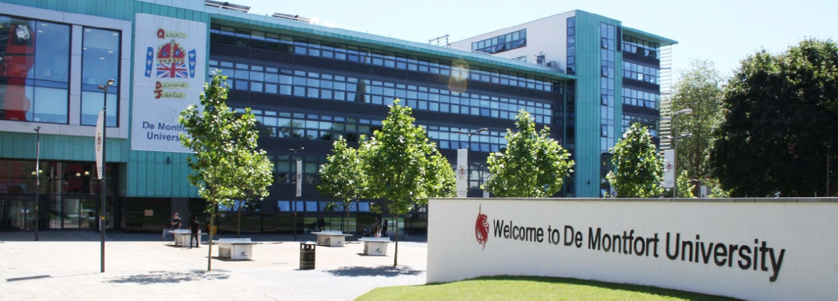
The De Montfort University campus in Leicester.
An easy decision
Due to the success of the trial, the Strategic Planning Service selected Tableau as their tool of choice and began using it in earnest. The interest from other departments meant that authorisation was granted by the university to buy 40 Tableau Server licenses and 10 Tableau Desktop licenses.
Interest was prevalent across the board. Faculty managers, HR and finance data analysts, deans, and core executive stakeholders all became involved in the trial process.
David believes a big factor in why Tableau has been so successful is down to its ease of use. David commented, “Our previous tool was very technical, which put new users off." Tableau eradicated this problem.
“Staff of all levels and abilities use Tableau, as it’s extremely intuitive. We can develop polished, good-looking solutions in a short amount of time and not have to worry about end-user training."
With a wide variety of staff now using Tableau for report creation, viewing data, and sharing with their colleagues, it wasn’t long before the wider university community showed an interest.
Within three months, such was demand, a decision needed to be made. David explains, “The widespread uptake across the university meant every business area was now wanting to use Tableau to produce reports."
With the popularity of Tableau, it was decided that an institutional licence was the only way to go. De Montfort University subsequently bought an institutional licence, so that Tableau could be made available to all of its staff.
Having been involved right from the beginning, David knew the power of Tableau. He didn’t, however, anticipate the sheer uptake from other members of the university staff.
“When we started this process, I couldn’t have imagined that we’d be in the position we are today." David continues, “To have an institutional license so quickly is fantastic. What is even more rewarding is seeing the output and enthusiasm from users across the university. It is clear Tableau has been an unmitigated success at De Montfort.”
A raft of benefits to the whole University
Tableau has benefited the Strategic Planning Service, but the software has also benefited other teams at the university. The Academic Quality Department uses Tableau to deliver information to colleagues, while the HR department uses Tableau to provide data for specific projects like Athena Swan, which recognises commitment to advancing women’s careers in science, technology, engineering, and math.
A number of benefits have stood out in particular:
- Engagement levels have increased: Previously, data was difficult to create due to the technical nature of the old tools. This was impacting work flow and productivity. Tableau has appealed to staff members who ordinarily had no interest in data. David explains, “From a user perspective, the reports are so responsive and visually engaging, staff seeing it are eager to use Tableau and explore what it can do for them.”
- Data mining has never been so easy: With Tableau, the Strategic Planning Service now produces information that has an impact. Results are displayed visually, so that information can be clearly understood.
“The way we now look at reports has changed, figures on a spreadsheet can be one dimensional," says David. "Tableau’s output adds real value.”
- User adoption increase weekly: Stakeholders can often be hesitant when a new solution. Time and resources can be spent delivering training and engagement methods with little or no interest. The successful uptake of Tableau at De Montfort University has largely come down to the software's intuitive design.
“Ease of use means that staff members that are traditionally not able to produce reports are completely involved” says David. "Tableau has provided flexibility for its users, benefiting all at the university. More time can now be spent on engagement with our colleagues, rather than preparing the data itself."
- Future scope: With their growing user base, David believes the potential for further Tableau use is huge. “By no means have we utilised all possibilities that Tableau offers, there’s so much more to learn.”