Griffith University simplifies analytics to foster a data culture
More than 150 dashboards providing deep insights into the university’s research, learning and teaching, staff, and students
A growing data culture with more than one-third of employees using Tableau
Reduced complexity, making data analytics easier to manage and understand
Griffith University is a comprehensive, research-intensive university, ranking in the top 2% of universities worldwide. The university’s teaching and research spans six campuses in South East Queensland and it has a staff of 4,000 supporting 55,000 students each year. As an organization of this size, Griffith generates a vast amount of data, and it has developed a robust business intelligence (BI) function that optimizes data for strategic and operational planning.
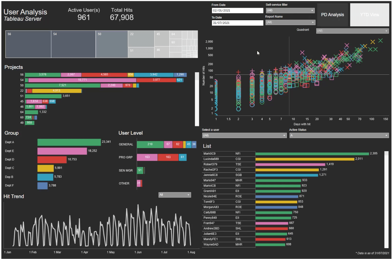
With Tableau, the BI and Analytics team has developed more than 150 dashboards that provide deep insights into the university’s research, learning and teaching, staff, and students. The team is also helping to build a strong data culture within the university and there are now 1,600 employees using Tableau for activities like planning, budgeting, and forecasting.
Tableau gives you complete freedom and flexibility to curate analytics exactly as you need them to best answer your questions,” said Jeffrey. “It helps us ensure that every dashboard we release is as easy as possible to view and understand. It also helps our team be more agile and give people the information they need in the way that they need it.
Optimizing organizational intelligence
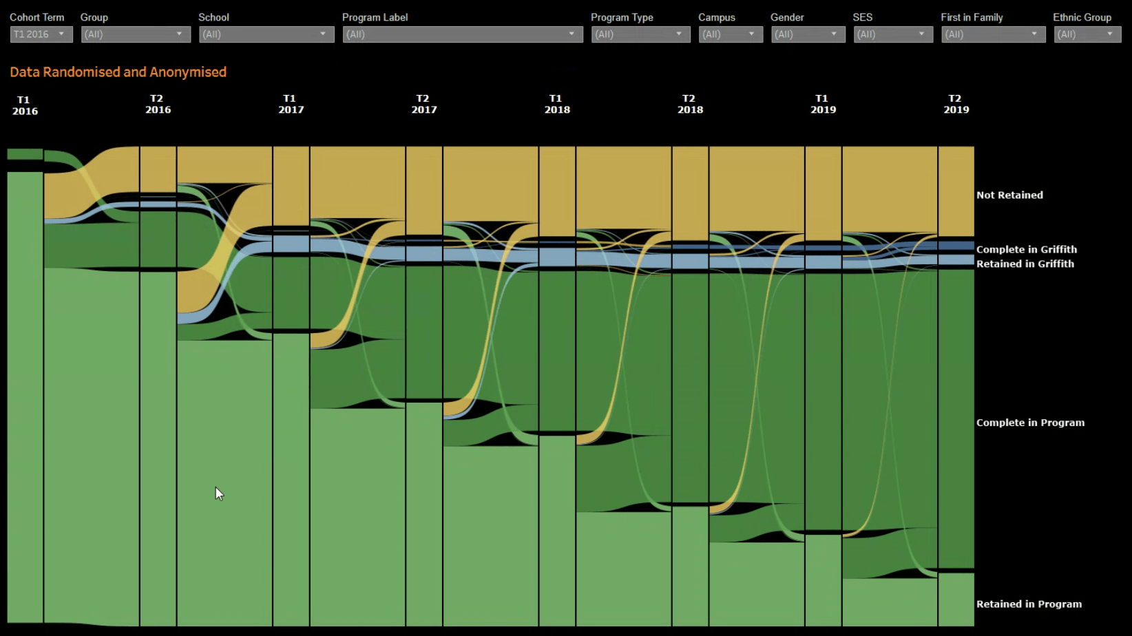
Like many other higher education institutions, Griffith’s activities are broadly split across research and education. The university tracks a range of metrics that help it plan and manage these activities and maintain its competitive position. To manage its research activities and understand the impact of grants, the university tracks things like how many projects have been published or cited. To manage resource planning and teaching allocation, it tracks a range of human resources metrics.
Mark Jeffrey, Senior Strategic Leader BI and Analytics at Griffith University shared that most of the university’s data relates to its students.
“We look at the entire lifecycle of the student, from the point of application through to when they graduate and then, ideally, when they return as a postgraduate or a Higher Degree Research student. We also collect data to understand their graduate outcomes and how their field of employment ties back to their program of study,” said Jeffrey.
With the help of Tableau, Griffith is using this data to understand better the student journey and how it can better support people to move through it. It’s also optimizing the intelligence gained from all of the other data it collects to help employees at all levels make data-driven decisions.
Reducing data complexity
Tableau was brought in by the BI and Analytics team to replace a legacy analytics tool that was overly complex and a burden to manage. For instance, every time there was an upgrade to the infrastructure, there was real concern something would break, and dashboards would have to be rebuilt. As data volumes grew, there was also extra work involved in managing the infrastructure.
When transitioning to Tableau, the team focused on reducing complexity and making dashboards easier to understand.
We love Tableau Server and the simplicity of the architecture, which makes it really easy to update and interact with the infrastructure. The Tableau Knowledge Base is also full of specific examples which help us troubleshoot any issues and improve things like our refresh speeds.
Tableau has also helped to reduce the complexity of managing infrastructure. The university primarily uses Tableau Server, which connects directly to a data warehouse that holds a rich array of curated data that’s been collected over 10 years. Around 250GB of data is sent from the data warehouse into Tableau every day, while Tableau also connects directly to a few SQL server environments.
“We love Tableau Server and the simplicity of the architecture, which makes it really easy to update and interact with the infrastructure. The Tableau Knowledge Base is also full of specific examples which help us troubleshoot any issues and improve things like our refresh speeds,” said Jeffrey. “Our analysts and the Data Warehouse team work closely together to curate the data in the best possible way so we can get the best performance and value from our analytics.”
Driving adoption and data literacy
When the BI and Analytics team launched Tableau to the university three years ago, they began with three simple dashboards and took the time to gain feedback and establish some best practices. Ever since the team has remained committed to providing users with the best possible experience, and it uses Tableau itself to understand trends in user behavior.
“With Tableau, we’re only limited by our ability to ask questions. It tells us everything we need to know about the performance of our dashboards and how they’re being used,” said Jeffrey.
Over the last year, the team has had an increasing focus on adoption. It has run a number of live online events to give employees the opportunity to learn more about Tableau and how it can support them in their work. The format of the events has enabled attendees to submit any questions anonymously, which has resulted in increased engagement.
The Business and Analytics team frequently promotes new features and dashboards and it has created an entire portal on the university’s intranet where staff can access a range of dashboards and reports. The team has also built a recommendation engine with Tableau, which it uses to point users to dashboards that are relevant to their role.
With Tableau, we’re only limited by our ability to ask questions. It tells us everything we need to know about the performance of our dashboards and how they’re being used.
All of these activities have helped drive uptake of Tableau, and there are now 1,600 total users across the university, with around 800 active in any given week. There are also between 50-70 users who are set up as Explorers and support different functional areas of the university.
Most importantly, there’s a greater understanding of data analytics across the university, with dashboards increasingly used to inform decision-making. The next step for the BI and Analytics team is to work with users to help them better leverage their data in real-time, rather than relying on static reports.
“While there’s always a need to digest and reflect on data, we can see a future where more people are also using their data in real-time to make the best decisions they can,” said Jeffrey.