How business leaders can use Deloitte Canada’s dashboard to track recovery from COVID-19


In the midst of the COVID-19 pandemic, the question of “when will things go back to normal?” is weighing on everyone’s mind. Even if we don’t know what “normal” will look like in the post-COVID world, we do know that economic recovery is the goal, even if the path to reach it is still uncertain.
Deloitte Canada breaks the current pandemic down into three phases: Respond (when organizations need to react to the crisis), Recover (when actions are taken to make the organizations stronger), and Thrive (success in the post-pandemic world). As a leading consultancy firm, they see that leaders need to be able to conceptualize all three stages at once to understand where we are now, how we begin to work our way out of it, and how we set ourselves up for success in the future. The key to doing so is understanding a wide range of data points—beyond traditional economic and financial metrics—that indicate how the virus is progressing, and how the people and businesses that make up the economy are faring.
To capture all these metrics, Deloitte Canada has created a comprehensive, publicly available dashboard on Tableau Public that business leaders can consult to understand everything from media sentiment to foot traffic volumes to congestion on city streets. Taken together, these data can signal important turning points in the crisis, maybe even before more traditional metrics register the change.
Since it was first published in early April, the Economic Recovery Dashboard has quickly become an in-demand resource from government and business leaders alike. To learn more about the process behind it, we talked to Stefan Popowycz, leader of Deloitte Canada’s Visual Analytics practice and partner in Omnia AI, the artificial intelligence division, and Alex Little, a senior manager for Omnia AI.
To see the dashboard in full, visit Deloitte Canada.
Why did you decide to create this dashboard? How did you decide which metrics would be most critical for business leaders to see and understand?
Stefan Popowycz: We wanted to give business leaders a way to understand the factors impacting their strategies and cash flow during the COVID-19 crisis. Our chief economist at Deloitte Canada and our chief economist Craig Alexander at Deloitte Canada and our global supply chain leader Jim Kilpatrick came up with a set of financial and economic metrics that we would normally take a look at, but those are often lagging, and COVID-19 is changing rapidly in real time. So we wanted to think outside the box and analyze some more non-traditional indicators that could speak to rebound and recovery, and to collect them all in one dashboard to give a more complete picture to leaders who need to analyze them quickly.
We started brainstorming around metrics like foot traffic, actual traffic, online sentiment, where people are no longer going, and then we quickly reached out to a variety of vendors to pull in data. We’ve been doing a lot of work with PiinPoint and SafeGraph for foot traffic and distance-traveled data. And then we have Geotab, which is a global telematics company that also tracks commercial trucking data, so we’re able to see those volumes as well as data on border crossings. It’s interesting—we’re finding that with a lot of vendors, when we explain to them what we’re doing with this data, they’re happy to give it to us to include as long as we make a reference back to them.

How can business leaders benefit from seeing all this data collected in one place?
Alex Little: Business leaders typically have data sets that pertain to their specific domain, and that's what they monitor to understand changes on a daily basis. But with something as broad as this COVID-19 situation, that standard data domain may not provide all of the answers that leaders need to actually understand what’s happening on the ground.
I think that's one of the reasons we've seen people gravitate towards this dashboard—among all these different data, leaders can pick and choose the parts that are most relevant for them. They may have had access to 10 or 15% of this information in their own data, but seeing it all together allows them to really hone in on what they care about, or see some trends they may not have been able to before.
How have business and government leaders responded to the dashboard?
Stefan: The key thing that we’re hearing is the value of the democratization of data, of having all of these metrics accessible in one place.
So far, we’ve had a global American credit card company reach out and say they want to explore creating a version for themselves; the Office of the Deputy Prime Minister of Canada and several Provincial Ministries have reached out with some insights about the way that they are looking at the dashboard, and ideas for potential different data elements that they think could be useful to include. The President of an Asia-Pac country wants us to create a bespoke version of the dashboard for them to use. And we heard that a global American chemical company shared the dashboard during a departmental meeting and said they need to be monitoring it every day.”
This dashboard has clearly resonated with a lot of leaders. What about the way you chose to present all of this data makes it so effective and actionable, and what can other data teams learn?
Stefan: Data needs to be presented in a way that’s understandable. Design fundamentals are so important to the consumption of the information—it needs to be effortless.
Our visual analytics practice includes a human centered design team, so we have information designers and creative directors sitting next to data scientists and data engineers. For this COVID-19 dashboard, we were able to work very closely and quickly to make sure all the elements were coming together in a way that is understandable to a broad audience. If you look at the dashboard, it has a very linear narrative flow that really tells a story around COVID and the different metrics that you should be focused on. I think that’s what’s been contributing to the response we’ve been getting from executives and CEOs—they can understand it immediately and use it as a resource.

The type of information you’ve collected here is incredibly useful for businesses all across the world. What kinds of challenges do you face in scaling a dashboard like this to a global audience?
Alex: Sizing and information design has been the main challenge. There’s a conversion factor when you go from one language to another—the frame that we build English with is about 1.5 times the amount of space that’s required for French. As we’ve focused more on Human Centered Design, we’ve become very precise with locking down the measurements of each component of a dashboard to make the information visually strong. But that creates a challenge when you have to adjust the size of everything for a different language—otherwise you have huge amounts of whitespace, or text crushed into boxes, and that creates barriers for people consuming the information.
Why did you choose Tableau to build this dashboard? What has the experience using the platform to communicate this information been like?
Stefan: We were drawn to using Tableau because we wanted the data to be free and accessible to people. For us it’s not about advertising—it’s about sharing information and making it consumable.
But we actually broke Tableau Public—where we initially created the dashboard—because we pushed it in a way that it's never pushed. So Tableau gave us 40 core external facing servers and said here’s a license, do your stuff, and we’ll talk about it in July. It was like Tableau was saying: This is important—you need to communicate information, and this is the tool to do it. Tableau is contributing to meet the demand for the increased communication of information.
During COVID-19, Tableau is sharing resources and information on how data is being used to understand and address the pandemic. To learn more, visit the COVID-19 Data Resource Hub.
Zugehörige Storys
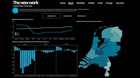
What we can learn from open data: COVID-19 in the Netherlands
 29 April, 2021

After a year of COVID-19 charts, eight data communication lessons learned
 19 April, 2021
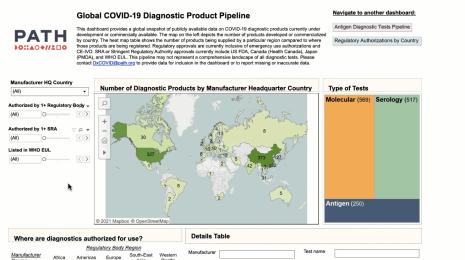
Data innovations in public health: PATH creates COVID-19 diagnostic test dashboard
2 April, 2021