Tableau Visionary Ryan Sleeper shares his tips for creating mobile-first dashboards in Tableau, including how to: determine if you should consider a mobile-first design, scroll multiple sheets at once and eliminate default scroll bars completely, leverage tooltips, and more.Alle Visualizations Storys

Visualizing Every Single Street in San Francisco, in collaboration with Rickey Gates
 6 März, 2020
How I presented data on disabilities to a U.S. Ambassador to the United Nations

Navigating New York with the “City of Women” Map
 6 Januar, 2020
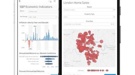
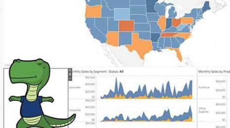
5 tips for mobile-first dashboard design in Tableau
 3 Dezember, 2019

Viz your Tableau Conference schedule in 3 steps
 16 Oktober, 2019

3 storytelling with color tips to improve your data visualization
12 September, 2019
Making the NYC subway user-friendly through effective visuals
28 August, 2019
How to get people to remember your visualization
 9 August, 2019
Designing a great dashboard extension
 8 August, 2019
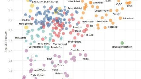
Digging into concert setlist data: Which artists play the same songs over and over?
 31 Juli, 2019

How to build information experiences for comprehension
 23 Juli, 2019

Visualisierung von Spotify-Musiktrends in Tableau
 17 Juli, 2019
Visualizations
Rickey Gates’ newest adventure. Rickey Gates is one of the most recognized extreme runners in the world. For his Every Single Street project, he ran every single street in San Francisco. Data viz expert Yvan Fornes helped him visualize all of his running routes—over 1,317 miles in 46 days—in Tableau.
Visualizations
2 März, 2020
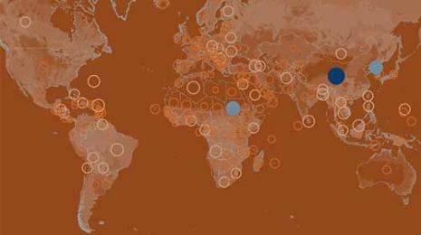
On the International Day of Persons with Disabilities, Nick Hara was given two minutes to advocate for people with disabilities using data visualization. In this post, Nick shares the process behind the dashboard along with his learnings.
Visualizations
A chat with map co-creator Joshua Jelly-Schapiro about the process of creating “City of Women” and how maps help us see places in new ways.
Tips & Techniques
Visualizations
Make a viz of your Tableau Conference schedule with the Web Data Connector, where you can easily pull in TC schedule data into Tableau for your visualization pleasure. Here is how to do this in three easy steps.
Visualizations
Color is one of the easiest ways to control the style of your data visualization. A good use of color makes visuals more engaging, makes insights pop off the view, and adds some professional polish. Learn to use color in your visualizations to communicate your narrative.
Visualizations
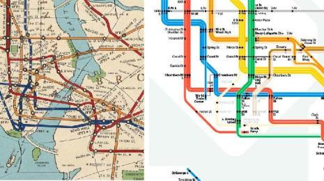
In 1965, designer, Massimo Vignelli and Bob Noorda were tasked with redesigning New York's newly formed subway system. Allen Hillery explains how data visualization practitioners can learn from the successes and downfalls of this project—like details around audience and design principles including color, shapes, and lines.
Visualizations
Since our brains aren’t remembering things as they once did, it’s yet another challenge to us, as visual creators, to make our works memorable even against this gradient of forgetfulness, this necessity of filtering out vast rivers of content from our consciousness lest we find ourselves overwhelmed, flooded, and washed away.
Visualizations
So, you’ve built a Tableau dashboard extension? Awesome! But what’s the user experience like interacting with it? Is it easy to use? Is it aesthetically pleasing? Is it effective? Follow this guide to ensure that your extension provides a user-friendly experience and is delightful!
Visualizations
Have you ever considered how much thought a band gives to the songs they play in their live sets? Chris Love and Rob Radburn take a look at over 200 of the most popular artists on setlist.fm (~180,000 sets) and analyze how their sets have changed over time.
Visualizations
Building an information experience for comprehension and retention will take your visualizations from "not bad" to "great." Lilach Manheim and Mike Cisneros explain how you can boost your data viz design for your audiences.
Visualizations
In einem kürzlich abgehaltenen Webinar mit unserem Team und mit Skyler Johnson, Data Visualization Designer bei Spotify, haben wir gezeigt, wie Sie tiefer in die Daten einsteigen können, die den Top 200- und Viral 50-Charts von Spotify zugrundeliegen. In diesem Blogbeitrag erfahren Sie, wie Sie mit Spotify-Daten ein einfaches Dashboard erstellen, das die Top-Songs und -Interpreten nach Land analysiert.