5 questions to ask when designing a mobile dashboard


This year, I have a goal to walk or run 1000 miles. It’s part of the #Walk1000Miles community, run by Country Walking magazine. And of course, I wanted to track my progress with Strava and Tableau.
[Before we continue, a quick note on distance units. As a proud European, I measure my exercise in kilometers, so that’s why everything’s calibrated to the number 1609 km, the metric equivalent of 1000 miles. It might not be a round number, but 1609 is a prime number, so it’s inherently a cool number, right?]
I developed the mobile version of the dashboard in parallel with the desktop version and all design decisions were made with both mobile and desktop in mind. During the design process, I got to thinking about the things we need to consider when building dashboards for mobile devices. In short, don’t leave mobile design until the end: build for mobile as you build for desktop. Dig into the rest of this post for the nitty gritty details.
Do you need a mobile version of your dashboard?

This one is simple. Yes, you do need a mobile version.
You need to get the data to where people are. Our job as analysts is to engage all users and that means giving them a good experience where they are, not where you want them to be.
Designing for mobile gives you a creative constraint. In my recent Data Viz Debate with Andy Kirk, he raised the excellent point that when you have a constraint, such as a small screen, or static charts, it forces you to think more clearly about your purpose. The same goes for a mobile dashboard—it forces you to have a clear purpose for your desktop version.
Do you need all the KPIs on your mobile dashboard?

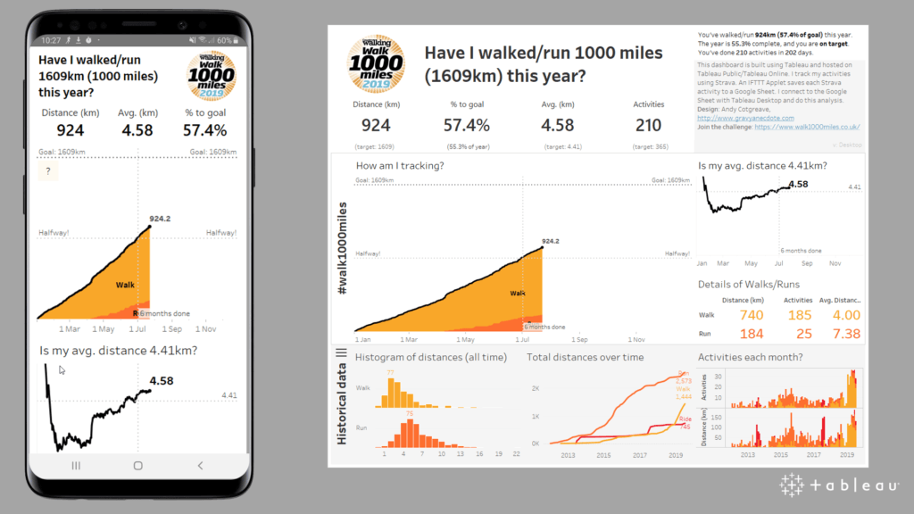
I have four key performance indicators (KPIs) on my desktop dashboard (total distance, percent of goal, average distance, and number of activities (highlighted above). They are all useful, but only the first three are directly related to my goal. In the mobile version, I only show the first three KPIs. Number of Activities is useful secondary information, but my mobile version focuses on the primary dashboard question, which is purely about my 1609 km target.
Should it be portrait or landscape?
I believe mobile dashboards should be designed for portrait mode. Most phone usage is in portrait mode—(92% according to some sources). Mobile video has already begun to switch to vertical, and I think mobile dashboards should go the same way. You should design to make the user’s life easier, not harder. Which leads me on to the next question…
Should it fit on one screen?

The classic definition of a dashboard states that they should fit on a single screen. If you can get all your info on one screen and maintain readability, that’s great. However, using our thumb to scroll is so fluid and fast, we no longer need the single screen constraint: it is fine to make the dashboard scrollable.
In my dashboard, I made a couple of choices:
- The line chart showing how average distance has changed over time deliberately overlaps the bottom of the screen. This suggests to the user that there is something further to discover by scrolling.
- The lower half of the dashboard focuses on the historical data. This is secondary information, needed only to delve a bit deeper into my data, after the first look at progress to my goal. This layout creates a sense of two “pages.” The first is focused on my 1000 mile goal, the second is deeper contextual analysis.
Which text can you remove?

In moving to mobile, I had to pare down the amount of text on display. Below are two areas I could safely remove/hide:
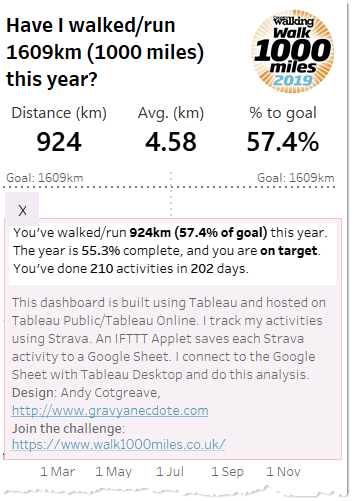
- I removed the contextual text beneath the KPIs. It’s good to see the targets on the desktop, but space is too tight on the mobile version. I make an assumption that the mobile audience are familiar with what the goals should be (of course, for this dashboard, the audience is me).
- The text on the right hand side is really important. The top section is a written summary of the primary goal: am I on target and by how much? It also contains a description of the dashboard. Where should this go on mobile? I chose to hide this behind a Collapsible Layout Container. The info is there, but on demand.
Learn more
Those are the five main questions I ask myself when creating a dashboard, particularly for mobile. When you design your next dashboard, consider how you meet the audience where they are, the primary questions you will answer on your dashboard, what you can remove on the mobile version, and how you can limit the text on display.
What other tips do you have for mobile designs? Let me know in the comments, or on Twitter (I’m @acotgreave).
And finally, you can follow my progress and download the workbook on Tableau Public.
Zugehörige Storys
How to Improve Business Productivity with Tableau Mobile
 31 August, 2022
Introducing improved online/offline flows in Tableau Mobile
 17 November, 2020
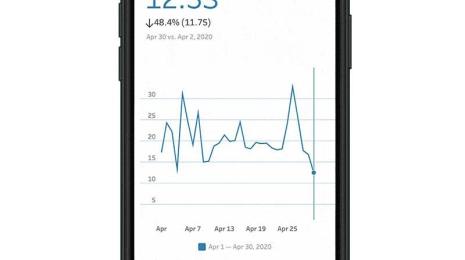
Metrics, headlines for your data
 28 Mai, 2020
Learn about Metrics for Tableau—Optimized for mobile, track all your KPIs from various dashboards at a glance, all in one place—anytime, anywhere.