Choropleths, Isopleths, and Area Maps

Understanding and Using Choropleths, Isopleths, and Area Maps


Choropleths and isopleths are both types of area maps, which are usually geographic maps. But they have two key differences that separate them: choropleths rely on boundaries, while isopleths rely on density.

A choropleth map, or filled map, takes a set of data that applies to a country, a state, a county, a parish, or any sort of geographical boundary and uses color or shading to denote the relevant values. They are often used to present data on fields that ties to specific locations with boundaries like elections, population density, and median income. Baron Pierre Charles Dupin created the first choropleth map in 1826. He was a French engineer and economist who tried to map the levels of illiteracy across the regions of France.

Isopleth maps don't rely on a defined area like choropleth maps do. Instead they follow contours and areas of interest regardless of borders. Points are overlaid on a map that all share the same value of a selected measure. A common example of an isopleth area map are radar maps used in meteorology to estimate wind speed or precipitation.

How To Read Choropleths and Isopleths


A choropleth map will display the different values of a selected measure laid across the geographical areas on a map. The geographic location type determines the boundaries of the map. Each geographic area is color-coded to signify the value of the location. To ensure you understand what different colors or shading show on the map, make sure to read any instructions and look at the color key/legend. A map that shows the number of births per state in the U.S. would have its boundaries defined by state. Higher or lower birth rates would be color-coded to show percentages.

Isopleth maps rely on continuous data. The isolines, or boundaries, that appear on a map connect data points using the same measure. This means that isolines of equal value appear on an isopleth map with values on one side being higher than the values on the other side. Similar ranges with similar values will have the same color assigned to them. Isopleth maps are similar to choropleth maps in that they color the areas between isoline. This type of map allows the reader to see the gradual changes occurring on a map due to the absence of strict boundaries.

What Type of Analysis Do Choropleths and Isopleths Support?

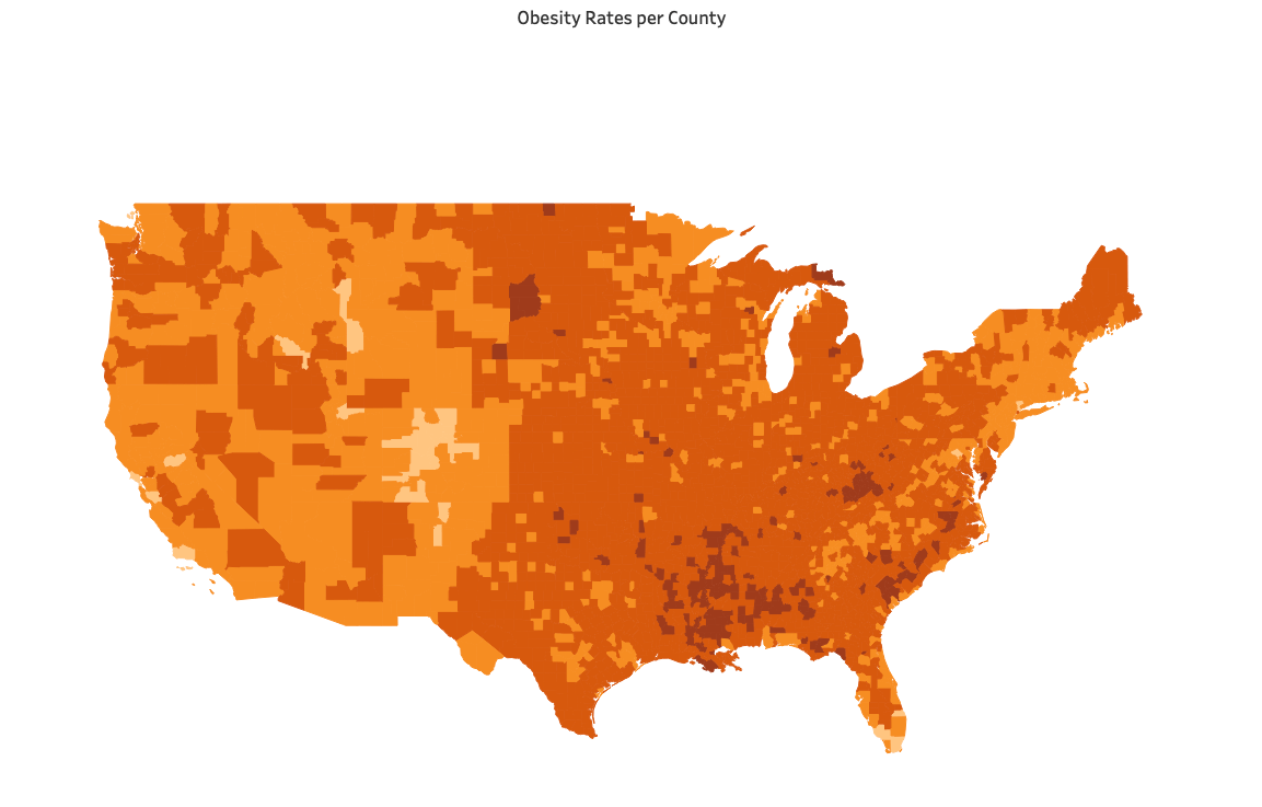
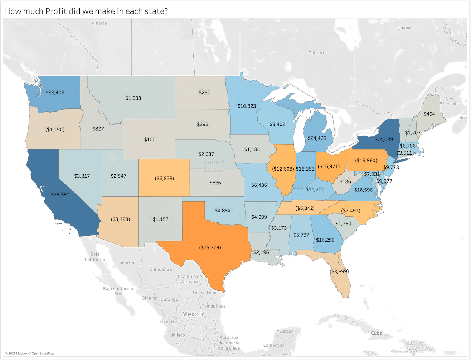
A choropleth map is a simple way to visualize a numeric field across a geographic area by displaying the range of variability using color. Choropleth maps are useful in that they can present the actual numbers behind your data on a map. But due to their use of colors they don’t need numbers to be present on a map to identify geographical hot spots. These maps can also be effective at measuring percentages as parts of a whole. Choropleths are a good choice when geographic precision is important. However, when quick interpretation of the data is most important, consider using a tile grid map (shape map) to avoid the visual imbalances. These are inherent to choropleth maps due to the varying sizes of geographic areas.

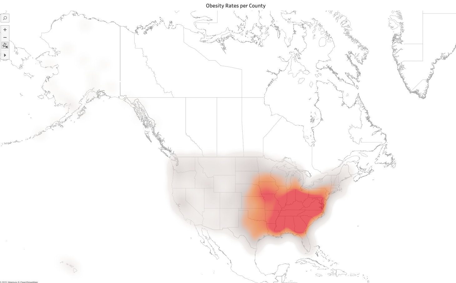
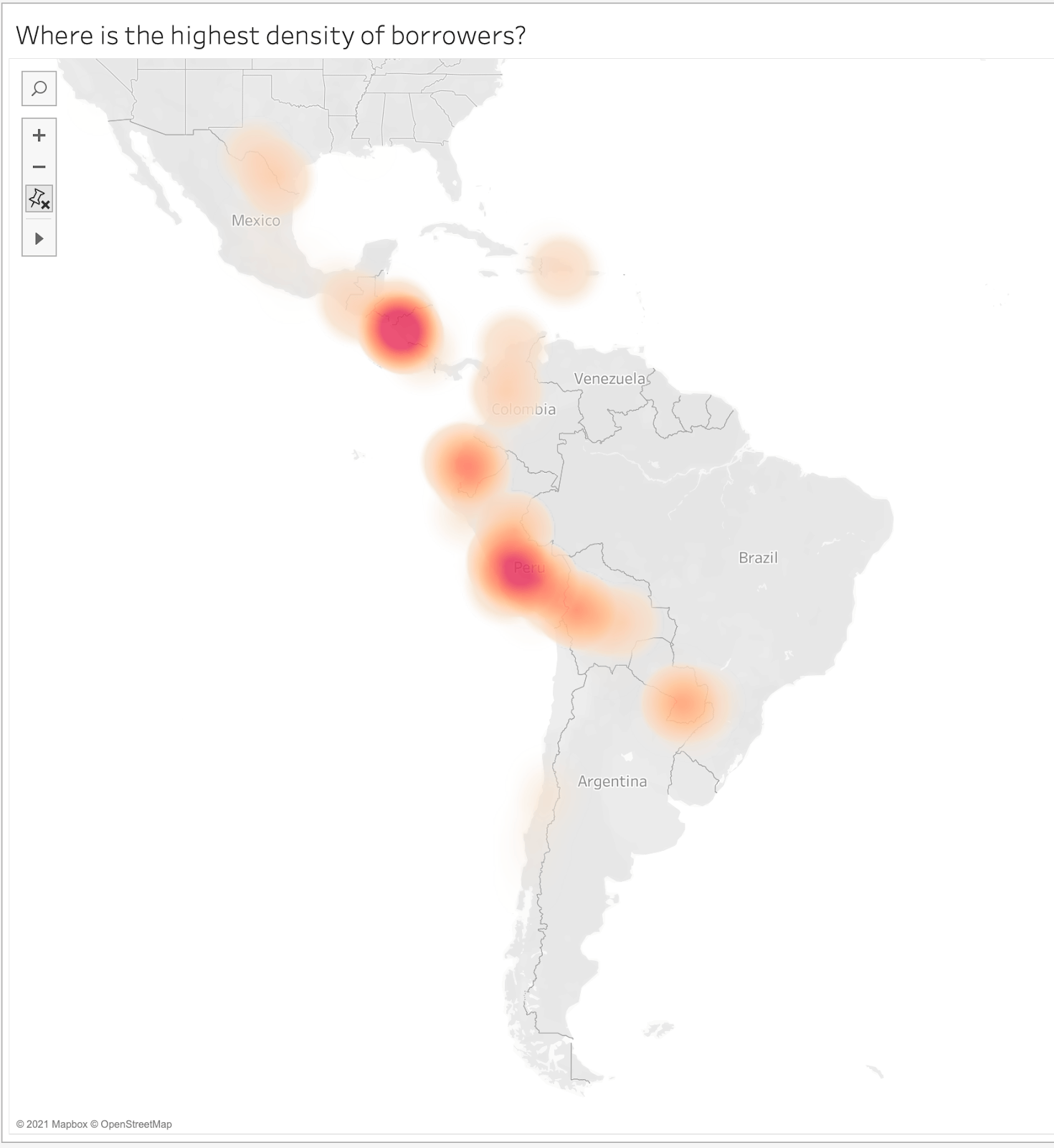
Isopleth maps are more effective when you do not want your data bound to predefined boundaries like a choropleth map. If you want to use continuous data to show gradual change and varying density over a geographic region, an isopleth is a great choice. Weather maps are a kind of isopleth map as they aren’t bound by state or country boundaries. Patchy data that doesn’t connect to other points does not work well in an isopleth map though.

When and How to Use Isopleths and Choropleths for Visual Analysis

If you have a regional or population based dataset, a choropleth map can help display the differences between geographic areas to a viewer. Isopleths, , don’t need a set boundary to show anything on a map.

You should use a choropleth map if:

  • You are looking to represent your data within geographic boundaries.
  • You want to show percentages of a whole on a map.
  • You can divide your data into ranges.
  • Your data displays a single variable.
  • Users don’t need to see specific numbers or variables.
  • Geographic precision is important.

You should use an isopleth map if:

  • Your data crosses over standard geographical boundaries.
  • Your data isn’t bound by population.
  • You don't need to show the data as a percentage of a whole.

When designing these maps, here are some things to avoid:

  • Don’t make the key focus of the map a geographic area that is too small.
  • Don’t use conflicting colors or more than one color scheme.
  • Don’t try to show more than one category.

Some good alternatives to these maps include cartograms, symbol maps, and dot density maps.

Great Examples of Choropleths


This choropleth map follows the obesity rates per county throughout the United States. But rather than assigning a new shade of orange to every different rate, the rates are split up into ranges.

  • The map has one consistent color theme.
  • The ranges give a better idea of which regions suffer the most from obesity.
  • There is only one category measured over all.

Bad Examples of Choropleths

POOR EXAMPLE

This choropleth map shows the same categories as before, but with one key difference that makes it a bad map. Each number for each county has a different color. The overwhelming number of colors/counties makes it impossible to determine patterns or regional rates.

BETTER ALTERNATIVE

A better alternative for this map is an isopleth map, where the data isn’t split apart by boundaries. The locations where the highest problematic areas are where the center of the splash of red, while orange radiates around the red.