Create data that moves you with viz animations
Viz animations help you see and understand your changing data. Dive into the blog to learn more about viz animations.


With Tableau viz animations, it’s easier than ever to explore, understand, and present your data, showing changes to tell powerful, moving data stories. Available for you to try now in the Tableau Beta—and soon available in our next release, Tableau 2020.1—animations put your data in motion and take your work to the next level. Use cases for viz animations span analysis, presentation, and data storytelling. Pair them with the pages shelf for seamless transformations over time. Use them to see and understand how dimensions reorganize after a sort. Even guide your audience’s attention during a presentation to help them focus on what matters. Read on to learn how to enable animations, get tips on realizing their full potential, and see examples of our favorite use cases.
Why animation?
In the ‘90s, data visualization experts were just starting to explore motion's then-untapped analytical potential. Now we know that thoughtfully-applied animations can enhance understanding. As a pre-attentive visual property, motion calls attention to what’s changed and de-emphasizes what hasn’t. This is just as true in Tableau. Without animation, changing something like a date filter causes scatterplot marks to suddenly jump to new locations. It’s hard to pinpoint what changed or why, but a smooth animation connects the dots. It’s easier to spot and understand changes, like when a specific mark becomes an outlier, when there’s a sudden value spike or dip, or when data clusters appear. You can sense how bars grow, shrink, or re-sort relative to each other, or track an individual mark’s path. Animations clarify analysis by calling attention to what matters and directing your audience’s focus to where it counts. They help you and others understand the how and why behind evolving data.
How to use viz animations
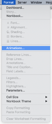
Animations is on by default in your workbooks. However if you notice that a workbook has it disabled, it can be turned on by going to Format > Animations...
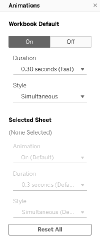
An animation formatting pane will appear on the left side. Enable animations by setting the Workbook Default to On. With animations enabled, play around to your heart’s content and see how they work.
From Tableau 2021.4, you can also replay animations at the original, half or double speed. Click the Replay Animation button in the Tableau toolbar to replay. This button will be enabled only if at least one animation has occurred in the active session in the viz and it will replay the last played animation. The drop down next to it can be used to select the speed.
Viz animation tips & tricks
Now that animations are on, you’re ready to make the most of motion. Here are some ways to get started:
Just turn them on. Viz animations are native and automatic: once on, no need to write any code or further configure them. You have the creative control in your hands to change style and duration as you like.
Do a motion makeover. Open an old workbook and enable animations for a fresh take on a once-static dashboard, potentially uncovering new insights. You can even give new life to your Makeover Monday entries on Tableau Public.
Try different mark types. We automatically animate a broad variety of vizzes. In 2020.1, we're supporting the following marks and viz elements with more coming in future releases:
- Bars
- Lines
- Circles
- Squares
- Shapes
- Density (Desktop-only)
- Area
- Filled Maps
- Gantt
- Mark labels
Explore different actions. Once on, viz animations automatically work for any underlying data changes. Try the below actions and see how animations improve cognition, aid analysis, and guide attention:
- Apply or change filters
- Set a quick filter or parameter
- Sort a viz
- Change axis properties
- Apply or change filter actions
- Modify a measure via a calculation
- Swap, add, or remove measures via a pill or shelf change
- Use the page control (including the play button)
You can also write calculations to trigger animations for the following: Changing the measure field, changing dimensions, and drilling down or changing level of detail.
Change the style. For greater creative control, tweak the animation style in the formatting pane. The simultaneous style is fast and direct, immediately playing every possible animation. For example, it works well when showing value changes in line charts, app-like dashboards, and spike maps, just to name a few.
Sequential style goes step-by-step: exit, move, sort, enter. This is useful for understanding complex concepts and presentations, particularly when the simultaneous style might otherwise play all these steps at once. Try both and see which one works better for your scenario.
Change the duration. Adjust the duration to shorten or lengthen an animation using our defaults or by setting your own custom duration. Faster animations make dashboard applications feel responsive, while some audiences may appreciate slower, demonstrative animations.
Fine-tune your dashboard. Animations can be configured for entire workbooks down to individual sheets. When you select a sheet in a dashboard, you can use the animation formatting pane to apply animation style and duration for the selected sheet. This is especially useful when applying different settings to multiple vizzes in one dashboard.
Create your own best practices. Viz animation’s possibilities have just begun and we know there’s still much to be discovered and created. We encourage authors to think about whether using animations creates the best experience for end users. Share your best practices and breakthroughs on Twitter and Tableau Public with the #VizAnimations hashtag.
And if you’re hungry for more, we’ve got additional information for you on using viz animations here.
Viz animations in action
We’re in awe of the passionate Tableau Community’s examples from the alpha and beta. Your creative dashboard applications, data stories, and even animated art have gone beyond our wildest dreams. Here are just a few of our favorite viz animation possibilities:
Analysis
With animations, you can easily track a specific mark’s path and see other patterns. Try following the highlighted mark without animations on top. Then compare it to the animated viz on the bottom, where it’s much easier to see its path, how it’s moving relative to other marks, and how they’re moving relative to each other. 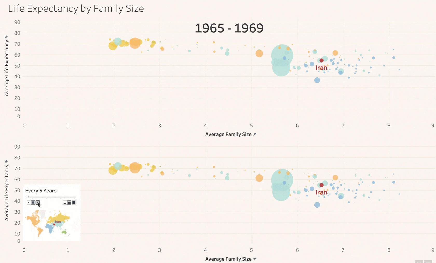
Data source: Gapminder.org
Now, try applying viz animations to your own vizzes and see how simple it is to gain new analytical insights.
Data storytelling & presentation
Editorial news pieces often apply well-crafted data animations to highlight less obvious patterns and key details. Tableau viz animations make this possible for you to replicate in your own reporting. This example uses animations to highlight key relationships and patterns among multiple vizzes about evictions in San Francisco. Without animations, it’s hard to see what’s changing when you adjust the date filter. Flip animations on and the insights are clear. Districts reorganize themselves on the bottom left as geographic spikes grow and shrink. 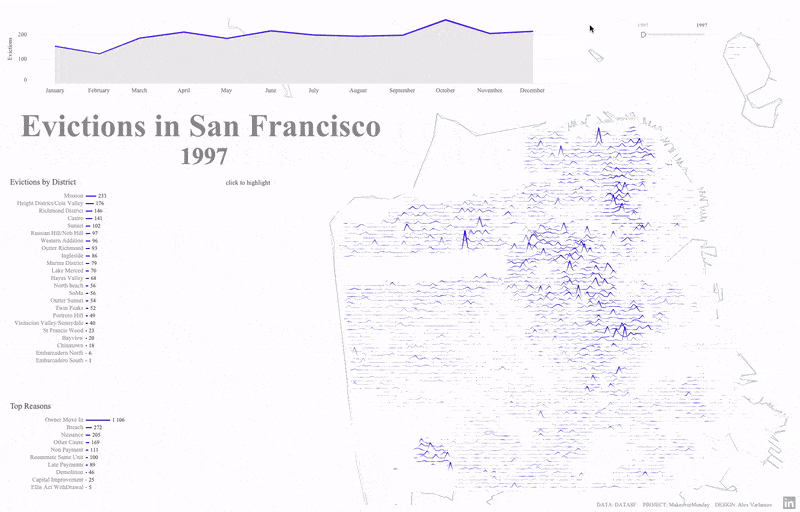
Source: Alex Varlamov
Another stunning viz uses seismometer-style animation for global warming data. By combining animations and the pages shelf, it expertly focuses viewers’ attention on the most relevant part of the line. This also helps guide the discussion when presenting this viz in a larger narrative. 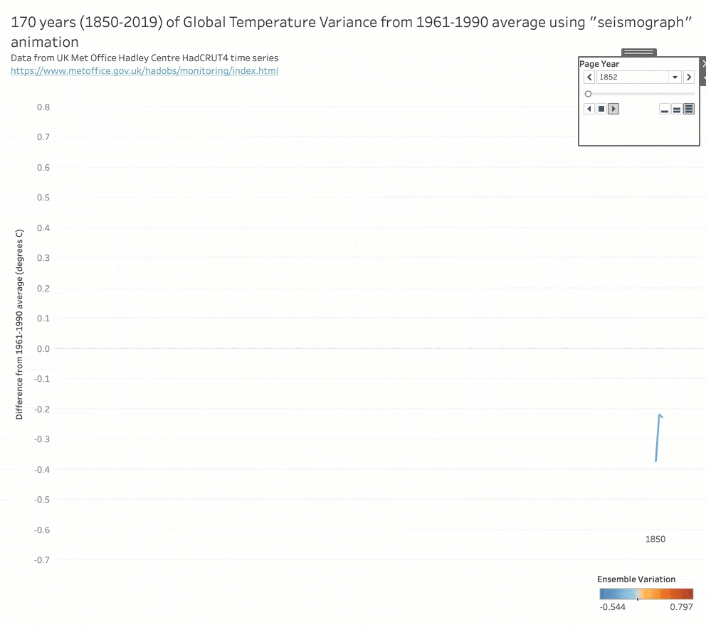
Source: Jonathan Drummey
Dashboard applications
Many dashboard authors turn their workbooks into full blown app experiences. In these cases, animations aid perceived performance with a responsive, polished feeling. This sales calendar date picker uses animations on the right-hand sheet to zoom in and out as the date scope changes. Best of all, it all happens automatically with our animation engine. 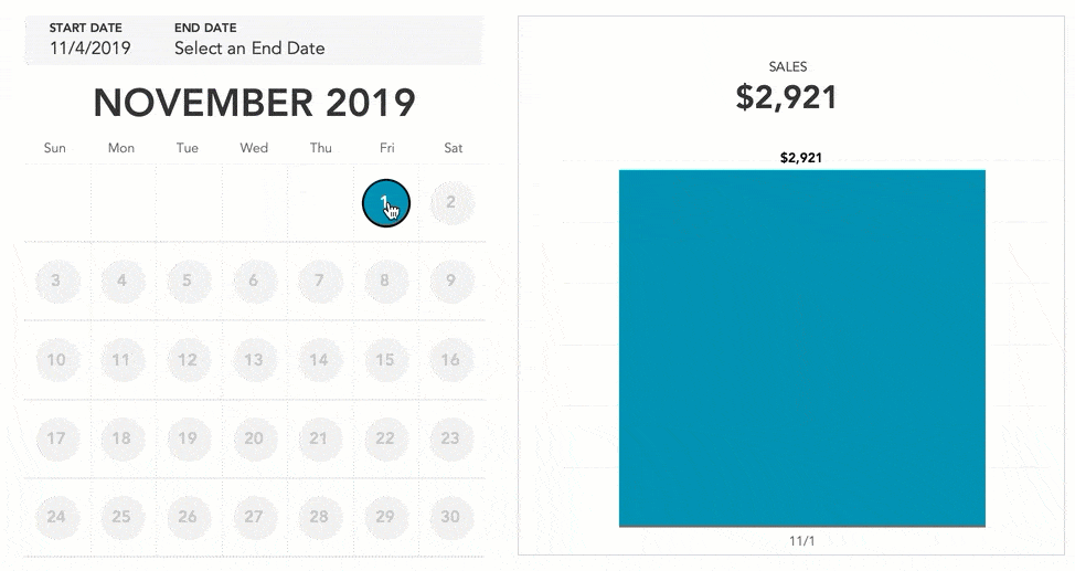
Source: Lindsey Poulter
Bar chart races
We would be remiss not to mention this fan favorite. Though there are reasons not to use them, applied sparingly, they can also be a compelling data storytelling tool. It’s also a top-requested feature that once required various fragile hacks and workarounds. With viz animations, adding a bar chart race is simple and automatic. In the below video, Tableau developer Paul Isaacs shows how to implement a bar chart race in Tableau in just a couple short minutes:
Source: Paul Isaacs
We’ve also seen the community creatively extend this concept to other viz types like line chart races: 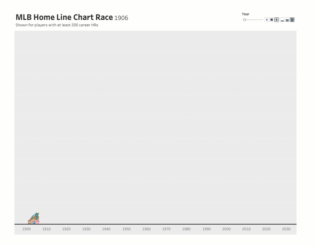
Source: Jacob Olsufka
Get started with viz animations today
After many years in the making, we’re thrilled to bring you this project. A fast track to clear analysis and stunning data stories, viz animations tap our brains’ motion awareness, empowering us to see and understand data in new ways. We’re proud to say we’ve done this while staying true to core Tableau values like simplicity, directness, and analytical usefulness. Whether you’re analyzing your own data, presenting work to others, or building sophisticated dashboard applications, viz animation’s possibilities are almost limitless. So, if you’re ready to put your data in motion, download the latest Tableau, then hop on over to Twitter to share your animations with the community.
เรื่องราวที่เกี่ยวข้อง

The Tableau+ Bundle with Premium AI, Enterprise Capabilities, and Premier Success
 มิถุนายน 24, 2026
What is Tableau Prep?
 เมษายน 30, 2026
Insights Wherever You Work: Meet the Tableau App for Microsoft 365
 มีนาคม 16, 2026