Behind the Viz: Adrian Zinovei Helps You Design Your Next Dashboard


Today we’re honoring the work of Adrian Zinovei! Adrian is a Toronto-based Tableau Consultant and Business Intelligence expert in creating insightful business dashboards. With more than 10 years of experience in Tableau Desktop and more than 20 years as a data analyst, Adrian is dedicated to helping organizations analyze data and make better business decisions.
Adrian's passion for Tableau and helping others has earned him recognition as a three-time Tableau Forum Ambassador and a 2024 Tableau Visionary! After years of hands-on experience as a Tableau Consultant and witnessing the challenges faced by countless users in starting a project, designing, and developing dashboards, he was struck by a common struggle on their dashboard-building journey.
Read on to learn how Adrian first got involved with the Tableau Community and explore his viz, Dashboard Builder.
How long have you been using Tableau?
I have been using Tableau for more than 10 years and the first version I came across was Tableau 6.0. I was drawn to Tableau because it was more intuitive and easier to use than other business intelligence (BI) tools.
What role has Tableau Public played in your professional development?
About five years ago I decided to become a Tableau Consultant full-time and thought Tableau Public would be a great way to showcase my data skills with an interactive data visualization portfolio. For any Tableau enthusiast wondering how to create a good Tableau Public Portfolio, my advice is, "Make your portfolio so good that you’d hire yourself".
Why did you choose this topic?
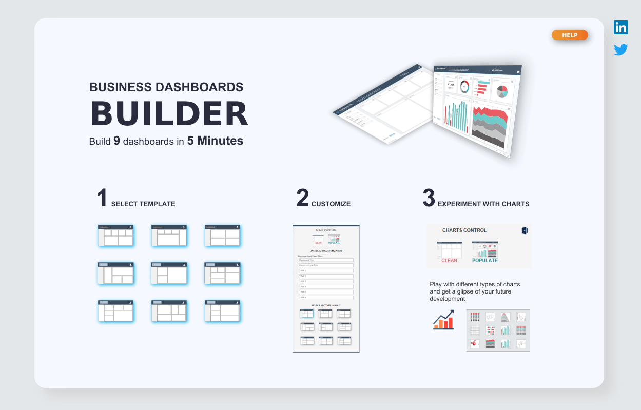
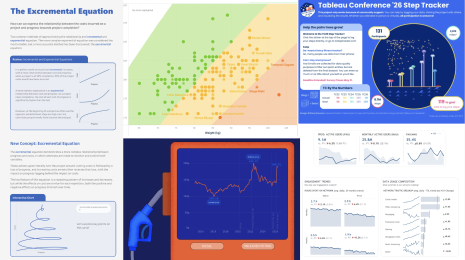
The story begins at the Tableau Conference in May of 2023, where people were recognized for their unique dashboards on Tableau Public. Being successful at my consulting job and mostly building business dashboards, I decided to share my skills with the DataFam with the hopes of being recognized at the next Tableau Conference by people who found them helpful. This dashboard is a part of a series of business dashboards and best practices in the corporate BI world. Check out my Tableau Public profile for more examples, including Business Dashboard Best Practices.
Second, from the technical point of view you can make multiple charts swap in a container, but the complexity is increasing as not many chart types can “Fit Entire” containers. So the solution was to use Dynamic Visibility.
Third, it was interesting to see from a technical point of view if a dashboard can support 100+ dynamic visibilities, a lot of parameters and 100+ worksheets.
Above all else, I wanted to help people save time when designing a fast mock-up for a new dashboard or data visualization project, allowing them to quickly experiment with how it’ll look and what charts to use.
What was the hardest decision you made when creating this viz?
The hardest decision was to decide how many different charts (or worksheets) to use for each specific design box: horizontal, vertical, and Key Performance Indicator (KPI). Depending on how many charts will be on the final dashboard it will result in optimal balance in performance and acceptable chart quantity.
Did you run into any design challenges, new insights, or inspiration during this process?
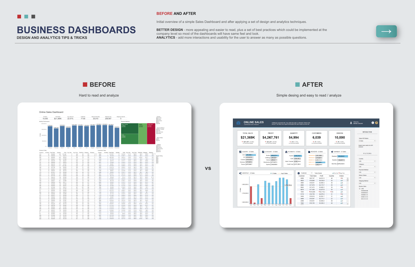
As I was finalizing the design and creating supporting images, I had a specific thought in my head, "you worked too hard for this to make it ugly, so make sure it’s pretty". Design absolutely matters if you want people to pay attention. But performance also matters too.
After the final seven or eight dashboards with full functionality were added, I observed saving to Tableau Public took up to 45 seconds. That made me a bit nervous. With 120 Dynamic Visibility interactions, I anticipated Tableau Public would struggle to render and possibly even suggest I adjust the final result, but once I published it I realized it worked just fine.
What is your favorite new Tableau trick? How can others use it?
When you have a large KPI you want to showcase that does not require additional context with tooltips, try this. Use chart type polygon with measure on detail and title instead of the view area.
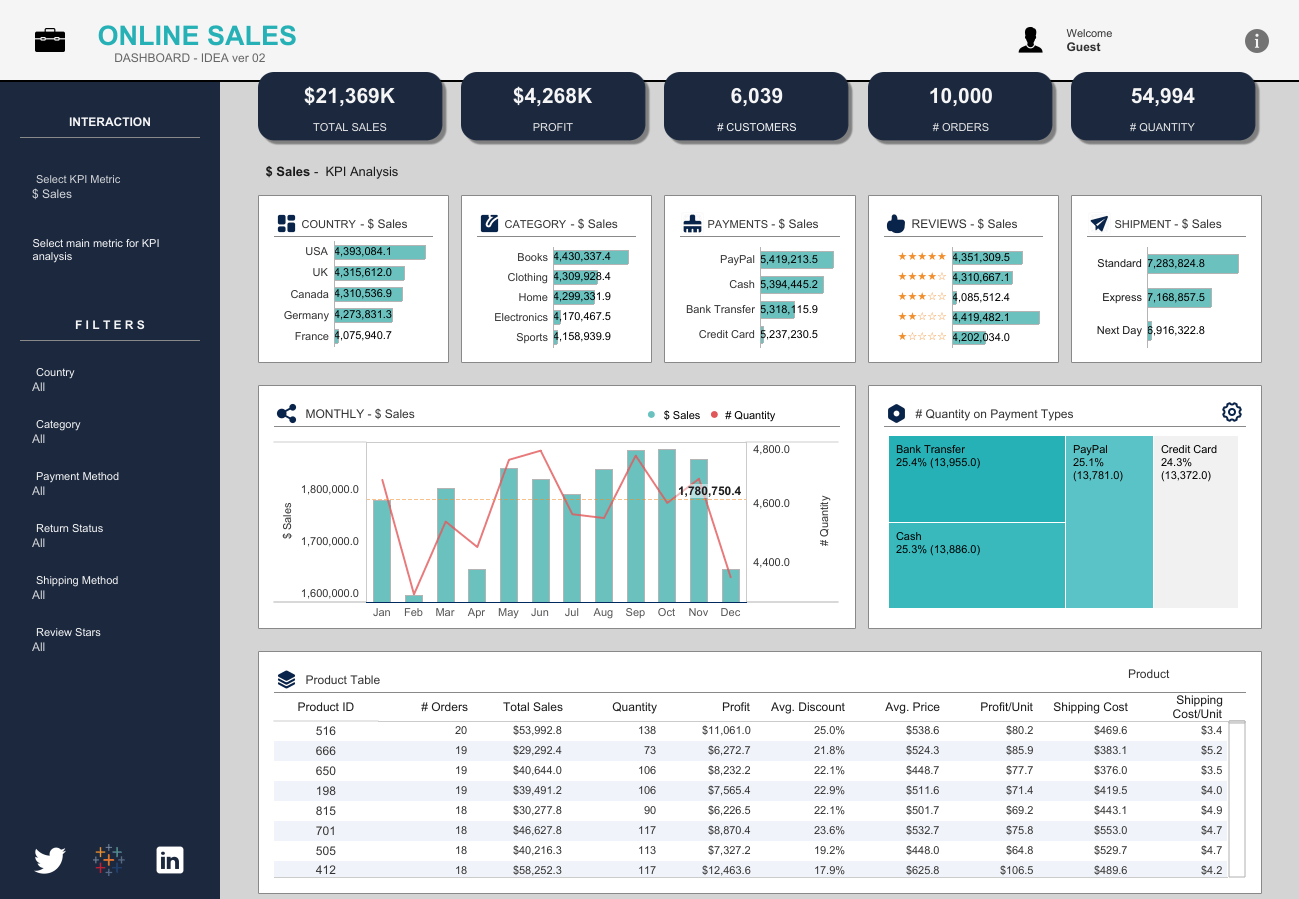
Explore this Sales Dashboard to see this technique in action.
What does the DataFam mean to you?
The DataFam are people just like me, who live in a world of BI solutions and get recognition on social media through Tableau and Tableau Public. Basically, all the things that make us stronger like collaboration, learning, events (TUGs), and sharing a passion for Tableau and data.
If members of the DataFam visit Toronto, what would you recommend they do or see?
The easiest one is to take a CityPass and you’ll get a combo to the Top 5 destinations in Toronto. Also, consider a side trip to Niagara Falls and take tons of photos.
What is the best music to listen to while vizzing?
I am a huge fan of symphonic rock like Epica, Delain, and Nightwish.

Adrian attending TC23 in Las Vegas and probably already dreaming about TC24.
Verwante verhalen
DataFam Roundup June 2026
DataFam Roundup May 2026

Iron Viz 2026: Read Between the Data
 28 mei, 2026