11 Most-Favorited Data Visualizations on Tableau Public


Since Tableau Public launched in 2009, over 5 million people worldwide have joined our free data visualization platform to explore, create, and shared more than 11 million interactive vizzes. From pop culture to the environment and politics, there's a data visualization to explore on almost any topic you can imagine. Looking for something specific? Have a look on search.
In celebration of more than 11 million vizzes on Tableau Public, let's take a look at the top 11 most-favorited data visualizations of all time.
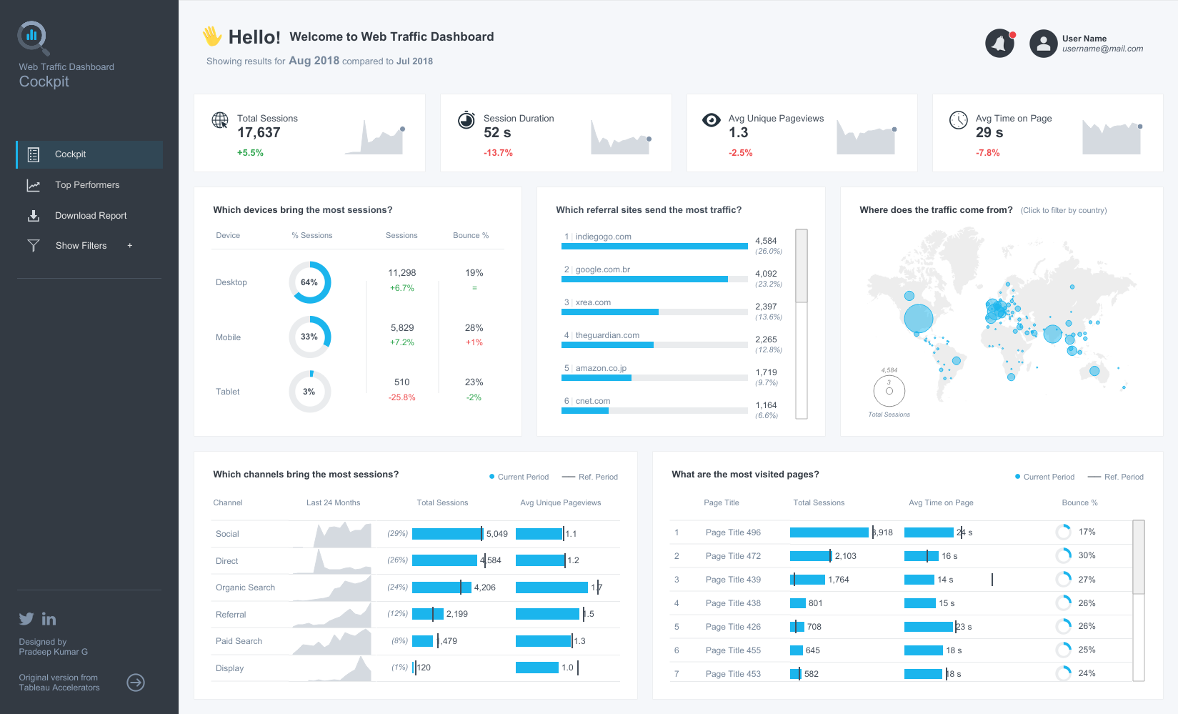
11. Web Traffic Dashboard | Digital Marketing by Pradeep Kumar G
One of the many things Pradeep is known for in the data visualiation community is his participation in Iron Viz as a 2021 finalist. Iron Viz challenges contestants to create impactful vizzes on a given theme within a limited time frame. This viz is one example of many by Pradeep, leveraging his skills to present complex data, in this case web metrics, in an insightful and engaging way.
Data viz: Web Traffic Dashboard | Digital Marketing
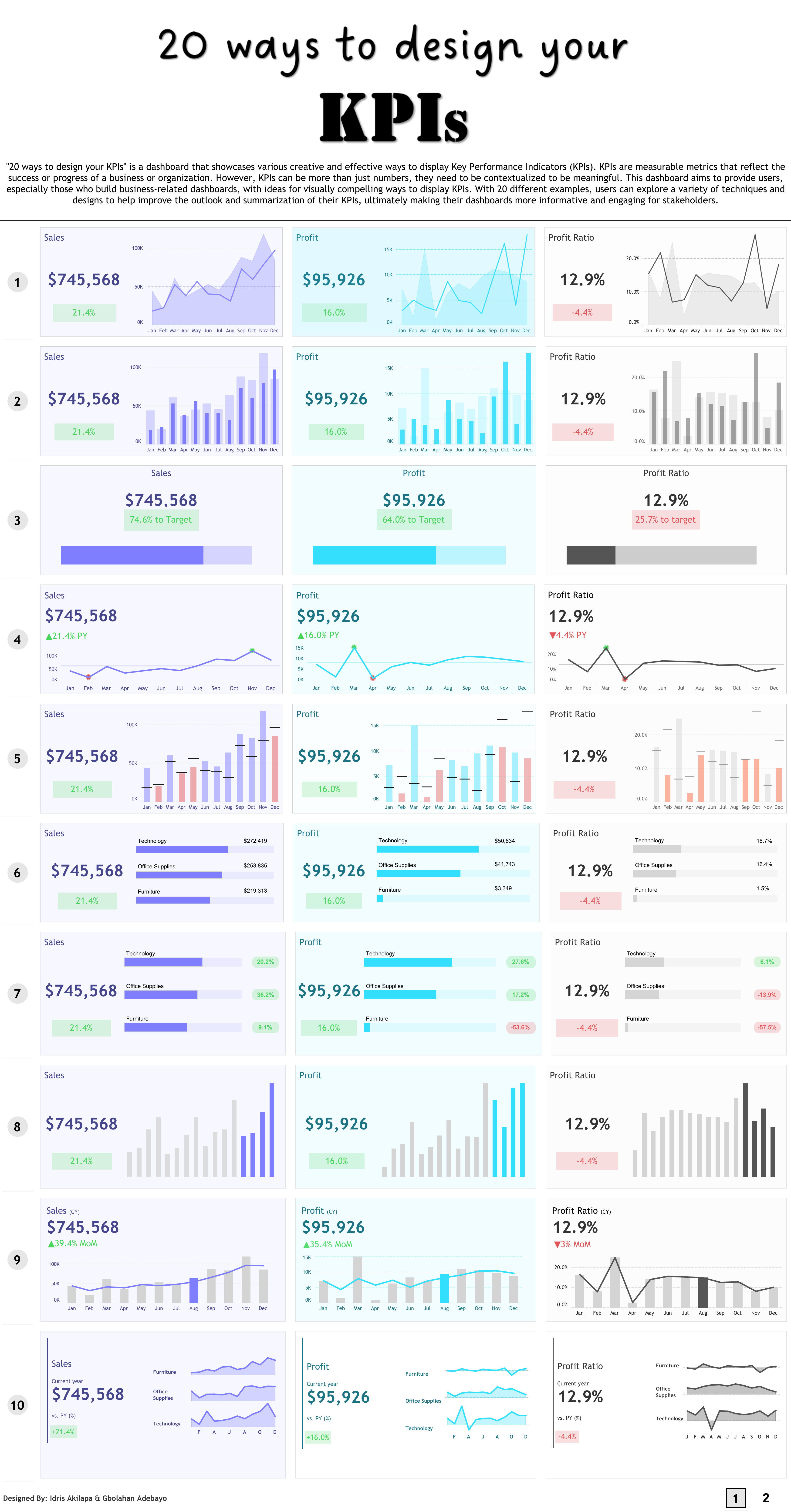
10. 20 ways to design your KPIs by Gbolahan Adebayo and Idris Akilapa
This viz highlights several ways to display Key Performance Indicators; showcasing important metrics that reflect the progress of an organization or individual’s goals. With 20 different examples, you can explore various techniques and designs to help improve your dashboard’s effectiveness in telling a compelling data story.
Data viz: 20 ways to design your KPIs
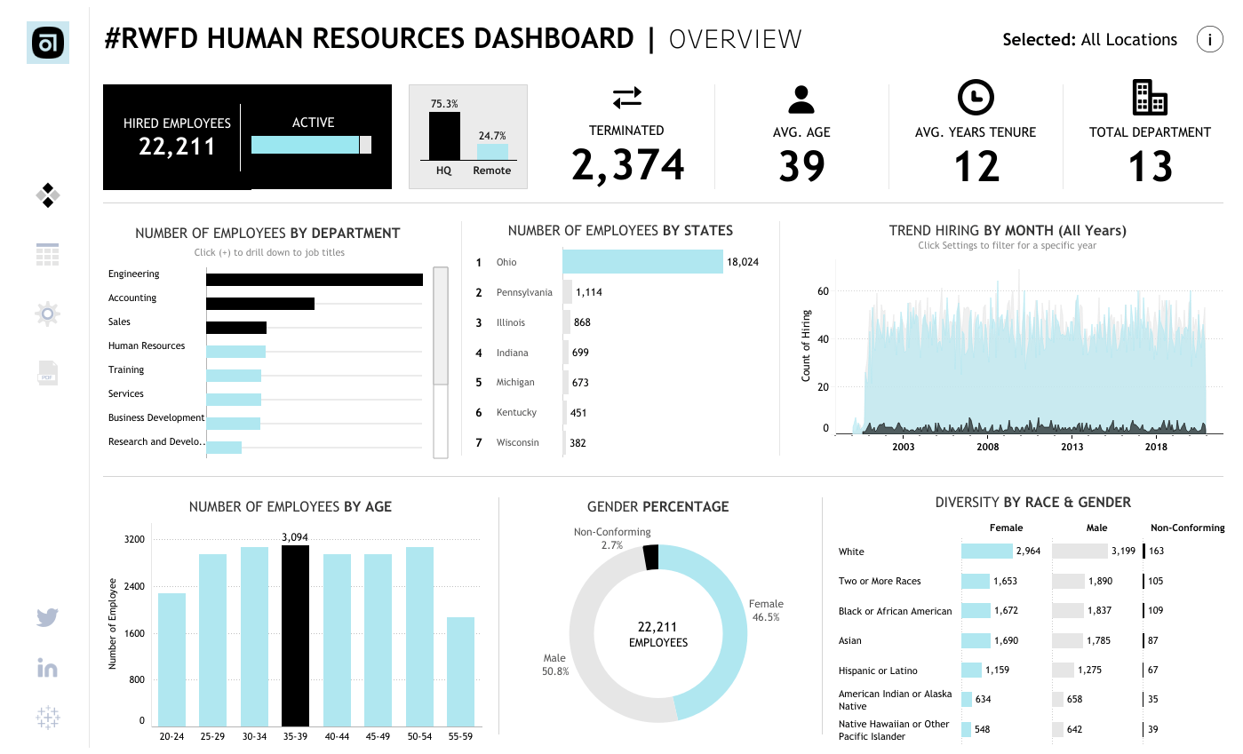
9. HR Dashboard | #RWFD by Gandes Goldestan
This viz was inspired by Tableau Community Project Real World Fake Data—a monthly data visualization challenge to practice creating business dashboards across various industries and departments. Viz author Gandes Goldestan belatedly submitted it and it quickly became a favorite proving that you don’t have to participate in Tableau Community Projects in real-time to reap the benefits. What time can you set aside this week to learn something new?
Data viz: HR Dashboard | #RWFD
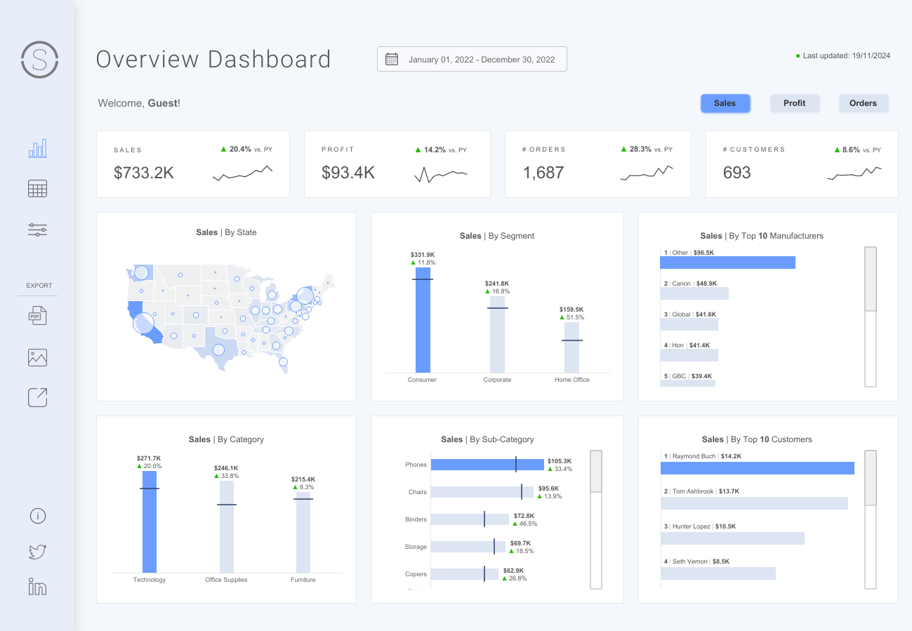
8. Superstore Dashboard by Priya Padham
Inspired by the work of Pradeep Kumar G, Priya also built a beautiful business dashboard using Tableau’s Superstore to visualize sales, profits,and so much more!
Data viz: Superstore Dashboard
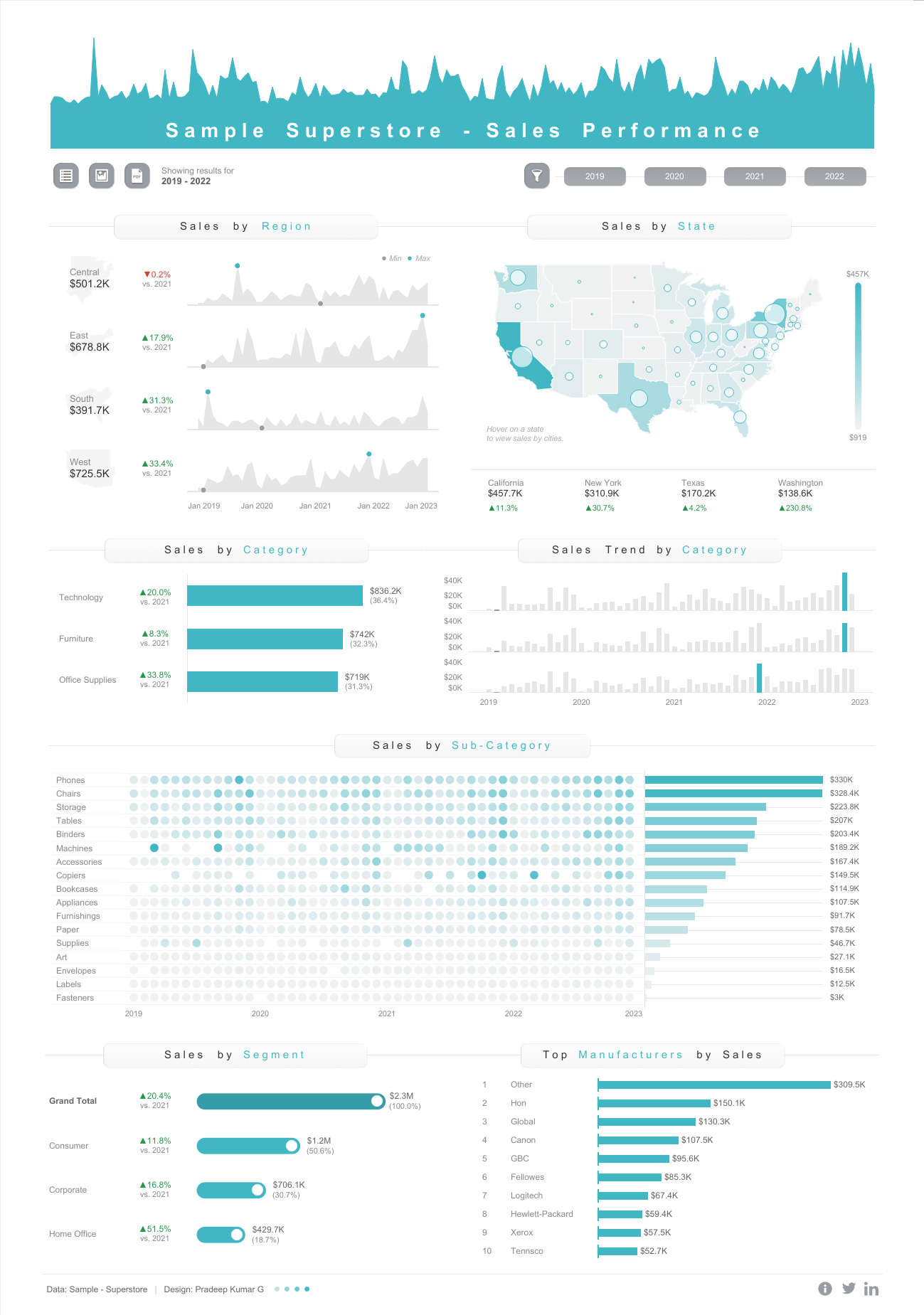
7. Sample Superstore - Sales Performance by Pradeep Kumar G
If you’ve used Tableau Desktop before, you’re probably familiar with the default Superstore sample data set. In this dashboard, Pradeep Kumar G visualizes sales performance using collapsible containers and adeptly showcases the possibilities of a well-designed dashboard.
Data viz: Sample Superstore - Sales Performance
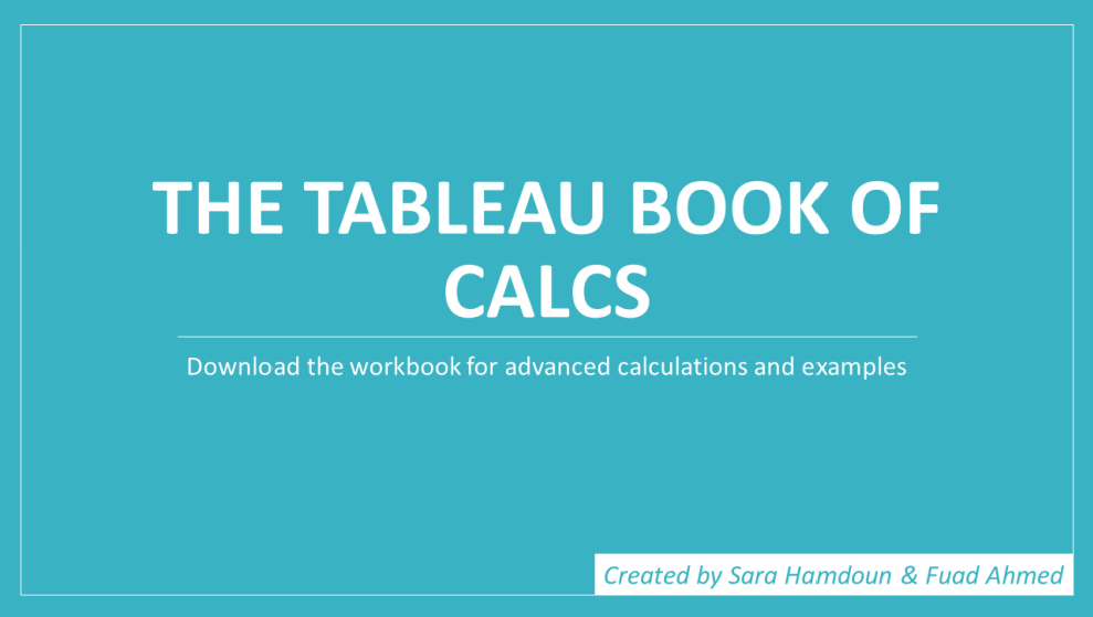
6. The Tableau Book of Calcs by Sara Hamdoun and Fuad Ahmed
Calculated fields allow you to create new data from data that already exists in your data source and can be used to further segment data, find ratios, filter results, and much more. Fuad and Sara created this step-by-step guide for Tableau-related calculations with examples in this handy viz.
Data viz: The Tableau Book of Calcs
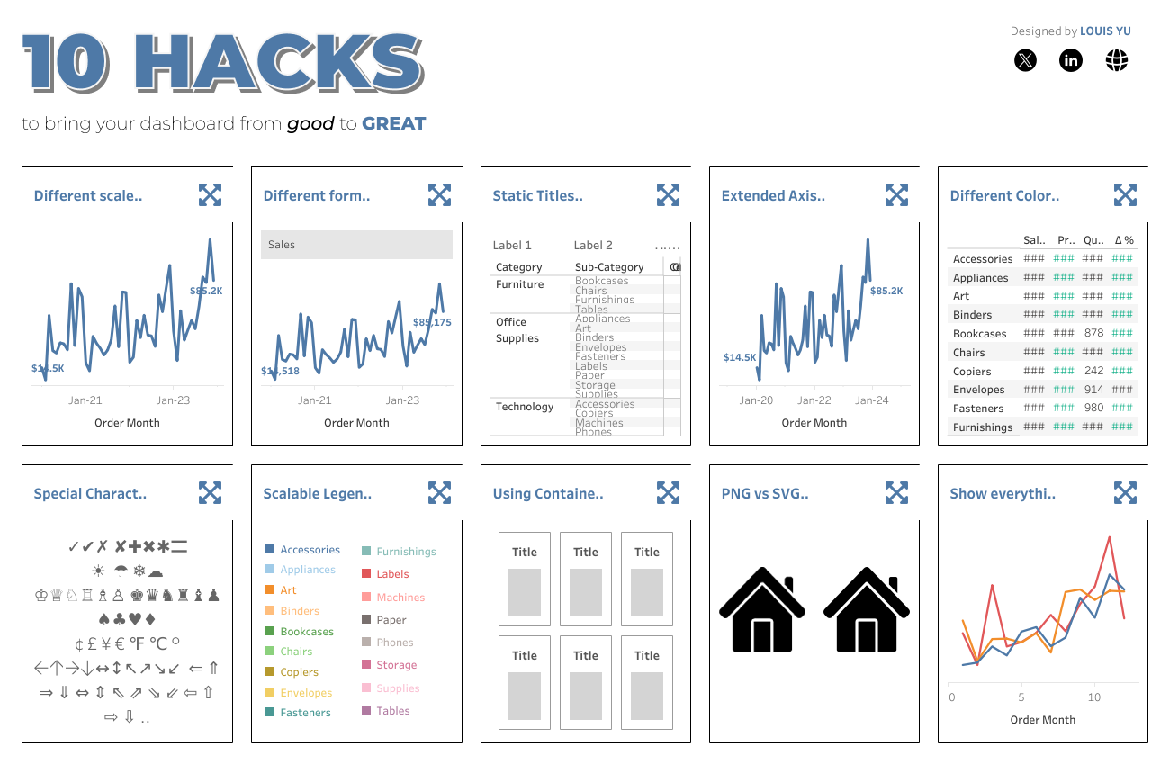
5. 10 hacks to make your dashboard GREAT! by Louis Yu
While working on internal dashboards, Louis noticed he relied on several consistent techniques in every project. Though the dashboard details were confidential, he saw an opportunity to refine and adapt these methods for the Tableau Community. The result? A new favorite viz that not only showcases his creativity but also offers fresh insights and practical Tableau tips. Dive into the viz to explore these techniques and elevate your own data skills.
Data viz: 10 hacks to make your dashboard GREAT!
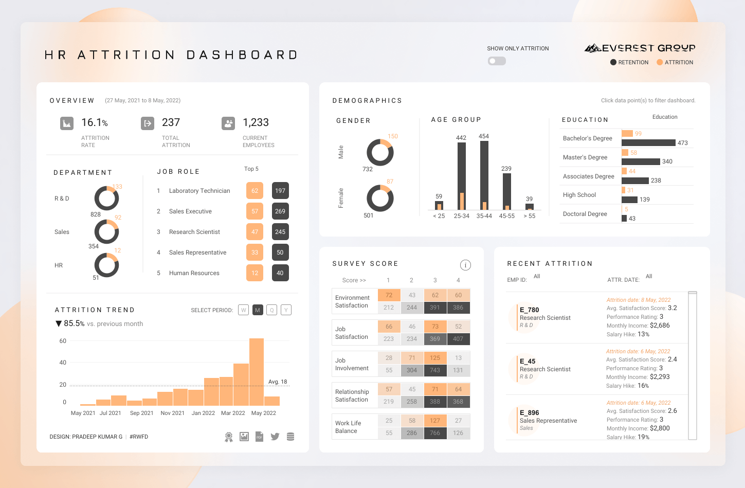
4. HR Attrition Dashboard | VOTD | #IIBAwards'22 by Pradeep Kumar G
This viz was also inspired by a Real World Fake Data Tableau Community Project. Created by 2019 Vizzie recipient and 2021 Iron Viz Champion Pradeep Kumar G, this business dashboard won an "Information is Beautiful Awards" in 2022 in the category for Business Analytics.
Data viz: HR Attrition Dashboard | VOTD | #IIBAwards'22
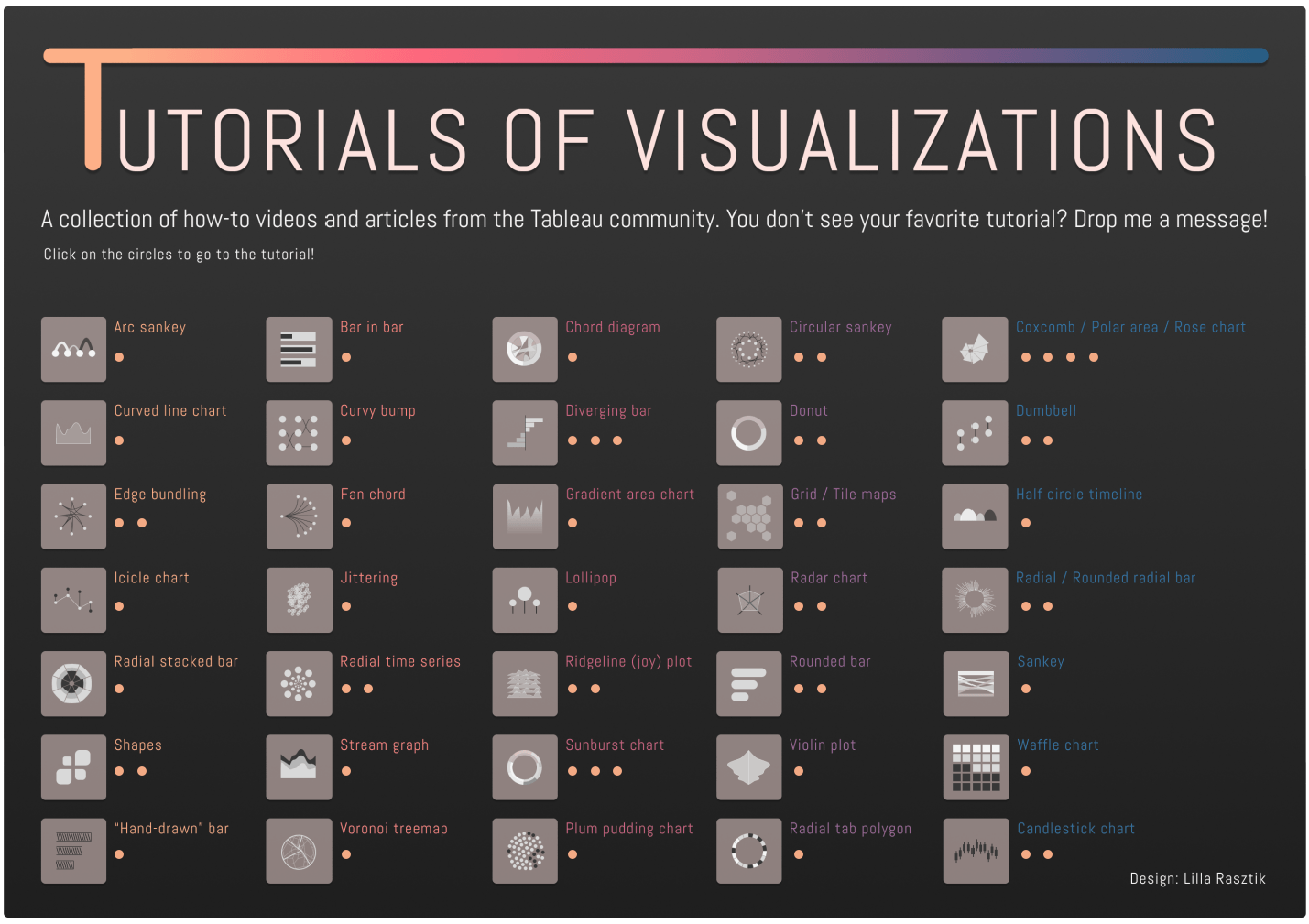
3. Tutorials of Visualizations by Lilla Rasztik
Lilla Rasztik built a useful collection of how-to videos and articles from the Tableau Community that not only highlights 35 different chart types and elements—from Arc Sankey to shapes and waffle charts—but also showcases how much people enjoy learning new Tableau techniques on Tableau Public.
Data viz: Tutorials of Visualizations
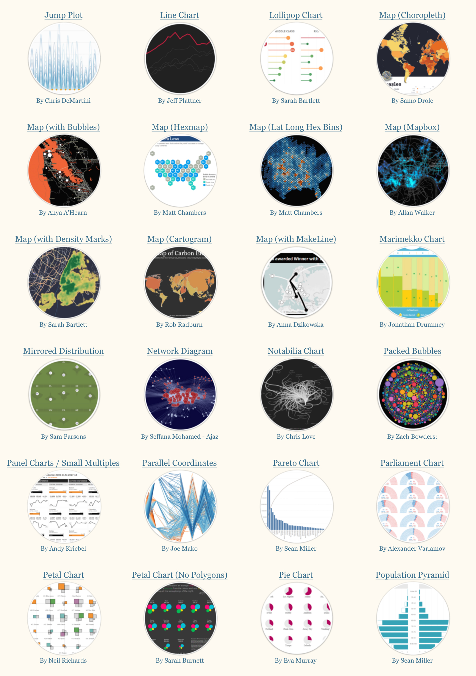
2. The Tableau Chart Catalog by Kevin Flerlage
Kevin Flerlage created this viz to help the Tableau Community learn and be inspired. The Tableau Chart Catalog lists 100 chart types with links to actual visualizations created by 74 unique authors on Tableau Public.
Data viz: The Tableau Chart Catalog
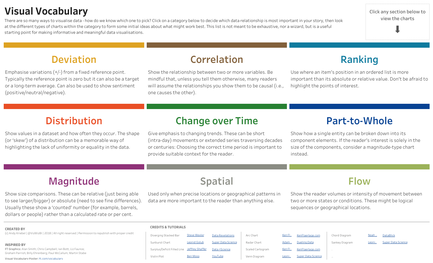
1. Visual Vocabulary by Andy Kriebel
There are so many ways to visualize data. How do we know which one to pick? Inspired by the Financial Time’s Visual Vocabulary, Andy Kriebel created this workbook to help others choose an appropriate chart based on the data relationship they’re trying to show. Leverage it as a starting point for making informative and meaningful data visualizations.
Data viz: Visual Vocabulary
Here's a look back and a look forward from Andy himself.

Andy Kriebel
“Creating a Tableau Public profile had a direct link to getting jobs at both Facebook and The Information Lab. Without Tableau Public, I am sure I wouldn’t have been noticed.
I have a couple bits of advice:
- Never delete anything from your profile. This shows a progression in your work and employers will see how you have been learning.
- Share. Let others download your work so they can reverse-engineer it. Or maybe you’ve created a stunning dashboard that can be used as a template. Help others learn from you.”
Thank you to these 11 amazing Tableau Public authors—along with the 5 million others—who have collectively created over 11 million data visualizations for anyone to search and explore for free on tableaupublic.com.
It’s interesting to note that the most-favorite vizzes of all time on Tableau Public are primarily focused on designing and building business dashboards, learning new data skills, and capturing inspiring examples. While pop culture vizzes are both fun and popular, not a single viz about Marvel, Taylor Swift, or your favorite sport made the top 11. This is not to say those things aren’t popular (because as we know they are) but a good reminder that memorable vizzes on Tableau Public can be both fun and functional. I can’t wait to see what the DataFam creates for the next.
Looking to improve your data skills, get inspired, or grow your career? You can create and explore data visualizations for free with Tableau Public as you build your own portfolio of work. Connect, share tips and tricks, and collaborate with data enthusiasts around the world. Read our step-by-step guide to get started, follow viz creators, and optimize your Tableau Public experience.
Verwante verhalen

Explore the 2026 Iron Viz Entries
 15 december, 2025

Iron Viz 2025: Where Data Took Flight
 6 mei, 2025

Meet 2025 Iron Viz Finalist Bo McCready
8 april, 2025