Using Tableau to Bust Sports Myths
This is the third blog post in our Sports Month series. Matt Chambers and Matt Cobb both work at Clemson University. Chambers is a Data Architect and Cobb is a Data Analyst.
Matt Cobb and I both had the amazing opportunity to attend Tableau Conference 2014. We decided to attend a session on blogging, and we were so blown away and inspired that we decided to participate in the community.
Since then, we have both had a few Viz of the Day winners. I scored my first VoTD for my analysis of players with the best combination of size and speed at the NFL Combine and followed it up with another viz on Clemson football recruiting. Matt Cobb brought home the VoTD win for his analysis of MLB player productivity.
Lately we’ve been a little covered up with work and life in general, so we were ecstatic when Dash Davidson asked us to team up for a guest blog post. With newfound inspiration, we began to look at potential data sources, and Matt Cobb found a list of all pitchers who have had Tommy John surgery. Tommy John surgery is becoming fairly common for pitchers, but there is a misconception that the surgery actually enhances performance. Uninjured pitchers have even sought out the surgery in hopes of improving their performance.
Logically, we wanted to see if there was any impact on key pitching statistics before and after surgery, but the data set we found only contained the list of pitchers that had the surgery and not their stats. However, I noticed that there was a column for mlbamid, which corresponds to the player_id used on mlb.com.
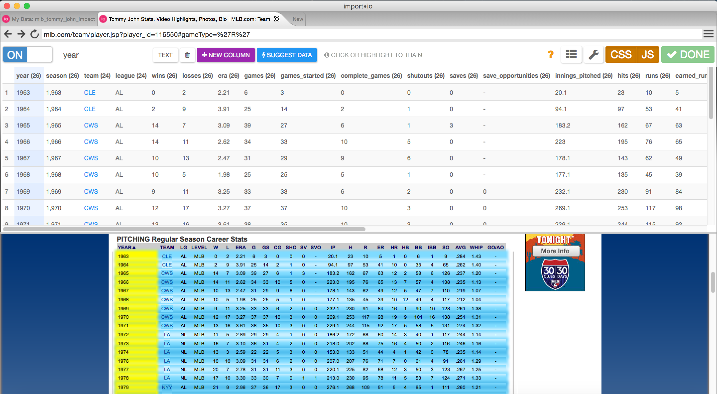
Now that I had a way to pair the list of pitchers that had surgery with their stats, I used import.io to scrape the data. import.io makes scraping pages extremely easy by allowing you to easily extract table data. I pointed import.io at mlb.com and used the player id to retrieve a page and extract the table data.

ImportIO's User Interface
Once this was working, I needed to be able to run a batch search to find the stats of all of the pitchers. import.io does not currently support this feature, but they provide a Google Sheet that enables this functionality by allowing users to paste in a list of URLs for batch processing.
This worked great except for one issue. The API that was created by import.io was not able to follow the redirect that mlb.com issues for current players. For example, if you visit a URL for an inactive player, there is no redirect, and import.io handles this perfectly. However, for active players like A.J. Burnett, there is a redirect from mlb.com to pittsburgh.pirates.mlb.com, and the import.io API does not handle this properly. In order to follow the redirect and capture the URL, I built a script that runs the following cURL command:
curl -w "%{url_effective}\n" -L -s -S http://mlb.com/team/player.jsp?player_id=150359
This allows the redirected URL to be captured. Once I ran this for all active pitchers, I was able to run the URLs through the batch search process and finish completing the data set.
With a complete data set combining all pitchers that have had Tommy John surgery with their career stats, we were finally able to start visualizing the data. After looking at several statistics for pitchers, we decided that Walks plus hits per inning pitched (WHIP) was the most fair statistic since a pitcher only controls how many walks and hits they give up per inning. Earned run average is not always a fair statistic because it depends heavily on the defense behind the pitcher as well as the size of the pitcher’s home stadium.
We wanted to focus on building a visualization that easily lets a user compare an individual pitcher to the rest of the cohort and also see the overall differences in the statistics before and after surgery. We worked with Dave Lee on the design, and he built an awesome graphic for us to build the viz around.
As it turns out, WHIP and ERA are higher after the surgery, thus illustrating that there is no advantage from a statistical perspective from having the surgery. The surgery simply allows pitchers to come back from an injury that was once a career-ender. And, here at long last, is the viz:


