5 tips on designing text tables
There is nothing worse than opening a report in an Excel spreadsheet and seeing pages and pages of columns that provide little or no insight into the data. But text tables do have their place, especially in the financial sector. Here are some things to consider when designing text tables.


Note: The following is part of a series of guest posts by Tableau Zen Master Jeffrey Shaffer. In the first installment, Jeffrey explored the rule "don't use red and green together." 
A time and a place for text tables
The data-viz rule: "Avoid text tables." The issue: "There are better ways to visualize the data. They are boring." Reaction: "Never use text tables." The field of data visualization offers many tools to help visualize data. We should leverage these tools to find trends and patterns in the data that we would not see with numbers in a table. There is nothing worse than opening a report in an Excel spreadsheet and seeing pages and pages of columns that provide little or no insight into the data. Tableau Ambassador Keith Helfrich refers to this as the “giant walls of tabular data.” He discusses Tableau as a data-viz tool that’s often used as a “tabular report builder.” “Leverage the visual display of quantitative information to enhance cognition and reach better business conclusions faster!” says Keith. That’s really the point of data visualization—to enhance cognition and reach better business conclusions. Recent blog posts, discussions, tweets, and redesigns related to this topic had me thinking more about text tables, which sometimes can't be avoided. Here are some things to consider when designing text tables.
1. Consider the purpose of the text table and the audience
Data-viz designers should not be redesigning these tables simply because they are "boring," as tempting as that might be. That's not the purpose of data visualization. There are certain industries and instances where tables are expected or even required—for example, balance sheets, income statements, cash-flow statements, bank statements, bank-reconciliation reports, etc. These are long established reporting formats and should not simply be disregarded as boring and subject to various redesigns. They can serve an expected purpose and would create far more confusion to the typical audience of those reports if they were not presented in their standard format. Maybe someday the Financial Accounting Standards Board (FASB) will change the way we visualize financial statements, but until then, the financial world is very much used to seeing things in this standard format. (It’s interesting to note that FASB requires the tabular format in certain cases because the board believes the format offers more transparency). Even when the table is not the expected form of communication, users often need tables to do their job. Executives, vice presidents, and directors may not need the details in their dashboard or report, but somewhere in the organization, there is someone who needs to work at a very detailed level, and that person may need a simple table of information to do his or her job.
2. Consider the data
There are also instances in which there are no measures in the data. For example, I created a Tableau “visualization” of the music library at my church while my wife was serving as the interim music director. The “client” simply wanted an online catalog. I built and uploaded a Tableau viz. It’s really just a searchable text table. There isn’t a single chart or graph; there are only columns of dimensions that people can search from their computer, tablet, or phone to get more details. The viz links to a YouTube search for reference, and people can print lists as a PDF as necessary. It’s exactly what this audience needed. They didn’t want or need metrics about their music library; they simply wanted to be able to search it by various dimensions.
3. Remember this mantra: Overview, filter, details on demand
Ben Shneiderman summarized the basic principles of visual design as this mantra: Overview first, zoom and filter, then details on demand. He actually takes this further in his paper, The Eyes Have It: A Task by Data Type Taxonomy for Information Visualization. In this paper, Ben discusses seven tasks that a user wants to perform: Overview: Gain an overview of the entire collection Zoom: Zoom in on items of interest Filter: Filter out uninteresting items Details on Demand: Select an item or a group and get details when needed Relate: View relationships among items History: Keep a history of actions to support undo, replay, and progressive refinement Extract: Allow extraction of sub-collections and the query parameters Some of these tasks imply an interactive visualization (for example, zooming and filtering won’t be available on a printed report). However, some of these same principles apply. A report or a dashboard can provide the overview as a main page, then the details on demand can be supplemental materials, possibly a text table. If it’s an interactive visualization, that’s even better. Give people the ability to filter down to the level that they require and then retrieve the details on demand (again, this could be a text table). You can take this one step further and give people the ability to extract the data they need through an export. For an example, check out Tableau Zen Master Andy Kriebel’s Greatest Tableau Tip Ever.
4. Formatting is key
Just like charts or data visualizations in general, format and design are very important. Poorly-formatted text tables can be very frustrating and lead to wrong conclusions. When creating tables or financial reports, the numbers should be aligned right and the font should have tabular figures that are monospaced or fixed-width, not proportional. This vertical spacing allows numbers to align in a table, which is very important for purposes of scanning the table to make quick comparisons of numbers. Note: When simply using a table of numbers, the font doesn’t have to be entirely monospaced; the rule only applies to the numbers. Check out the table below. Which fonts make the number comparisons quick and easy? 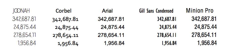 Notice how well Arial works when scanning up and down the column. This is the current default font in Tableau. The order of the table is another important point to consider. Unlike charts where it’s often best to order by some sort of quantitative field, maybe descending sum of sales, there might be other ways to order a table. For example, alphabetical order can often be very useful in a reference table to look up information. Ordering by date might be important in other instances. In addition, consider the context of the information and the level of precision needed. Does your reader need the details of the table down to two decimal places? This level of precision might be needed on a bank reconciliation report in the accounting department where they have to tie transactions to the penny, but it’s probably not needed on a monthly sales report.
5. Know the strengths and weaknesses of text tables
Text tables have their place. We see them in places we don’t even realize—displaying movie times, prices on a menu, store catalogs, sports scores, reference tables, or even a phone list. Also, consider that Tableau actually lists the text table in the Show Me tab as the very first chart type. Stephen Few sums this up very well in The Encyclopedia of Human-Computer Interaction: “This table does two things extremely well: it expresses these sales values precisely and it provides an efficient means to look up values for a particular region and month.” That’s what text tables are really good for—a list of precise values that can be looked up. He also explains what a text table does not do well—seeing trends and patterns in the data: “What these numbers could not communicate when presented as text in a table, which our brains interpret through the use of verbal processing, becomes visible and understandable when communicated visually. This is the power of data visualization.” If formatted correctly and used in the right context, then there is no reason that text tables can’t be included in the data visualization toolbox. Like so many chart types in the field of data visualization, text tables, when formatted poorly or used in the wrong context, can obscure things in the data and bombard the reader with too much information at the wrong level of detail. You might also consider offering the reader both a chart and a table. This allows the reader to see the trends in the data, but have the details if they need them. Microsoft Excel calls this a “data table” that can be shown below the chart, but this can also be done in Tableau simply by putting two worksheets together for the same result. In the example below, we can easily see the fourth-quarter trend of sales or the second-quarter dip in 2011 for technology. But we can also look up the exact sales numbers in any quarter for any category without cluttering the chart with data labels or axis labels. 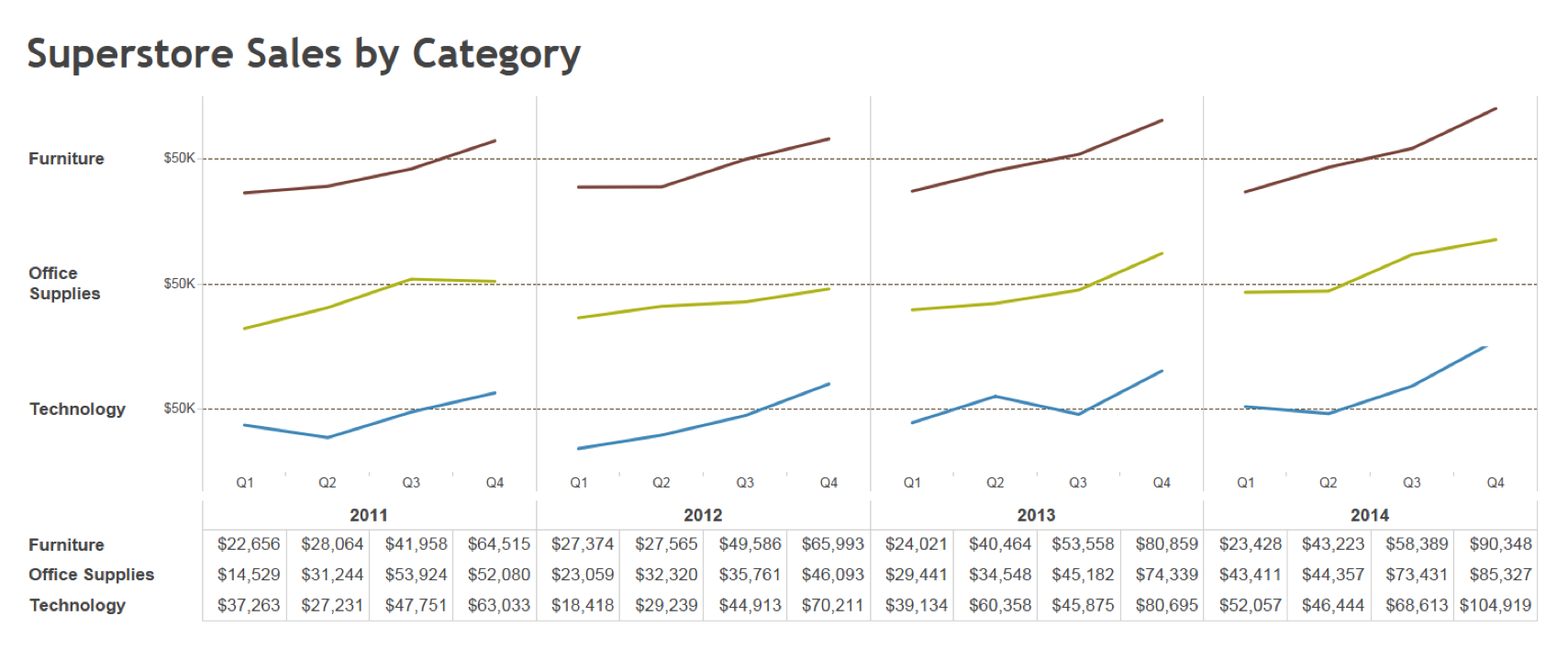 Do you use text tables as part of your workflow? Have design tips to share? Let us know in the comments below. For more tips, ideas, and vizzes by Jeffrey Shaffer, check out his Tableau Public page and his blog. You can also connect with him on Twitter @HighVizAbility.
관련 스토리

5 Ways to Use Tableau Public to Achieve Your Goals
 2025/01/11

World Mental Health Day: Elevating Awareness Through Data Visualization
 2024/10/10

From TV Screens to Tableau: Visualize Your Favorite Shows with IMDb
 2024/08/31