Behind the Viz: Thi Ho talks about maps, design challenges, and new insights


Get to know your fellow Tableau Public authors with Behind the Viz, a blog series where we explore the people and processes behind our featured vizzes.
Today we're honoring the work of Thi Ho! Thi Ho works in the field of data analytics and is passionate about data visualization. She has been a Tableau Social Ambassador since 2021, was Tableau Public Featured Author in 2020, and is a Tableau Certified Associate. Her vizzes have been featured in the Virtual Viz Gallery during Tableau Conference, and Tableau’s COVID-19 Viz Gallery. She placed within the top 10 in the Women in Analytics Data Visualization Contest in 2021.
In additional to all that, Thi also has presented at a wide variety of events including TC20, TC21 (with Sarah Bartlett and Dzifa Amexco), VizConnect, APAC Tableau User Group, and Singapore Tableau User Group. She is a strong advocate for doing good with data and is an APAC Regional Leader of Viz for Social Good.
Read on to learn how Thi first got involved with the Tableau Community and explore her viz, Singapore Population, Housing & Infrastructure.
How long have you been using Tableau Public?
I started to learn Tableau for my job in Digital Analytics and use Tableau Public in late 2018. If you look at my Tableau Public profile, you will notice that my work started to make more progress once I started engaging in community projects like IronQuest (around February 2020). That’s also when I joined the community on social media and I’ve learnt so much and made so many friends since then.
Why did you choose this topic?
I love maps and I have always wanted to upskill myself with maps in Tableau. I guess I was not the only one feeling constrained by the number of data layers on the map we could have, which was limited to 2 if we use dual axis. For the 2020.4 version, Tableau released this new awesome map layers feature which allowed us to add as many data layers to the map as we wished! I was inspired by the early and beautiful vizzes using this feature from Marc Reid, Kizley Benedict and Adam E McCann and wanted to try it out for myself with local Singapore data!
It was such a wonderful surprise that a few days after I published the viz, on 7 April 2021, I received my first Viz of The Day! Words still cannot describe how happy I was (and still am)!
Marc Reid has kindly mentioned my viz in his Tableau blog about mapping here.
What was the hardest decision you made when creating this viz?
The hardest part was choosing the datasets. I did not have a specific topic at the beginning. I browsed data.gov.sg looking for shapefiles, and under Infrastructure alone there were 145 datasets!
At first, I downloaded quite a number of datasets, explored them, and then drilled down to just a few that could tell a more coherent story about Singapore population, housing and infrastructure. In the end, I settled on 6 datasets which make up 7 layers.
Anything else interesting about the creation of this viz that you’d like to share? Did you run into any design challenges, new insights, or inspiration from or for other vizzes during this process?
It’s interesting that I spent more time on selecting the datasets and shaping the story I wanted to tell than on putting them on the map. Tableau has made it so easy for us to do so with just a few clicks!
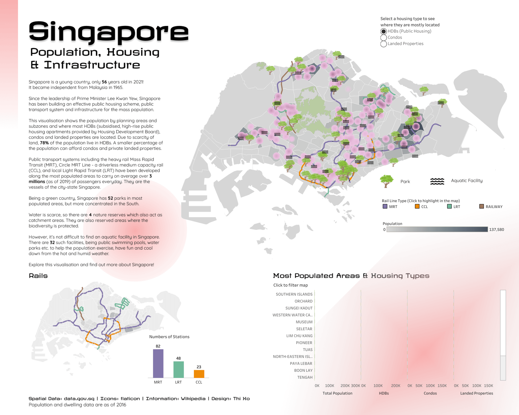
Before building this viz, I also didn’t know which areas in Singapore had the highest population, public housing units, condos and landed properties. I didn’t know how many parks, nature reserves and aqua facilities there were in Singapore. I also had a hypothesis that the rail ways were built to support the most populated area and there were more public housings along the rail ways than condos or landed properties. The visualization of the data was able to quickly confirm my hypothesis. I had some “oh” and “ah” moments while exploring the map layers by myself. Clearly, the Singapore government has done a great job in planning the rail lines, public housing and public facilities along the most populated areas.
What is your favorite new Tableau trick? How can others use it?
It’s not really a trick, but in this viz, inspired by Adam E McCann’s viz, I brought in some icons to use for the park and aquatic facilities layers. The icons give the viz a more infographic look.
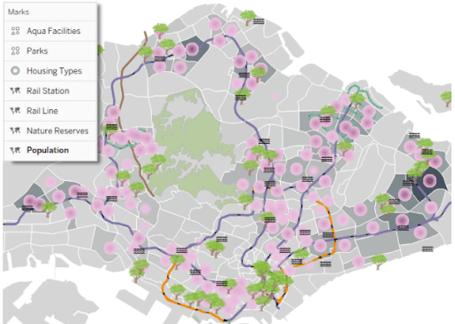
Another “tip” is that the layers work like the layers in PowerPoint, as in you can drag one on top of another to change the order of their appearance. As there are many layers, you will need to decide which layers you want to be at the background (like population in my case) and on top (like aqua facilities). If I change the population layer to be second instead of last layer, below is what I would see. The icons in the park and aquatic facilities layers will be hidden!
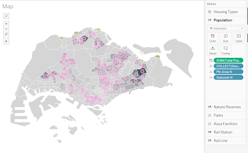
You can also easily switch on or off a layer by toggling the “eye” icon in front of each layer in the Marks card. Here I have switched off the Housing Types layer.
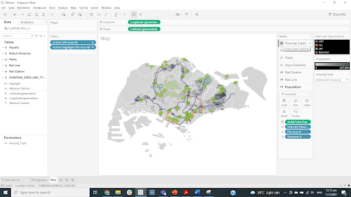
Tableau has made it so easy for us to play around with map layers and adjust them on the fly. Thank you Tableau!
What does the #DataFam mean to you?
The #DataFam means the world to me. They are like my second family who have supported me, encouraged me, cheered me up, and inspired me. I have found my amazing mentor, my lovely sister (from different parents) and dear friends from all over the world who share the same passion in Tableau and data viz! It’s hard to say how much they have lifted me up through my difficult times. Also, thanks to the #DataFam, I have expedited my Tableau learning and found a new job. The #DataFam has changed my life. I am forever grateful!
If members of the #DataFam visit Singapore, what would you recommend they do or see?
Singapore is a garden country and city, so definitely visit the iconic Gardens by the Bay and Botanic Gardens, and appreciate the greenery from almost any street in the city. I would also recommend that you try all the fun activities on Sentosa island and then take a cable car trip from Sentosa to Mount Faber to take in the beauty of the island’s nature!
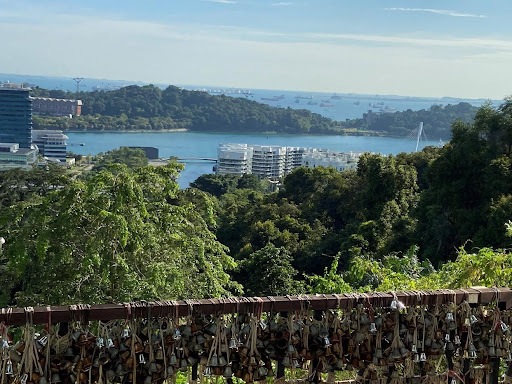
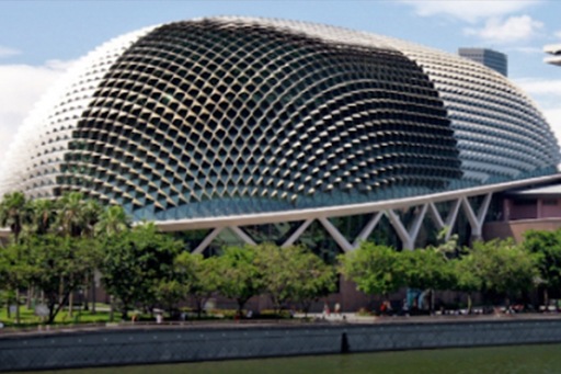
Museum lovers should check out the Art Science Museum, National Museum of Singapore and National Gallery Singapore. I would also recommend a stroll along the Singapore River from Raffles Place to Clarke Quay and Roberson Quay to see the lovely colorful shophouses where you can try out fresh seafood while enjoying the vibrant nightlife. There is a wide variety of food in Singapore, so spend a few days trying out the local signature dishes such as chicken rice, nasi lemak, chilli crab, kaya toast, and roti prata. For those who are curious about durian (yes, that spiky bizarre fruit with such a debatable smell!), you are in the right place to try it out! Whether you love it or hate it, it’s going be an experience of a lifetime! There is a theatre by the bay called Esplanade that takes the shape of a durian (in my opinion)!

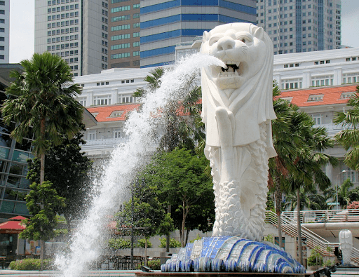
Don’t forget to take a photo with the Merlion while you visit Esplanade. It’s the beloved Singapore icon!
What is the best music to listen to while vizzing?
I usually viz in late night so I would prefer silence as I find it easier to focus.
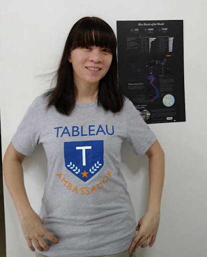
Tableau has brought me so much happiness since I joined the community. Here’s me happily flaunting my first ever Tableau Ambassador t-shirt and the print of my viz Rice Bowls of the World that was featured in the Virtual Viz Gallery of TC20 (that Tableau graciously sent to me!)
관련 스토리

Iron Viz 2026: Read Between the Data
 2026/05/28

Tableau's Iron Viz Winners

Explore the 2026 Iron Viz Entries
 2025/12/15