Supporting Dashboard Composition through Intent-based Recommendations


Tableau Research is the industrial research team at Tableau that explores future innovation in the space of augmented analytics and new experiences that help inspire the path ahead of the current product roadmaps.
Visualization dashboards showing charts and key performance indicators (KPIs) are prevalent across many domains, including business, sports, healthcare, and finance. Yet, authoring dashboards is a laborious process. Users need to go through several complicated steps before they even get to constructing a dashboard. They first need to explore the data and create a series of potentially interesting individual views. Then they have to identify which of those views align with the intended goal of their dashboard, and subsequently compose a dashboard with a relevant subset of these views. This sequential workflow of picking individual views and composing them into a dashboard can make dashboard authoring feel more of an afterthought rather than an active part of the users’ analytical process.
To make dashboard composition a more active analytic process, we introduce Medley, a prototype that recommends sets of views and filtering widgets (hereon referred to as collections) that make the dashboard authoring process easier for users from different domains and with varying levels of data and visual analysis experience.
Utilizing collection recommendations for dashboard composition
To see what collection recommendations look like and how they can be utilized during dashboard composition, let’s walk through an illustrative usage scenario of Bruce, an operations-reporting analyst creating a dashboard using the popular Superstore dataset. You can also check out a video of the scenario in action.
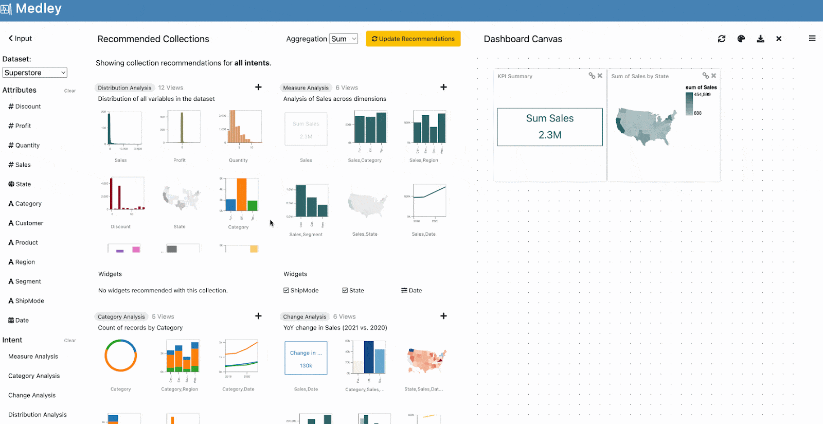
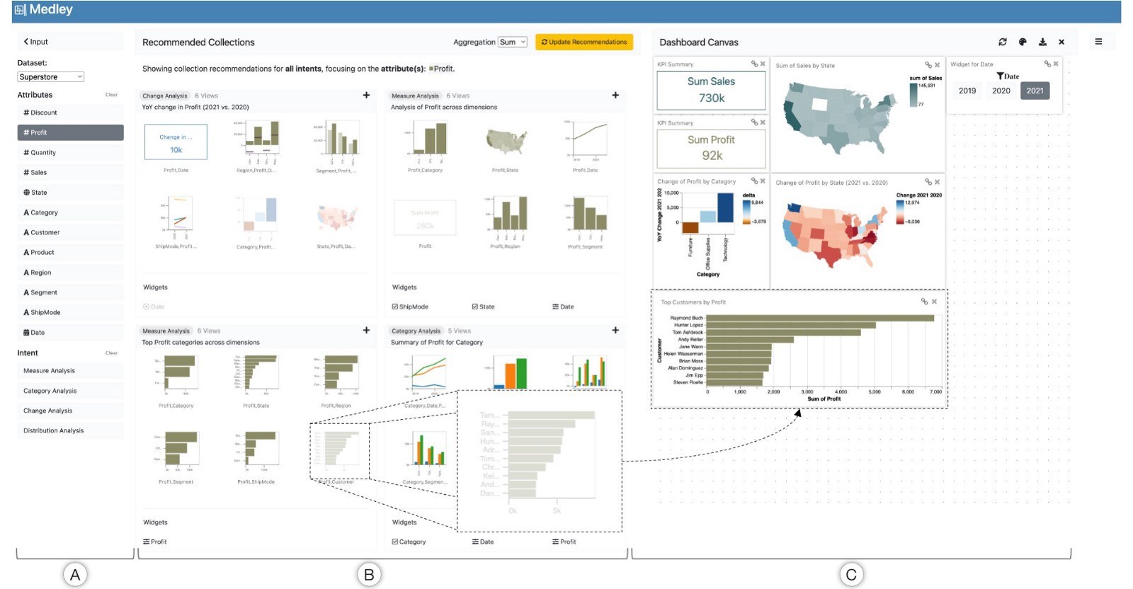
As Bruce loads the dataset into the tool, Medley recommends a set of collections by mining the underlying data patterns to address the “cold start” challenge, suggesting views for a dashboard. The recommendations are based on four high-level intents including measure analysis (summarizing one or more quantitative attributes), change analysis (showing data changes over time), category analysis (comparing values for a categorical field), and distribution analysis (displaying a count of records across available data fields). To ensure that the dashboard’s content is consistent, each collection focuses on specific attributes and an objective (e.g., “Year-over-Year change in Sales,” “Comparison of Sales and Profit”). Looking through the recommendations, the collection showing “Analysis of Sales across dimensions” appears to provide a good overview of Sales so Bruce adds two views (a KPI chart and a map) from that collection to the canvas.
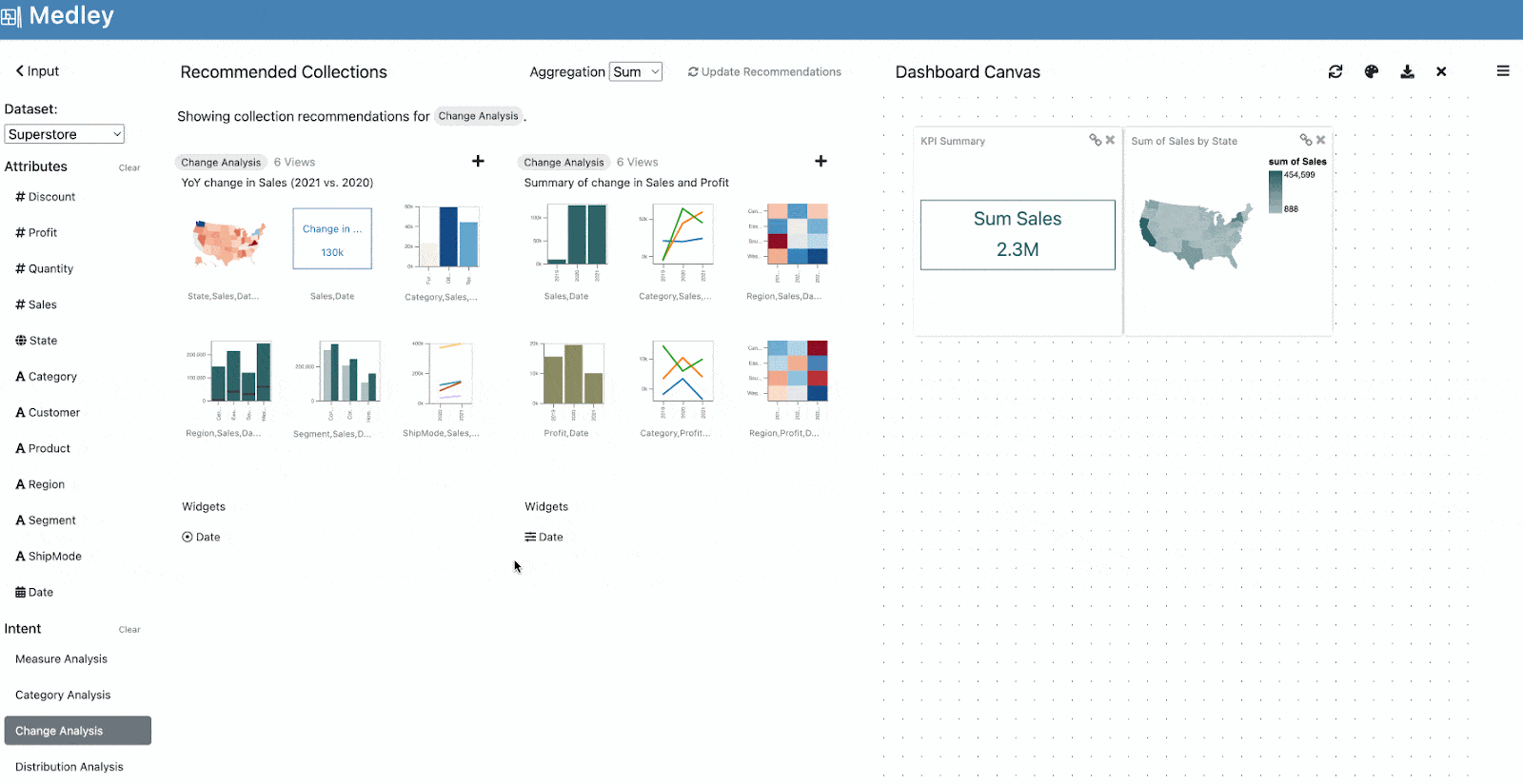
Looking through the other recommendations, Bruce notices a change analysis-focused collection that displays “Year-over-Year change in Sales.” Since showing yearly changes can help contextualize values in a dashboard better, he is curious to look at more collections like this one and filters the recommendations to those focusing on change analysis. Medley now displays two collections with one showing yearly changes in Sales and the other summarizing the change in Sales and Profit across all years in the dataset. Inspired by the second collection, Bruce wants to include Profit as part of my dashboard but still look at yearly changes. To indicate his interest in the Profit attribute, he selects it in the left panel.

Medley updates its collections to focus on the Profit attribute instead of Sales. Inspecting the updated collections, Bruce adds the map and the difference bar chart showing yearly changes in Profit to the canvas. To select years to focus on (e.g., 2021 vs. 2020, 2020 vs. 2019), Bruce also adds the recommended filtering widget to his dashboard. Since Medley implicitly adds interactivity between the canvas elements, having made just a few clicks, Bruce now has the content for a dashboard that can provide an overview of Sales for a particular year while also contextualizing those values with changes in Profit compared to the preceding year.
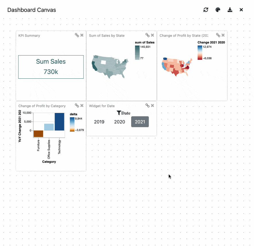
Bruce can now adjust the dashboard for a better user experience by updating the sizes of the charts and the dashboard layout. He can also use Medley’s lightweight direct manipulation interface to test and edit interactions between the dashboard elements, not only choosing which views are interactively linked but also the type of interaction to use (e.g., highlighting vs. filtering).
What’s next? A “medley” of opportunities around designing intelligent dashboard authoring tools…
As dashboards continue to grow as a medium for data sharing and communication, the notions of intents and recommendations can allow us to explore a new generation of more intelligent dashboard authoring tools. A logical next step is to integrate Medley’s recommendations within drag-and-drop based chart specification tools that allow for more fine-tuned authoring. We also envision these dashboard intents being used to design novel natural language interfaces. Such interfaces could enable people to use high-level utterances for stating their dashboard goals and reduce the tedium associated with explicitly selecting data attributes and intents.
This post summarizes the research paper “Medley: Intent-based Recommendations to Support Dashboard Composition,” co-authored by Aditeya Pandey (a former intern at Tableau Research) and Tableau researchers Arjun Srinivasan and Vidya Setlur. The paper was presented at the IEEE VIS 2022 conference held in Oklahoma City, USA from 16–21 October 2022 where it received a Best Paper Honorable Mention Award.
To learn more about the Tableau Research team and other research projects, visit research.tableau.com.
関連ストーリー

Which Model Speaks Your Data Language? A User-Centered Approach to Evaluating LLMs for Conversational Visual Analytics
 2026/04/14
Rethinking How Data Workers Revisit Analytical Conversations and Communicate Insights
 2026/04/10
Stepping through Charted Territory: Creating Interactive Step-by-Step Dashboards Tours
 2025/06/08