Quantifying Semantic Labeling of Visual Features in Line Charts


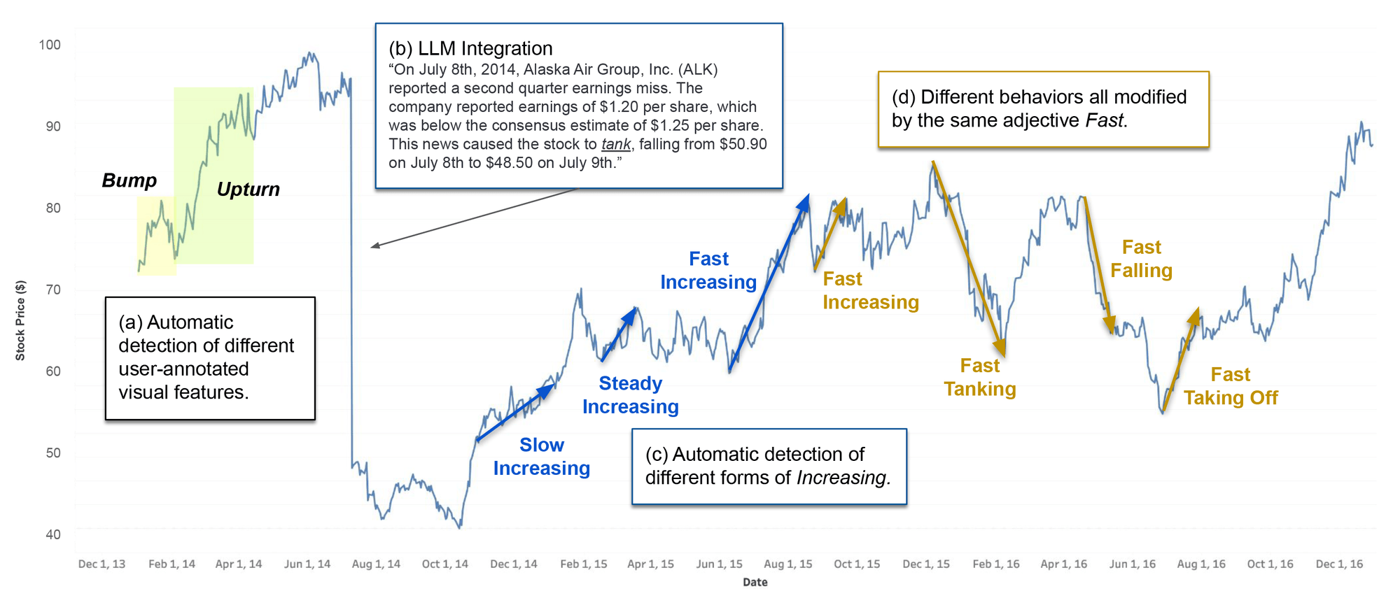
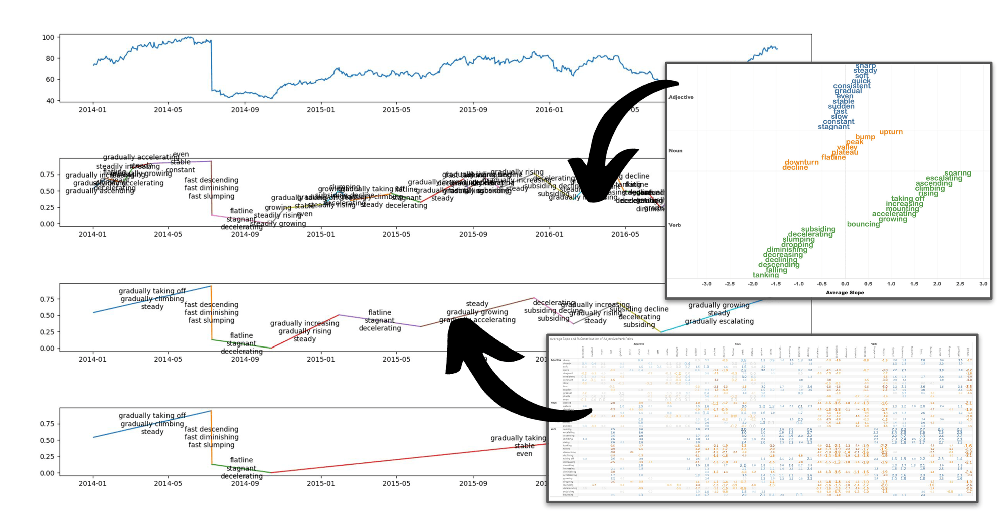
Automatic labeling of visual features in a line chart. (a) Automatic detection of user-annotated visual features. (b) Integration of discovered visual features with a large language model (LLM). (c, d) Automatic labeling of increases and decreases in trends using quantified semantics; the adjective/verb pairings encode specific empirically-derived line-slope information for generating corresponding annotations.
Editor's Note: This work is presented at the IEEE VIS 2023 Conference and is available for download on the Tableau Research page here.
Why do we want to quantify natural language?
Visualization has been the go-to method of data analysis for hundreds of years, and for good reason; it is a high-bandwidth channel for consuming multiple data dimensions simultaneously. It leverages our natural perceptual machinery and is approximately language and culture-agnostic. In fact, the data visualization tools market is expected to be worth $22B (that’s billion with a B) US dollars by 2030. So, it turns out that people like to look at their data.
People also like to discuss data (whether it’s signing, speaking, writing, whistling, or TikToking among other things). We listen to the news on the radio and television, read books and newspapers, and tell each other what’s happening in the world. But natural language (NL), while nuanced enough to let Toni Morrison split any number of emotional hairs, is not great at explaining large amounts of data. How long would it take you to verbally communicate even a simple scatter plot or bar chart? This is where visualization takes the prize; much of that $22B visualization budget is being spent by people who care deeply about efficient consumption of precise numbers: missing persons, climate change, profit margins, and disease occurrence, for example. When planning hospital staffing during the COVID-19 epidemic, people wanted hard numbers for infection forecasts and staff/patient ratios because they needed to plan down to literally the last decimal place; failing to do so would cost lives.
And yet, how did lay people consume COVID-19 data? Speaking for my family, we listened to news reports and watched for trends—we wanted to know if infections were going up or down, if the number of cases in our local area had spiked, was stable, or was hopefully even decreasing. And while we absolutely cared about hard numbers, small, easily-consumed trend descriptions were often precise enough for us to plan our day; COVID-19 cases low and stable? Send the kid to school. Covid cases rising? Wear a mask. Covid cases spiking? Time to stay home and binge that series you’ve been waiting for.
This is why we set out to try and quantify NL; it’s a great medium for data analysis if we can make the data consumable and numerically accurate enough for people to feel comfortable taking action or extracting an insight about something they care about.
What does it mean to put numeric values on words?
Words like stable, spiking, or gradually rising have an intrinsic quasi-quantitative sense. For me, stable means “like it was before,” spiking means “it went up a lot and is much higher now than it was before,” and gradually rising means “a bit higher than before but heading up and might be even higher tomorrow.” These words tell us if something is changing and even begin to forecast how it might be in the future. They also indicate shape—a spike typically means that something went up and came back down again (although spiking could imply that we are in the middle of a spike and haven’t come back down yet). Spike also seems to have a larger magnitude than bump—but by how much—10%? 100%? 63%? The number probably varies from person to person. So, if we want to use these words accurately (or in our role as computer researchers, to teach a computer to use them accurately), we need to ask some people what they think and come up with some consensus numbers.
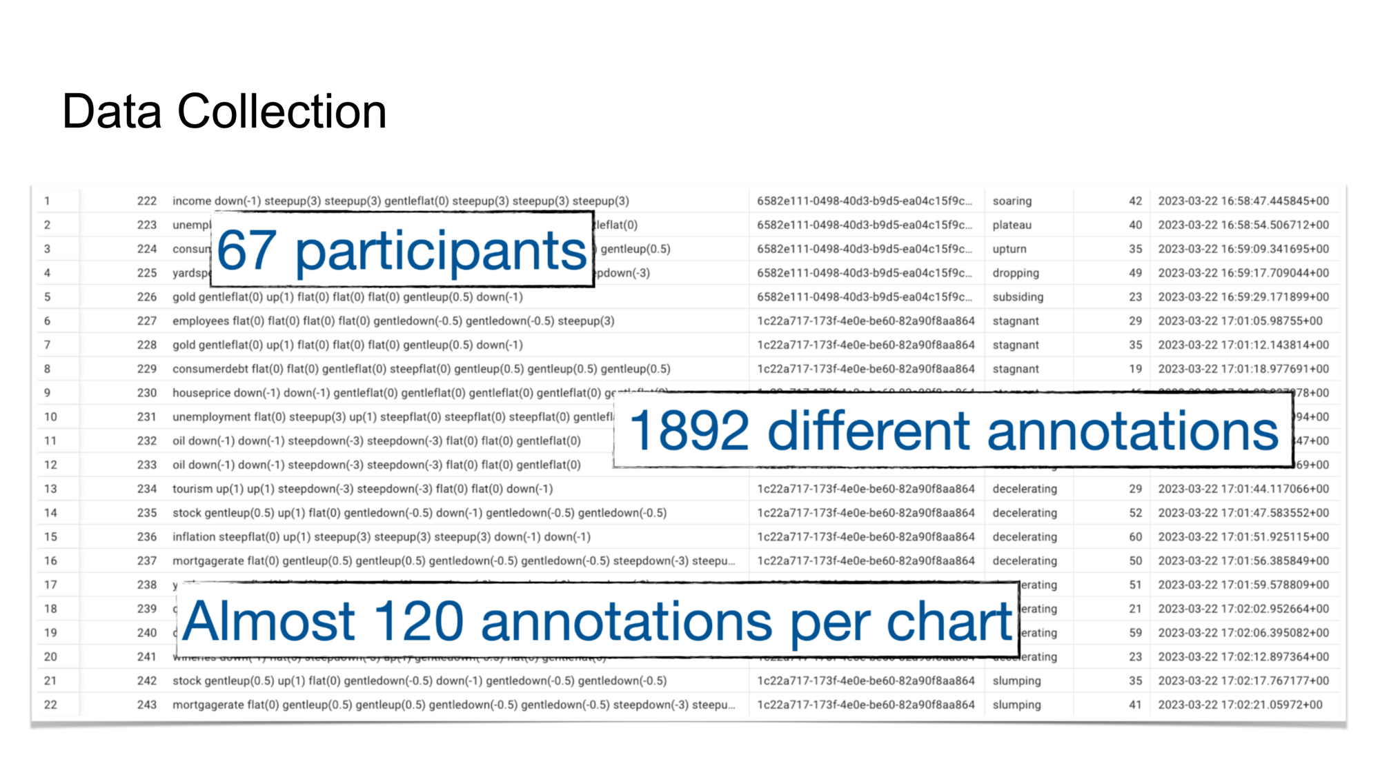
To try and get a widespread sense of what constitutes, for example, a hill or a valley, we built a web application that asked people to label randomly generated line-chart shapes where each shape consisted of seven connected line segments. As shown in the image below, participants labeled shapes by dragging words from a word bank on the left over to the shapes on the right. From there, the label was snapped to the nearest line segment.
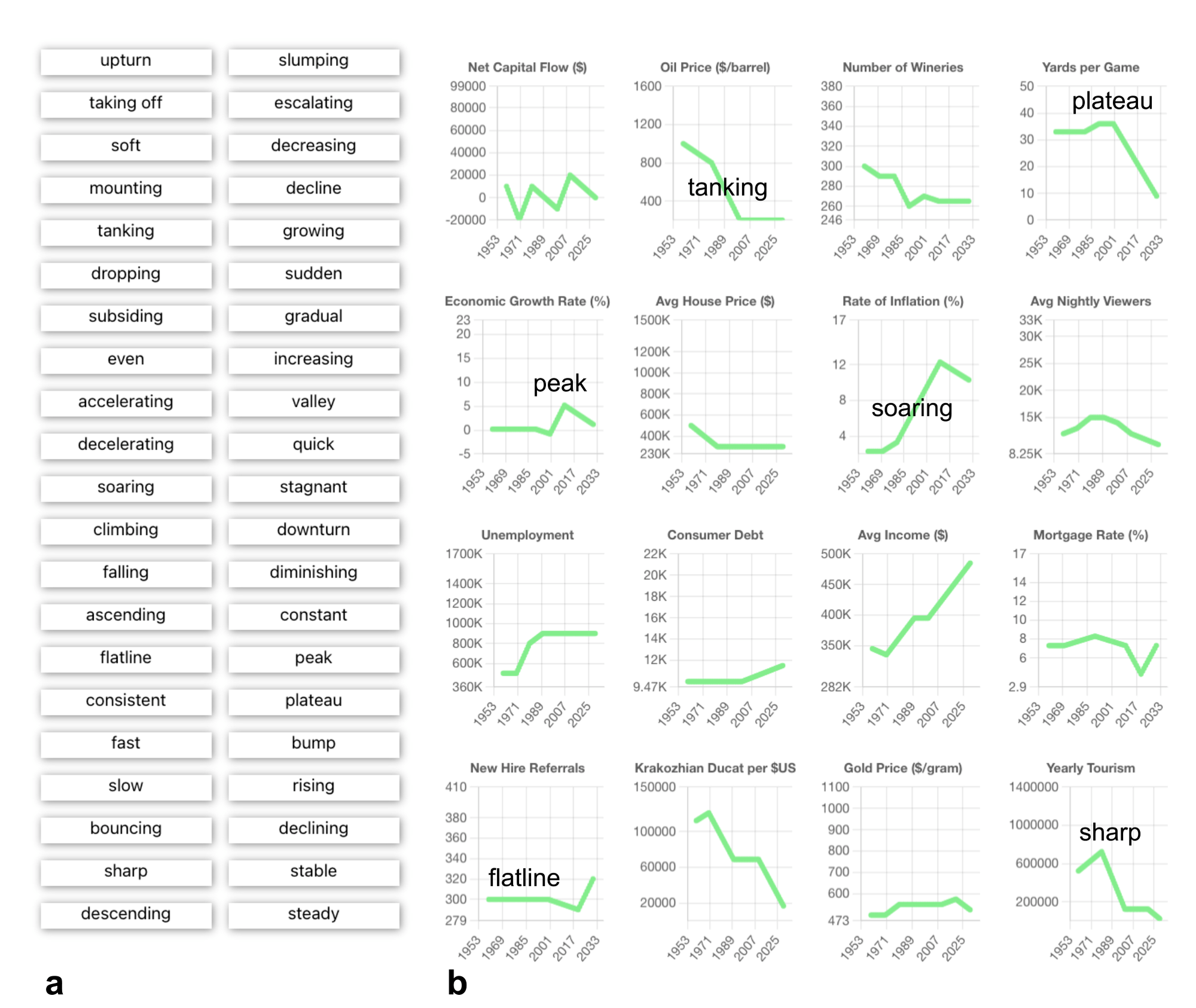 The annotation-collection tool. Participants drag words from the left (a) over to visual features of the charts on the right (b). The words are snapped to the nearest chart position. Words may be moved or deleted once they are attached to a chart. Individual words may be used on multiple charts and multiple times on a single chart.
As shown here, we collected a ton of great data. We began our analysis by looking at word co-occurrence, i.e., which words appeared together.
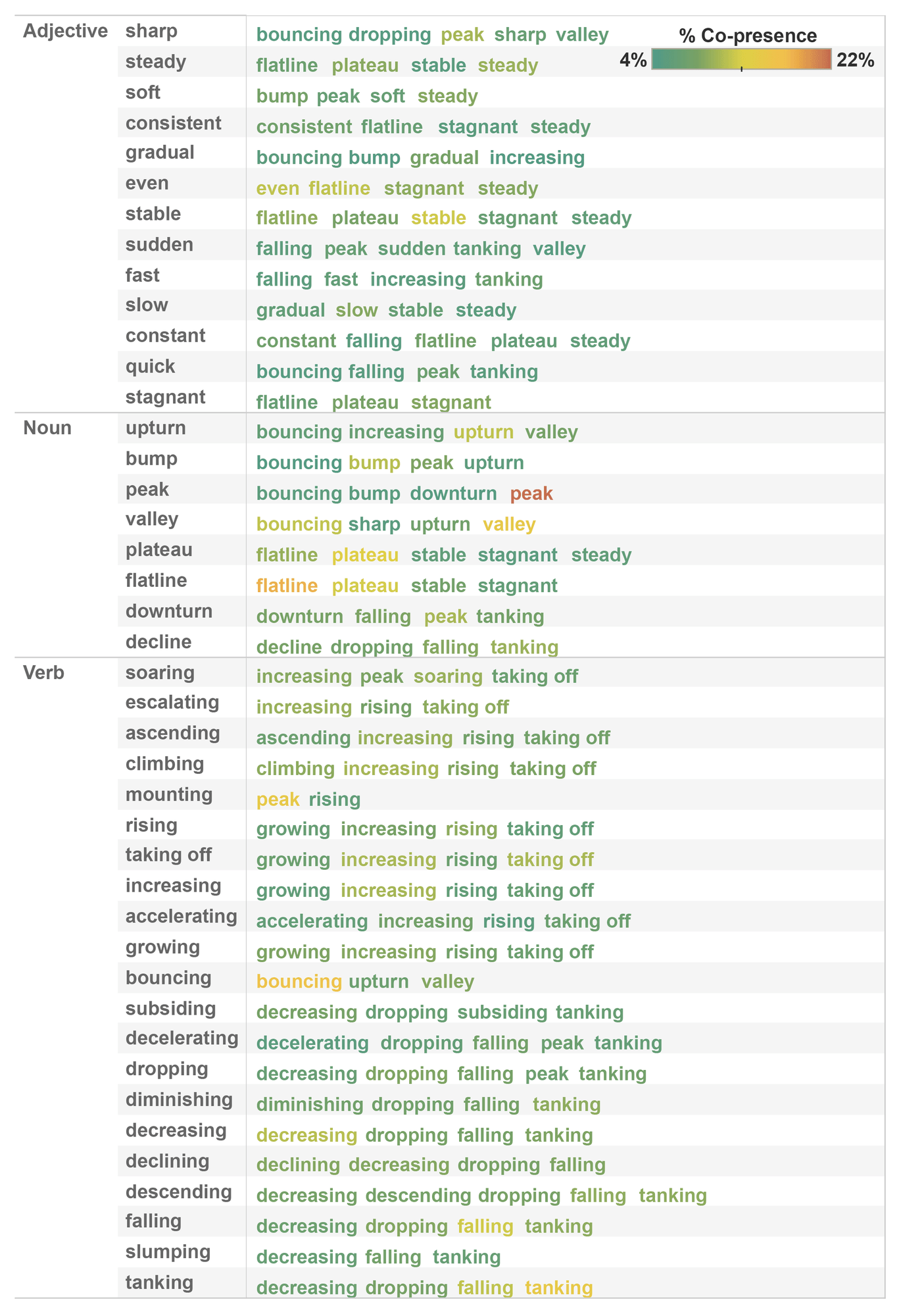
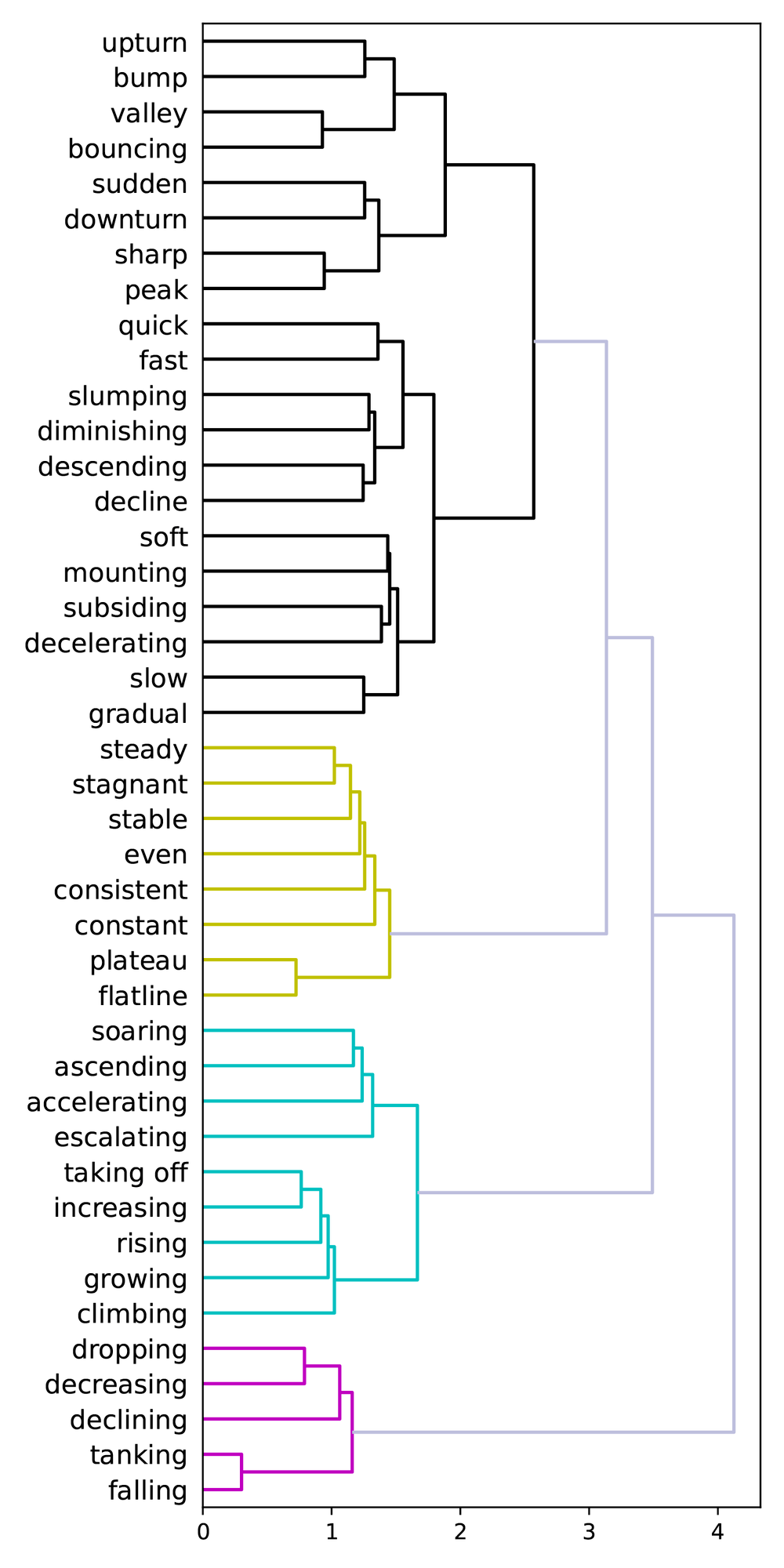
The idea was that words that appeared together—that were placed by different participants on the same segment—might indicate a shared sense of meaning. On the right, we can see two aspects of clustering. The first shows a table of words that most co-occur with other words. For example, mounting typically co-occurs with peak and rising. On the right side of the figure, we used label co-occurrence to perform hierarchical clustering. Five major clusters popped out, three of which align pretty well with the concepts of flat, up, and down.
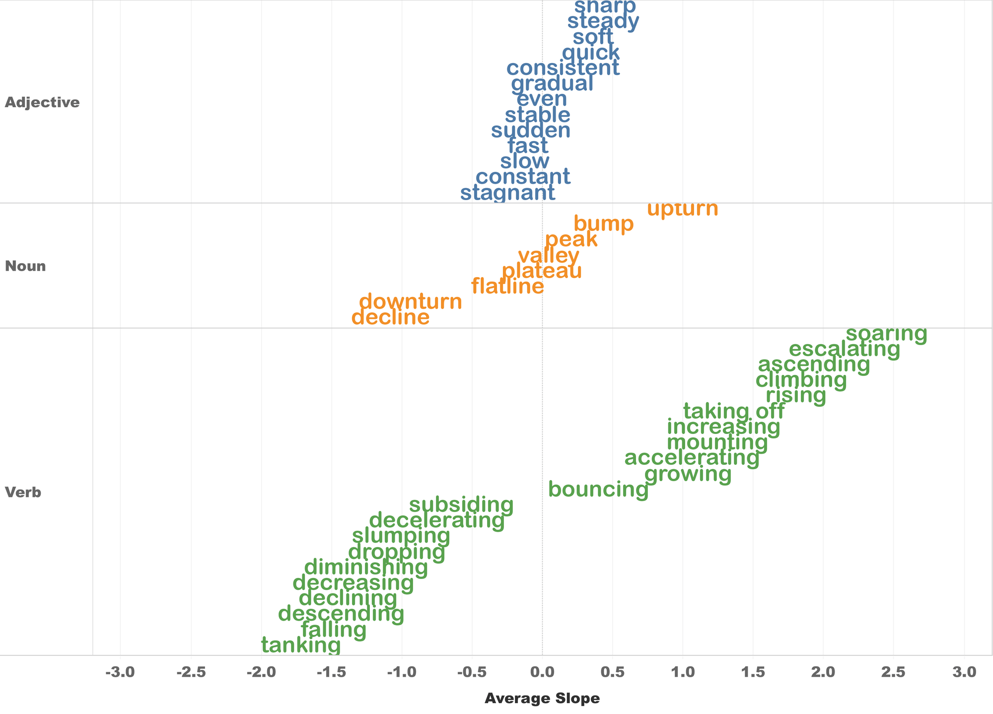
We then began looking at the slopes of the labeled segments (remember that each shape consisted of seven linked segments). When we calculated the average per-label segment slopes, we found a clear signal that aligned well with our intuition. As shown below, we were able to create a preliminary semantic hierarchy which showed, for example, that the slope of tanking is more steeply negative than dropping, which is more steeply negative than plateau, which is basically flat (it’s on the zero-slope line in the middle of the chart). And from there, we can walk up the slope chart to growing, to taking off, and finally to soaring.
When we saw this chart, we got pretty excited because it showed that we were actually beginning to quantify these terms; there was, unequivocally, a signal in the data that we could measure and quantify and—hopefully—use when analyzing new data.
Let’s use the slope data!
Say you’ve got some data you want to analyze—maybe stock market data—and you would like to (accurately) label some notable moments before you share it with your friends or co-workers. But that moment where the stock price dropped 80%—did it plunge? Was it tanking? Was it part of a gradual correction? This is the kind of ambiguity we were looking to address.
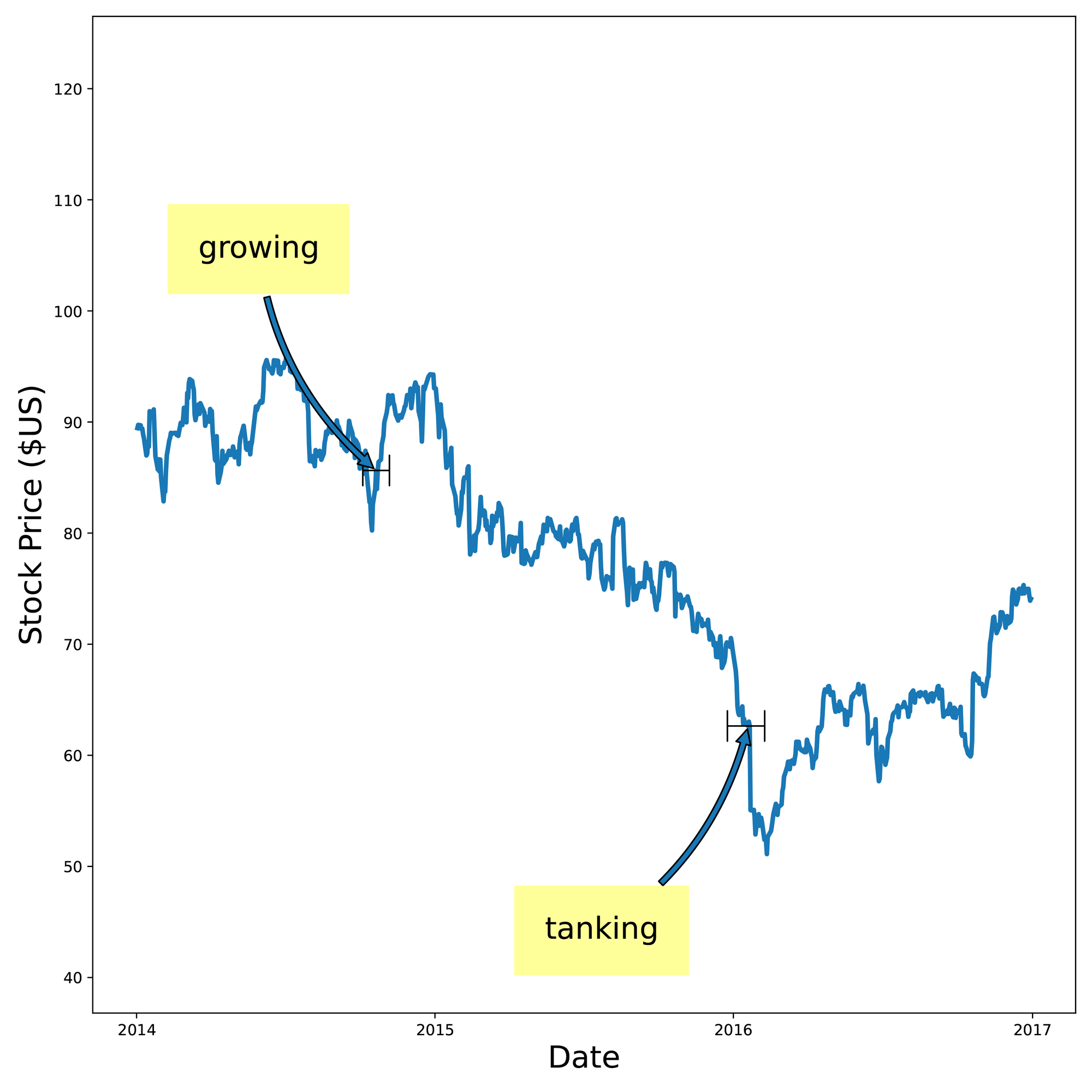
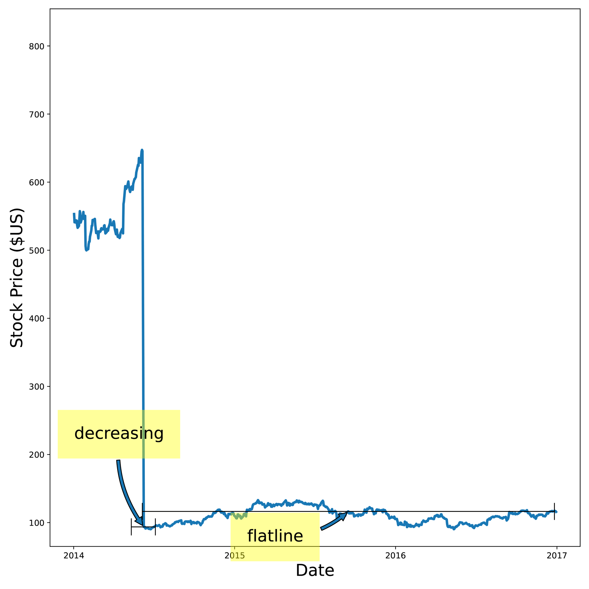
We broke this problem into two parts—shape identification and slope identification. For shape identification, we used a DSP (digital signal processing) -style approach where we took each shape and slid it past our input data using a technique very similar to cross-correlation. This approach gave us a similarity score between the shape and the input data for every step along that sliding comparison. At points where the shape didn’t look anything like the input data (e.g. the input data was flat but the shape was a cliff-like dropoff), the score was low. At points where the shape looked a lot like the input data (e.g. they both looked cliff-like), the score was high. We then looked at all the labeled shapes, found the shapes with the highest score, and used those labels to label the input data. You can see here that the algorithm identified regions such as growing, tanking, decreasing, and flatline.
Slope identification took a slightly different approach. If you remember, the labeled shapes in the data collection web app were composed of individual line segments, each of which has a label and a slope. So if we know the slope of a line, we can take the label hierarchy figure above and use it like a dictionary; if the input data has a stretch of data with a slope of around 1.2, we look that up in the figure, see that a slope of 1.2 corresponds to increasing, and we label the segment increasing. If it has a slope of -1.7, we’ll label it tanking. So all we really need to do is break down our input signal into line segments, calculate the slopes, look them up in the slope:label dictionary (our figure), and we’re set.
That was for one-word labels. But when we looked at two-word compound labels (e.g., slow decreasing), we found a hidden gem in our dataset. It turns out that we can quantify the effect of adding adverbs like slow or fast to verbs like decreasing. For example, while decreasing has an average slope of -1.4, slow decreasing has a more subdued slope of only -0.5, and fast decreasing has an increased slope of -2.5. Slow and fast are acting as numeric scalars to predictably change the slope of the base word.
The cool part is that this is exactly what we do in English (and other languages); would you prefer that your bank account be slowly decreasing or quickly decreasing? Do authors want a mild response to their new book or a wild response to their new book? These modifier words change the meaning of the base word in semantically and quantitatively meaningful ways, i.e., they change the semantics of the sentence to more accurately reflect the underlying data. And because of that, the increased accuracy lets us make more effective data-driven decisions.
So, once we were armed with both the single-label and compound-label label:slope dictionaries, it was time to do some slope labeling. To do this, we used the Ramer-Douglas-Peuker algorithm for subdividing the time-series dataset into line segments. Shown here, we subdivided the input data (top) by three different resolutions so that we could identify small, medium, and large slope regions. From there, it was easy to calculate the slope of the line and look up our labels.
All this so you can tell me that an 80% loss in stock price is a ‘cliff’?
While part of this seems obvious—couldn’t we just come up with some heuristic to label these things and call it good? There are a few aspects to this approach that are pretty special.
- This approach is language agnostic. The web app that we discussed above collects shape labels as generic language-agnostic strings. It knows nothing about English or any other language. We could just as easily have collected this data in Japanese or French. Or gibberish. Or crayon scrawlings. And the nuance there is that different languages almost certainly have slightly different sensibilities and colloquialisms when describing data. So taking an English-language dataset and simply translating the words might not capture the subtleties that native speakers convey in their own language.
- This approach is domain agnostic. For this initial foray, we tried to pick some common everyday words. But there is no reason why we couldn’t use this technique to quantify domain-specific vocabulary for describing medical data, financial data, or any other niche domain where people use domain-specific words to describe domain-specific things.
- These are crowd-sourced shape and slope definitions; they represent an aggregate from many people, not just a couple of developers. This is important if we want to use this data to communicate and interact with people from different backgrounds.
- We actually quantified a general domain of NL! That’s cool! And more than just cool, it opens the door to further investigation and more interesting applications.
Ok, I get it now. So what’s next?
There are lots of ways we would like to move this forward. The most obvious paths are simply expanding on what we have already done: improving accuracy, expanding the set of labels, and moving into more niche domains. But we also want to move beyond just line charts; how can we bring this same approach to bar charts, pie charts, and geospatial maps? Can we use this in the absence of a chart? Can we use this to convey findings from machine-learning models and AI agents?
One area where we have begun to experiment is using this approach to help large language models (LLMs) like ChatGPT be more accurate in their language. LLMs are literally where language crashes headlong into data, so this seems like a natural opportunity. As you can see in the figure in the beginning, ChatGPT 3.5 was able to roll our new slope and shape information into a compelling and semantically correct narrative (along with a few factual hallucinations). But the fact that ChatGPT could adhere to these new language guidelines without losing its LLM magic was a great sign. We expect this integration to improve as newer versions of LLMs and AI agents become more accurate and nuanced.
If you couldn’t already tell, we’re pretty excited about this approach's possibilities, which we are referring to as quantified semantics. Data seems like it might be kind of a big thing and AI might be important as well. So teaching a computer to use accurate language when analyzing data sounds like a no-brainer. As we look at data consumption scenarios like text messaging and Slack, earbud-resident tools like Google Assistant and Apple Siri, accessibility projects like low-vision capable interfaces, and mass-communication needs like what we saw in the pandemic, communicating via NL is more important than ever.
We are already working on the next phase and would love to hear your thoughts. This work is presented at the IEEE VIS 2023 conference and can be read in its entirety on the Tableau Research site.
Storie correlate

Which Model Speaks Your Data Language? A User-Centered Approach to Evaluating LLMs for Conversational Visual Analytics
 14 Aprile, 2026
Rethinking How Data Workers Revisit Analytical Conversations and Communicate Insights
 10 Aprile, 2026
Stepping through Charted Territory: Creating Interactive Step-by-Step Dashboards Tours
 8 Giugno, 2025