How Tableau Features the Power of Data and Generative AI at Gartner BI Bake-Off


I presented at the Gartner Data and Analytics Summit 2024 in Orlando, participating in the Analytics and BI Bake-Off event. It was an honor to demonstrate Tableau’s capabilities in four categories: Data Management, Analysis/Content Creation, Sharing/Collaboration, and Cool Innovation.
This year’s Bake-Off topic was about overcoming poverty and how to make the world a better place. To address the topic, Tableau and other analytics platforms were expected to incorporate how AI is transforming data and analytics. For as long as Tableau has been around, it’s innovated, continuing to evolve and grow into a complete, integrated analytics platform that supports individual and enterprise growth.
The Bake-Off event was as exciting and illuminating as ever, with multiple platforms to reveal their platform’s capabilities creating demos using a common data set and presenting in a controlled environment. Tableau’s many strengths in the fields of AI, community, and data philanthropy made me excited to tackle the challenges in the Bake-Off event.
Our approach focused on not only identifying the root cause of poverty, but the direct actions we can all take to address this global issue. Starting with data management, I used Tableau Prep to quickly combine, shape, and clean my all data sets regardless of the type—whether it’s housed in the cloud or on-prem, Tableau Prep can connect to it.
Data Management
It’s critical that organizations build trust in their data with data management, and non-profits are no different. I started in Tableau with poverty rates from the Organization for Economic Co-operation and Development (OECD), which was data we were required to use, and one correlation with high graduation rates and low poverty rates as an example. There is no way that the story begins and ends here, with only two measures, and a data quality warning from my colleague called out the need for more data sources to enrich my data set and tell the complete story.
Moving over to Tableau Prep Builder, I began with the core OECD data provided and applied the Tableau Python script (TabPy) to interpolate missing fields, but TabPy is a powerful feature that ensures your ability to access all of your data engineering teams’ advanced machine learning algorithms.
Beyond the OECD measures for housing and health, I added a third data set from the World Giving Index from the Charities Foundation, which ranks countries in terms of citizen philanthropy (donations and volunteering time).
Before unioning the data, I cleaned everything up with Tableau Prep, which automatically identified field types, visually showed the presence and flow of data across the data sets, and apply Tableau Prep’s smart, intelligent recommendations. For the event, Tableau Prep suggested a specific field would be better as a geospatial data type. I also loved that I was able to fix fields, like the misspelling of a country name–right in the prep flow without having to go back to edit the source data. I was able to union the three data sources with different methodologies, structures, and types with no issue. The union also colorcoded where the data came from and showed mismatched data before I put it into Tableau Cloud. But you can connect to data on-premises or in the cloud—whether it’s a database or a spreadsheet—and can export your data and securely host it anywhere you want.
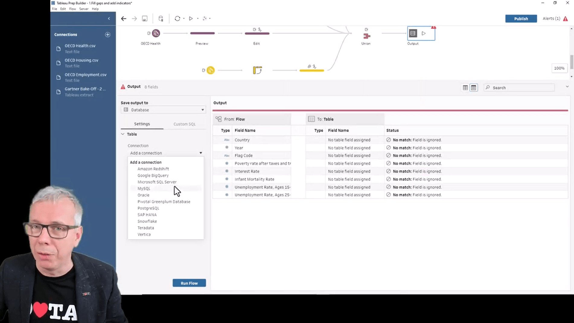
The data prep flow we built for this demo was quite complicated, but Tableau Prep handled it fine, allowing me to see errors, run history, and schedule flows at any time or frequency. More importantly, I could see lineage, which informs me of what data sources are impacted. When a change is made, it's propagated down to every worksheet, workbook, and owner.
Now our OECD data is prepared and combined with the World Giving Index source, providing trustworthy data for people to access. After this work, my colleague was happy with the data so I could certify it for use across the organization. Before publishing this dashboard, I used Workbook Optimizer, which gave me advice on rules to ensure the it would not not overload resources and keep everything performing as fast as possible.
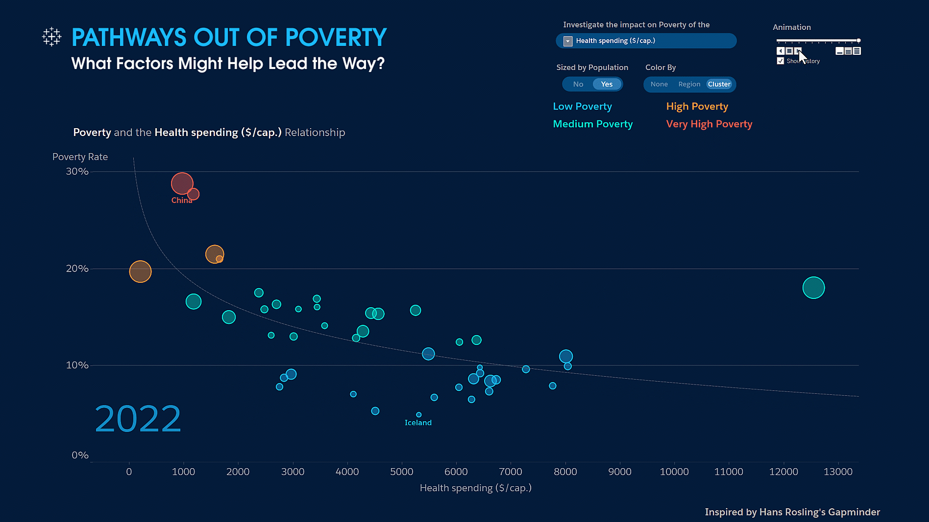
Besides higher graduation rate having a positive effect on poverty, we dug into the dashboard and found a correlation between increased healthcare spending lowering poverty rate, with the US as a notable exception. We also discovered a new correlation in the World Giving Index data: A higher percentage of citizens donating money charitably is correlated with the country’s poverty rate decreasing. We dug into this correlation in the event’s next section about analysis.
Analysis, content creation, and collaboration
Tableau is a secure, flexible platform that can showcase endless creativity through visualization, but also reveal powerful insights for people to take action on. That’s what we’ve tried to do with this Pathways Out of Poverty dashboard that surfaces what factors might lead the way.
Before diving too deeply into the story, we used Tableau’s clustering tool to easily drag and drop to find different levels of poverty across the OECD nations.
A month ago, we felt that our poverty story wasn’t particularly compelling, but after applying the Explain Data feature–which surfaces AI-driven insights that invite deeper exploration–interesting correlations were revealed. Explain Data looks at the profile of your data to reveal insights such as this scatterplot that help you find data stories.
So how do you go from a persuasive data story to an actionable strategy to make the world a better place? I went back to our correlation between higher rates of citizen giving and lower poverty rates to see if we could do something about this.
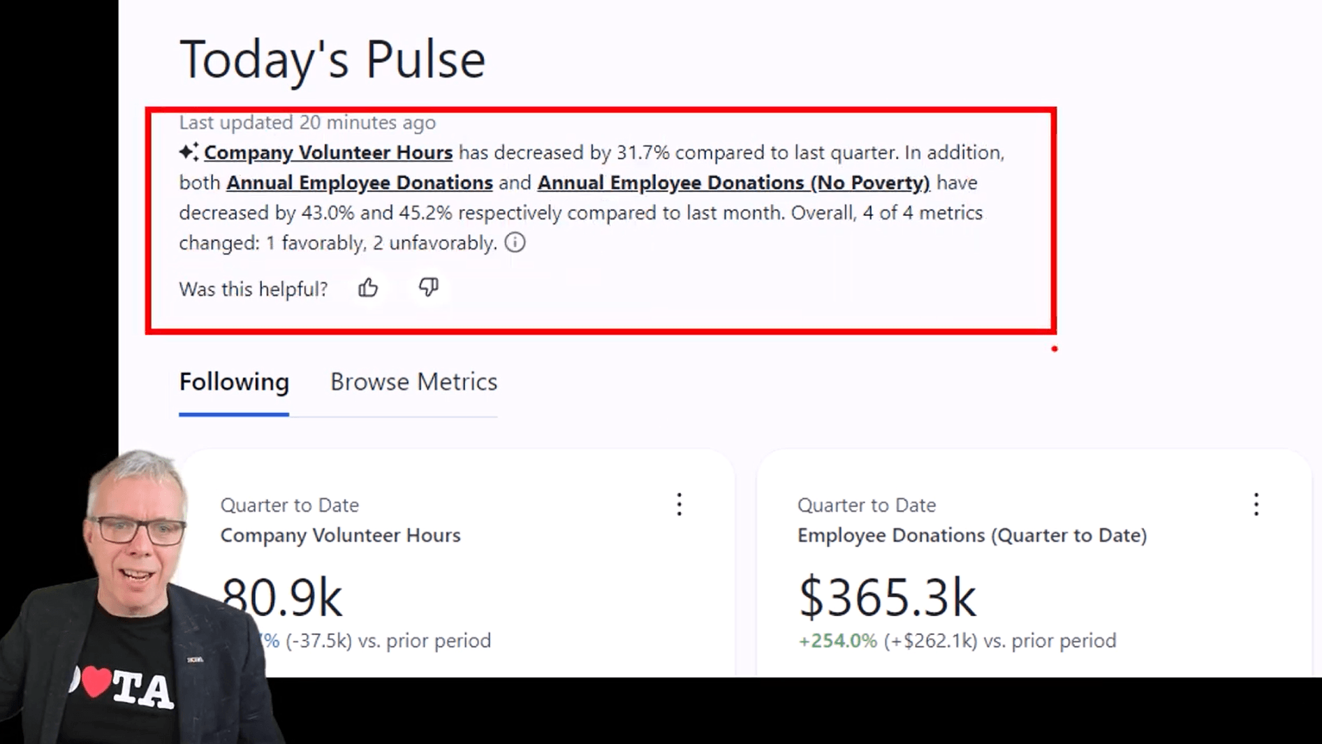
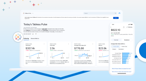
First, I added a comment for my colleague, Christian, to ask if he had any data to track donations of time and money across Tableau and Salesforce. While waiting on Christian to respond, I tried out Tableau Pulse to get personalized, contextual, and intelligent metrics powered by AI using the sources I had available. In Tableau Pulse, I chose the data source for Salesforce and Tableau volunteering to track that over time. I added two filters for location and sustainable development to produce the company-volunteer-hours Pulse metric.
The live data showed that employee giving has been going down a bit, also delivering an AI-generated summary. As I follow this metric over time, I also set up notifications for changes in trends. At this point, Christian has added me to three new metrics so that I have a Pulse digest about citizen philanthropy at our organization.
Sharing
At this point, we have insights and donation KPIs, but the true question is: How can we tackle the global issue of poverty with local action? Well, we can start by sharing dashboard insights, subscribing people in order to spread the strategy across Salesforce and improve philanthropy KPIs. I can do burst reporting via subscriptions to people across the organization, or I can set up alerts so people only get information when a threshold has been reached.
Leveling up our strategy to our board is critical for executive sponsorship and buy-in to impart even greater impact to reducing poverty. To present to our board, I decided to use story points as my presentation mechanism. Story points are individual sheets within a Tableau story, which is a sequence of visualizations or sheets that work together to tell a narrative or demonstrate how decisions relate, for example. These story points have done the trick, convincing leadership to invest in our strategy.

The AI summary at the top was generated by ChatGPT with a Salesforce Trust Layer in between. All of the data is masked and no data is retained outside of Salesforce. I can leave feedback for Tableau, saying things like “The generative AI summary is great,” so that Tableau can use the feedback to continually improve the engine.
Drilling into employee donations, I can see analysis of trends and drill into questions that Tableau Pulse generates, such as “Which country’s charitable giving has increased the most?” (In this case, it’s Mexico.) I can adjust Pulse filters to see different development goals to help my colleagues move the need on poverty. I can also make sure that the right people become followers of this metric. By sharing the insights with my coworkers, Christian and John, I’ve made this analysis more collaborative. Now, as a team, we can develop a strategy to encourage and match employee donations of time and money to in order to do what we can to address the macro problems of global poverty.
The next step is to get employees on board by creating an employee portal. For that I’m going to need to embed my visualizations (vizzes) into the portal, so I’ll use the Tableau Embedding Playground. I’m a data analyst, but not a coder. No problem: The Embedded Playground lets me use advanced features without writing a single line of code. I can make changes to the dimensions, device type, and other filters by dragging and dropping them into the playground.
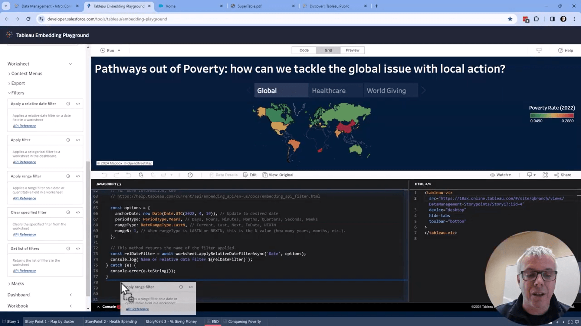
Let’s take a look at the portal. There is a Tableau Pulse dashboard embedded here because Pulse is embeddable and customizable via APIs. We see several metrics we’ve been tracking, and one about employee donations that has been going down, revealing the need to push there. In addition to the story points and scatterplots we already embedded, there is also more detailed map of all employee engagement across the organization. It looks like they’ve been doing well in Florida , so I wanted to send an email to employees to congratulate and thank them for all of their efforts and contributions. I quickly select the names, right click, and export them all into a .CSV, .XLS, or .PDF to share internally.
Because poverty is a global problem, the more that we can get the word out, the better. And what better platform to introduce change in the world and share dashboards externally than Tableau Public? I like to say it’s the “YouTube of data visualizations,” with 9 million visualizations made by people around the world. On Tableau Public, I search for the term “poverty,” and discover that over 10,000 vizzes have been built on the topic. One particular viz has been seen over 1.5 million times! You can embed and share these Tableau Public visualizations via Slack or other channels to reach a wide audience, showing the power of sharing with Tableau.
Cool Innovations
To take data sharing a step further, I want to bring data into my meetings and drive home insights with my colleagues. A capability optimized for virtual meetings is Tableau Gestures, which makes it possible to interact with viz overlays by simply pointing at them in live webcam video. Let’s check out what we’ve been doing with Tableau Gestures over the past year.
I want to be immersed in the data during my meeting, so I’m able to interaction with various data elements by pointing to, selecting, moving, zooming, and panning viz elements by pinching them. I’m now able to interact with maps and geospatial data in meetings, so I shared a globe with the clusters we identified earlier, showing the global distribution of poverty levels. While the globe is good for seeing spatial relationships, I wanted to interact more easily with data from small countries so I changed the globe into a tile map. What I lost in geographical shape, I gained in relative space.
Let’s look at how the poverty levels have changed over time. The average poverty for the countries I’m showing on screen hasn’t really changed over time, staying between 12 to 13 percent, but if we bring in the clusters, we start to see interesting stories. Digging into the Baltic region, we see Latvia’s poverty rates worsen, but then improve more recently. Looking at Estonia, which is Latvia’s neighbor, we see the opposite trend: initially veering towards the low poverty cluster, it’s now the reverted to increased poverty rates that have remained.
Then I moved on to look at North America, seeing that Mexico started with higher poverty rates, but has managed to reduce that recent years. This was a similar situation that was for Canada, but they’ve managed to move to the cluster of low poverty rates. One exception is the US, which stays static throughout this time period.
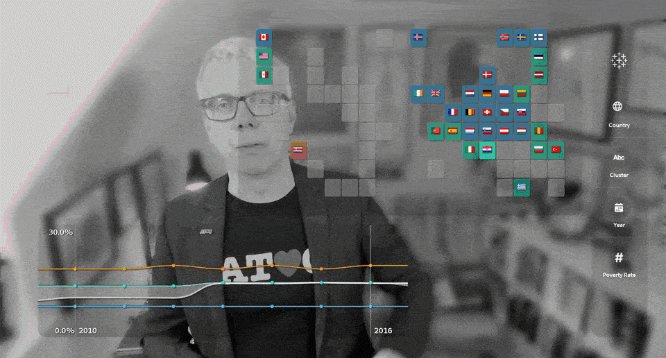
Tableau innovates with data and AI
Throughout the Bake-Off event and various approaches, we demonstrated the ability to reveal insights around lowering the global poverty rate in order take action using data-driven strategies.
Across data management to analytics to collaboration, and even pointing-based interactions for presenting data, Tableau continues to innovate using data and AI. We help customers start with data and move forward with Tableau.
Learn more about analytics and business intelligence by checking out the latest features and what’s coming next in Tableau. And register to attend Tableau Conference and discover even more innovations.
Storie correlate
Top New Tableau Pulse Feature Releases to Know
My Tableau Story: Andy Cotgreave
 16 Marzo, 2024
5 Reasons Why Data Pros—Like You—Should Attend Dreamforce
 11 Luglio, 2023