Coronavirus Data Hub FAQ: What you should know about our COVID-19 dataset


Editor’s note: Since published, we’ve updated the data source to make sure everyone has uninterrupted access to the latest data. Learn more about the latest data source.

The Tableau COVID-19 Data Hub contains resources to help you visualize and analyze the most recent data on the coronavirus outbreak. On the hub, we’ve created a jumpstart workbook, pre-loaded with COVID-19 case data, that anyone can download and use for their analysis. We want to make sure that you’re fully informed about the data you’ll be working with on the hub. Below, we’ve compiled answers to some key questions about the data. We know this situation is changing rapidly, so as the data and questions change, we will update our answers accordingly.
Where is the dashboard data coming from?
The data comes from the dataset maintained and updated by the Johns Hopkins University Center for Systems Science and Engineering. Tableau cleans, reshapes, and makes this data ready for your analysis.
What is included in the dataset?
The data represent a point-in-time snapshot of to-date totals of confirmed cases and total deaths.
Here are the fields included:
- Case_type: Confirmed Cases and total deaths
- Cases: Point in time snapshot of to-date totals (i.e., Mar 22 is inclusive of all prior dates)
- Date: Jan 23, 2020 - Present
- Country_region: Provided for all countries
- Province_state: Provided for Australia, Canada, China, Denmark, France, Netherlands, United Kingdom, United States
- Admin2: US only - County name
- FIPS: US only - 5-digit Federal Information Processing Standard
- Combined_Key: US only - Combination of Admin 2, State_Province, and Country_Region
- Lat
- Long
- Location
- Table Names: The Table Name identifies the specific Johns Hopkins datasets that were used:
- JHU Timeseries - All data is sourced from the current JHU Global Timeseries dataset, provided to the public once per day
How often is the data updated?
The data from Johns Hopkins is updated at approximately 7 p.m. PST.
What formats is the data available in?
The data is available in a few different formats:
.Hyper File:
- Available for direct download.
- Refreshed daily by 10 p.m. PST.
- The COVID-19 .hyper format takes advantage of the improved data engine, which supports faster analytical and query performance for larger data sets. It is provided for current Tableau customers and can be downloaded on demand from the data.world COVID-19 Data Hub.
CSV File:
- Available for direct download.
- Available through Web Data Connector
- Refreshed daily by 10 p.m. PST.
Google Sheet:
- Link available here.
- Refreshed daily by 10 p.m. PST.
- Note: Google Sheets may experience periodic outages during times of peak usage.
For more information, visit our Tableau Community Forum.
What range of dates does the data show?
The data captures case numbers for every day from January 23, 2020 to the present day.
How is the data sorted geographically?
Every country and region is represented in the data. For the following countries, data is provided at the province or state level: Australia, Canada, China, Denmark, France, Netherlands, United Kingdom, United States.
For the United States, data is also provided at the county level. We started displaying county-level data on March 26, and it is available from March 23 onward. Due to this relatively recent change in the level of detail provided, the “Difference” field has been appears as a null value—we are working through this issue.
I noticed that data on recovered cases is no longer available. Why is that?
On March 24, JHU stopped providing data on recovered cases due to a lack of confidence in the data. This means that we’re no longer able to differentiate between active and recovered cases in the total case data, so we have removed those values from the dataset. This is a permanent change.
I saw guidance on the COVID-19 Data Hub about “vizzing responsibly.” What does this mean and where can I learn more?
In making these data resources available to the public for analysis, we want to make sure we’re advocating best practices—from the perspective of data visualization, and from the perspective of public health. This also means advocating for the idea of “flattening the curve”—the spike in the number of cases. We believe that this should be the goal of data visualizations representing COVID-19, as that’s what’s needed right now from a public health perspective. For more information, read this helpful blog post by Amanda Makulec, a masters of public health and data visualization expert who is consulting with Tableau on the COVID-19 Data Hub project.
Storie correlate
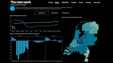
What we can learn from open data: COVID-19 in the Netherlands
 29 Aprile, 2021

After a year of COVID-19 charts, eight data communication lessons learned
 19 Aprile, 2021
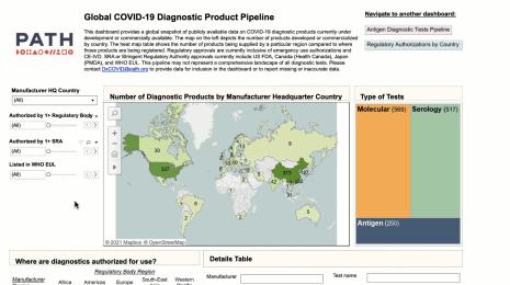
Data innovations in public health: PATH creates COVID-19 diagnostic test dashboard
2 Aprile, 2021