Visualizing all of the protests and political unrest in the U.S. this summer


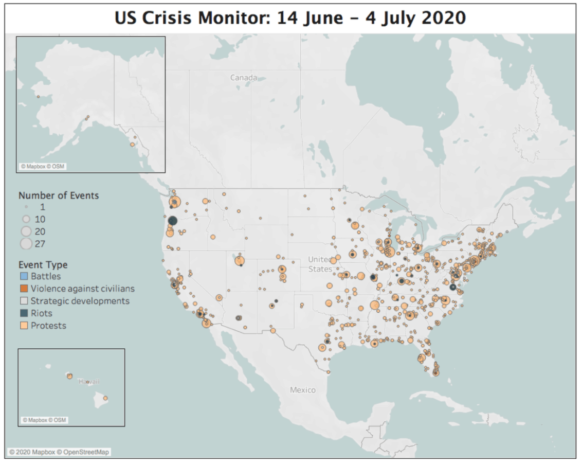
In the U.S., 2020 has been a year marked by crisis and protests—and with an election in November, tensions will continue to run high. In times of uncertainty, it’s critical to understand where the risk of instability and political violence is highest. However, there’s been no centralized effort to collect comprehensive data on demonstrations and political violence across the country to create a sightline to future risks as the election nears.
The Armed Conflict Location & Event Data Project (ACLED), a Tableau Foundation partner, is stepping up to fill this information gap. Together with the Bridging Divides Initiative at Princeton University, they launched the U.S. Crisis Monitor to aggregate real-time data and analysis on political violence and demonstrations in the U.S. for the first time. The comprehensive dashboard, built in Tableau, is intended to provide a critical up-to-the moment snapshot of unrest across the United States, as well as an ability for users to drill into the data and understand what’s happening in-depth.
The dashboard so far contains over 4,000 events recorded in 50 states and the District of Columbia during the nearly two-month period from June 14 to the present, and most of the events relate to the recent Black Lives Matter protests. ACLED plans to retroactively collect data on events leading back to May, when the protests began, and will document all events at least until the end of this month. “The idea was that we wanted to have this data collection effort ongoing to map out the potential risks and emerging crises going into the 2020 election, knowing that would be a potential flashpoint for violence and unrest,” says Sam Jones, communications Manager for ACLED. "The recent wave of protests over police abuse and racial inequality has made the project even more urgent, and underscored the need for this sort of real-time monitoring."
Learn more about the U.S. Crisis Monitor here.
While the U.S. Crisis Monitor represents a new frontier for ACLED’s work—typically, they focus their on a more global scale and this is their first U.S.-focused effort—their rigorous approach to aggregating and sharing data is consistent across all of their initiatives. “What sets ACLED apart is that we rely on a team of human researchers,” says Dr. Roudabeh Kishi, ACLED’s research director. “It’s not automated work.”
ACLED’s researchers have to analyze multiple data streams and develop a thorough understanding of the media environment in each country to understand where to source information. There’s a long process of testing and vetting each data stream and integrating the data into a composite source. For the U.S., for instance, ACLED drew on 1,500 different data sources to build its data set.
The ACLED researchers also have to analyze each event that goes into the data to determine where the demonstration occurred, how many people were involved, if the demonstration is violent or not, what organizations or groups are involved, and many more factors.
The breadth of information and context around the data that ACLED includes in its dashboards makes Tableau critical. “We make our data available for download for people who want to work directly with the data, but the dashboards with interactivity built in make it really possible for people to easily digest all the information in one place,” Kishi says.
On the U.S. Crisis Monitor, users can see an all-up view of the events that have happened over the past eight weeks, but also drill down to understand more about select events (under the “Details of Events” module, ACLED includes an overview of each event contained in the data). There’s also a special focus section on the Black Lives Matter movement and its connection to the events in the data. The ACLED team takes great care in designing their dashboards to include as much data as possible, but in such a way that users can choose for themselves what aspects to explore in more depth.
ACLED also makes excellent use of tooltips in Tableau to explain and add context to the vast amount of data they present. In the tooltips, ACLED includes definitions of key terms, like “demonstration” or “political violence,” and more in-depth descriptions of the types of events included. “Tableau really allows people to engage with the data thoughtfully and learn the context for important aspects like what we mean by violent or non-violent,” Kishi adds. “The dashboards enable us to include this in-depth information without cluttering things and creating barriers to understanding.”
Going forward, ACLED will continue to monitor data and key events in the U.S. and make ongoing updates to the Tableau dashboard and dataset. But at the same time, they’ll be working retroactively to backfill more historical data on protests and demonstrations in the U.S. “Usually, when we expand to a new region, we do quite a bit of back-coding, usually to the beginning of the year, so we have a good tranche of data to present for context,” Kishis says. “For the U.S., it’s been a bit different because we’ve had to scale up to real-time coverage almost immediately.” While ACLED ran a small pilot to collect data on political violence and demonstrations in the U.S. last summer, they don’t have a lot of historical data to work off of—so while there’s a sense that the unrest in the country this year is extraordinarily high, it would take a lot more data than is currently available to back up that impression. As ACLED creates that dataset, they will be able to update the dashboard with more historical context.
The ACLED team will continue to update the U.S. Crisis Monitor through the end of the month, which is what their current funding stipulates. If they can secure more, they’ll extend the project through the election, inauguration, and beyond—when tracking such incidents will be more important than ever. “We feel it’s important to continue tracking this information and ensuring communities and civil society groups have access to the data they need,” Kishi says.
Articles sur des sujets connexes
From Kidney Donation to Tableau Dashboard
 octobre 25, 2022

Using data to drive conversations about climate change
 avril 28, 2022