From Kidney Donation to Tableau Dashboard
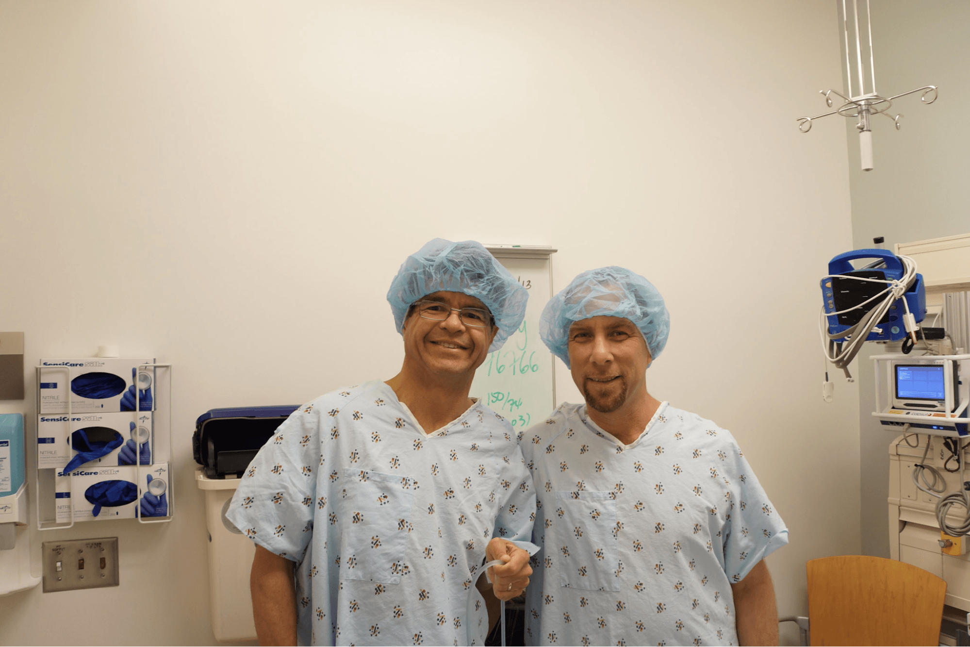
Nine years ago, Mark Shulman, the Senior Manager of Product Management for Tableau, donated his kidney to his best friend. After his transformative experience, he looked for new ways to raise awareness about the lifesaving need for kidney donation, and the people who benefit.

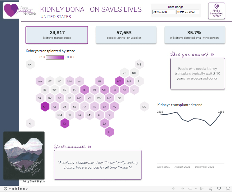
After recalling how he explained his decision to donate to his family and quelled their fears, Mark ideated leveraging Tableau to develop a straightforward, easy-to-use Kidney Transplant dashboard that provides insights for both potential donors and recipients.
“To convey the importance of my upcoming kidney donation to my then 11-year-old son, I said ‘If you could save your best friend Thomas by giving something that you had two of, you would do it right?’” said Mark. “However, swaying my partner to the idea required more convincing. I shared hard data about the safety of the procedure with near zero risk to my health and only a couple nights in the hospital. She told me it was the data that helped her overcome her fear.”“It dawned on me that raising awareness about the criticality of donating an organ whether during or after life could only be addressed through a combination of hard data and wonderful human stories of generosity and resilience.”
The Purpose
As part of Salesforce’s Volunteer Time Off (VTO) program, Mark dove into 20 years of organ donation data from the Organ Procurement and Transplantation Network – but quickly found he needed to bring in the true experts to navigate the jumbled, inconsistent data set. He recruited three Tableau Lead Solution Engineers specializing in Healthcare – Sarah Kerr, Cambria Brown, and Jared Sathaye – to help.

Since March 2022, the four have worked together to build an embeddable viz to help people learn more about the dire need of kidney donation and discover transplant resources near them.
“We created a Tableau dashboard that displays kidney transplant data by location,” said Mark. “It links to resources to find out more including being a living donor, sign-up for donor registry, etc.”
The Impact
As part of their broader efforts to empower those diagnosed with kidney disease, the Renal Support Network (RSN) raises awareness about organ donation, while encouraging innovation, research, and work within the community to help drive change. The nonprofit embedded the team’s “Kidney Donations Save Lives” dashboard on their website to educate and engage potential donors and recipients. The relevant, accessible tool – which also includes extracts that are easy to keep up-to-date – is a stark contrast to existing kidney data sites that require folks to be professional data analysts to interpret.
“Even if just one person decides to donate, or a recipient finds the transplant center that’s best for their needs, it will be well worth the effort,” said Mark. “Our VTO program is a powerful tool for doing good in the world.”
“Even if just one person decides to donate, or a recipient finds the transplant center that’s best for their needs, it will be well worth the effort.”
The Build
To tackle the challenge of analyzing a highly complex database with hundreds of fields and millions of rows of data, the team used Tableau Prep to clean, restructure, and connect the data with look-up tables to map where all the transplant centers are located to make finding the best location a breeze. By providing the ability to clean and combine disparate data without writing code and achieve a complete picture of the data, Prep accelerated the efficiency and accuracy of the analysis process – enabling the team to get faster, better insights.
“Throughout it all, Tableau Prep proved to be a really useful tool to us,” said Sarah. “In the past, we would have had to code all of this from scratch! It made it much easier for us to build different versions of the entire data cleaning workflow and figure out which version was ultimately the right one for [starting the analysis].”
For the actual viz, the team built a visual wireframe to ensure the dashboard could drive action – whether it was empowering the viewer to understand the background story, increase their awareness of the need for organ donation, or find a nearby transplant center to donate themselves. They leaned on Cambria’s design knowledge and expertise to create an elegant Figma template, and then uploaded it as a background image in Tableau in order to display interactive visualizations on top of the chart. They further innovated by adding a Hex version of the U.S. map that allows viewers to pick their specific geographic region with ease.
Throughout the build, RSN provided content such as compelling patient testimonials and “Did You Know?” facts to supplement the data and further spread awareness about the impact of organ donation. For example, they added that wait times for live donors could be as high as 10 years depending on blood type, and that some recipients inadvertently became inactive and were dropped from the waiting list if they had a health issue and forgot to update their status when they recovered. The nonprofit also provided feedback as the team went through different iterations to ensure the viz aligned with their needs.
“The folks at RSN provided design feedback, such as location of different elements on the dashboard, based on their knowledge of the audience who would be typically interacting with their website…and made sure the metrics we were reporting were accurate and relevant to the story we were trying to tell and the action we were promoting with the dashboard,” said Jared.
For publication, the team leveraged Tableau Public to allow the dashboard to be easily embedded anywhere on the web and shared freely with the platform’s vast number of Tableau Community members and data enthusiasts.
Mark credits Sarah, Cambria, and Jared for carving out time for months to deliver the dashboard and overcoming major technical challenges throughout the process.
“They were instrumental in delivering to a cause that is simply one of the proudest moments of my career,” said Mark. “I am so proud of what this team has accomplished.”
Explore the “Kidney Donations Save Lives” dashboard on Tableau Public, or embedded on the Renal Support Network’s website. Learn more about how to give back to your community through our VTO program here.


