Product Sales Volatility
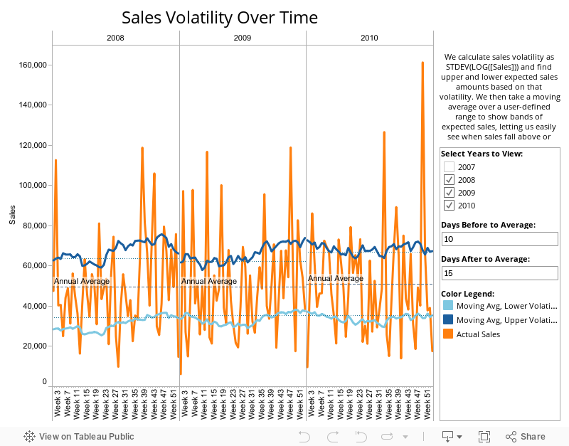
This example uses Superstore Sales data to create ‘Volatility Bands’. By plotting a user-defined moving average of upper and lower sales volatility alongside actual sales you can see when sales performed at extraordinary levels or fell far short. This type of view helps you abstract away from short-term movements in results and see outliers.
Want to get started creating your own Tableau visualizations? Try It for Free