Doing Good Data Means Doing No Harm


Editor's note: This article originally appeared in Forbes, by Renee MacLeod, Director, Inclusive Marketing
Data analysis and data communication are fundamental to the way people and businesses understand concepts, make decisions, and create solutions.
Anyone who communicates with data needs to be mindful of the impact of the stories they tell. Sometimes they can do more harm than good. The reality is that unintentional harm can result from data that is misrepresented or misused—from reinforcing damaging stereotypes to compounding systemic racism and discrimination.
To influence change and advance the understanding of what it means to use data with empathy and fairness, the Urban Institute, in partnership with Tableau Foundation, created the “Do No Harm Guide: Applying Equity Awareness in Data Visualization.” This resource offers data communicators actionable insights to help ensure their research, analysis, and visualizations incorporate principles of diversity, equity, and inclusion. As a group of growing data communicators and data-driven organizations, we all must recognize that data points are more than marks on a graph—they represent real people.
Inspired by a growing conversation
The idea to create the “Do No Harm Guide” grew in the wake of the Black Lives Matter movement. Its creators, Jonathan Schwabish, senior fellow at the Urban Institute, and Alice Feng, senior data scientist at Natera, wanted to use their data viz experience to contribute to the bigger, growing conversation about race. The focus of their work expanded as they conducted conversations with nearly two dozen experts, uncovering a greater necessity to examine how people and organizations collect data, where the data comes from, why it’s necessary to respect and include the people you research, and how to explore the entire research ecosystem.
Topics include:
- How the concept of empathy relates to data, research, and visualizations.
- What it means to approach data with an equitable lens.
- How racial stereotypes can be reinforced and groups can be harmed by data that is not grounded in principles of inclusion and fairness.
Key recommendations
In my conversation with Schwabish and Feng, it became clear that the guide should be an essential resource for any data communicator and organization, and that there is increasing interest in learning to do no harm with data. As Feng noted, “It’s an evolving document that will grow and expand as feedback is received, as the field matures, and as more people think about these issues.”
Let’s look at 10 recommendations from the guide that can help anyone who works with data be more aware of its impact and learn to become more mindful, empathetic, and inclusive when telling data stories and when talking about data with people or communities.
1. Critically examine your data
Before you begin to visualize your data, consider the context of your data. Equity awareness begins with gaining a holistic understanding of the story behind the data. Where does it come from? Who is included and excluded from it? How was it collected? Why was it collected? And who benefits or is harmed by it? As Feng and Schwabish note in the guide, “If I were one of the data points on this visualization, would I feel offended?”
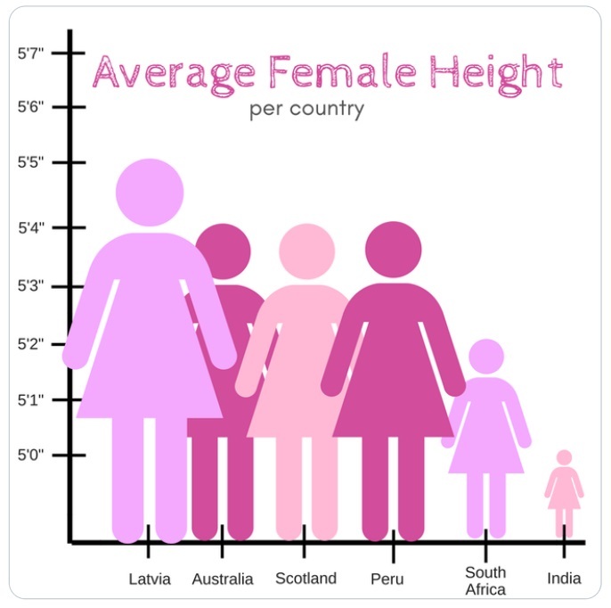
Figure 1: The size differential among people in this chart creates ambiguity about the intent and could be interpreted as offensive.
[Urban Institute, cited from @reina_sabah]
2. Use people-first language
If your data is about people, make it extremely clear who they are, remembering that your data reflect real lives and experiences. It could include your co-workers, prospects or customers, candidates, and more. Data labels should lead with the person, not their characteristics. In visualizations, you should strive to use people-first language: For example, “people with disabilities” is preferable to “disabled people.”
3. Label people, not skin color
Language is living, breathing, and ever-changing. It’s only logical that certain labels that were previously used are no longer acceptable. They might, in fact, be offensive. In your data analyses, the best approach is to use full labels, such as “Black people” not “Blacks.”
The language in the corresponding figure is not as inclusive as it could be. “Poverty” refers to an experience, not a static description, and “More Black” refers to skin color, not people. More inclusive language might be “Larger proportion of people experiencing poverty” and “Larger proportion of the Black population.”
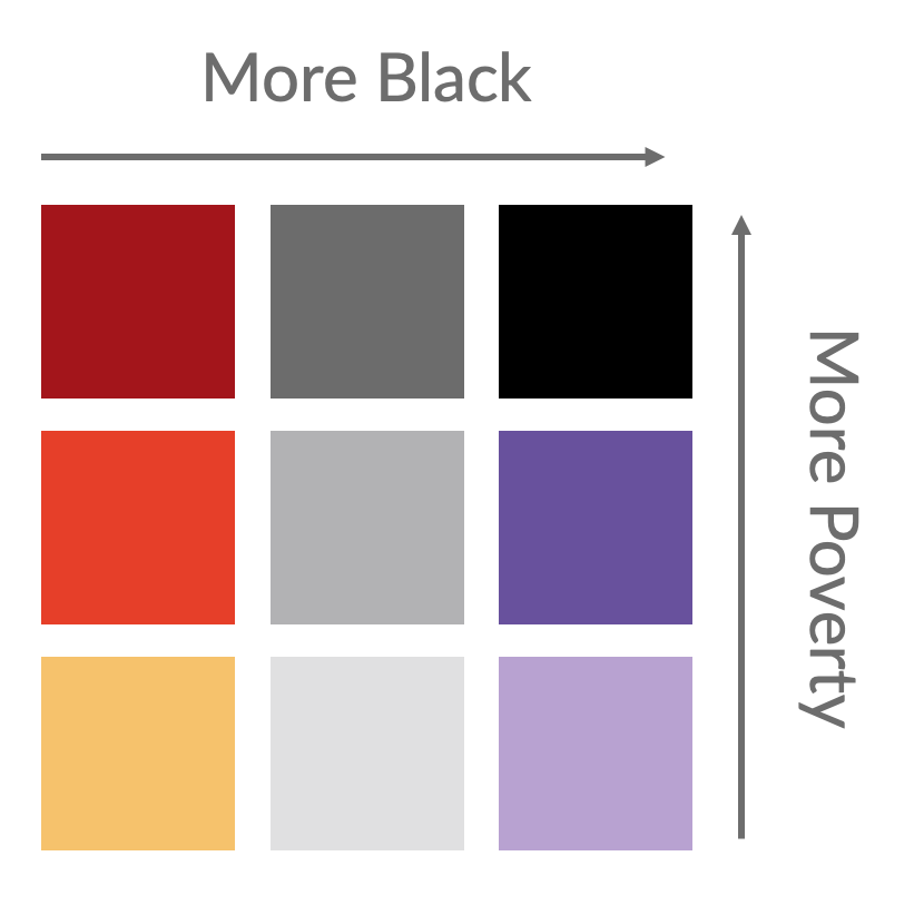
Figure 2. This legend was later changed from “More Black” to “Larger Black Population” to put emphasis on people, not skin color.
[Urban Institute, recreated from Tableau dashboard]
4. Order labels in purposeful ways
Have you stopped to consider who shows up first in a table, graph, or visualization? Surveys and other data collection methods frequently order responses hierarchically and in ways that reflect historical biases. It’s the order in which groups are listed in visualizations or narratives that can impact how the data is consumed or interpreted. Listing “white” or “male” first, for instance, can imply that it’s the dominant or more important group.
Consider alternative ordering or sorting, such as study focus, specific story or argument, quantitative relationship, alphabetical order, or sample size.
5. Consider missing groups
It’s important to acknowledge who is or is not included in data and charts. One way to do this is using notes and narrative that offer essential context for viewers who may not understand why groups are or are not represented.
Sometimes, there are charts that show data in broader racial groupings rather than at a disaggregated level where nuances are better understood. For example, in the United States, many charts on race and ethnicity only show white people, Black people, and Hispanic or Latinx people, but not other groups. According to Feng, “When reporting at aggregated levels, we miss lots of variation. This creates implications in understanding issues, knowing what people or communities need help, and what kinds of programs or policies to design that will make a difference.”
To demonstrate how aggregating racial groups can mask variations across more detailed information, the corresponding figure shows the estimated 2019 poverty rates for 139 racial groups recorded in the U.S. Census Bureau’s American Community Survey. Dots show estimated poverty rates for all 139 groups and the overall poverty rate for major racial groupings frequently used in analyses. As you can see, the poverty rate for some of these groups varies widely.
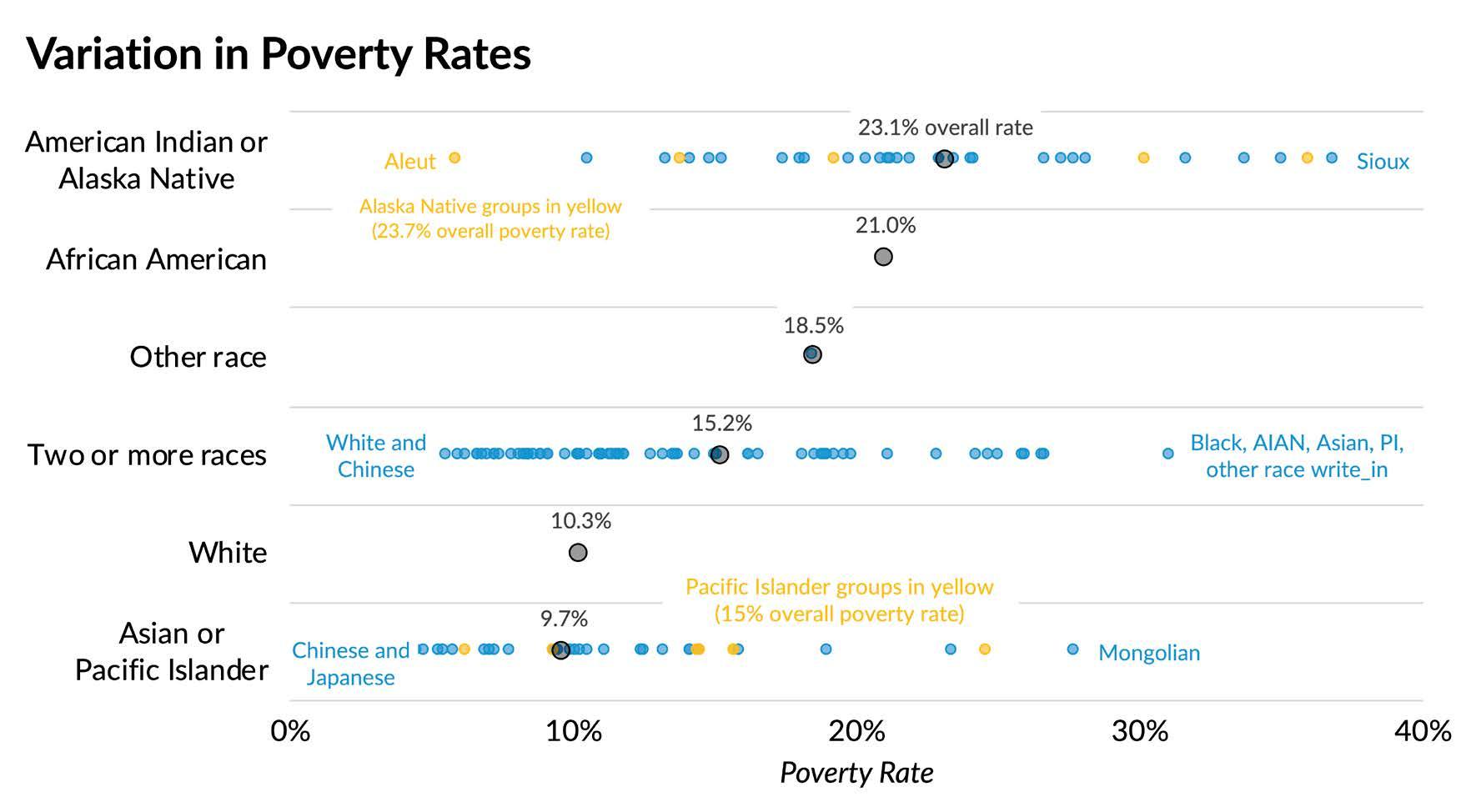
Figure 3: Disaggregated poverty rates across racial groups reveal variation that is missing when metrics are presented only for overall groups.
[Urban Institute, created from U.S. Census Bureau’s American Community Survey data]
6. Use color with awareness and care
The way we use color can inadvertently reinforce stereotypes, offend, and perpetuate inaccurate depictions of people and groups. To use color with the best intent, check your choices. Avoid colors associated with stereotypical gender labels—pink for women and blue for men, for example. Avoid colors also associated with skin tones or race, such as light-to-dark, or incremental color palettes indicating different demographics. And be aware of emotional connotations associated with certain color hues.
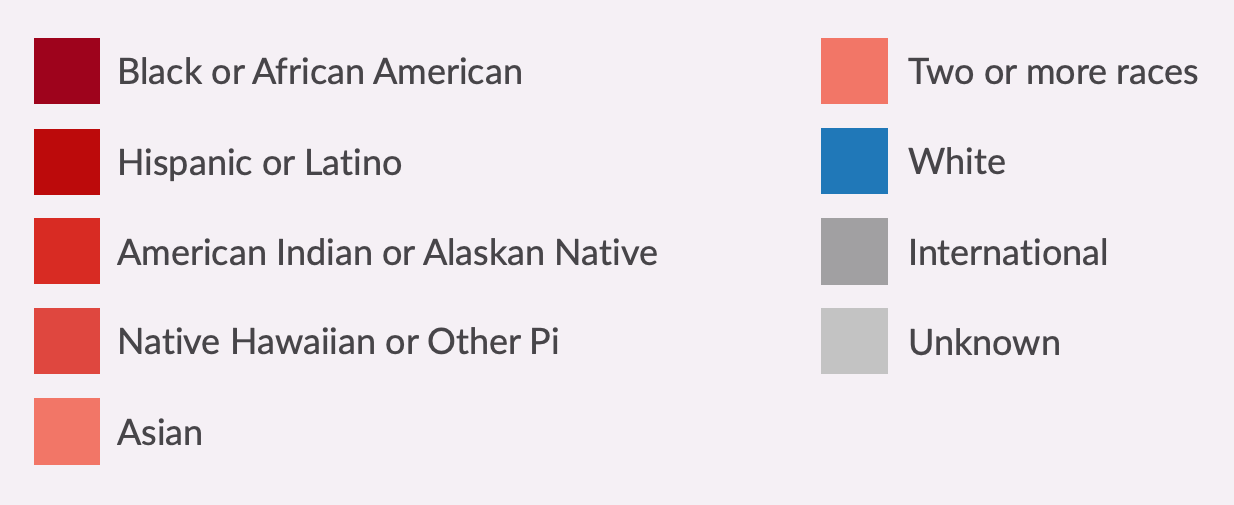
Figure 4: Legend showing a problematic color scheme applied to data on race and ethnicity. The shades of red apply to people of color while the only group that has its own color is white people, suggesting that they are the norm or default to which all other groups should be compared. Red can have negative connotations in Western culture—often associated with danger or aggression. The graduated color palette can also be misinterpreted as suggesting a hierarchy. See the guide for an example of a color palette without hierarchical connotations.
[Urban Institute, recreated based on the June 2020 version of the Diversity Dashboard from the Massachusetts Institute of Technology, Office of the Provost.]
7. Consider the impact of icons and shapes
Icons, by their very nature, are intended to convey broad meanings—but they can perpetuate harmful, offensive stereotypes when used carelessly. Choose them with intention. It’s essential that any and all stereotypical, discriminatory, and racist imagery be avoided; depict people as empowered and dignified versus being helpless.
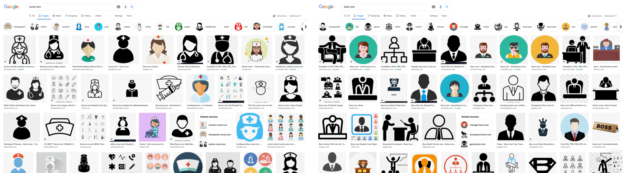
Figure 5: Image search results showing problematic stereotypes and biases. Google Images search results for the phrase “nurse icon” contain pages of images that we would identify as feminine, and a similar search for “boss icon” results in images that we would identify as masculine.
[Urban Institute, cited 2021 Google Images search results for “nurse icon” and “boss icon.”]
8. Reach out and involve communities
For data to be meaningful and relevant, it’s important to work with the communities at the center of it. According to Channing Nesbitt, social impact program manager at the Tableau Foundation, community input is key. “Without their guidance and hearing how they live through these experiences, it leaves out part of the information that needs to be displayed and shared,” Nesbitt said. Start with building diverse research teams, work closely with the communities studied, and receive buy-in from members, policymakers, and other stakeholders to help the research be embraced. Maintaining relationships also demonstrates commitment, partnership, and that you’ve listened to and clearly understand the collective voices.
9. Reflect lived experiences
We don’t all have the same life experiences. Our individual characteristics, such as ethnicity, gender, neurodiversity, and age, can deeply impact how we approach data and the ways in which we communicate it. To help identify what perspectives and viewpoints may be missing, consult people within and outside of your organization.
10. Understand the needs of your audiences
The value of data lies in how it is used, shared, and understood by intended audiences. As data communicators, we’re all responsible for ensuring that content is clear, unambiguous, and useful. This requires due diligence across all aspects of our work, striving to ensure that the word choices, terminology, and languages we publish in are fully optimized for audiences.
A path to more inclusive analytics
Ensuring that people are fairly represented is the cornerstone of diversity, equity, and inclusion, and for data communicators, it’s foundational to building credible, more equitable analyses. While there is no one-size-fits-all approach for organizations working to strengthen and expand their inclusion initiatives and do better with data, the “Do No Harm Guide” provides a solid framework for understanding the questions to ask, practical ways to drive inclusive thinking and strategy—and above all—how to lead with empathy.
To learn more from experts at the intersection of data and equity issues, download the “Do No Harm Guide,” visit the Racial Equity Data Hub, and watch this informative video.
Historias relacionadas
Learn the Basics of Well-Structured Data
 6 Diciembre, 2024
How To Spot Misleading Charts: Review the Message
 24 Octubre, 2024
How To Spot Misleading Charts: Check the Axes
17 Octubre, 2024