An Innovative Approach to Improving Healthcare Outcomes
Changes in the delivery of healthcare continues to be a leading subject throughout the country. A few Healthcare organizations are using innovative tools, such as Tableau Software, to better understand and react in order to improve healthcare outcomes. Improvement in health outcomes is based on providing better quality care at a reduced cost while still maintaining profitable operations in order to keep hospital and clinic doors open.There are multiple ways that healthcare organizations approach this – sometimes by reducing a patient’s length of stay. However, this can lead to a patient needing to be re-admitted for an unresolved medical issue. Are the long term costs of such an approach more costly than the short-term gains?


Changes in the delivery of healthcare continues to be a leading subject throughout the country. A few Healthcare organizations are using innovative tools, such as Tableau Software, to better understand and react in order to improve healthcare outcomes. Improvement in health outcomes is based on providing better quality care at a reduced cost while still maintaining profitable operations in order to keep hospital and clinic doors open.There are multiple ways that healthcare organizations approach this – sometimes by reducing a patient’s length of stay. However, this can lead to a patient needing to be re-admitted for an unresolved medical issue. Are the long term costs of such an approach more costly than the short-term gains?
This is a guest post by Ted Corbett. Ted is the founder of Viztric, a business intelligence and data visualization consultancy focused on healthcare. Viztric, based in Seattle, Washington, helps all organizations find the middle ground between business and IT to drive business improvements while delivering powerful business intelligence and data visualization solutions.Improving Healthcare Outcomes
According to Medicare, 17.8 percent of patients were readmitted within 30 days in 2012. Though the rate fell in 2013, it could represent up to $300 Million in penalties to hospitals nationwide.
Though I have spent several years working with Tableau in the healthcare industry, I thought it would be great to better understand what others throughout the industry are handling these challenges. In this article three innovative organizations and individuals are each looking at the problems of readmissions in uniquely different ways.
- Judson Howe from Adventist Hospital discusses how Tableau helped reduce time to deliver information to providers about readmissions
- Mark Jackson from Piedmont Healthcare illustrates how Tableau was used to reduce readmissions resulting in improved patient satisfaction scores.
- Jonathan Drummey from Southern Maine Health Care illustrates new ways to visualize readmissions to lead to reductions in readmissions
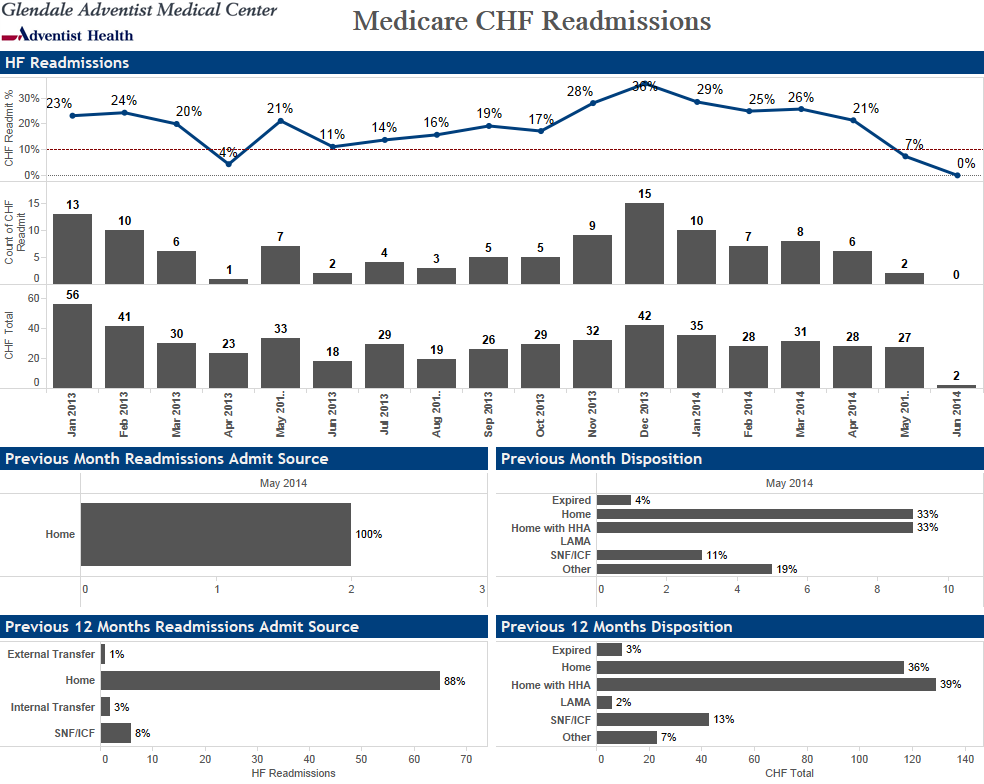
To overcome the new challenges presented by the Affordable Care Act and avoid penalties, hospitals and providers must find better solutions to understand and react to the new conditions. Judson Howe, Director of Business Intelligence (BI) at Adventist Hospital in Glendale California said, “Dashboards are more about monitoring what happened in the past. Analytics and the use of Tableau Software helped us understand why it is happening.”
Judson is one of a handful of innovative leaders providing advanced solutions to help providers better understand readmission rates in their organization. By better understanding the types of patients being readmitted, Adventist can help providers enact process improvements resulting in improved patient care. Judson stated that his organization used Tableau to reduce readmissions to the lowest levels in more than 2 years. Adventist's focus on Acute Myocardial Infarction, Community Acquired Pneumonia and Congestive Heart Failure illustrated the results while tracking more information required than Centers for Medicare and Medicaid Services (CMS) required. The dashboard below reduced the time to deliver details about readmissions from months to minutes.
At Piedmont Healthcare in Atlanta Georgia, Mark Jackson shared his organization’s readmissions dashboard below. According to Mark, Tableau was instrumental in a project called “Patient First” that focused on quality improvements. Mark said, “We’ve seen some real benefits from the Patient First project, which allowed the physicians to really focus all their attention on one patient-centered activity at a time. We’ve seen a 50% improvement from benchmark of cardiovascular length of stay, a 10% reduction in heart failure readmissions, and a 12% reduction in readmissions heart attack patients. And overall, that’s improved our patient satisfaction scores by 7%. In addition to helping us set up the new physician schedules, Tableau has helped us track the results of our efforts for all phases of Patient First."
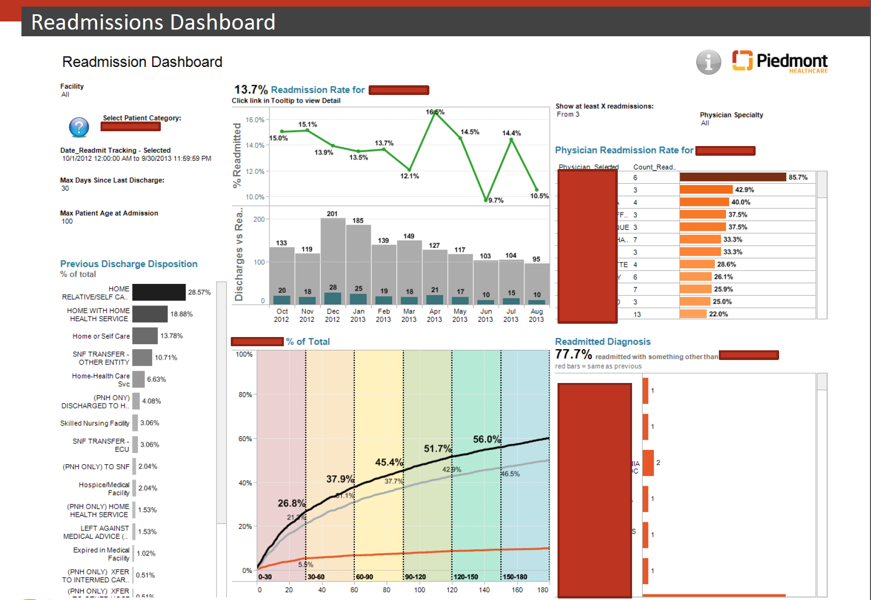
The Readmissions Dashboard presented by Mark Jackson is a great representation of what can be done with Tableau to illustrate what is possible to a broad cross-section of the organization.
Evaluating for Root Cause
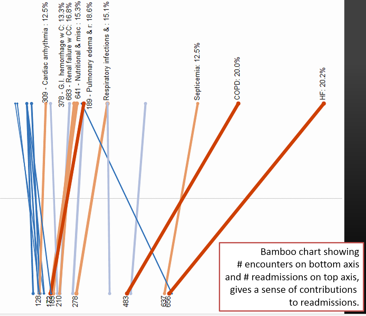
One of the benefits of using Tableau as a data discovery and analytics tool is to help determine the root cause of readmissions. In the following view, Jonathan Drummey from Southern Maine Health Care uses an innovative “bamboo chart” to illustrate the relative rate of readmission for a variety of diagnostic risk groups (DRGs). In this illustration it is very clear that both Chronic Obstructive Pulmonary Diseases (COPD) and Heart Failure (HF) are two of the biggest contributors to readmissions.
In another visualization, Jonathan uses a rank functionality to explore the differences between cases with the most total discharges vs. those with the highest readmissions rates. One may think that the number of readmissions would parallel the number of discharges for a given DRG. In the illustration below, COPD and Acute Myocardial Infarction (AMI) show the highest readmission rates while the 2 Heart Failure DRGs have the overall highest # of discharges and readmits.
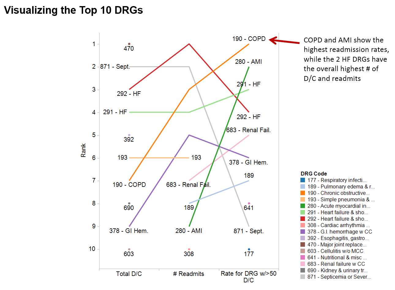
Jonathan said, “These two visualizations helped inspire the creation of a COPD working group that implemented a number of the recommendations of the Pittsburgh Regional Health Initiative (PRHI). The working group is still gathering data, early returns are showing a similar reduction in COPD readmissions as was seen by PRHI’s research.”
These three organizations presented very different visualizations highlighting the power of Tableau in a healthcare setting. These different approaches helped leaders focus on the areas important for their organizations and communities. A single out-of-the-box solution would not have been as effective at helping these organizations drive increased value to help improve patient outcomes and reduce costs.
Suscribirse a nuestro blog
Obtenga las últimas actualizaciones de Tableau en su bandeja de entrada.