Explain Data, Explained


Explain Data is an autoML feature in Tableau that lets anyone ask “Why?” questions about their data. Why are sales down this month? Why did people ride bikes more in August? Run Explain Data on any mark or data point in a viz that you want to understand better. Tableau will build and test statistical models of the data, including unvisualized data from your workbook, to build possible explanations of why your selected mark is high or low.
Today, I’ll walk us through the various explanations that can be surfaced in the order that they would appear in the Explain Data panel. I’ll discuss what can and can’t be concluded for each type of explanation. Then I’ll go into more technical details of how Tableau decides whether or not an explanation is good (feel free to skip this section!).
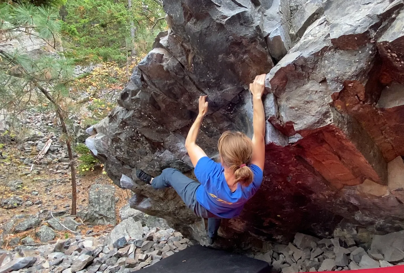
At Tableau, I am a Principal Data Scientist, working on augmented analytics features such as Explain Data. But I’m also an avid rock climber: I boulder and trad climb (but, strangely, I don’t sport climb! Bouldering = climbing boulders with pads and people spotting to protect a fall; sport climbing involves ropes and clipping into bolts drilled into the rock; trad or traditional climbing involves ropes also but gear should not alter the rock and be cleaned after the climb).
For this post, I’ll analyse a climbing dataset that compiles survey responses from over 500 climbers. Questions ranged from height and weight to specific details of training for climbing. I’ll look into how these aspects relate to the bouldering grade that they climb at.
Boulders are graded in North America by the V-grade system and rate the level of difficulty; they go from V0 (pretty easy) to V17 (climbed by only 2–5 people, pending grading consensus on three very hard boulders). Note that not all ‘V10 climbers’ (the climbers that can boulder V10) are alike: there’s the climber who focussed all year and only climbed a single V10 vs the climber that can do several in a session. That’s a huge source of noise in this data!
Extreme Values
I expect bouldering grade to correlate highly with various strength metrics — pull-ups, finger strength, etc — but when it comes to core strength, visualized here as the maximum duration of a hanging L-sit, the climbers with the highest average value only climb V6. While this is the most commonly climbed max grade for the male respondents, it’s not even half the hardest grade climbed in this dataset. The world record is under 2 min and yet the average for V6 climbers is over 3 times higher!
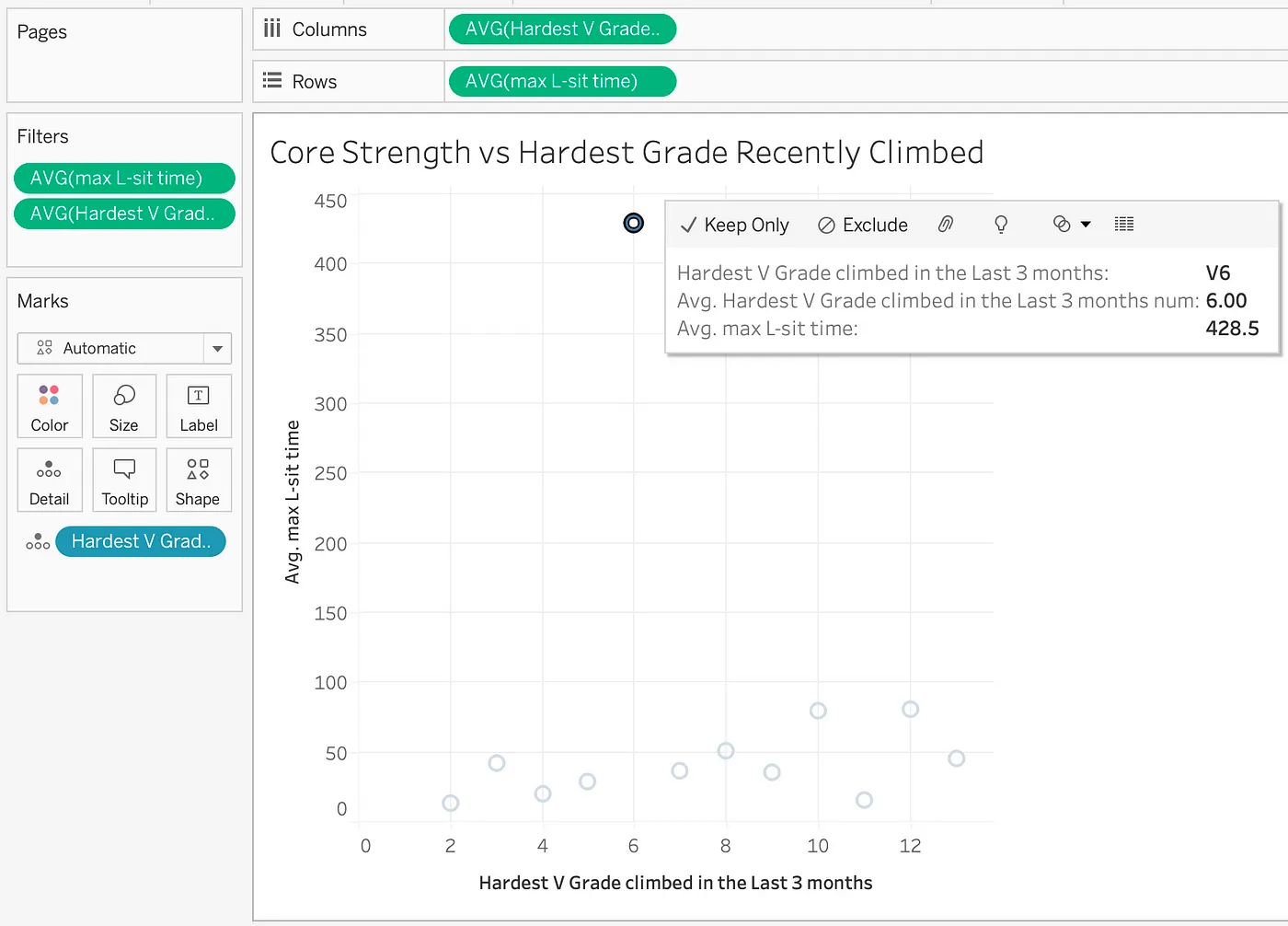
To explain this suspiciously high L-sit time, select the V6 mark and then click on the lightbulb. Each of the 2 measures in the viz is shown but I’ll start by investigating the AVG(max L-sit time) by clicking into that tab. The first explanation we see is:
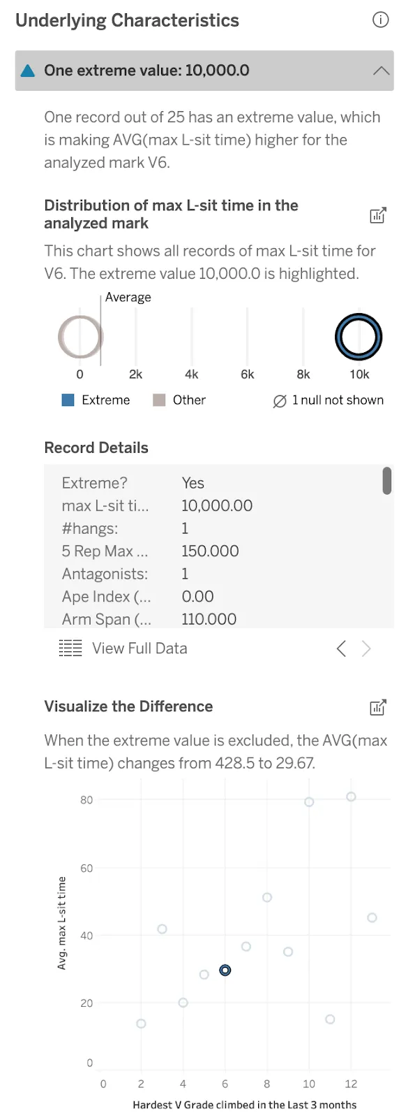
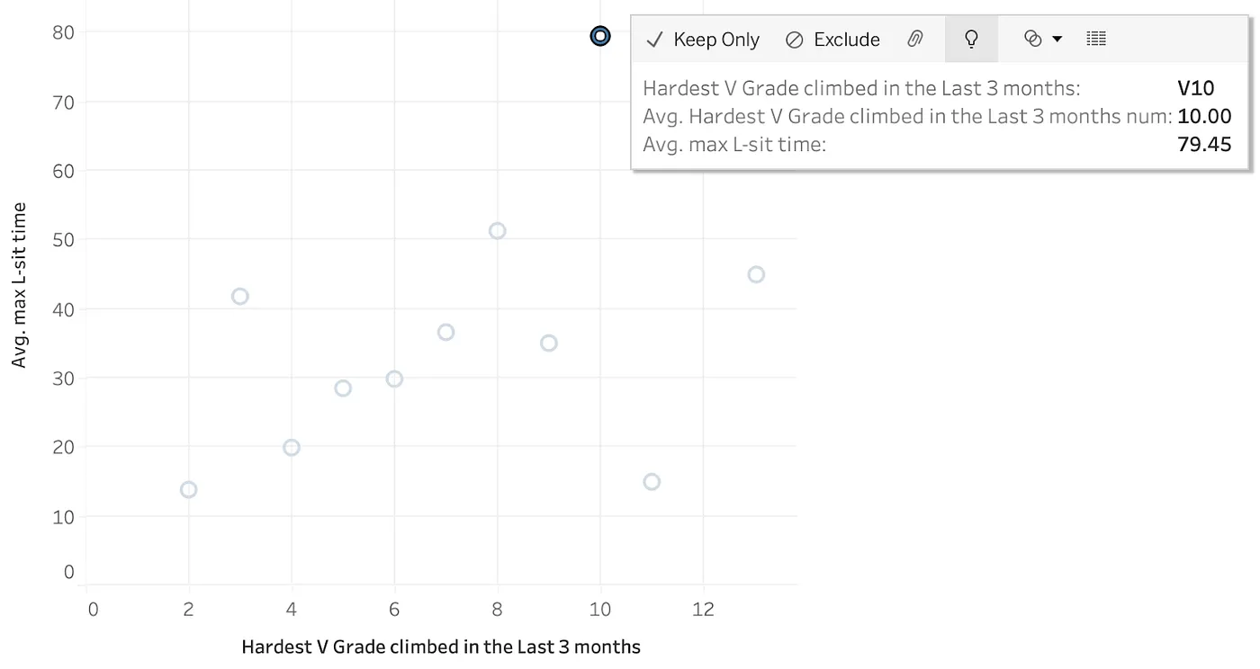
Out of all of the records for V6 climbers, one climber had an L-sit time of 10,000 seconds! Given the world record is under 2 min, this value must be wrong. Explain Data calls out this extreme value and shows record details for the suspicious record: many other values are suspicious so I want to drop that entry entirely. The next viz does that for me: now with a far more reasonable mean L-sit time of 30s, the V6 climbers follow the overall trend. I can pop out that viz as a new sheet and keep working without that entry.
Explaining V10 Climbers
As a climber myself, what I really want to know is how to climb harder grades. Can the data help me direct my training? Now I’ll explore the V10 climber data (V10 is a grade that’s high but can be climbed by quite a few climbers in this dataset — Explain Data requires at least 5 rows to explain a mark).
Contributing Dimensions
For Contributing Dimensions explanations, an unvisualized dimension (or the single value of one) is used to predict the bouldering grade. Here are the top results.
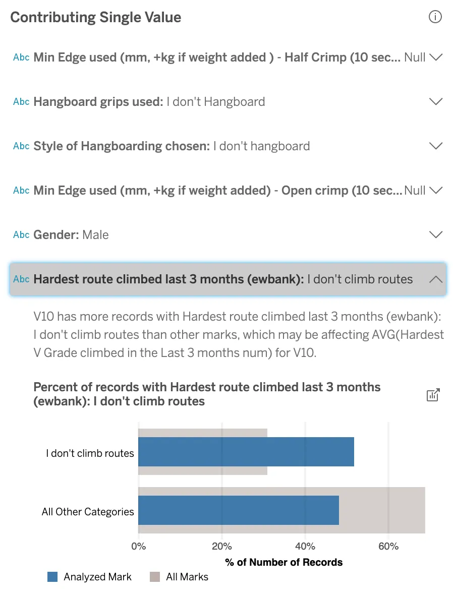
Just over half of the climbers who’ve climbed a V10 in the last 3 months don’t do any kind of roped climbing, answering “I don’t climb routes”; compare that with only 30% of climbers who boulder at any grade. Furthermore, the fraction of responses “I don’t climb routes” increases with bouldering grade.
I have explored this climbing data before and haven’t discovered this particular explanation: clearly, there should be a trend between the climbing grades, but I hadn’t considered the Nulls as predictors of the other. AutoML like Explain Data is especially good at looking at all combinations, even the “silly” ones, and sometimes it finds startling insights. To be more like the stronger climbers, I should hang up my ropes and focus on bouldering.
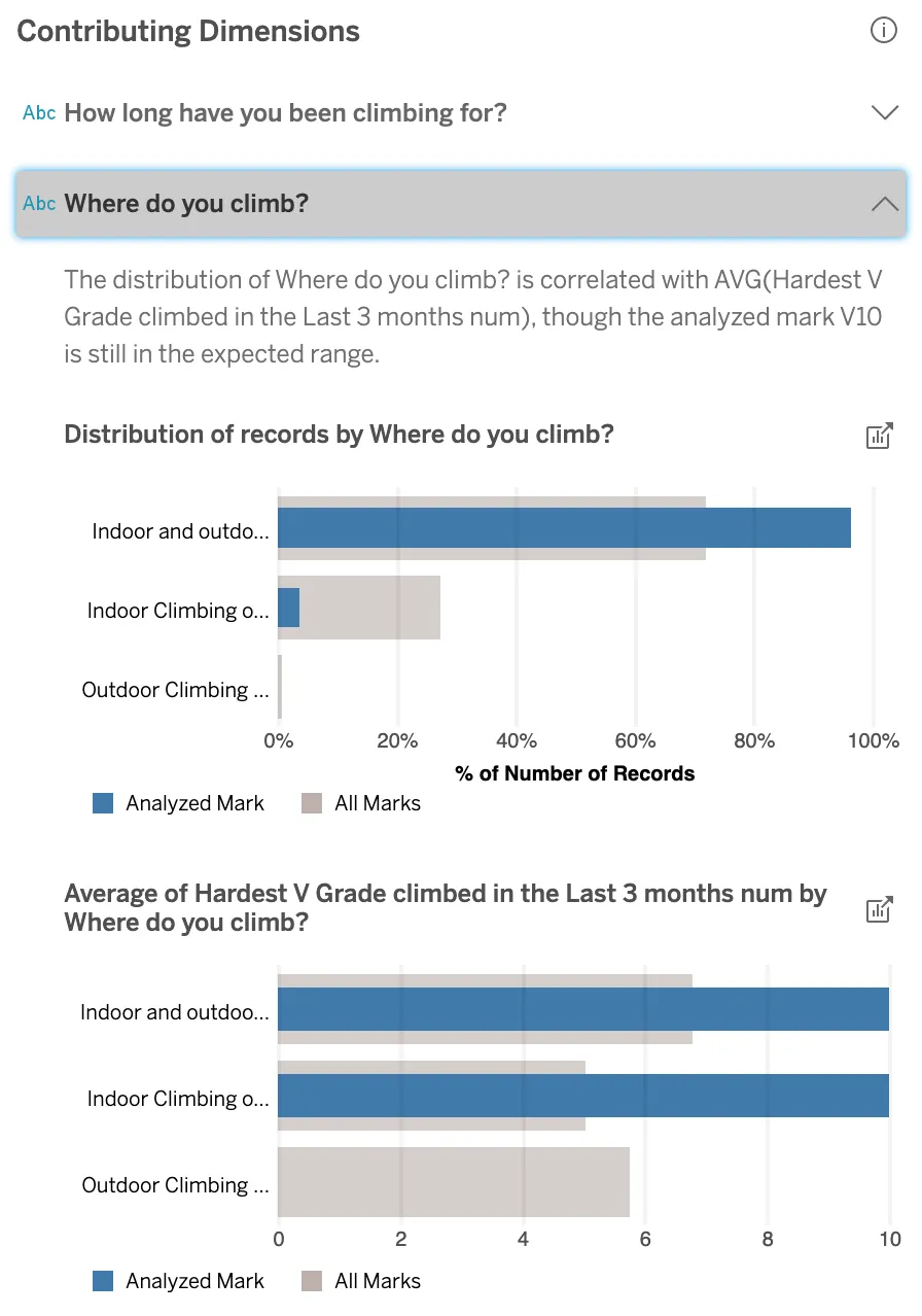
The explanation given by “Where do you climb?” considers all three values: climbers that climb inside or outside or both inside and outside. The higher grade climbers are more likely to climb both indoors and outdoors; only a few V10 climbers climb only indoors. Lucky for me, I started bouldering outdoors!
Contributing Measures
The explanations in this section use the average of an unvisualized measure to predict climbing grade. Here are the results:
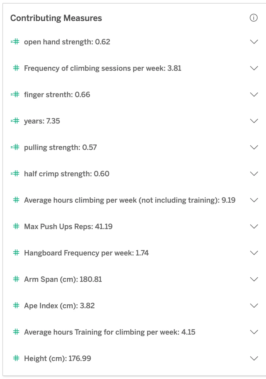
I see all the expected correlations: strong climbers have stronger fingers (purported to be the strongest predictor of climbing level), they climb more, train longer, are stronger generally, are taller, and have a longer arm span. Seems I just have to double to triple each of the relevant strength measures (and increase my training to get there), and grow another ~8cm taller and ‘spannier’. This is where I run into one of the limitations of any kind of analysis like this — the algorithms used by Explain Data can tell me what differentiates a V10 climber, but they don’t have any knowledge of which variables I can actually control!
Other things to explore
Back at the root level of the Explain Data pane, we can click through to see “What is unique about V10?”, completely independent of either measure in the viz (more details on scoring to come). This category of explanations might include totally random information, such as the percentage of climbers with blue eyes, or what kind of pet they own (if that were in the dataset). There may or may not be an actual relation with climbing grade but, in this section, the explanations highlight only what makes V10 climbers different.
V10 climbers weren’t unique and have no explanations in this section. To find some, consider instead a viz of the average ‘hardest V grade ever climbed’ across all months of the year. Why is November higher than other months? I shouldn’t expect many meaningful explanations for this peak (however, November is downtime for many climbers and possibly a good time to complete surveys).
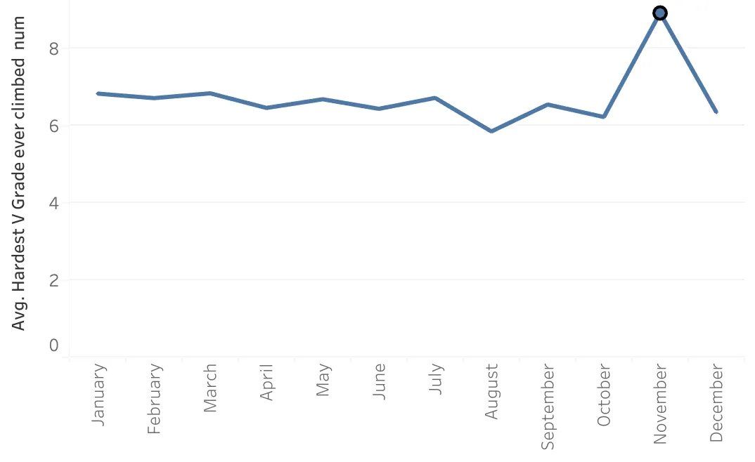
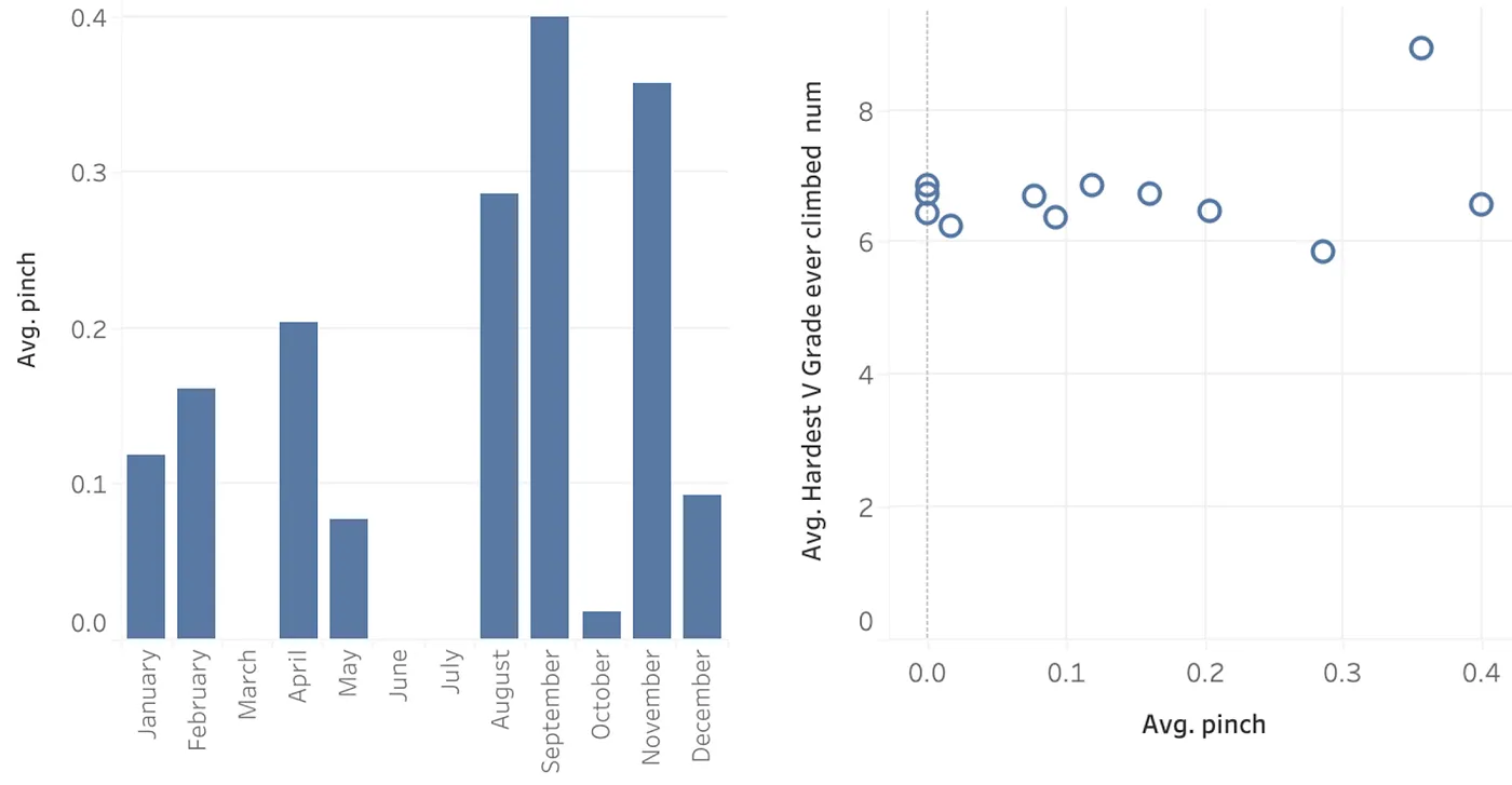
November has a standout high fraction of respondants that train pinches (either by hanging hands pinched to a block or pinching a heavy block and lifting it), but there is no discernible trend in bouldering grade as a result of training those pinches. This is why this explanation is called out as something that makes November unique, but isn’t offered as an explanation for a climber’s grade.
A dimension returned only as unique may still be a good explanation: the model may not be able to learn from the other marks to explain this one <em>because</em> it’s so different from the others. Use domain knowledge to pick out what is worth pursuing further.
Scoring Model-Based Explanations
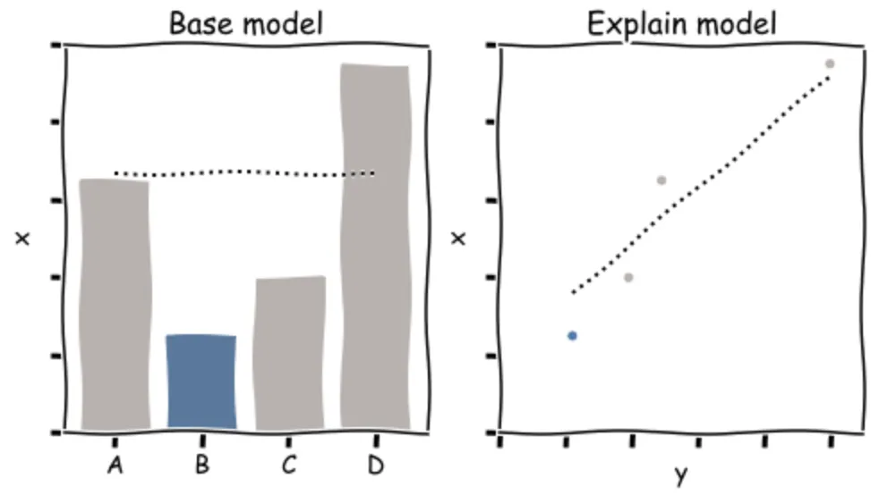
Most of the explanations under the measure tab are <em>model-based explanations</em>. If a model including an unvisualized dimension or measure performs better than without, that dimension or measure is possibly <em>contributing</em> to the target measure. Under the “What is unique about V10?” tab, Tableau lists unvisualized dimensions along which the mark is rather different compared to the other marks.
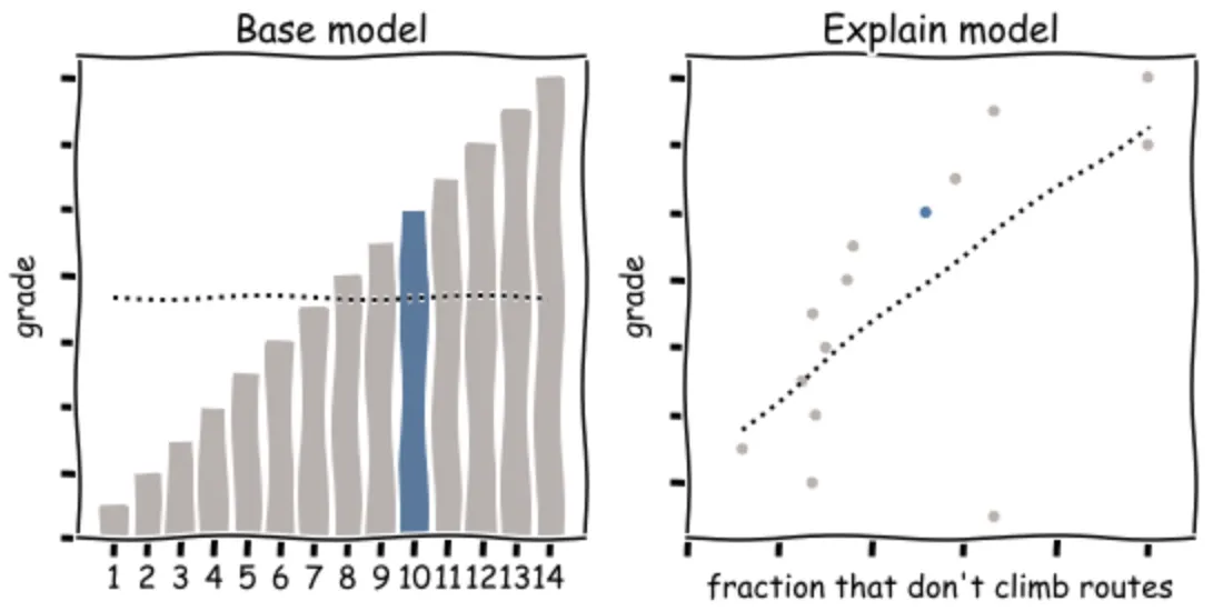
The models being compared are two regression models of the target measure. Every model is fit to the marks, excluding the mark being explained. First a base model is fit using the visualized dimensions as predictors (if there are at least 2); when there are no predictors, the base model is just the average over other marks (left in the figure). Next, one by one, all unvisualized dimensions and measures in the dataset are used as additional features in the explain model (y in the right plot of the figure).
Each model is evaluated by the mean absolute fit error and the error in predicting the held out mark. The quality of the explanation is scored by comparing the errors of the two models. Roughly speaking, the score is a weighted average of the relative fit and predict errors, with adjustments to counter possible overfitting and a lucky prediction on the single held out mark (with an anomalously low prediction error most likely gotten entirely by chance).
Our models use ridge regression with a regularization constant of 0.1; visualized dimensions are one-hot encoded; unvisualized dimensions are modelled using the rate across each of the top 10 values as predictors; unvisualized measures are averaged to the viz level of detail and modeled to second order; measures and rates alike are normalized.
Are all model-based explanations just finding strong correlations? Not only: the explained mark is not in the training set and the relation must generalize to predict it well. Explaining a different mark may have different explanations. Are all explanations also a strong correlation? If we mean linear correlation, then, again, no: we include quadratic order of measures and they might actually have zero linear correlation.
Scoring of Other Explanations
Non-model based explanations are evaluated differently. These include the Extreme Values (though some are model-based) and unique mark explanations shown with the climbing data in this article.
Extreme Values are row level values that are separated by at least 1.5x the interquartile range (the middle 50% of the data) from at least 75% of the data.
For unique mark explanations, the distribution of values across an unvisualized dimension in the mark is contrasted with that of the other marks; if the marks’s distribution is different enough from the distributions of other marks, this explanation will be displayed.
How to use Explain Data
Explain Data makes it easier to exhaustively explore a new dataset. It will consider all unvisualized dimensions and measures as predictors of the target measure; it looks for outliers at row-level within the mark and odd behaviour of the mark itself along unvisualized dimensions. But Tableau doesn’t know which correlations are spurious, has no understanding of the direction of causality (does being strong enable the climber to boulder V10 or does bouldering V10 make the climber strong?), and doesn’t know which variables I can control (training habits) and which ones I can’t (height and arm span). What I do with the explanations will then rely on my “domain expertise”.
Of course, any tool is only going to be as good as the data you put in, and any findings will mirror the bias inherent in the dataset. How would our findings have changed had the climbing survey recruited from a juniors team, or at a climbing gym, or at the physiotherapist’s office (where so many climbers end up after over-training)?
Explain Data and Augmented Analytics
Explain Data isn’t about closed loop analysis — it can’t be with autoML — but rather to keep the human in the loop. Could you find everything Explain Data shows you on your own? If you have the expertise, sure, but it would take a long time and you might miss something; otherwise, maybe not.
What might you find in your data?
Zugehörige Storys

Which Model Speaks Your Data Language? A User-Centered Approach to Evaluating LLMs for Conversational Visual Analytics
 14 April, 2026
Rethinking How Data Workers Revisit Analytical Conversations and Communicate Insights
 10 April, 2026
Stepping through Charted Territory: Creating Interactive Step-by-Step Dashboards Tours
 8 Juni, 2025