Design Inspiration for Unique Visualization with Diatoms


This is a blog post is associated with the paper “Generative Design Inspiration for Glyphs with Diatoms” by Matthew Brehmer, Robert Kosara, and Carmen Hull, which will appear in a forthcoming issue of IEEE Transactions on Visualization and Computer Graphics in early 2022. You can also watch an explainer video. A recorded video presentation of this project from the IEEE VIS 2021 conference is also forthcoming.
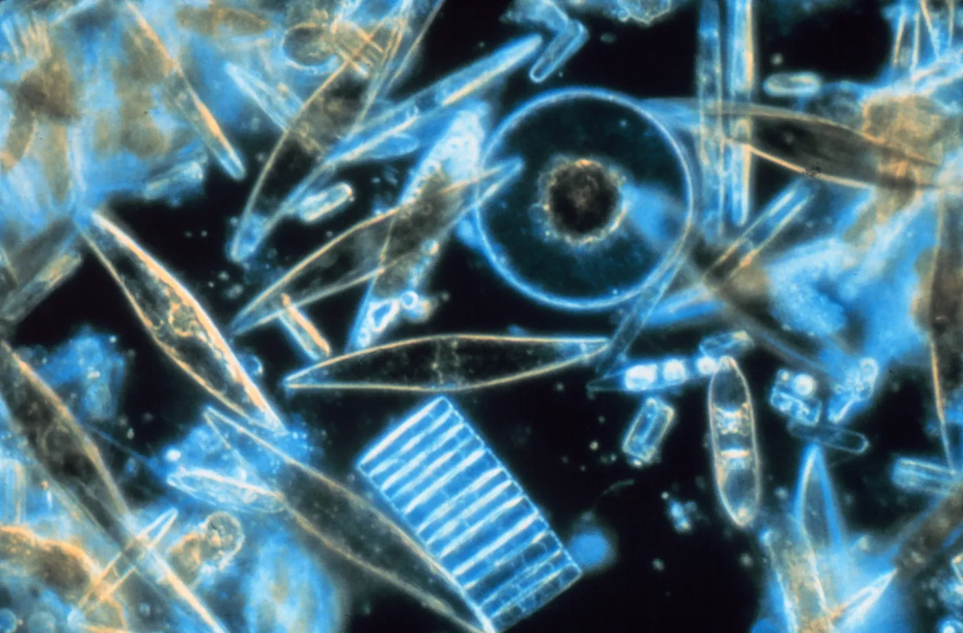
Diatoms are microscopic algae that exhibit an incredible variety of shapes, colors, and sizes. Producing a similar visual variety, Diatoms is also the name of our new experimental technique for generating design inspiration for a particular form of visualization: a multidimensional glyph.
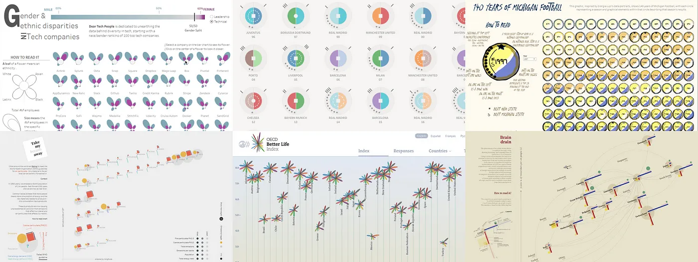
A glyph is a small visual object that depicts attributes of a data record, where we assign data dimensions to one or more marks and their visual variables. As the following examples show, glyphs often appear in small multiples grid configurations, where each glyph corresponds to a row of data. Glyphs can also be used in spatial configurations beyond a small multiples grid, such as by positioning them according to quantitative scales, or using them as representations for nodes in a network diagram.
The process of constructing glyphs in visualization authoring and illustration tools is tedious and challenging (particularly in Tableau), but before they are constructed, glyphs must first be designed, and this design process is what we focused on.
Our Diatoms technique generates alternative glyph designs by sampling from palettes of visualization design choices. It is a provocatively different approach to visualization design: rather than manually specifying mark types and assigning visual encoding channels to these marks, it instead asks designers to specify meta-design rules that respect relationships in their data and to curate permutations of design choices constrained by these rules.
Diatoms also combines the process of generating design inspiration with interactive design externalization, a way of comparing and winnowing alternative candidate glyph designs. Finally, it embraces the ethos of Generative Design, a practice that combines repetition, randomness, and logic. The goal of this practice is to generate many alternative designs and encourage divergent thinking, with the hope of avoiding some premature commitment to one point in a design space.
How the Diatoms Technique Works…
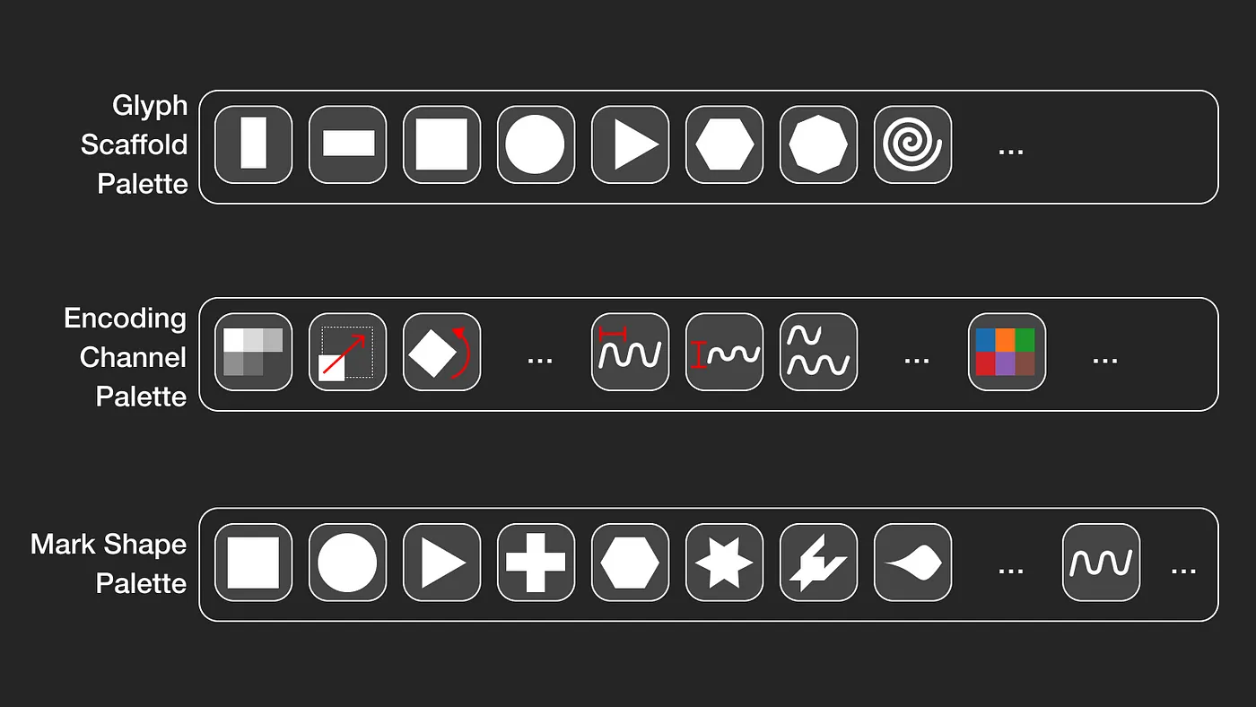
At a basic level, Diatoms generates glyph designs by sampling from a palette of mark shapes, a palette of visual encoding channels, and a palette of glyph scaffold shapes that determine the spatial arrangement of marks within a glyph. In this blog post, we use one set of example palettes; in practice, you could substitute any of these palettes with those of your own choosing.
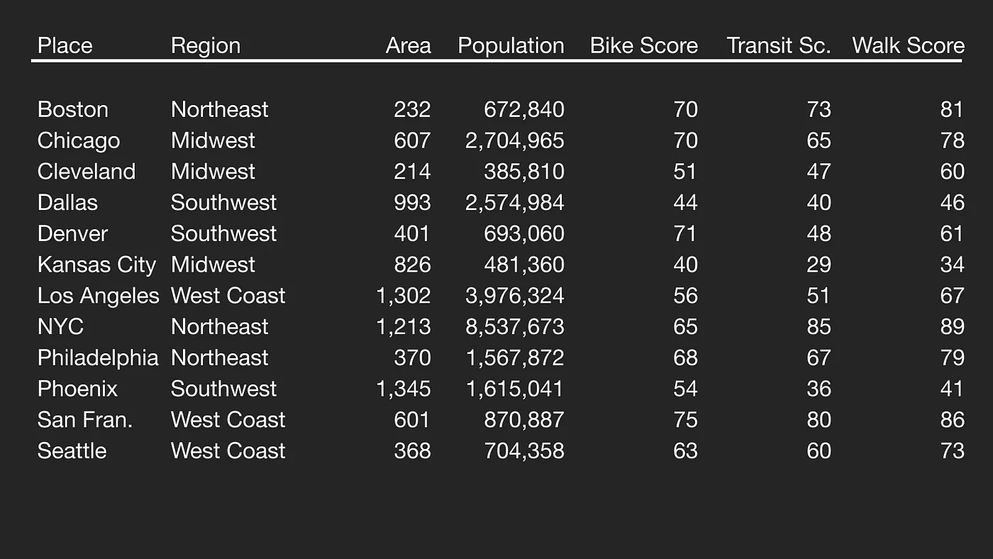
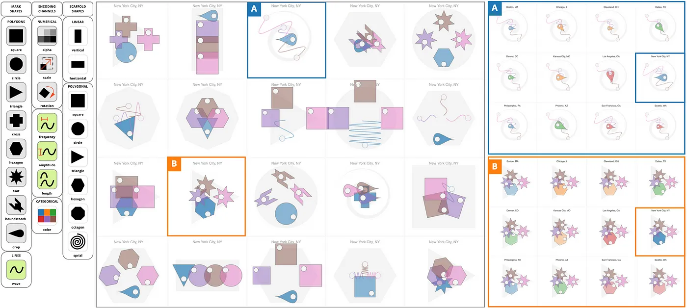
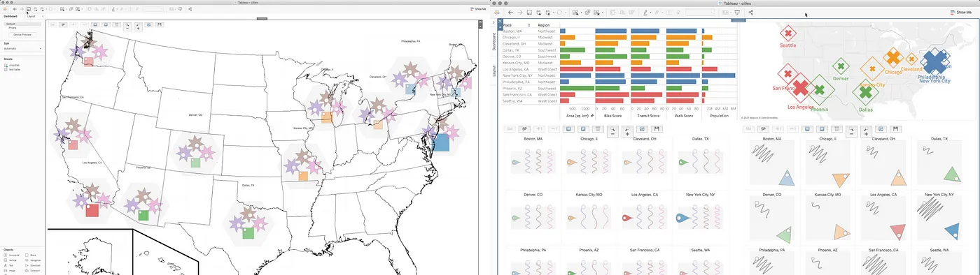
Let’s walk through an example in which we start with a small dataset about the urban mobility of several major US cities, working toward the examples shown at the beginning of this post.
The first step is to designate sets of related columns. In this case, we reserve the name of the city as a label, and we designate one set as descriptive attributes of a city (its region, its geographical footprint, and its population), while the second set is a set of urban mobility scores: the walk score, bike score, and transit score, all on a 0–100 point scale.
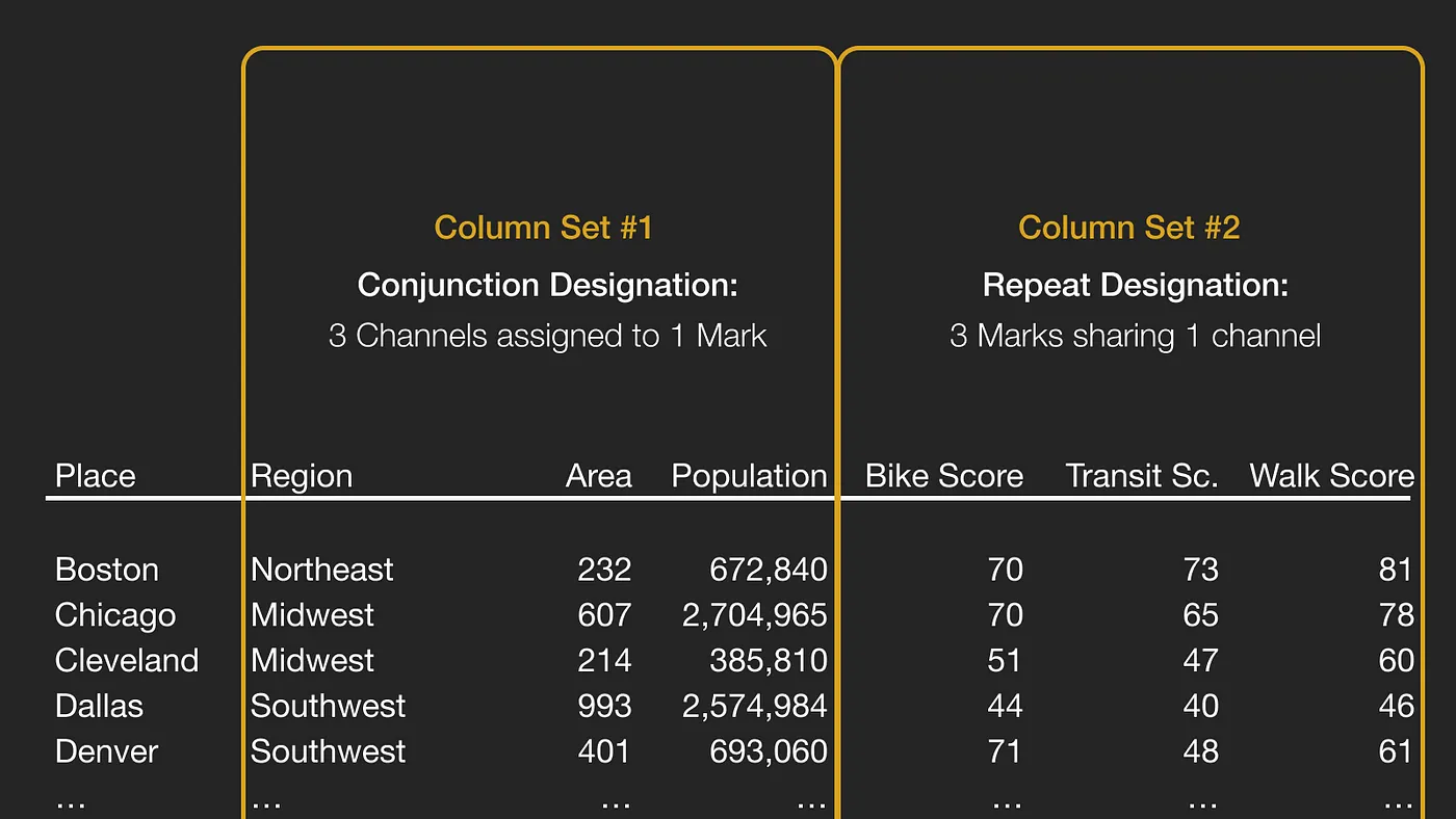
The next decision is to designate how these sets will correspond to marks and encoding channels. The choice is between a conjunction designation and a repeat designation. A conjunction designation generates a single mark, with a unique channel assigned to each column; this is ideal for the first set since these columns are of different type and are not directly comparable with one another. In contrast, a repeat designation assigns a unique mark to each column, and these marks will share a common shape and encoding channel because the values are directly comparable.
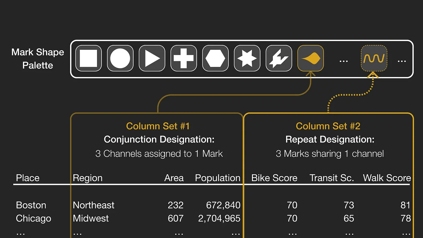
Given these set designations, we randomly sample from the mark shape palette. We sample without replacement, meaning that once a mark is selected for one set, it can’t be used for another. In this case, the first set gets assigned a drop shape, while the second set gets assigned a wave shape.
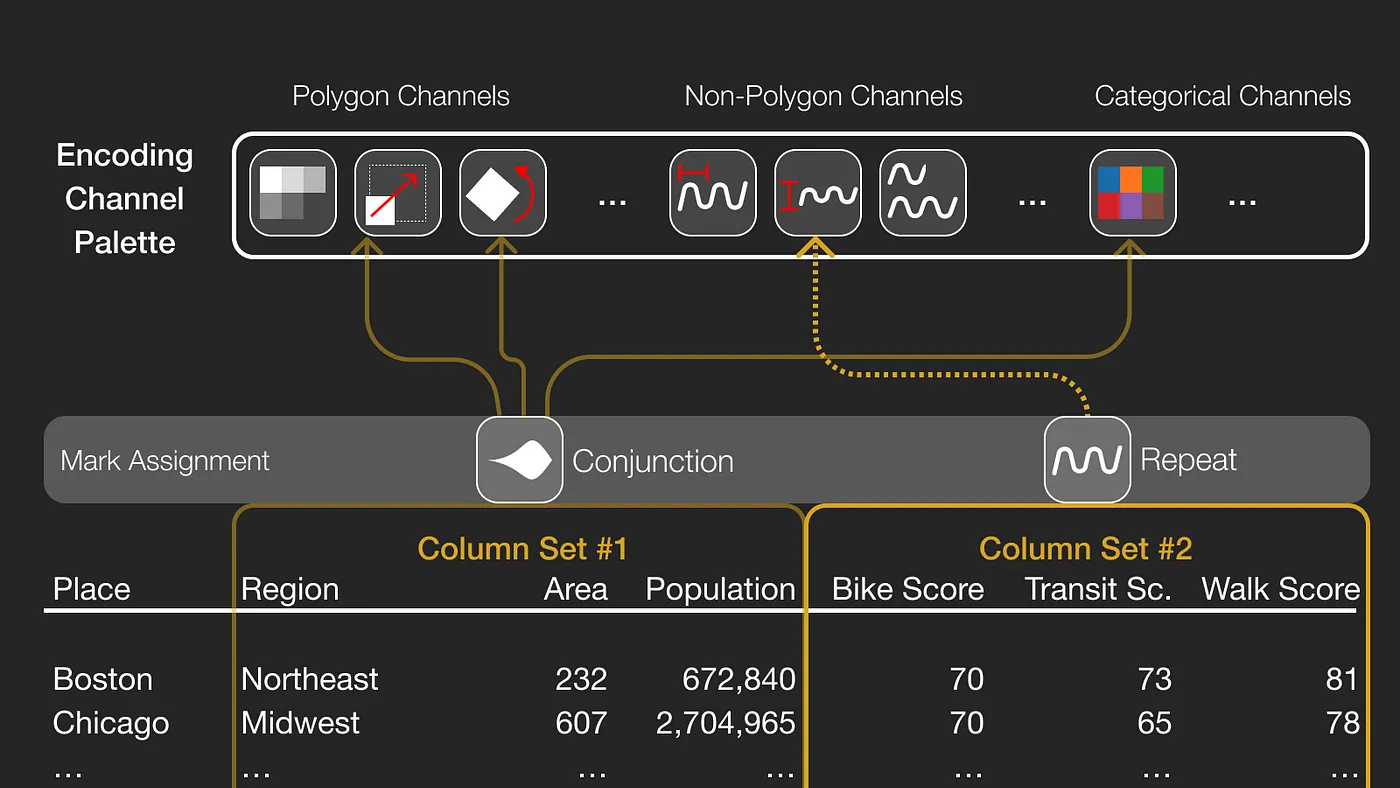
The next step is encoding channel assignment. This palette has channels for polygon marks, some for non-polygon marks, and categorical channels that could apply to either. Upon sampling, the first column set is assigned three channels. Because this set has a conjunction designation: color is assigned to a city’s region, while mark size is assigned to its footprint, and mark rotation is assigned to its population. The second set has a repeat designation, so despite having three columns, they only get one channel: in this case, each urban mobility score is assigned to the amplitude of its corresponding wave mark.
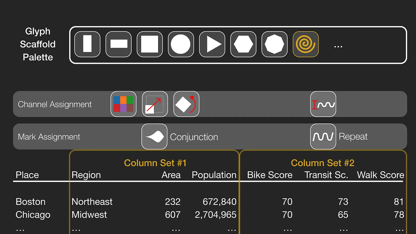
The third step is assigning a scaffold shape to the glyph, which determines how the marks are spatially arranged. In this case, the sampling selects a spiral shape. Finally, one last consideration is what we call the gravity of a scaffold, or how compact the marks are relative to the center of the scaffold. In this case, random sampling returns a weak gravity, meaning that marks will extend beyond the periphery of the scaffold.
With each of these assignments made, let’s look at the resulting design (we’ll call it “Design A” in the image below), where it’s possible to see the high mobility scores of New York City with its high amplitude wave marks, whereas Los Angeles is large in terms of geographic footprint, smaller in terms of population, and having noticeably lower mobility scores.
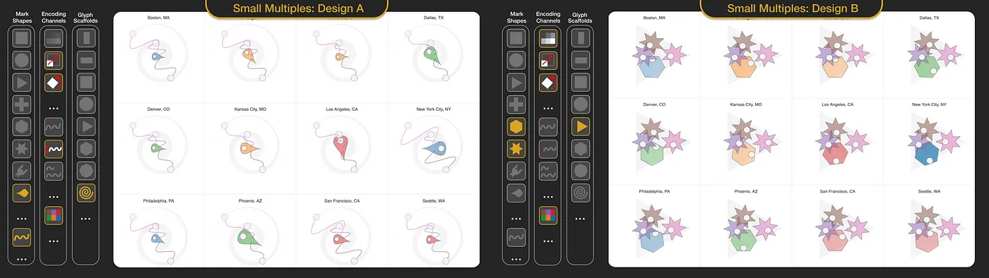
For comparison, let’s contrast the palette assignments of Design A with those of Design B. In the latter case, we have a triangle scaffold with a stronger gravity, a hexagon is assigned to the conjunction column set: now a city’s population is assigned to the mark’s fill opacity and its footprint is assigned to the mark’s rotation, as indicated by the location of the white “pip” within each hexagon. The three star marks represent the repeat column set of urban mobility scores, also using the rotation channel to encode these values.
To summarize, Diatoms samples across three palettes. Until now, we’ve only seen this process applied twice, to what I’ll call Design A and Design B, both shown in small multiples configurations. However, this process can be applied any number of times. Below we see the same data point (in this case, New York City) drawn according to many different designs, in a configuration that we’re calling small permutables.
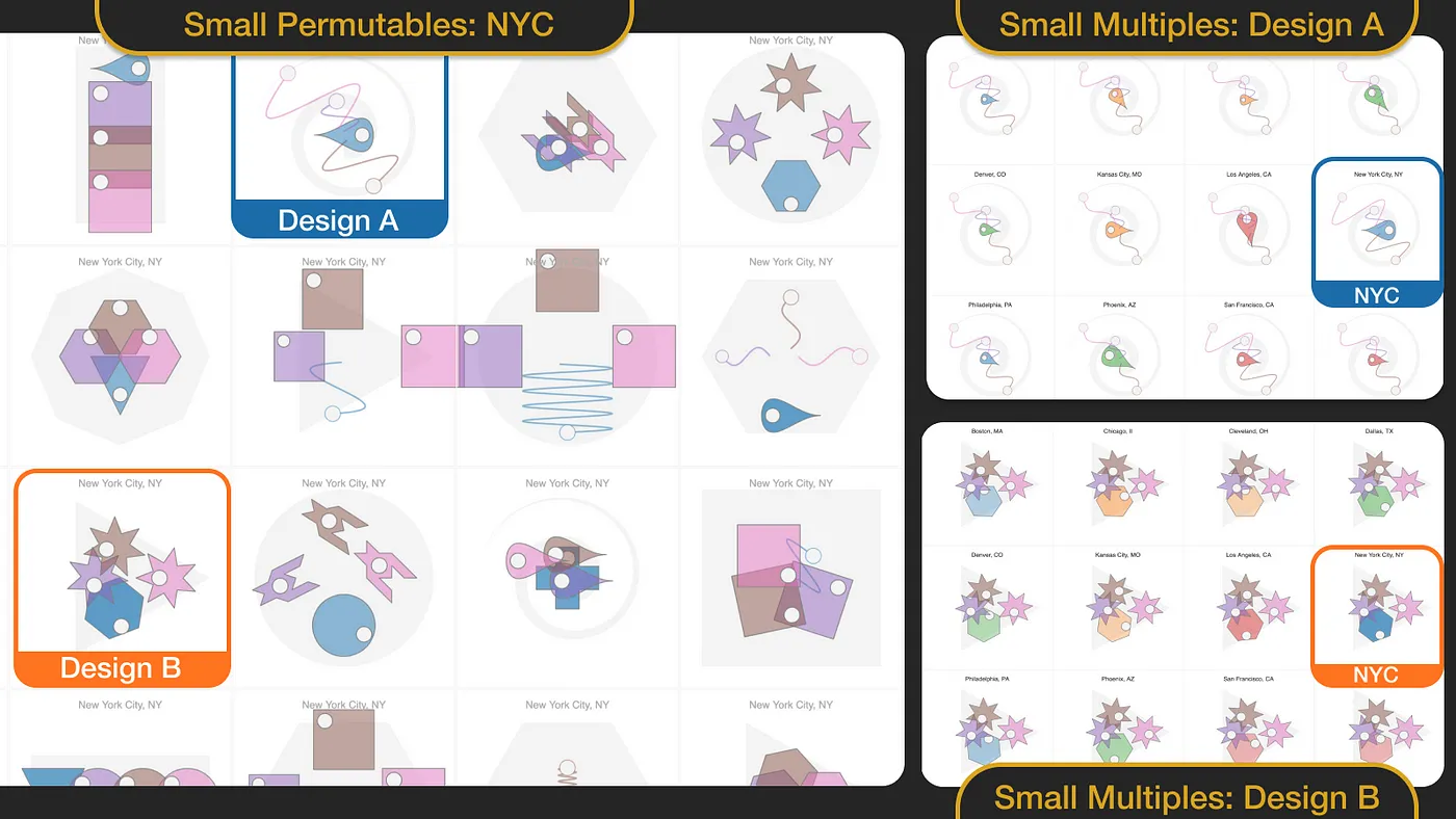
Beyond sampling from visualization design choice palettes, the second key aspect of the Diatoms technique is design externalization, or the ability to quickly compare alternative designs and toggle between two modes: small multiples for comparing multiple data points according to the same design, and small permutables for comparing multiple designs using the same proxy data point.
Demonstrating Diatoms as a Tableau Dashboard Extension
To demonstrate the technique, we implemented Diatoms using Tableau’s Dashboard Extension API. We implemented Diatoms in JavaScript and used p5.js to render the glyphs to a canvas element.
Our implementation allowed us to specify the set designations, generate and compare designs in either small multiples or small permutables configurations, understand the assignments from column to mark shape and encoding channel with on-demand legends, winnow unpromising designs, and evaluate the potential of designs at different sizes or in different spatial configurations beyond a grid.
There were two side-benefits of implementing our technique in Tableau: the ability to superimpose candidate glyphs designs on to other charts or maps, as well as the ability to combine alternatives glyph designs against conventional representations in a Tableau dashboard.
The Evolution and Evaluation of the Diatoms Technique
It may seem as though our shape and channel palettes, the column set logic, and the design externalization modes were planned from the outset of the project, however in reality these choices follow an evolution lasting many months; and this iterative refinement of design choices and rules is fairly typical for generative processes. Our research paper delves into many of the tradeoffs and design decisions that we encountered throughout this process.
Our paper also documents our preliminary attempt to understand the potential of Diatoms for inspiring visualization design. It contains excerpts and a thematic analysis of conversations with 12 designers, where we asked them about their current design processes and conducted chauffeured demos of our prototype implementation of Diatoms. Overall, designers’ reactions to our proposed technique was quite enthusiastic, however there’s plenty of more nuanced reactions to Diatoms discussed in our paper.
What’s Next for Diatoms?
We see several opportunities for extending and incorporating Diatoms into visualization design practice.
With our prototype implementation, we could generate, compare, and winnow designs; the next step would be to tweak or fine-tune promising designs, or perhaps breed two promising designs to see related designs that combine their mark and channel assignments.
Integrating Diatoms into an end-to-end visualization authoring process is another obvious next step, and designers should ideally be able to use palettes of their own choosing within these integrated authoring environments.
Finally, we don’t yet have evidence to suggest if Diatoms could serve an analytical function, such as by providing a visual calibration as a preventative measure against apophenia (seeing patterns where there are none). Or perhaps a sample-generated glyph design could uncover insights that had been previously unnoticed with conventional visual representations?
If you’re excited about the potential of Diatoms, read the full paper and let us know what you think! And if you want to learn about other Tableau Research projects, visit research.tableau.com.
Zugehörige Storys

Which Model Speaks Your Data Language? A User-Centered Approach to Evaluating LLMs for Conversational Visual Analytics
 14 April, 2026
Rethinking How Data Workers Revisit Analytical Conversations and Communicate Insights
 10 April, 2026
Stepping through Charted Territory: Creating Interactive Step-by-Step Dashboards Tours
 8 Juni, 2025