In celebration of Black History Month, we're taking a closer look at how Du Bois’s visualizations for the Paris Exposition were innovative.Alle Visualizations Storys

Data visualization resources for analysts of all skill levels
 9 Juli, 2019
Beyond the hook: Building information experiences for attention and engagement
 26 Juni, 2019

Iron Viz at TC Europe struck a chord with music data
 21 Juni, 2019
Design secrets we can learn from historic visualizations
 17 Juni, 2019
Problemlose Analysen georäumlicher Daten mit zwei neuen räumlichen Funktionen: MakePoint und MakeLine
 13 Juni, 2019
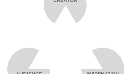
Creating, not designing: The four goals of every information experience
13 Juni, 2019
How I overcame the vector map learning curve
 31 Mai, 2019

Effective data visualizations share this magical hidden structure
29 Mai, 2019
Critiquing data visualizations: A discussion on channeling empathy and productivity
 10 Mai, 2019
The 3 waves of data visualization: A brief history and predictions for the future
 27 Februar, 2019
So finden Sie die besten Quellen für kostenlose und öffentlich zugängliche Datensätze
 26 Februar, 2019
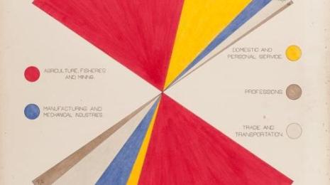
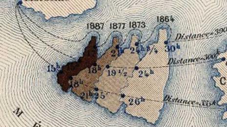
How W.E.B. Du Bois used data visualization to confront prejudice in the early 20th century
 20 Februar, 2019
Visualizations
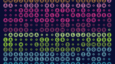
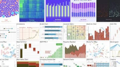
Looking for data viz resources? Use this list to explore best practices, get inspired by data viz podcasts, and dig into words of wisdom from the Tableau community.
Visualizations
Every audience’s interaction with an information experience begins with choice. Zen Masters, Lilach and Mike explore what factors influence choice.
Visualizations
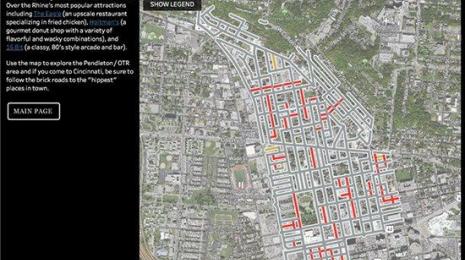
Iron Viz Europe is the ultimate data showdown where data rockstars from across Europe compete live on stage with the same data set to determine who will be crowned the European champion. This year, Anna Dzikowska (Poland), Simon Stusak (Germany), and Tristan Schouten (Netherlands) went head-to-head in a viz battle for the ages. Check out the vizzes and discover who rose above the rest.
Visualizations
RJ Andrews discusses design secrets we can learn from eight historic visualizations that have stood the test of time.
Visualizations
Für alle, die Standortdaten verstehen und räumliche Muster erkennen möchten, führt Tableau zwei neue räumliche Funktionen ein, mit denen Standortdaten einfacher denn je analysiert werden können.
Visualizations
Guest bloggers Lilach Manheim and Mike Cisneros explain four goals behind a dataviz design philosophy that will help you create more meaningful information experiences and outcomes.
Visualizations
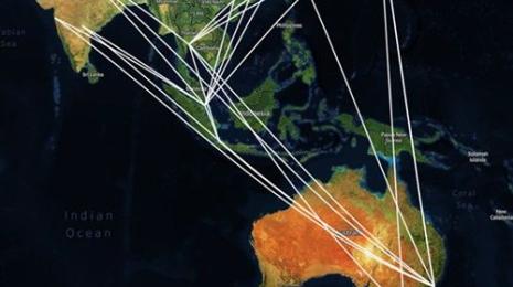
New to vector maps? Here's a breakdown of vector tile mapping from the perspective of a mapping novice.
Visualizations
Effective data visualizations share a magical hidden structure—but what is it? Check out our latest post to find out.
Visualizations
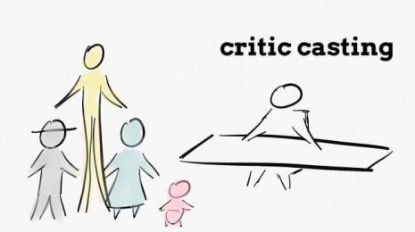
Data Visualization Designer Alli Torban shares different approaches to critiquing data visualizations. She also shares thoughts and discussion points from other data viz professionals around giving critique and feedback.
Visualizations
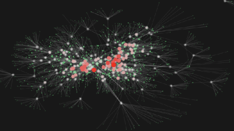
Data enthusiast Elijah Meeks provides an overview of the waves of data visualization throughout recent history—and shares how this history has culminated in a third wave of data visualization.
Visualizations
Jacob Olsufka gibt Tipps, wie Sie den perfekten Datensatz für Ihr nächstes Datenvisualisierungsprojekt finden können.
Visualizations