Wenden Sie im Handumdrehen eigene Formatierungen auf Ihre Tableau-Visualisierungen an, indem Sie eine Stilvorlagen-Arbeitsmappe erstellen.Alle Visualizations Storys

Put Down Your Mouse and Step Away from the Screen! Here's Why
 2 Juli, 2015
What 17th Century Pioneers Can Teach Us about Sharing Ideas
25 Juni, 2015
Sparen Sie Zeit mit Stilvorlagen und etablieren Sie Ihren eigenen Stil
 12 Juni, 2015
Sometimes One Number Tells the Whole Story
11 Juni, 2015

Alberto Cairo’s ‘Little Gems’: 5 Lesser-Known Books on Data Visualization
 10 Juni, 2015
Vizzing the UK Election: Comparing Values over Two Time Periods
28 Mai, 2015

Vizzing the UK Election: Showing Ranks over Time
22 Mai, 2015

What William Zinsser Taught Us about Visualizing Data Well
 20 Mai, 2015
Vizzing the UK Election: Rethinking Stacked Bars with Ghost Marks
12 Mai, 2015

3 Visualizations that Make the Avengers Even More Awesome
 1 Mai, 2015
Top 15 LOD-Ausdrücke

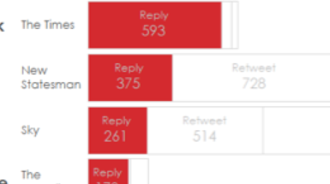
What Do the Media Say During the UK Elections?
2 April, 2015
Visualizations
Our goal is to communicate effectively with data. Software tools provide nice templates for you to show your data. But sometimes the inspiration won’t come from the screen; you're likely to get something better from a piece of paper. If you’re trying to come up with a better way of communicating your insights, step away from the screen and take up the pencil.
Visualizations
How do you know your work is effective? And how can you improve it?
One way is to emulate the 17th century coffeehouse patrons who led the age of Enlightenment.
Visualizations
Visualizations
Having powerful tools can sometimes be a problem. It can encourage us to overcomplicate what should be a simple task.
When finding business value in your data, you should be ready to hold back and remember the KISS acronym: Keep it simple, stupid.
Visualizations
Alberto Cairo first began visualizing data in 1997, when there were few books on the subject. “And obviously we didn’t have social media to connect to each other, or even weblogs,” says Alberto, who teaches data visualization at the University of Miami. Alberto is delighted things have changed since. These days, data explorers have a trove of resources to turn to, including each other. In the spirit of community, he recommends these “little gems”—lesser-known worthy reads for data explorers.
Visualizations
What's the best way to compare two categories over time? We'll explore the options in this final post in our UK election series.
Visualizations
Often the raw values are not as important as the actual ranks. This is true in sports, politics, and any instance where final positioning is more important than the actual values. As with all chart types, showing the data in one way means a compromise. A bump chart hides the underlying raw values.
Visualizations
As I read On Writing Well by the late William Zinsser, it struck me that his advice for communicating well with words applies directly to the craft of communicating visually with data. His seven principles in Part I—the transaction, simplicity, clutter, style, the audience, words, and usage—could be written about visualizing data as well.
Visualizations
Throughout May, we’ve been analysing how the media used Twitter in the UK general election. I’m going to do a series of posts on my favourite charts from the project, explaining why they were useful and how they show data in unusual ways.
Visualizations
"The Avengers: Age of Ultron" hits theaters today, and as data geeks, we’re pretty excited to see all the data it generates. Between movie reviews, social media mentions, and box office numbers, tons of data is going to be created this weekend.
Of course, data about the Avengers has been available for a long time. After all, Marvel first introduced the superhero team back in 1963!
So to celebrate the new release, we rounded up our all-time favorite visualizations about the Marvel universe.
Visualizations
Tableau Software hat sich das Ziel gesetzt, Daten für Benutzer sichtbar und verständlich zu machen. Mit unseren gut durchdachten Funktionen können Benutzer ihren Daten Ausdruckskraft verleihen. Ein Schwerpunkt liegt dabei auf Berechnungen. Je einfacher Ideen in einer Sprache für Berechnungen ausgedrückt werden können, desto verständlicher können sie für Benutzer dargestellt werden. Die Einführung von LOD-Ausdrücken in Tableau 9.0 bedeutet einen Durchbruch in diesem Bereich. Dank der neuen Ausdrücke können Benutzer mit einfachen Anweisungen komplexe Sachverhalte ausdrücken.
Visualizations
Here in the United Kingdom where I work, we’re counting down until the general election on May 8. It’s a fascinating election as our nation comes to grips with coalition politics. The extent to which the media controls the outcomes of elections is important and yet hard to quantify. This has become harder since the advent of social media. This year’s event is being called the social media election, and diverse organisations such as the BBC and Buzzfeed will be covering it using their own distinct styles. What does the data tell us?