 Tableau Public
5 Ways to Use Tableau Public to Achieve Your Goals
 มกราคม 11, 2025
Kickstart your personal and professional goals with Tableau Public—a free online platform that allows users to explore, create, and share data visualizations.
มกราคม 11, 2025
Kickstart your personal and professional goals with Tableau Public—a free online platform that allows users to explore, create, and share data visualizations. Tableau Public
World Mental Health Day: Elevating Awareness Through Data Visualization
 ตุลาคม 10, 2024
See how transforming data and statistics into clear and compelling visuals fosters empathy and drives awareness by making abstract numbers relatable and engaging.
ตุลาคม 10, 2024
See how transforming data and statistics into clear and compelling visuals fosters empathy and drives awareness by making abstract numbers relatable and engaging. Visualizations
From TV Screens to Tableau: Visualize Your Favorite Shows with IMDb
 สิงหาคม 31, 2024
Tableau Visionary Kevin Flerlage shares his joy of television—and how participating in the Data+TV challenge can help you grow your data skills.
สิงหาคม 31, 2024
Tableau Visionary Kevin Flerlage shares his joy of television—and how participating in the Data+TV challenge can help you grow your data skills. Tableau Public
Build Your Data Analytics Portfolio with These 5 Essential Chart Types
กรกฎาคม 11, 2024
Yesterday was the best day to build your data analytics portfolio, the second best day is now ✨ – Here are 5 essential chart types to include.
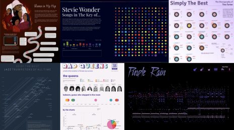 Tableau Public
Celebrating Black Music Appreciation Month Through Data Visualization
 มิถุนายน 30, 2024
Initiated by President Jimmy Carter in 1979, Black Music Appreciation Month is an annual celebration of African-American music in the United States. Explore these Tableau Public data visualizations to learn more.
มิถุนายน 30, 2024
Initiated by President Jimmy Carter in 1979, Black Music Appreciation Month is an annual celebration of African-American music in the United States. Explore these Tableau Public data visualizations to learn more.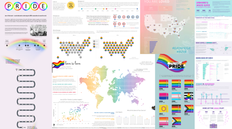 Tableau Public
Data, Diversity, and Pride: Honoring the LGBTQ+ Community on Tableau Public
มิถุนายน 25, 2024
See how data visualization celebrates diversity, promotes inclusion, and amplifies the voices of the LGBTQ+ community. 🌈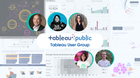 Tableau Public
What can you learn from attending the Tableau Public User Group?
May 21, 2024
Join this monthly meeting to learn from others' experiences achieving Viz of the Day and gain valuable insights into building exceptional data visualizations. Tableau Public
The Tableau Public Viz Gallery at Tableau Conference 2024
เมษายน 29, 2024
Explore the 2024 Viz Gallery featuring 31 captivating vizzes from global creators.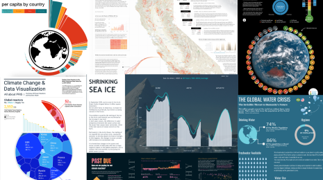 Tableau Public
Visualizing Climate Change: Expert Tips from #TheSDGVizProject Leaders
 เมษายน 23, 2024
Get expert guidance for visualizing climate data and inspiration from a curated gallery of data visualizations from the DataFam.
เมษายน 23, 2024
Get expert guidance for visualizing climate data and inspiration from a curated gallery of data visualizations from the DataFam. Visualizations
Visualizing Women's Impact to History Through Data Visualization
มีนาคม 18, 2024
Recognizing and honoring women throughout history with 36 vizzes from the DataFam. Tableau Public
Behind the Viz: Adrian Zinovei Helps You Design Your Next Dashboard
มีนาคม 1, 2024
Get to know your fellow Tableau Public authors with Behind the Viz, a blog series where we explore the people and processes behind our featured vizzes. Visualizations
Charting the Heart: Data Visualizations on Love
 กุมภาพันธ์ 14, 2024
A curated list of 24 data visualizations celebrating love, relationships, and Valentine’s Day.
กุมภาพันธ์ 14, 2024
A curated list of 24 data visualizations celebrating love, relationships, and Valentine’s Day.