Truncating the Y-Axis: Threat or Menace?


This post is meant to accompany our honorable mention paper for CHI 2020, “Truncating the Y-Axis: Threat or Menace.” For more information, read the paper or consult our osf repository. This post was written collaboratively by Michael Correll, Enrico Bertini, and Steve Franconeri.
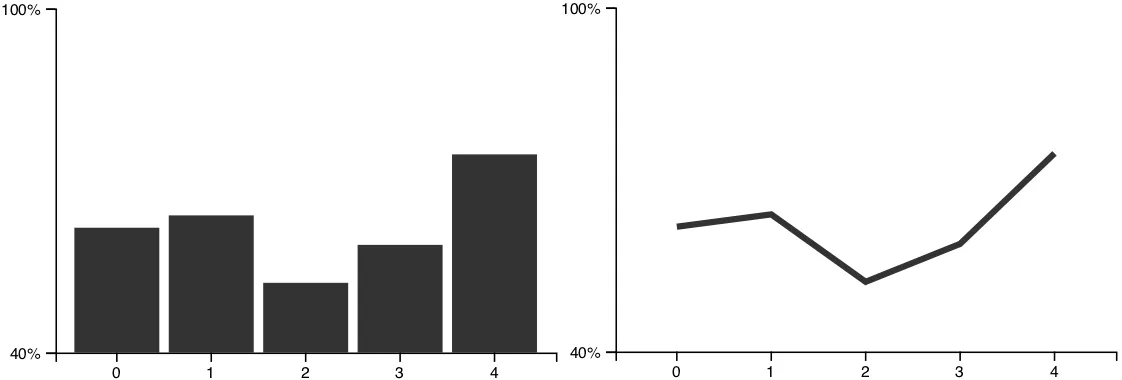
If you’re not immersed in information visualization culture, this is one of those papers that looks so obvious as to be trivial. The general gist of the paper is that, in charts like the following, the bars on the left look more different than the bars on the right:
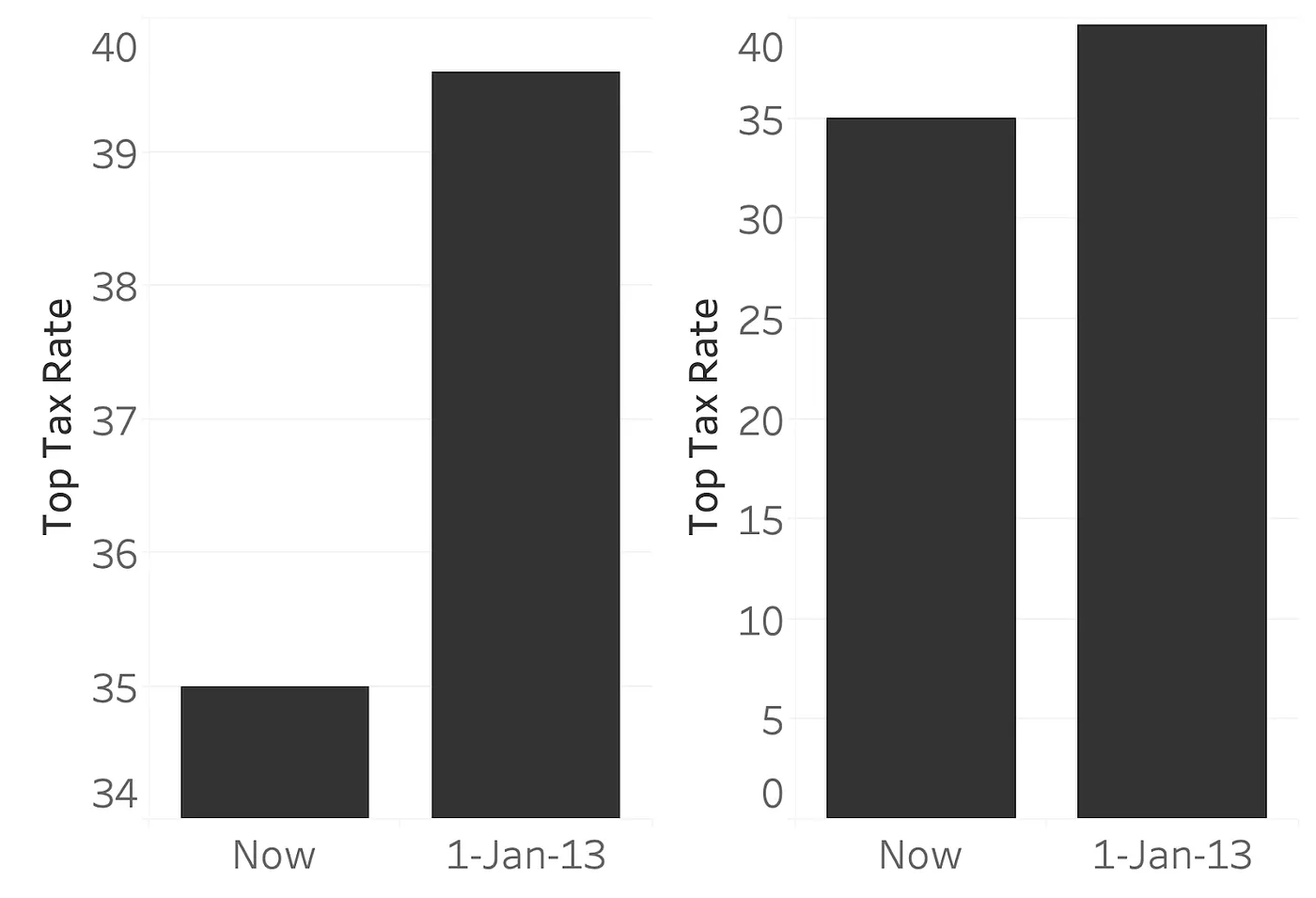
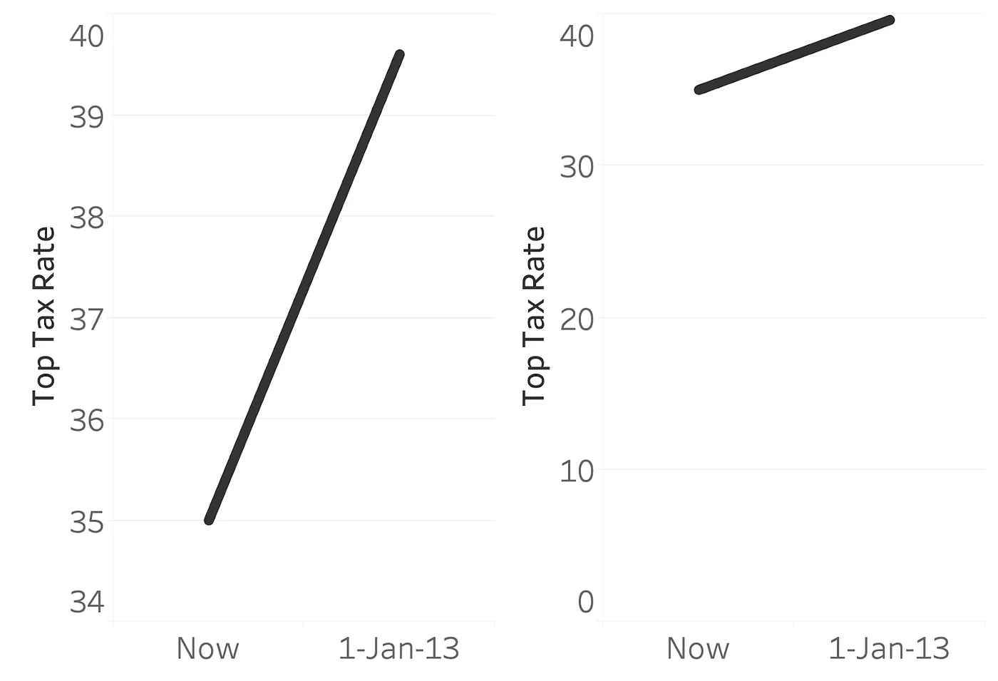
This is despite the fact that both charts are showing the same difference in value (an increase from ~35% to ~40%).The fact that those bars on the left look more different from each other remains true even if you add a bunch of junk to the sides or bottoms of the bars, or make the bars into dots and lines instead of rectangles:
That’s really it. Several months of work, a bunch of Skype calls, and a handful of crowd-sourced experiments, all to deliver to you the message that stuff with differing heights look different. Why did we think this is a big deal? This is because we are intervening in the decades-long debate that haunts the corridors of chartmaker’s conventions, sets Excelites and Tabloids at loggerheads, and causes even people like Tufte to second-guess themselves: when is it okay to truncate the y-axis of a graph?
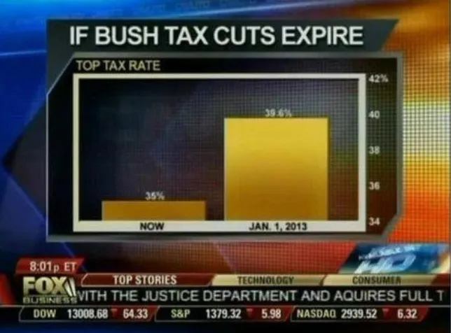
The problem with messing with the y-axis has been frequently illustrated through this chart in particular, one of many in Media Matter’s hall of shame of misleading Fox News graphics, showing what would happen to the top tax rate if tax cuts implemented during the George W. Bush administration were allowed to expire. The bar on the right is more than five times taller than the bar on the left! That seems like a huge deal! But the y-axis on the right shows why this has been called a “misleading” visualization, a “lying” visualization, and even a “visualization that failed at life.” The y-axis starts at 34%, making an increase of 5% look quite dramatic. This misleading drama is why we are often told to never ever ever start the y-axis of a bar chart from anything other than 0, to avoid the scenario where the visual difference between bars becomes disconnected from the actual difference in the data.
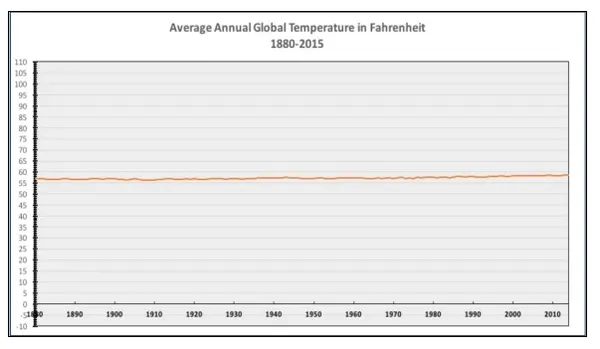
Sometimes, however, the effect sizes you care about don’t care about your 0s. If you’re measuring body temperature, for instance, then 37ºC is normal but 38ºC is a fever. The difference between “everything’s fine” and “call a doctor!” is just not going to show up when you start your y-axis at 0. As much scorn as the Fox News chart above got, much derision was also heaped on the chart above, the National Review’s so-called “the only climate change chart you’ll ever need.” An increase in global average temperature of even a degree or so is a big deal, so starting the y-axis at 0ºF obscures the important changes over time you’d want to see. This is why, when we design line charts, we pay special attention to the aspect ratio of our charts so that people can correctly estimate the rate of change in the data.
So what gives? Is starting the y-axis from 0 always bad or not? A great deal of ink has been spilled on this problem. We looked at a bunch of blogs (but are always happy to read more!) from top visualization researchers and practitioners. I will (extremely unfairly) summarize the main positions here. Note that these positions are not quite mutually exclusive:
- 🚫The Anathemists: Truncating the y-axis is always wrong, as it inflates the perceived effect size. Never ever do it.
- 📈The Line Chart Exceptionists: Truncating the y-axis of a bar chart is always wrong, but it’s okay and in fact perhaps desirable for line charts. The usual reasons given are either related to the encoding scheme (bar charts encode value with the height of a filled area, which is no longer tied to the relative difference in data values when you truncate the axis, in a way that is less problematic somehow for line charts, where we care about slope) or the task (bar charts are for, and, perhaps only for, comparing absolute individual values, whereas line charts are for comparing relative values and changes over time).
- 🚦The Signalers: It is permissible to truncate the y-axis of your chart if the “action” happens in a narrow range, or if the 0 is unimportant or irrelevant to the story you want to tell. However, you must always indicate visually that the y-axis continues off the chart or was otherwise messed with through things like broken axis glyphs or torn paper metaphors.
- 🎊The Libertines: The important thing in your chart is the effect size you want to communicate. Don’t waste your time including a zero if it’s not relevant to your effect size. Start the y-axis based on the range of your data and/or some standardized measure of effect size.
We were most interested in the claims of the 🚦signalers and 📈line chart exceptionalists in our study. We were curious about how y-axis truncation impacts perceived effect size of a chart, and if that impact is moderated by the chart type (line chart, bar chart) or forms of signaling (indications of y-axis breaks or y-axis continuity beyond the bounds of the chart). So that’s what we did, we gave folks a bunch of charts.
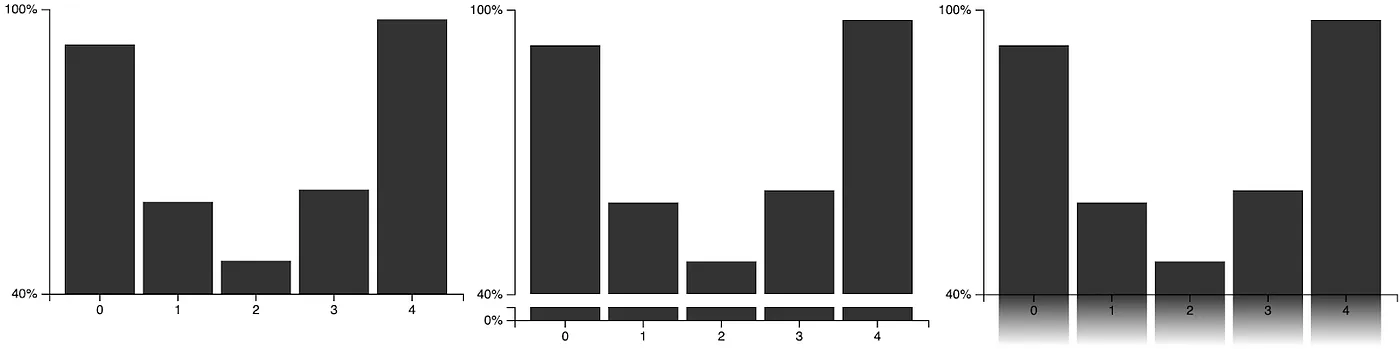
Both lines and bars, in one experiment:
And various “split” or “discontinuous” axes, in the other:
We then asked people some variation of the question “how quickly are the values changing?” across a variety of different monotonic trends to see how much the starting location of the y-axis, and the different visual designs of the same data series, would impact subjective perceptions of effect size.
As for our results? I already gave away the answer way back at the beginning of this post, but, in short: truncation has a strong impact, and nothing seems to matter. Across all conditions, we found the same impact of y-axis start location: the higher you start y-axis, the bigger the visual difference between data points, and the bigger a deal people thought the trend was. What’s more, the 📈 line chart exceptionalists seemed to be wrong: although the way that bars and lines encode data is different, that didn’t seem to matter for how our participants decoded the chart into a measure of subjective trend strength. We didn’t see any significant difference between bars and lines. Similarly, the🚦signalers also seemed to be wrong: just indicating that something screwy is going on with the y-axis was not sufficient to remove the impact of the truncation on perceived effect size. A small spot of potentially good news (depending on your stance) is that these axis manipulations didn’t seem to harm the actual reading of numerical values (people were more or less as accurate about guessing the actual numbers in the chart, no matter the chart type), only the subjective impression of the trend’s severity.
In the paper, we more or less leave it at that: where you start your y-axis has an impact on the subjective effect size that people get out of your chart, and this impact isn’t mitigated or consistently different across the chart types or the signaling methods we tried. But in this medium we have the license to speculate wildly, so we’ll end this post with our suggestion for designing the y-axis of your charts:
Since the designer of the chart has control over the perceived importance of the effect size, the designer must actively take responsibility for choosing the visual size of the effect in the chart. Think about what counts as an important change in the data. Think about whether 0 is an important “landmark” in your data. These questions will be dependent on your domain, your audience, and your data: they are not questions for which a one-size-fits-all rule is going to help you. There is no shortcut for thinking critically about your audience and your messaging. Truncate your axis or don’t, but don’t fall back on defaults unthinkingly.
เรื่องราวที่เกี่ยวข้อง

Which Model Speaks Your Data Language? A User-Centered Approach to Evaluating LLMs for Conversational Visual Analytics
 เมษายน 14, 2026
Rethinking How Data Workers Revisit Analytical Conversations and Communicate Insights
 เมษายน 10, 2026

Stepping through Charted Territory: Creating Interactive Step-by-Step Dashboards Tours
 มิถุนายน 8, 2025