Three different ways to build funnels in Tableau—and why


A funnel—also called a pipeline, a sales process or a cycle—can be used to bring significant clarity to your sales data. Whether you’re interested in identifying customers who are dropping out of the sales process, understanding your buyers’ purchase journey, or visualizing whether you have enough prospects to achieve a sales target, you can do it with a funnel.
Five years ago, I created my first funnel in Tableau to analyze an airline e-commerce website funnel. Recently, I’ve been asked to visualize our company’s sales pipeline, so I had the opportunity to explore alternative ways to visualize a funnel.
When creating a funnel in Tableau, there are three common formats to consider and the one you choose will depend on your goals:
- You want a funnel shape, not bars on top of each other.
 And not ->
- You want each step differentiated with color.

- You want your funnel segmented and filled with color.
There are many ways to create a funnel viz using Tableau, but in this article I’ll focus on the three described above.
Easiest approach
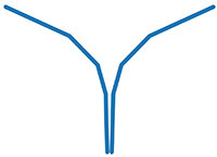
This is the simplest way to create a bar or a line funnel with different colors or a funnel shape with no separations between the steps. It’s one of the first vizzes I created in Tableau—thanks to this tutorial.
 or
or  or
or 
Here are the 5 steps:
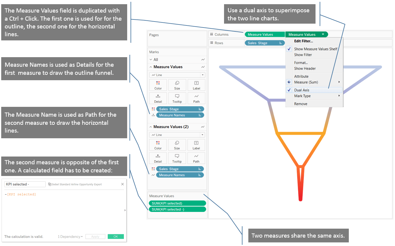
- Duplicate the measure you want to use to visualize with the funnel (customers, revenue, visits).
- Put the two measures on the column shelf.
- Reverse one of the two measure axis. You will find the option by double clicking on the X axis:

- Add to the Rows shelf the dimension you want to use to split your funnel (the sales stages, the steps, the pages types, etc.). This is what you should end up with:

- Don’t forget to customize your formatting to get rid of any lines—especially the column dividers and the Zero Line that would otherwise divide your funnel in two.


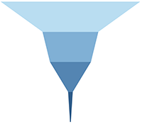
The Measure Values approach
Use this approach for a funnel shape with differentiated steps.
Sales funnels with a real funnel shape look much better than a bar funnel. They also allow you to differentiate each step with a different color and use the funnel as a color legend. Adam Crahen published a great viz and blog post explaining a simple and powerful technique to build this kind of funnel. Adam’s approach consists of duplicating the measure you want to use to draw your funnel (like we did in the previous step) and sharing the same axis with the Measure Values field. This is how it looks:
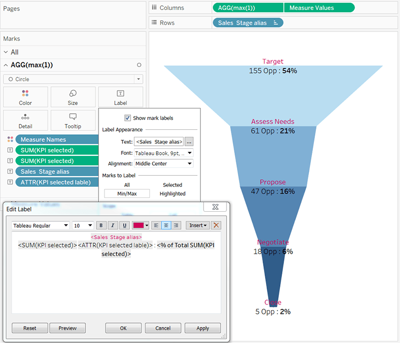
Measure Values with table calculations approach
This approach is the most advanced, but it’s not complicated if you want a filled funnel shape with steps differentiated by color.
Thanks to Adam’s blog post I learned to draw a real funnel, but when I wanted to have a filled funnel shape, I struggled. This is when I found a post by Rajeev Pandey on Tableau Community. He suggests creating two calculated fields for each funnel stage or step, so I don’t recommend this technique if you think that you may add a stage in the future; your dashboard will not detect the new stage automatically and you would need to add two calculated fields to detect the new stage.
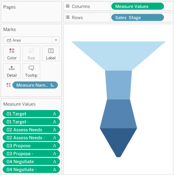
1. Create two calculated fields for your first funnel stage.
- Create the first field with this table calculation that allows you to draw one area by stage:

- Create a second field to generate the opposite side of the funnel. It will be the negative value of the previous calculated field, as in the previous approach:

2. Create the same two calculated fields for all your funnel stages. This is what my Measures pane look like when all the calculated field have been created:

3. Place all those measures on the same axis by using a blended axis. Place this new Measure Values field on the Columns shelf:

4. You may get this type of funnel if you don’t turn off the Stack Marks option:


This is what it should look like after the Stack Marks option has been turned off:
5. Final touch: add a title and a label to each stage by adding an axis. Type directly in the Columns shelf “max(1)”, add labels, and use a dual axis (as we did during the second approach) to place the labels on top of your funnel. This is what it will look like (all the numbers displayed in this viz are fictitious):
Ready to have fun with funnels?
Knowing how to create funnels in Tableau is a useful, foundational skill with many interesting applications. Use the table below to help you to find the approach that is most appropriate for your goals.
Find more of Yvan’s tips, tricks, and vizzes on his Tableau Public page—and be sure to connect with him on Twitter @YvanFornes.
เรื่องราวที่เกี่ยวข้อง

5 Ways to Use Tableau Public to Achieve Your Goals
 มกราคม 11, 2025

World Mental Health Day: Elevating Awareness Through Data Visualization
 ตุลาคม 10, 2024

From TV Screens to Tableau: Visualize Your Favorite Shows with IMDb
 สิงหาคม 31, 2024