Inside the Release: Tableau 2022.4 for Analysts and Business Users


With growing economic uncertainty, it’s more important than ever to deliver more with less. Even as resources shrink, expectations remain high. To exceed expectations and overcome turbulent times, you need more efficient ways to work.
Tableau is here to help your organization achieve success now and in the future. Our customers realize a 29% increase in business user productivity and a 29%* faster delivery of business-driving reports. Let’s look back at how our innovations from 2022 create efficiencies and boost your bottom line.
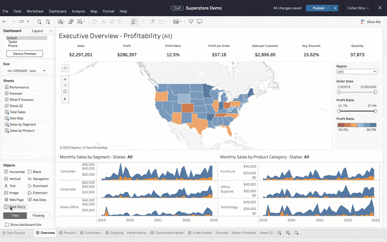
Automate the analysis, build, and communication of insights with Data Stories
Executive summaries enhance dashboards but require a lot of time and effort. By the time you analyze the data, curate insights, and write the summary, it can already be outdated. With how frequently data is updated, manually rewriting reports does not provide the agility needed to make decisions at the speed of change.
To keep up with the ever-changing business environment, use Data Stories. In three simple steps, you can automate the analysis, build, and communication of insights.
Data Stories generate dynamic and customizable plain-language summaries that update as new data comes in and as you interact with your dashboard. Spend less time on busywork and more time driving results by using Data Stories.
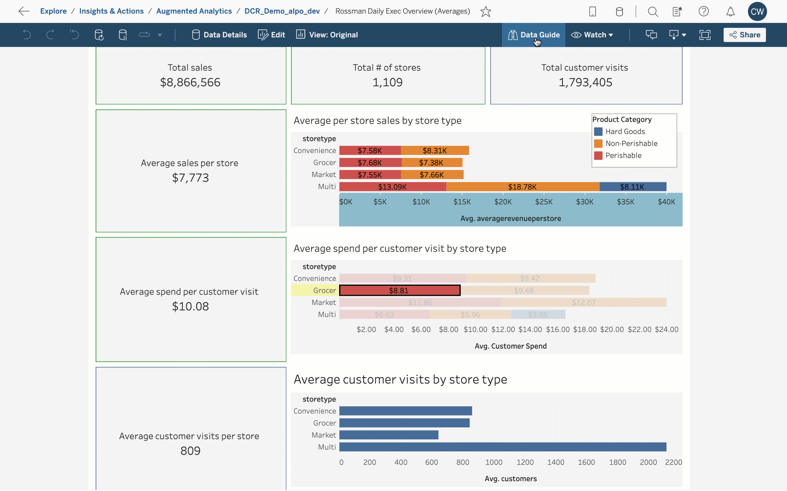
Drive up productivity with Data Guide, Data Change Radar, and Explain the Viz
When viewing a dashboard, it’s not always obvious how to use it or where to focus attention. This uncertainty can slow people down or even discourage data-backed decisions altogether. When exploring a dashboard, you need tools and resources to guide you to relevant and accurate insights.
Data Guide provides explanatory context that make it easy to readily trust and understand dashboards. Along with automatically storing the dashboard’s name, author, and last publish date, authors can input descriptions and link to related resources. Using Data Guide, anyone can self-serve the information they need to uncover insights faster.
In the Data Guide pane, you can access insights powered by Data Change Radar and Explain the Viz. Data Change Radar automatically surfaces notable data changes, helping accelerate time to insight. Instead of aimlessly searching for answers, leverage AI-driven explanations from Explain the Viz as a starting point for deeper data exploration. With these augmented experiences, you can enhance your analysis with a fraction of the work.
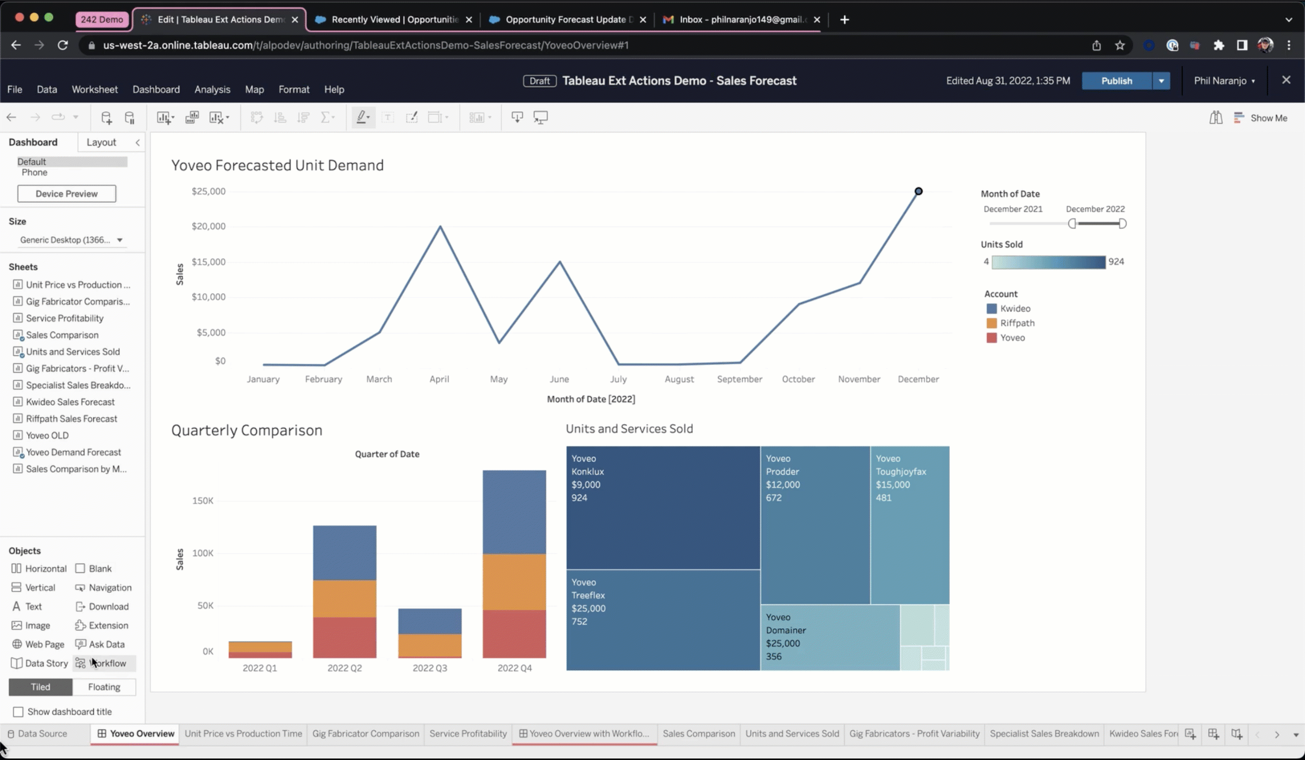
Meet all your business needs in one place with Tableau External Actions
Switching between applications is costly. Each time you pivot between applications, you lose context and add complexity, making it easy to get disoriented and off track. On top of that, loading a new application takes up valuable time.
Using Tableau External Actions, you can make decisions in context. By natively integrating with Salesforce Flow, Tableau External Actions helps trigger automated workflows right from Tableau dashboards. This new capability connects any data in Tableau with a flow in Salesforce, bringing together data from various teams and tools. This new capability makes it easy to streamline complex processes and handle all business needs in one place.
Improve workbook performance with Workbook Optimizer
Slow load times can make you want to give up on analysis before you even have a chance to start. But identifying the underlying causes behind performance issues can be challenging. This raises the dilemma: do you spend time now to improve performance or save time now and risk long-term challenges?
With Workbook Optimizer, solve for both by quickly resolving performance issues. The Workbook Optimizer evaluates dashboards against best practices and suggests ways to improve performance. To help you prioritize, suggestions are organized in three categories: “Take Action,” “Needs Review,” and “Passed.” By following the Workbook Optimizer’s recommendations, you can improve load times to help end-users get to insights faster.
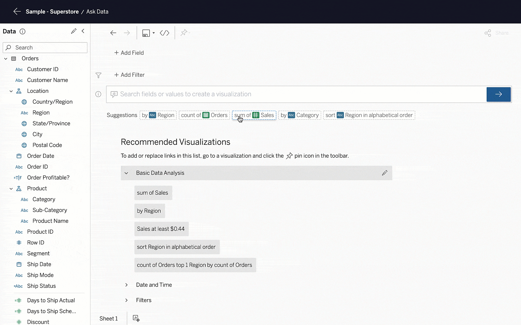
Enable self-service analytics and save time with Ask Data
Even the most comprehensive workbooks still have gaps. It’s a given that end-users will have follow up questions, but it’s impossible to anticipate them all. Further, those one-off requests take up time that you need for everyday work.
Ask Data empowers everyone in the organization to build visualizations using natural language queries. Instead of creating additional work for analytics teams and waiting for them to build visualizations, you can get answers to your questions immediately.
With Ask Data Phrase Builder, even the most novice users can use a hybrid point-and-click guided experience to build visualizations on the fly. And with intelligent recommendations, Ask Data helps hone questions to help anyone discover relevant insights.
Get to relevant insights faster with an improved search experience
As the amount of content in analytics environments grows, it can be increasingly difficult to find relevant information. To surface relevant insights faster, Tableau revamped its search experience.
Tableau’s search algorithm has been tuned to incorporate recency, frequency, popularity, and other signals about activity in Tableau. Now, it’s easier to discover–and rediscover–content specific to your needs. And with a streamlined and dynamic Quick Search experience, the content you need is only a click away.
Work more efficiently with features inspired by the Tableau Community
To help you perform common tasks more efficiently, we made several quality of life improvements inspired by the Tableau Community. We’ve made it easier to:
- Manage tables in your data model. Swap any table with the root table in a single click for more flexibility with data models
- Simplify Tableau Prep connections. Discover and join tables automatically based on file attributes
- Dynamically load images. Use links your data to manage image assets externally, making it easy to load, reuse, and update pictures
- Convert case text with a pre-built function. Format string fields using the PROPER() function instead of complex workarounds
- Track your most important data. Create and edit Metrics, and dynamically explore different date windows for a lightweight way to keep up with KPIs
- Collaborate with your team. Share and manage permissions in a single workflow to ensure your team has proper access to content
- Boost workbook performance. Improve workbook load times by using View Acceleration to precompute data
*Source: 2022 Salesforce Success Metrics Global Highlights. Data is from a survey of 3,706 Salesforce customers across the US, Canada, the UK, Germany, France, Australia, India, Singapore, Japan and Brazil conducted between June 8 and June 21, 2022. Results were aggregated to determine average perceived customer value from the use of Salesforce. Respondents were sourced and verified through a third-party B2B panel. Sample sizes may vary across metrics
เรื่องราวที่เกี่ยวข้อง

The Tableau+ Bundle with Premium AI, Enterprise Capabilities, and Premier Success
 มิถุนายน 24, 2026
What is Tableau Prep?
 เมษายน 30, 2026
Insights Wherever You Work: Meet the Tableau App for Microsoft 365
 มีนาคม 16, 2026