Using Augmented Reality for Touchless Interaction with Visualizations


If you have ever spoken about data during a meeting or presentation with a remote audience, odds are that you shared your screen using a teleconference app. Perhaps you showed a series of slides containing your latest KPIs or pasted some screenshots of vizzes. Or perhaps you were brave enough to deliver your speaking points while simultaneously interacting with a Tableau workbook.
As you may know, both approaches can be poor experiences for speaker and viewer alike. On the one hand, a prepared sequence of slides limits spontaneity: the speaker’s ability to interact directly with static viz content, either to direct an audience’s attention or to respond to viewers’ questions. On the other hand, a live presentation is not a scenario that a Tableau workbook excels at. In our earlier research, we heard from customers that the use of Tableau in live meetings and presentations often feels more like a demo than a presentation; Tableau’s interface chrome can be distracting and it can be difficult or awkward to selectively reveal and emphasize content under time pressure.
In general, remote presentations as we’ve come to know them—whether or not they are about data—have lost a level of human connection between presenter and audience that we enjoy when we are co-located. Presenters have been relegated to thumbnail-sized videos of talking heads when sharing their screen, and we lose a shared spatial context, making phrases like “if you see here…” or “this spike in the data…” somewhat ambiguous.
In collaboration with University of Michigan PhD research intern Brian Hall and former visiting research professor Lyn Bartram (of Simon Fraser university), Tableau Research has developed a new approach for interacting with vizzes when speaking to remote audiences, one that we recently wrote about in research paper to be published in the proceedings of the ACM Symposium on User Interface Software and Technology (UIST) in October 2022, where it will be among a small number of papers to receive an Honorable Mention Award.
A touchless approach to presenting data
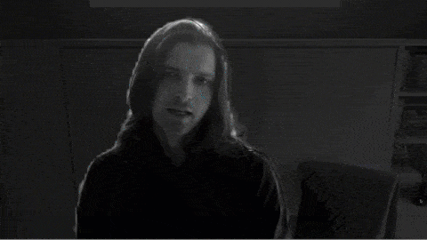
We developed a new browser-based presentation environment that composites visualization overlays with live webcam video. We also support continuous hand tracking in this environment, thereby allowing a presenter to interact with the viz overlays by simply pointing at them. Our approach is touchless, in that there is no semi-transparent touchscreen display that the presenter needs in order to select or highlight viz elements. Actually, the only hardware needed for our approach is a standard webcam; no depth cameras or wearable sensors are required.
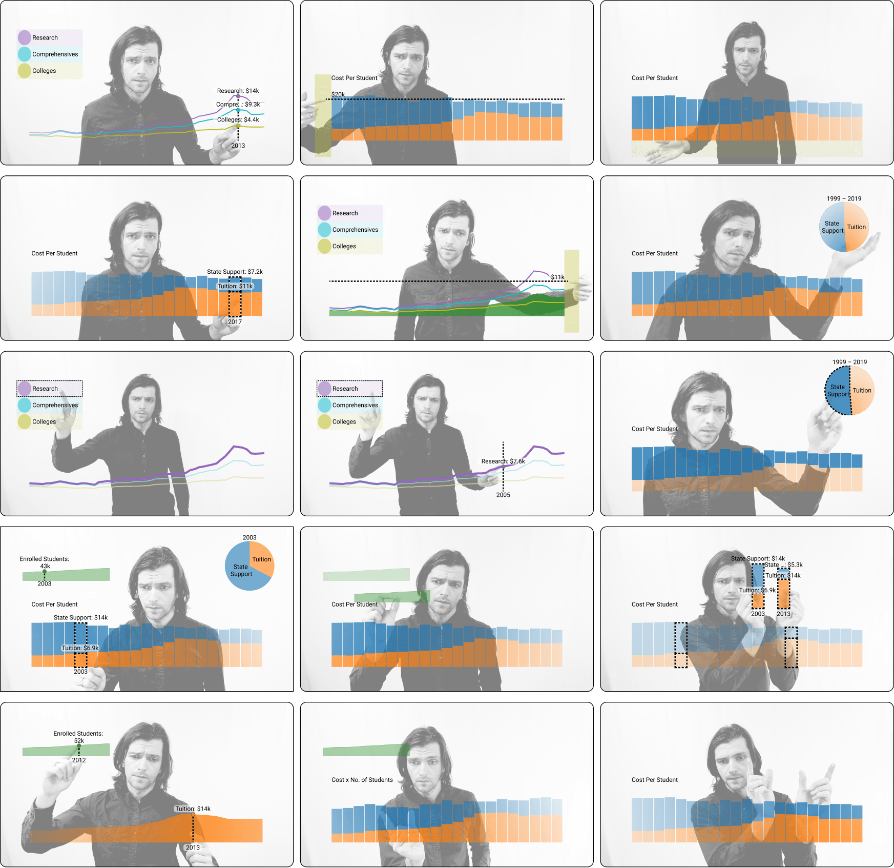
How did we achieve this? First, we composited SVG-based vizzes built using d3.js and the Svelte framework over an HTML5 canvas element, into which we piped a live webcam video feed. Meanwhile, we used Mediapipe (a machine learning framework maintained by Google) and specifically Mediapipe’s background segmentation and body tracking functionality to track the position of the presenter’s hands and fingers, continuously translating these positions into the coordinate spaces of the vizzes, allowing the presenter to trigger mark annotations and reference lines. Lastly, we added our own pose recognition functionality to detect one- and two-handed pinching gestures that allow presenters to select, move, zoom, and pan viz elements.
Currently, our presentation environment supports variants of bar, line, area, and pie charts. With any of these vizzes, a presenter can interact both with individual marks in a viz along with a viz’s margins and legends. When multiple vizzes are shown simultaneously, we broadcast mark selections to the other vizzes, allowing for brushing and linking, similar to the linked highlighting commonly experienced in Tableau dashboards.
Lastly, our presentation environment is built around the principle of “what you see is what I see”, meaning that the audience sees exactly what the presenter sees in their own display: a mirror image of the presenter. Because this environment lives in a browser tab, it is straightforward to share the tab in any teleconference application.
We produced a brief video demonstrating the combined capabilities of our presentation environment, while the following images showcase a selection of one- and two-handed interactions recognized within our environment and their effects on the viz overlays.
Our inspiration
While we were broadly motivated by the increased prevalence of data visualization and augmented reality in broadcast television news, one specific influence stood out to us: a brief documentary featuring the late public health expert Hans Rosling called 200 Countries, 200 Years, 4 Minutes, which was produced for the BBC in 2010. This is one of many great presentations by Rosling (which also include a keynote presentation at the Tableau Conference in 2016). In the BBC clip, Rosling stands in an empty warehouse while a semi-transparent scatterplot is composited in the foreground. Each mark in the scatterplot corresponds with a country, and its position is initially determined according to the country’s GDP and life expectancy 200 years ago. As Rosling speaks, he points and gesticulates in reference to the marks in the scatterplot, and the marks begin to animate as the scatterplot is updated to show more recent years. At various points in the clip, specific marks and parts of the axes are highlighted, seemingly in response to Rosling pointing at them or framing them with his hands. Given that this video was produced twelve years ago, this effect was achieved in post-production. We were curious to see if we could produce a similar effect in a live presentation setting today by leveraging recent advances in computer vision, without requiring a presenter to have special camera equipment or a visual effects team at their disposal.
From Hans Rosling’s presentations to TV news reporters and college lecturers, we’ve learned from earlier research indicating that audiences benefit when presenters make use of their hands while speaking about technical subjects. This is because people are hard-wired to attend to human motion and particularly any movements of the hands. The ability of the presenter to perform illustrative and rhetorical gestures can often reinforce what they are saying. With this in mind, we wanted to develop a presentation environment where audiences could see the presenters’ hands as they spoke about data.
No, this is not Minority Report…
Since we started demonstrating this project, a frequent element in peoples' reactions is a reference to the 2002 Steven Spielberg film Minority Report. In a pivotal scene, the main character (played by Tom Cruise) navigates a collection of data in augmented reality by gesturing with both hands in the space in front of him. However, it’s important to note that Cruise’s character is performing functional gestures in support of an analytical search task, one performed without an audience in mind (he is unaware of us, the cinema audience). In contrast, by using our presentation environment, a presenter is very much aware of the audience watching, and the gestures that we support are primarily communicative rather than functional: pointing and framing rather than sorting through content. We were careful in our gesture design to ensure that the presenter could still perform the natural rhetorical gestures that they would normally make when speaking to an audience, and as a consequence, we still rely on the keyboard and mouse for many functional interface commands.
What’s next?
Earlier this year, we tested our presentation environment with internal audiences and volunteer presenters, and this process gave us many ideas in terms of where we want to take this work in the future. Now that we’re able to speak about the work publicly, we’re eager to collect more ideas from Tableau customers and the academic research community alike.
A number of people have asked us to explore the potential of interacting with maps and geospatial data in our environment. Meanwhile, others have asked about the potential for multi-party interaction allowing both the composited presenter and the viewing audience to interact with viz overlays, suggesting more of a collaborative environment. Finally, we’re thinking about presentation authoring experiences complementing the current presentation delivery experience.
In summary, this is an early-stage research project with the potential to change how people talk about data with remote audiences. We do not yet have a sense of if and how these ideas could be integrated into future Tableau releases. Nevertheless, we’d be delighted to hear from Tableau customers that these ideas resonate with. If you’re interested in learning more about the project and reading about the reactions to our environment from presenters and audiences, please check out our paper and video demo. Finally, you can learn more about our team and the research that we do at research.tableau.com.
About the author
Matthew Brehmer is a human-computer interaction (HCI) researcher specializing in data visualization. As a senior research staff member of Tableau Research in Seattle, he designs, implements, and evaluates new interactive experiences for communicating and collaborating around data. Before joining Tableau, he was a postdoctoral researcher at Microsoft Research, which followed his PhD at the University of British Columbia. Learn more about his work at research.tableau.com and connect with him Twitter at @mattbrehmer or LinkedIn.
Relaterade berättelser
Once Again, with Style: Understanding and Supporting Partial Reuse in Dashboard Authoring
 5 Juni, 2026
From ‘Here’ to ‘There’: Exploring Proximity Semantics in Multimodal Data Exploration
 3 Juni, 2026

Which Model Speaks Your Data Language? A User-Centered Approach to Evaluating LLMs for Conversational Visual Analytics
 14 April, 2026