Highlight Tables and Heatmaps
Understanding and using Highlight Tables and Heatmaps
How To Read Heatmaps and Highlight Tables
Highlight tables display data in a text table. Using color, they speed up how you identify the most important numbers within a range of values. These tables also have rows and columns to depict different dimensions.
Heatmaps present patterns, trends, and relationships within the data. They use color and size from two on the same or different measures. For example, while using color to help identify changes to a measure in a heatmap, the creator might reinforce its importance by keying the same measure to size. To identify trends you’ll want to ask yourself: where is my point of interest in relation to the lightest, palest color on the heatmap? Is there an increase in the size of the shape used at a certain time or place in the map? The answers to these questions could indicate a relationship or trend forming within the data.
What Type of Analysis Do Heatmaps and Highlight Tables Support?
Highlight tables are text tables enhanced through the use of color to show high and low values. Suppose you have a financial spreadsheet that tracks revenue, loss, profit, net income, gross income, costs, and sales. You can use different colors on the measure value for each data point labeled. If you care about highlighting only declines, you can use one color for negative examples (ex. red). Positive outcomes can be a contrasting color to mark the difference (ex. black).
Heatmaps work best for presenting trends in dimensions that have more variables. This is because heat maps consist of one or more dimensions and one or two measures. For example, a hospital can have many patients come in and out at the same time. The hospital may want to know whether these patients are scheduled or are emergency visits? A heatmap can make that distinction with unique rows or columns for each type of appointment. They will then show hospital peak hours, and patient volume with color and size.
When and How to Use Highlight Tables for Visual Analysis
Use a highlight table to indicate salient values on a text table using color. Viewers will be able to quickly distinguish the higher measures from the lower measures within seconds of looking at the view.
Bad highlight tables will have:
- Multiple colors that confuse the viewer
- Measures that are too similar overall, thus making it difficult to see where the higher and lower quantities lie.
- If they show more than one measure and have the same colors for both measures.
- Divergent color palette when all values are positive or negative
- This should only be used when your data has a meaningful threshold that is being crossed
Great Examples of Highlight Tables
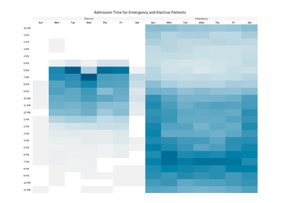
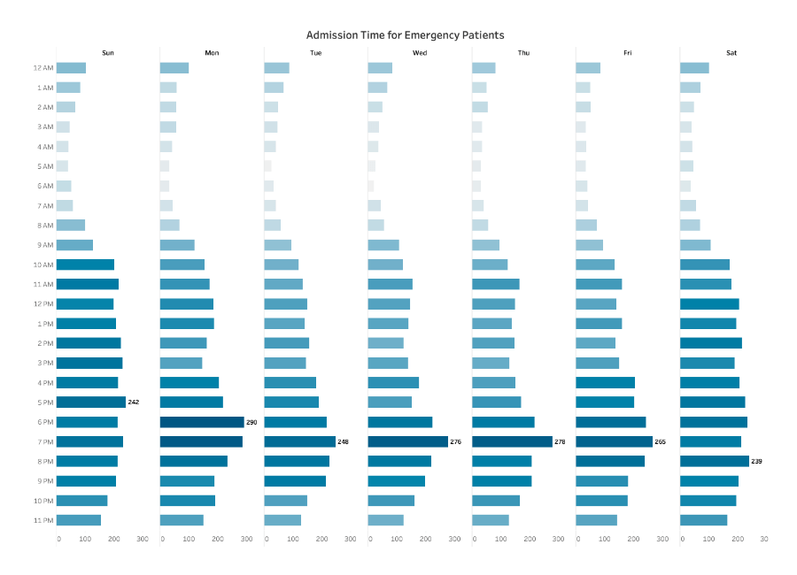
This highlight table looks at the number of patients who are admitted in a hospital, and their respective wait times. The darker the color, the more patients there are in the waiting room at that time.
- The data is spread evenly. Viewers can see when more patients are waiting and when the waiting room might be empty.
- Elective and emergency wait times are split into two tables, but use the same color.
Ineffective examples of Highlight Tables and Alternatives
When and How to Use Heatmaps for Visual Analysis
Use a heatmap to show a trend, pattern, or relationship in a set of data that fits well on a table.
Bad heatmaps will have:
- Too many similar sizes across shapes
- The size and the color represent two different measures
- Not a strong enough distinction between big and small numbers
- Unreadable text
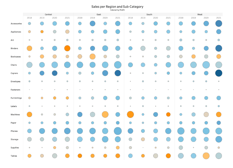
Great Examples of Heatmaps
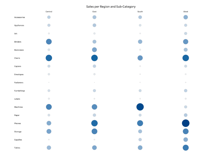
This heatmap looks at sales per region and subcategory. The viewer can see clearly that some subcategories, like chairs, sell very well in all regions, while others, such as art, don’t sell very well anywhere.
- The color theme remains the same throughout
- The circles aren’t all similar sizes
- Only four regional markets are measured, making comparison easy for the viewer.