Line Charts
Understanding and using Line Charts
How do I read a Line Chart?
For most line charts, the horizontal axis represents a dimension of time, while the vertical axis represents a quantitative value (Ex. money, number of people, percent change, etc.). The graph should have each axis, or horizontal and vertical lines framing the chart, labeled. Line charts can display both single or many lines on a chart. The use of a single line or many lines depends on the type of analysis the chart should support. A line chart with many lines allows for comparisons between categories within the chosen field.
With a single line, the shape and direction of the line provides the means to identify changes and trends within the data. A line rising in height as it moves from the left to the right side of the chart indicates an increasing trend. The opposite, a line decreasing in height, indicates that the line has a downward trend.
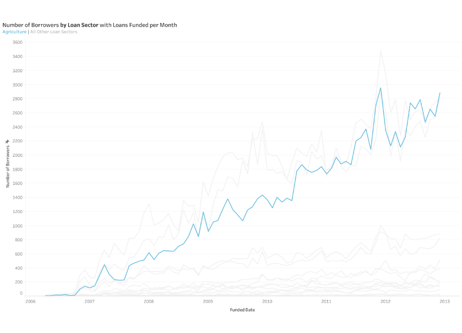
Many lines allow for comparison across different members within the same field as well as where lines intersect. When a field has several members, different colors are often used to make it possible to distinguish between members on the chart. It is also important to remember that charts with fewer lines are easier to read. So, be thoughtful when choosing the type of chart to best represent your data. Too many categories will clutter the line chart and make it harder to understand.
What type of analysis do Line Charts support?
A line chart supports monitoring behavior in a set of data. These charts are useful for more than tracking change over time. They also help highlight differences and correlations within your data. Furthermore, a line chart can help a viewer make predictions about what might happen next. Take a line chart tracking seasonality in the U.S. real estate market. A reader could use this information to investigate different aspects in preparation for buying a home. They could try to find the best time to buy or sell a home or how a recession could impact housing availability.
Consider the stock market as another example. They often use line charts to support buying and selling decisions. Line charts can show the change in values for a particular stock at different intervals of time, from yearly to minute-by-minute. Even though the market is somewhat unpredictable, brokers are able to use line charts to help make determinations. They can see whether a stock is likely to continue on an upward or downward trend. Their ability to predict what will happen is aided, in part, by the human ability to infer directionality from the lines in the chart. This makes this chart type a powerful tool for identifying patterns and trends.
When and how to use Line Charts for Visual Analysis
Data that is measured in a continuous progression works well in a line chart format. If your organization wants to track the behavior of data over a given period, line charts can be of great help. Your audience will see changes in the data, plotted out with a line connecting each data point as they changed over time.
The horizontal line should focus on a measurement with regularly occurring intervals. Usually, the horizontal line defines a length of time, but it can also focus on another form of measurement as well, so long as it meets the requirements (Ex. iterations of an experiment, pitches in a baseball game, etc.). Use color to identify deviations from the average or a target goal or to define individual members within a measured category. If you have outliers in your data set, the use of color can be a good way to make them stand out. Additionally, line charts do not require a zero baseline. This means it can be included or excluded depending on what the creator of the chart believes best tells the story within the data. The goal of an effective line chart is to emphasize changes and direction in your data, not display the size of the values themselves. If there are too many lines or colors on a chart, the visualization becomes confusing and difficult to read.
When deciding what chart type to use, remember that line charts can help users answer questions like the following:
- What patterns appear in the data over time?
- Is the data in an upward trend or a downward trend?
- Is one category performing better than other sets of data?
- Are we likely to meet our quarterly goal?
Good examples of Line Charts
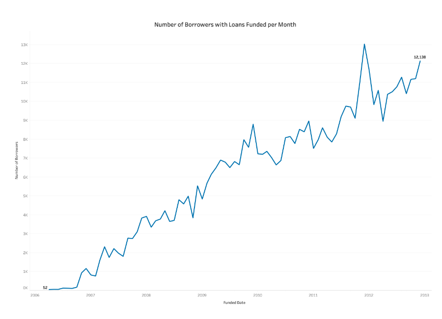
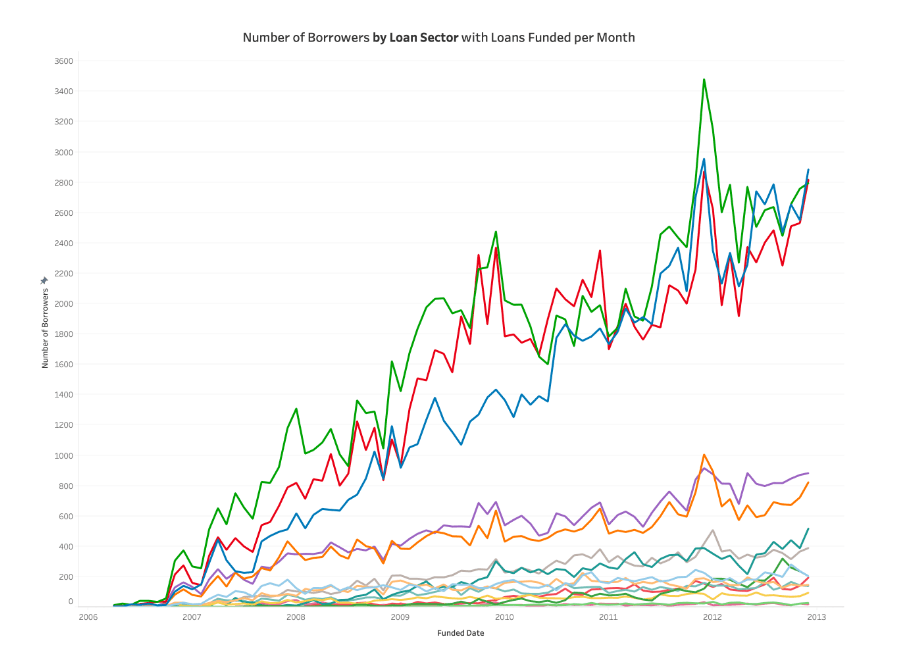
This line chart follows the number of borrowers measured every month over the course of several years.
- The x-axis represents the date field
- The y-axis represents the quantitative field
- The first and last points are labeled for context
- Labels for each data point are not displayed to reduce clutter
- Axis and light grid lines are visible to the viewer to help in identifying locations of data points
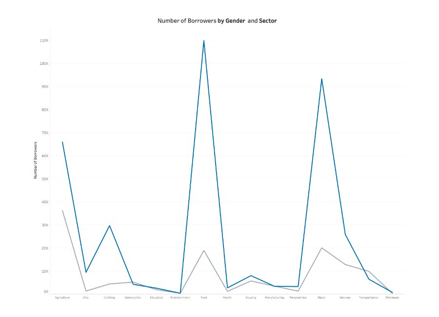
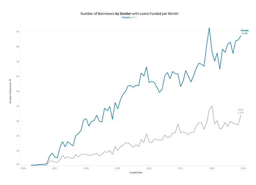
This line chart, known as a category line chart, splits the number of borrowers into gender, so two lines are displayed across the course of several years.
- It uses a strong color to highlight the line for the category being focused on
- It uses a neutral color for the second line
- Label colors match the lines for ease of identification
- The chart is not cluttered with labels
Ineffective examples of Line Charts and Alternatives