Vizzes from Around the World: Italy's Got Talent!


Italy is famous for its food, wine, and monuments, but have you heard of its flourishing dataviz community? We're taking you on a journey to discover the work of top Italian data journalists and visualization designers.
A High Standard of Data Journalism
Two of Italy's top newspapers, Corriere della Sera and Il Sole 24 Ore have a data blog on which they dissect national and international data.
Il Sole 24 Ore's data cell was created in 2011 and it publishes data-driven articles on a daily basis on its Info Data blog. Journalist Luca Tremolada and Digital Content & Data Manager Andrea Gianotti, a long time Tableau Public user, recently invited freelance journalist Filippo Mastroianni to contribute to Info Data. You'll see samples of both Andrea and Filippo's work in the last section of this post. Corriere della Sera is posting at a lower frequency on Data Blog.
Every year, the International Journalism Festival is held in Perugia, central Italy, and it has developped a data journalism track over the years. Italian folks can watch all sessions on the IJF Youtube Channel.
Finally, besides traditional newspapers, collaborative iniatives such as datajournalism.it show the vitality of Italian data-driven journalism.
World-Famous Data Visualization Designers
Italy is also the birth place of famous data visualization designers, who are not currently working with the media industry:
- Giorgia Lupi, the famous Italian half of the Dear Data project, creates stunning data visualizations, both hand drawn and digital.
- Paolo Ciuccarelli founded the DensityDesign Research Lab within the Politecnico di Milano's Design Department. He focuses on making complex phenomenons intelligible via data visualization.
The beauty and purity of these two designers' work is admittedly an influence for some of the Italian Tableau Public authors we are about to shine the spotlight on.
Brilliant Tableau Public Authors
If you're looking for authors to follow on Tableau Public, here are some you should definitely consider!

Fabio Fantoni: the Sports Fan
Fabio Fantoni started vizzing on Tableau Public about a year ago, and has since then created over a hundred visualizations on his favorite sports: soccer and basketball. If you share his love for the NBA and Italian football, he blogs (in English) at Pantoviz and tweets at @PantoMvp.


Filippo Mastroianni: the Data Artist
Filippo Mastroianni started using Tableau while working on his thesis. A communication science student, he was researching data journalism in the age of Big Data. His mastery of photo editing and illustration softwares make his very creative visualizations all the more unique and impactful. Filippo contributes to Il Sole 24 Ore's Info Data blog, writes on his personal blog (in English) at Vizzing Data and tweets at @FilMastroianni.


Marianna Cosseddu: the Social Researcher
Marianna Cosseddu owns a PhD in Social Sciences and Postgraduate Master in Social Research Methods. In addition to her strong statistics understanding, she's been honing her data skills over the past 10 years working for both public and private sector, research centers and universities. Her focus is on demography, and especially female participation in the labor force. In the below visualization, you can see the evolution of age at first child delivery among European women.


Davide Mancino: the Data Journalist
Davide Mancino has been using Tableau since 2013. He covers all sorts of newsworthy topics ranging from the quality of service in Italian hospitals to the employment prospects of young graduates in Italy. His articles usually comprises a series of simple explanatory charts, in a very recognizable clean and simple style. You can find his articles in a variety of Italian newspapers, including Quartz, Wired Italy and L'Espresso. Follow him on Twitter at @davidemancino1.


Andrea Gianotti: the Head of Numbers
Andrea Gianotti describes himself as the Head of Number, a term encompassing all his activities as a data person at Il Sole 24 Ore. Similar to Davide Mancino, he's been using Tableau Public for 4 years, creating an astonishing 554 visualizations. Recognizable thanks to their beige background, his visualizations often cover economic and financial topics. Find him on Twitter at @andreagianotti.


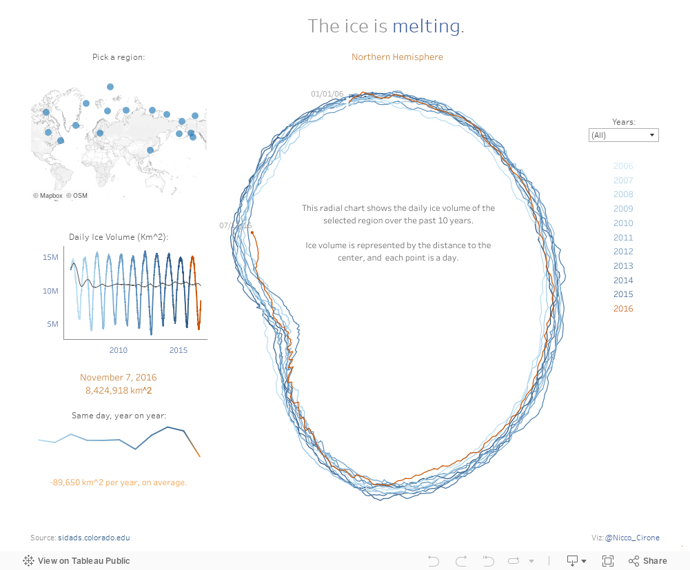
Nicco Cirone: the Global Citizen
Last but not least, Nicco Cirone is a London-based Italian, whose vizzes tend to focus on international problems of our times. One of his most famous visualizations shows data on ice melting in the Northern Hemisphere. He's also visualized 20th and 21st century's history with visualizations on World War II, worldwide coups since 1950, and the current European refugee crisis. Nicco blogs at Datapirata and tweets at @datapirata.
We hope you've enjoyed this virtual trip to Italy! Join our Twitter poll to select the next country to be covered in 'Vizzes from Around the World', and let us know in the comments if you'd like to suggest another country.
Which country should we feature in our next 'Viz from Around the World' blog post?
— Tableau Public (@tableaupublic) June 16, 2017
Verwante verhalen

Iron Viz 2026: Read Between the Data
 28 mei, 2026

Tableau's Iron Viz Winners

Explore the 2026 Iron Viz Entries
 15 december, 2025