Usability is the most satisfying design puzzle to solve


Editor’s note: This is the fourth post in a series about visual design with data. Read the first here, second here, third here, fifth here, and sixth here.
Usability isn’t always what gets designers excited. Beauty? Yes. Elegance? Yes. Grace? Yes.
Having the freedom to create with an eye to those goals, and those goals alone, is obviously energizing to any artist. But we aren’t here to create museum pieces. We’re here to create experiences for our audience, and doing that well requires consideration, even prioritization, of some other requirements over simple pulchritude.
What shall become of my beautiful aesthetic?
We have both known individual creators who subscribe to the egotistic “auteur” model of design in data visualization, believing that their aesthetic vision should be paramount. They considered it an affront to have to change their creative vision for the sake of “usability”...even though their audiences varied across dozens of dimensions and accommodations needed to be made for every one of their users.
“Woe is me!” wail these auteurs, rending their garments at the unfairness of...having to design to the needs of their audience. “My creative expression is under assault!”
It’s just the reality of the situation that some (many? most?) users want to consume their information via mobile phone, and that mobile phone might be the latest Samsung, or an eight-year-old iPhone, or anything in between. Meanwhile, the desktop users could be on Mac, Windows, Linux, or something else entirely; they could be running any conceivable version of any conceivable browser.
And no matter what technology a user is rolling with, 9-10% of them will have some kind of color-blindness; more still will have other visual, auditory, or physical disabilities; and some (in this semi-hypothetical scenario) will be remote with limited bandwidth, and will need a lite version or an extremely performant one.
The bottom line here is that the aesthetics of any information experience might be jaw-droppingly beautiful and completely unique, but if the audience can’t draw insights from the experience, it’s not usable, and thus a failure of design.
Buttons and filters and switches, oh my!
Another common misinterpretation of usability is that it is synonymous with interactivity.
Does this sound familiar?
“The audience must be given the freedom to explore in all dimensions! MUST. PROVIDE. ALL. POSSIBLE. INTERACTIONS! Whatever I’m building, I need to make sure that all users in every eventuality can get every answer they possibly want. Who cares how many buttons, toggles, switches, twiddles, filters, shelves, menus, and pages we need to get there? This is how we provide usability!”

But if you remember back in a previous post, we talked about how every information experience has parts of you, the creator, in it as well. Part of your responsibility is to make it easy for your audience to experience the insights that your data contains. You should, therefore, be removing paths to dead ends and ensuring that the important information comes to the forefront.
Adding every switch, button, and filter possible is just adding noise upon noise, smothering the essential signal of your product. That’s an abdication of your responsibility as a designer.
In all likelihood, your audience isn’t going to need to look at the data in every possible permutation and combination imaginable. Ideally, that’s what you’ve already done for them. Why would you make them do that work all over again, and then some?
Designing for usability means providing the optimal amount of interactivity—even if that amount is “none.” It’s never going to be the maximum amount.
Usability as experience: What we can learn from product design
Another perspective on usability is the pleasure factor. Is your audience going to enjoy the simple act of looking at and interacting with your product? Is it intuitive, smooth, responsive, internally consistent? Or do users struggle to pull out the desired information?
As a personal example: when Apple first released AirPods, their wireless earbud headphones, Mike thought they were extravagant and unnecessary. But when he actually had a pair of them, he became an enthusiastic supporter and advocate of them, largely because the experience of using them. They do what they’re meant to do—play music and make phone calls wirelessly—but the sensation of using them is pleasant, intuitive, and easy. There’s visual, audio, and haptic feedback at every step. Interactions are smooth and make sense. They are as large as they need to be, and no larger; they serve their purpose, and don’t try to be all things to everyone.
These lessons from product design apply to information experience design as well:
- Provide obvious feedback for interactions (visual, audio, and/or haptic if possible)
- Make sure your interactions are sensible and limited to what’s essential
- All elements work together as one solid and consistent construction
- Don’t try to make something that’s all things to everyone
Marrying usability and design: It’s a puzzle! Puzzles are fun!
We hope by now it’s clear that “usability” isn’t just the nuts and bolts of making sure your product is functional to the minimum degree required by the specifications.
Nor is usability a millstone, an albatross to be endured by every designer as they struggle to create an informational masterpiece
Usability is about giving your audience an enjoyable and productive experience while they engage with your creation.
At a bare minimum, sure, it’s providing the required functionality (and fighting ferociously against requirements creep). However, we’re not talking about doing the bare minimum here. We’re talking about you, the creator, solving this delightful puzzle. This is where you use your expertise comes in—your connection to the world, your ability to put yourself in the mind of your audience—to create an information experience that is not just illuminating, but a pleasure to use.
Put yourself in the mind of your audience or ask a friend to review your work in progress. When you’re creating an information experience, ask yourself these questions:
- How will the audience know that they are using this product the right way?
- Where will a viewer’s eyes be drawn? Are those the most important parts?
- When you as a user interact with it, do the interactions make sense and do you get meaningful feedback? Are you rewarded for doing things right and redirected when you do things wrong?
- Does the product help you understand its complexities, or are you left to figure it out on your own?
Earlier, we imagined how a designer might chafe at the idea of having to focus on usability instead of aesthetics. But now we see the truth of the matter: this is actually your time to shine as an empathetic creator.
You still can, and should, express your creativity, but in a way that directly serves the ultimate purpose of the work itself: creating an informative, complete experience that provides both pleasure and knowledge to an outside audience.
Solving the puzzle of how to achieve that, and seeing how the audience’s experience benefits from that effort, can be one of the most satisfying accomplishments for a creator.
Next time we’ll talk more about our third goal for success: comprehension and how to make it easier for your audience to relate to any given topic.
관련 스토리
VizQL Data Service from Tableau: Use Your Data, Your Way
 2024/08/08

When and How to Use Multi-fact Relationships in Tableau
 2024/08/01
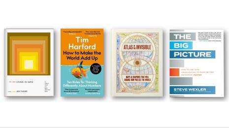
Top data books of 2021
 2021/12/12