#MyRecentViz: Electoral Votes vs. Popular Votes in US Elections


Editor’s note: This is a write-up of the key takeaways from the #MyRecentViz webinar that took place on 29 Nov 2016. It is the first in a series of blog posts and webinars, each deconstructing a beautiful and insightful viz.
As President-Elect Donald Trump takes office, let’s take one last look at the results of the US election.
The Question(s)
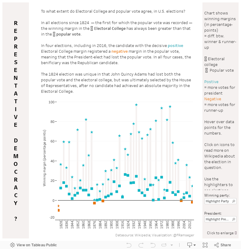
As is well-known, President Trump won the White House despite losing the popular vote. The fact that this is the second time in recent years (remember Al Gore?) made me wonder: Generally, how closely do the electoral votes and the popular votes agree in US elections?
In theory, they don’t have to always agree, due to the following facts:
- The number of electors is far smaller than the population size, thus the electoral vote will almost always only be an approximation of the popular vote.
- In most states, the winner of the state’s popular vote takes all electors, even if the vote was only won by a sliver.
- The number of electors is related to the size of the states’ populations, but there are deviations. Especially smaller states have more electors on a per-person basis, as the minimum number of electors for each state is three.
- There have been cases where electors do not vote in line with the popular-vote results from their states (“faithless electors”).
But not all of these effects have to necessarily run in the same direction, so it’s hard to say how they influence the election. Does the Electoral College often distort the popular vote, as it did in the most recent election? Have there been cases where the Electoral College gave the president a smaller winning margin than the popular vote? How large are these effects, empirically speaking?
The Viz
To answer those questions, I created the viz below. It looks at winning margins of US elections since 1824 with each column representing one election. The winning margin is the difference between the percent of votes of the president-elect and the percent of votes of the runner-up. Winning margins in the electoral vote are indicated by the star symbol, and those in the popular vote are represented with the square icon. The difference in the president’s winning margins in the electoral vote and the popular vote is shown using the grey bars.
The Answer(s)
What does this show us? First, the president’s winning margin has always been greater in the electoral vote than in the popular vote. Empirically-observed differences can be huge. For instance, in 1936, Franklin D. Roosevelt’s winning margin for electoral votes was 96.99 percentage points—he basically cleared the whole map. His popular-vote margin, on the other hand, was a mere 24 percentage points—still a huge winning margin, historically speaking, but of course a lot smaller than the electoral-vote margin. (Use the highlighter box in the bottom-right corner to look up other presidents.)
Second, there have been four cases where, like in the most recent election, the president actually lost the popular vote—as indicated by the orange squares—but won the electoral vote (turquoise stars). All four of these were Republican candidates. (Tip: Use the party highlighter in the bottom-right corner to see this.)
In one case, in 1824, the president had actually also lost the electoral vote (orange star), but was chosen by the House of Representatives in a contingent election. Click on that year or on the marks to follow a link to the election’s respective Wikipedia entry (Tableau how-to-tip: This is a URL action. Learn more about URL actions here).
Another thing that becomes apparent is that since the 1990s, winning margins have been shrinking, much like they did in the late 19th/early 20th century. If this trend continues, will we see more elections where the president loses the popular vote?
The Data
The data for this viz comes from Wikipedia. More specifically, from the tables in the following two articles on the electoral vote and the popular vote. I simply copied the two tables from these Wikipedia pages into two different sheets of an Excel file. The first thing I did in Tableau was to merge them using a join, using the year as the matching variable. (Click here to learn how do merge data in Tableau.)
The Chart
I chose to show the data as a connected dot plot, sometimes also referred to as a dumbbell chart. This works well whenever there are two data points for each entity of a dimension and we want to compare the differences between the two points across the dimension (a difference-in-difference comparison). In our case, we are comparing two different election results for each year, and we are comparing the difference across years.
You can find other great examples of this chart type on Tableau Public. Here are a few examples:
These are often horizontally arranged, but I chose to go vertical. Why? First, because that way year is on the horizontal axis, as we tend to picture time running from left to right. And second, because I liked the visual analogy of the Electoral College propelling the candidates to the top.
However, for the mobile version (using device designer) I have flipped the axes around to get a vertical layout, as most people view their phone in portrait mode.
To build this chart in Tableau, I used the measure names and measure values pills, as I had the electoral vote and popular vote margins in two different columns (I could have also pivoted my data set to get them into the same column). I put measure values on Rows to get a vertical axis with the margins, and measure name on Shape to assign them the two distinct shapes (stars and squares). I then added a reference band from the Analytics pane to visually connect the two dots of each year.
The Design
For the shapes, I used two shapes that can be clearly distinguished so that the eye can also make the visual connection across the years for each election type (i.e. visually connect all the stars).I experimented with a lot of different symbols, but liked these for their simplicity. They also have the advantage that there are similar icons available as Unicode symbols, meaning I could integrate them into the text. (Here’s a list of such symbols. )
In terms of the colors, I wanted the reader to clearly see the negative values, so I knew I wanted a bright color here. Red and blue were out of the question, as these are associated with the political parties. So I chose orange and turquoise to encode negative and positive values respectively. The warm grey felt like a good neutral color to complement these two.
In the layout, I was trying to mimic some of the vertical elements of the chart by having the title run vertically on the left and the legends pane placed on the right. I also used range sizing so as to allow people to enlarge the view when clicking on Full-Screen.
Closing Thoughts
I won’t be making any more drastic changes to this viz, but there were a few things that I had thought I could have changed or at least tried. The main thing is that I found it difficult to mentally track what I am comparing (winning margins), when we are so used to looking at actual election results (percentages). So I wonder whether I should have built a chart showing the latter instead? You would get four dots for each year—the election results for both popular vote and the electoral vote for the elected president and the runner-up. At the very least, I should have included the actual numbers in the tooltip. That way, the reader can get this secondary information for each election. I might do this…in time for the next election, in four years’ time.
If you have any thoughts, questions, feedback on the viz or the #MyRecentViz column, please reach out to me on Twitter @FRamseger.
관련 스토리

Iron Viz 2026: Read Between the Data
 2026/05/28

Tableau's Iron Viz Winners

Explore the 2026 Iron Viz Entries
 2025/12/15