Mapping Real Time Flights - Beginner Tutorial


Julien Godenir uses Tableau as part of his job at Travel Planet, and likes to analyze data for fun on Tableau Public. The advanced section of this post is available here.
You're organizing an international event and would like to show attendees arrival in real time? You're planning an Erasmus friends gathering and want to display when your pals will be flying into town? In this two installments tutorial, we will take a look at how to display a flow moving from one point to another. If you follow the two parts of this tutorial, you’ll be able to recreate this viz:

The idea here is to show we can use the NOW() calculation to actually display the completion of the flow. So let’s get started !
1. The Data
This tutorial can be applied to any data set with the following properties:
- 2 datetime fields (one for the start time of the flow and another for the estimated end time of the flow, in my case these are DEPARTURE_DATETIME and ARRIVAL_DATETIME) These fields are essentials to calculate the completion of the flow.
- 2 geocoded points (one for the starting point and another for the ending point). These columns have to be latitude-longitudes couples. Even though Tableau has built-in geocoding for cities, countries and even airports since the 10.1, we’ll need to do some calculations with latitudes and longitudes. Here, I have DEPARTURE_LAT, DEPARTURE_LON, ARRIVAL_LAT, ARRIVAL_LON.
One last thing you need to know is that, for Tableau to be able to map a point A to point B route, it needs to have the starting point and the arrival point in two different rows. This point was illustrated very clearly by Sophie Sparkes in this previous blog post.
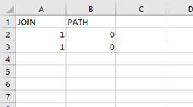
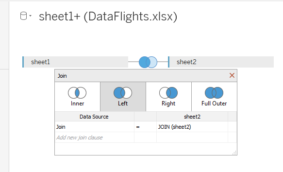
If your data set already contains the departure and arrival coordinates in two columns (instead of four), while another column indicates which is which (example: departures are identified by a 0, arrivals by a 1), then you’re good to go. Otherwise, you will need to apply a LEFT JOIN to your data in order to duplicate the rows and get one row of the data for the starting point and the other row for the ending point.
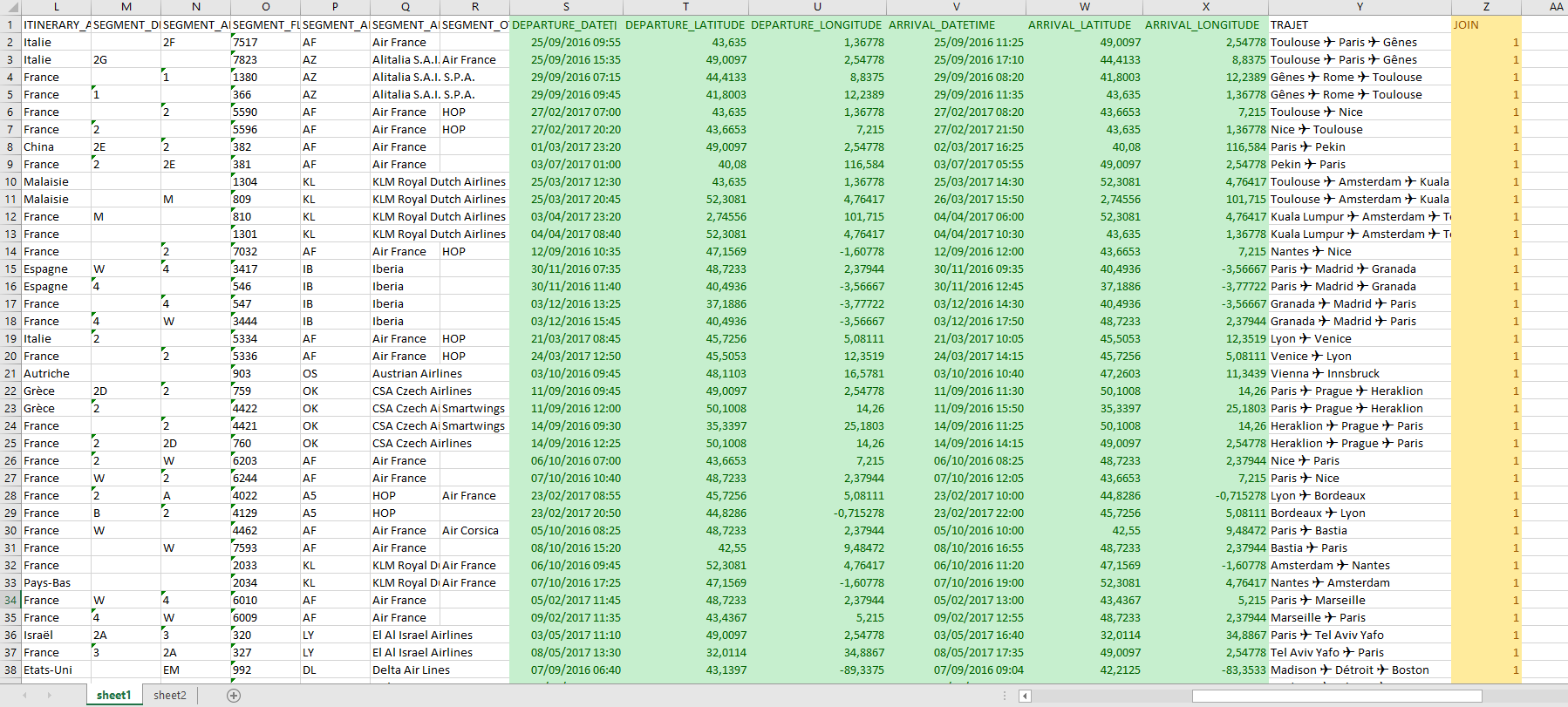
If you take a look at my data you’ll see in green the fields that are required for my viz and in orange I have highlighted a column JOIN filled with 1s, which is used as the key to join the fields from a secondary sheet in Excel containing the 2 below columns and rows only. This virtually recreates a data set where I indicate my departures and my arrivals with 0 and 1 respectively.
Finally, it can be useful to have a unique identifier for each trip. At the end of this tutorial you will see I use the ticket number on details to make sure each path is not an aggregation of many trips.
2. Connect to Tableau
Now that you have your data, just connect with Tableau and apply the join if it hasn’t been done already !
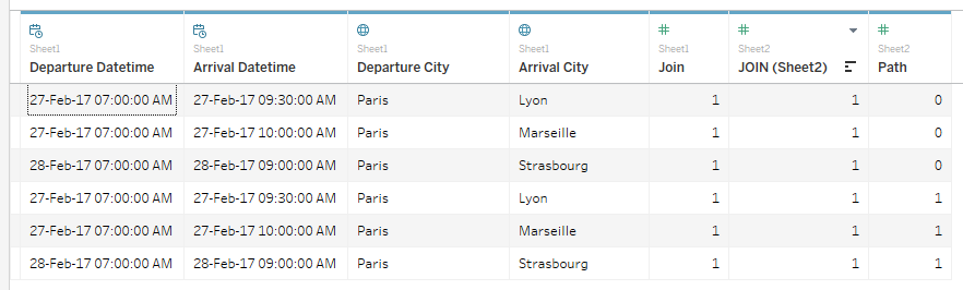
This is what your data should look like (notice how each row is now doubled with the Path column on the right).
3. The Calculations
First you want to display the trips that are ongoing at this very moment. For this purpose, just create the following calculated field using the NOW() Tableau built-in function:
NOW() > [DEPARTURE DATETIME] AND NOW() < [ARRIVAL DATETIME]
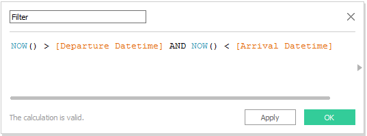
Bring this calculated field to the Filters shelf and set it to True. Only the flights currently in the air will be shown.
Then you want to calculate the completion of the displacement from point A to point B. We'll infer the completion from the departure and arrival times:
(NOW()-[DEPARTURE DATETIME]) / ([ARRIVAL DATETIME] - [DEPARTURE DATETIME])

You can set the default Number Property of the Completion field to percentage if you want to.
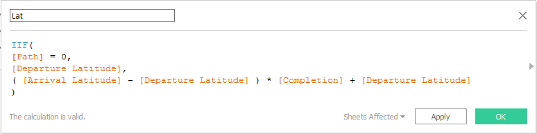
Finally, you'll map the current position of each flight applying the completion calculation to a straight line between the departure and arrival point. To do that, we’ll create two calculated fields named Lat and Lon as follow:
IIF( [PATH] = 0, [DEPARTURE LATITUDE], ( [ARRIVAL LATITUDE] - [DEPARTURE LATITUDE] ) * [COMPLETION] + [DEPARTURE LATITUDE] )
and
IIF( [PATH] = 0, [DEPARTURE LONGITUDE], ( [ARRIVAL LONGITUDE] - [DEPARTURE LONGITUDE] ) * [COMPLETION] + [DEPARTURE LONGITUDE] )

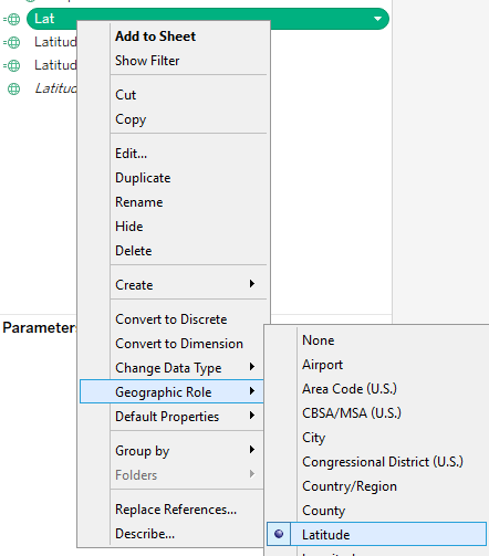
Don’t forget to set their geographic role to latitude and longitude respectively!
And this is it for the calculation!
4. Create Your Sheet
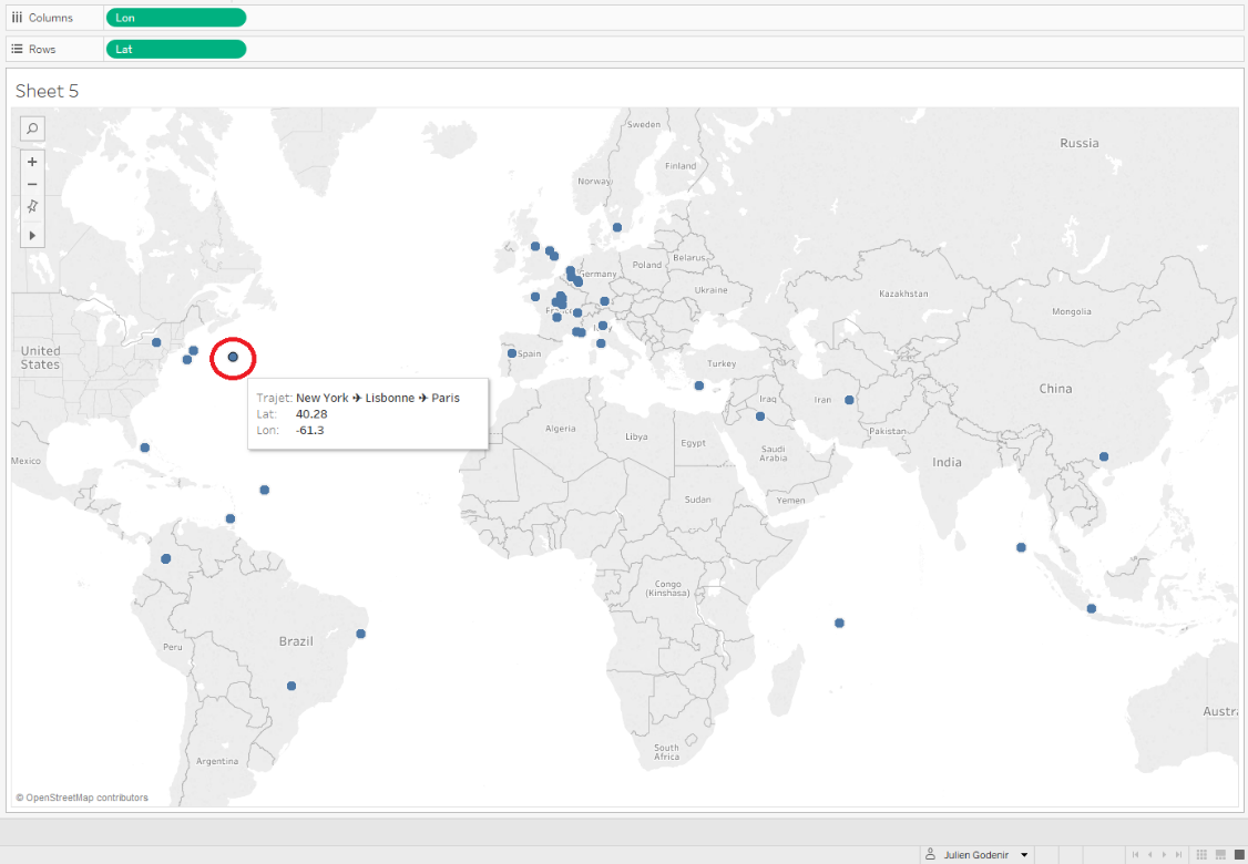
Drag and drop Lat to Rows and Lon to Columns, and in the top menu bar go to Analysis and uncheck Aggregate Measures. You should get something like this:
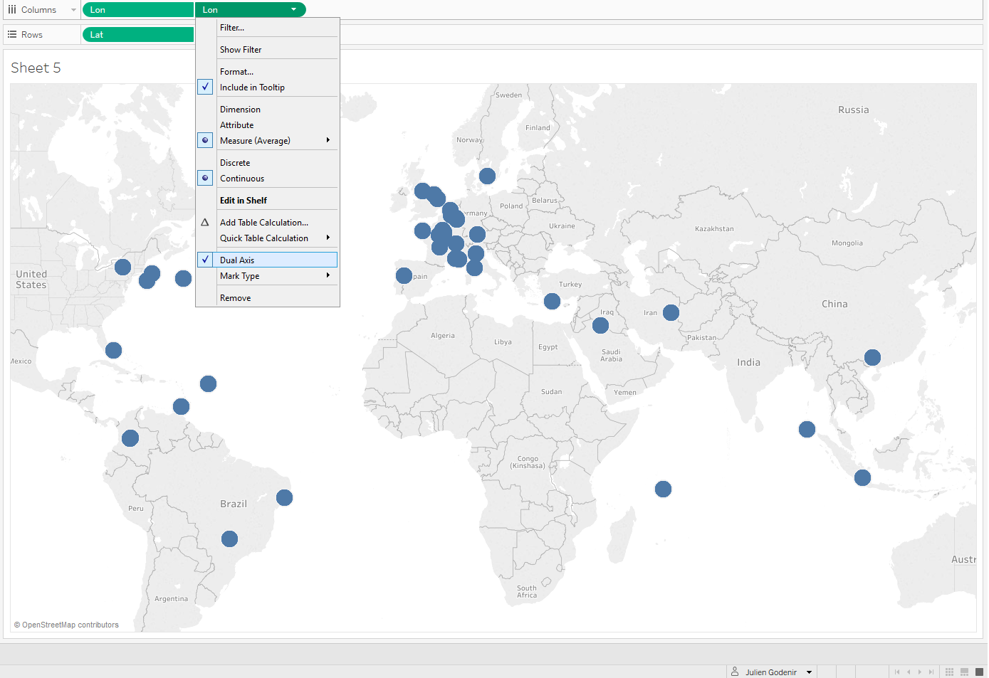
Next, I enlarge the size of my points and I put another Lon calculation to columns along with another Lat calculation to rows… What we want to do is display them on top of each other by selecting the dual axis option for both as follows:
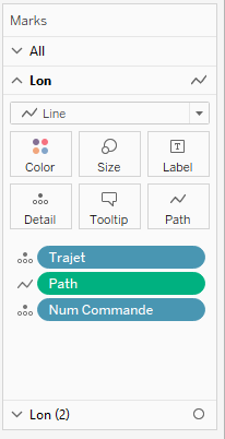
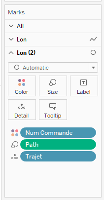
Now, you want to change one of the marks to line and add the Path column to the Path mark for the lines (cf. left screen capture below). Add the Path column to Size for the circles (cf. right screen capture below). You can then aggregate your data using any field that is relevant to your viz by drag and dropping it on detail or color. In my case I use the flight order number.
This is what you should get:
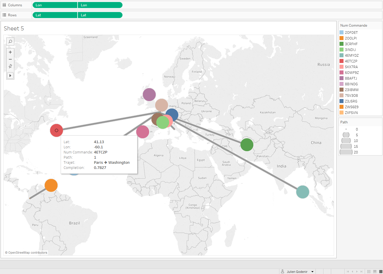
Great ! We now can see where the planes/cars/humans come from and where they are going! If you want, you can always replace the NOW() calculation by a parameter if you want to give your users the possibility to look at what your flows looked like in the past. In the end, it is up to you to choose what you want to do with this technique!
There are a couple improvements we can make to this viz though. For instance, we could draw a plane/car/train/whatever instead of a basic circle. Also, the path is currently straight, and we could want it to follow the curvature of the earth. This will be the subject of tomorrow's advanced tutorial in which we will implement these improvements!
관련 스토리

Iron Viz 2026: Read Between the Data
 2026/05/28

Tableau's Iron Viz Winners

Explore the 2026 Iron Viz Entries
 2025/12/15