Here's Our Revamped Key-Metrics Dashboard


Last week, we posted a guide to formatting a beautiful, high-level dashboard in just 10 minutes. Alas, the second comment, from Cristian Vasile, was not complimentary. He called it “a complete failure.”
Ouch.
We took a step back and realized that we’d focused on beauty instead of functionality.
The dashboard sure looked pretty, but we realized we’d forgotten a fundamental aspect of visualization: the need to communicate what each mark means. The dashboard was lovely, but we’d gone too far and removed too many labels, leaving the lines and marks without any meaning. Even if you’re doing high-level dashboards, it still needs to be readable at a glance.
Finding the balance of beauty and functionality is one of the toughest things to do. Just because it’s high-level doesn’t mean it should sacrifice functionality. How can someone engage with something that is all beauty and no functionality? Once they ooh and aah at the pretty formatting, what would happen when they realize the charts, without labels, convey no meaning? Who’d invest in a dashboard like that?
Anika and I had a quick chat and we worked out we could maintain the beauty by adding the absolute minimum of labels. Below is our reworked version of the dashboard. What I’ve always loved about Tableau is the speed with which you can redesign a dashboard in response to feedback. It’s fast and allows you to continuously iterate until everyone’s happy.
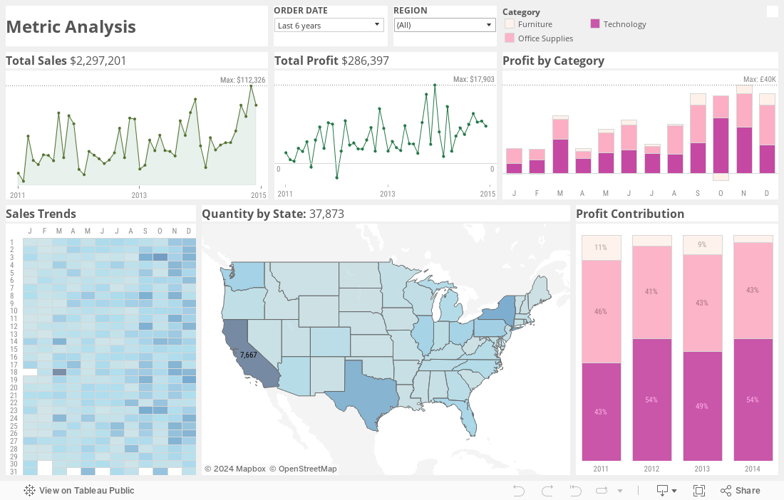
What do you think? I hope you think it is still a beautiful key-metrics dashboard, now with added functionality.
Cristian, I’d like to thank you for your comment. I would love to know your thoughts! If you or anyone still thinks the dashboard isn’t right, let us know why in the comments. Even better, download the dashboard and show us your own version.
I have also published a post on my own blog detailing all the design choices made in reworking this dashboard. Let me know which you agree and disagree with.
Update: this post was published with an earlier iteration of my reworked dashboard. I have replaced it with the intended final version, which has slightly better (but not perfect) clarity on the marks in the Profit charts.