Tips for Designing Mobile-Friendly Dashboards


When designing a visualization for consumption on cell phones, the smallest of screens, you must take utmost care to put yourself in the mind of your consumers. Imagine how they’ll interact with your visualization on the phone.
Cell phones offer far less screen real estate than we are used to on our desktop or laptop computers. And your users won’t have the luxury of a mouse to interact with your work; they only have their fingers.
Cell phones also offer the special characteristic of having both portrait and landscape orientations, so the visualization designer needs to make a flexible enough viz to work on two different screen orientations. All of the above are challenges, but the reward for making a great mobile viz is great, as increasingly more web traffic is coming from mobile. (In most newsrooms, mobile visits now account for 50% of total traffic.)
So how can we go about addressing some of these challenges when designing a Tableau dashboard for mobile? I can offer some helpful tips through some of the mobile-design projects I have done in the past.
Always Use Range Sizing
Range sizing is the most flexible of Tableau’s sizing options. You code in the minimum and maximum widths (and heights) that you will allow the dashboard to be presented at. Then Tableau will dynamically try to resize the dashboard for the allowable screen size of the end user’s device.
Here is an example of how range sizing can look, see the sizing preferences on the top left of the Tableau window:
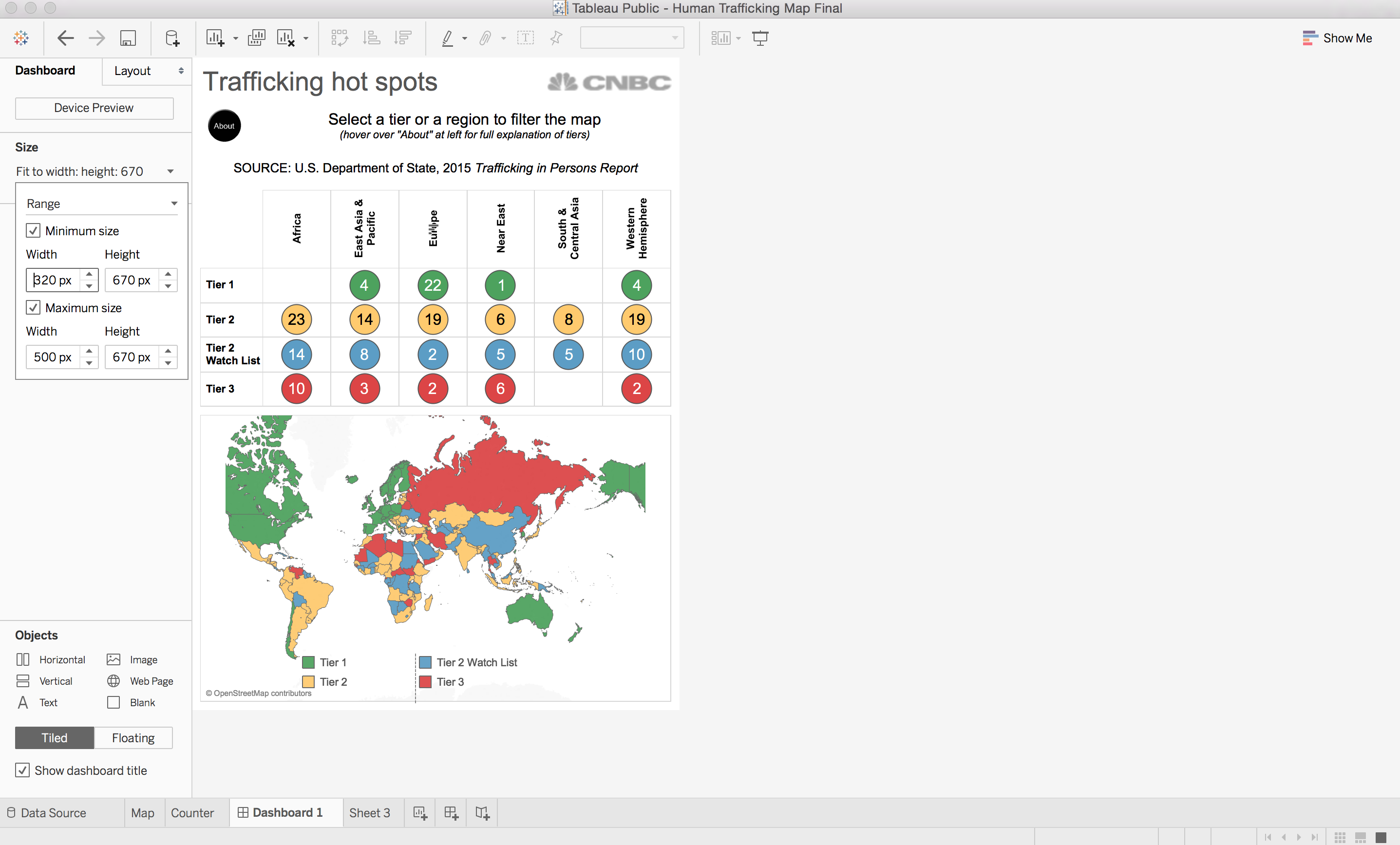
Range sizing is perfect for mobile design as it allows you to deal with the portrait/landscape orientation challenge. My advice would be to code the minimum range to be the smallest device size that you anticipate a consumer will use to view your viz—normally an iPhone 5 at 320 pixels wide—and cap the maximum at whatever is the width your CMS or blog platform allows—anywhere from 500 to 800 pixels wide.
Height is less important than width for mobile design as small screens are optimized for scrolling up and down, thus allowing the viz height to by far larger than just the phone screen.
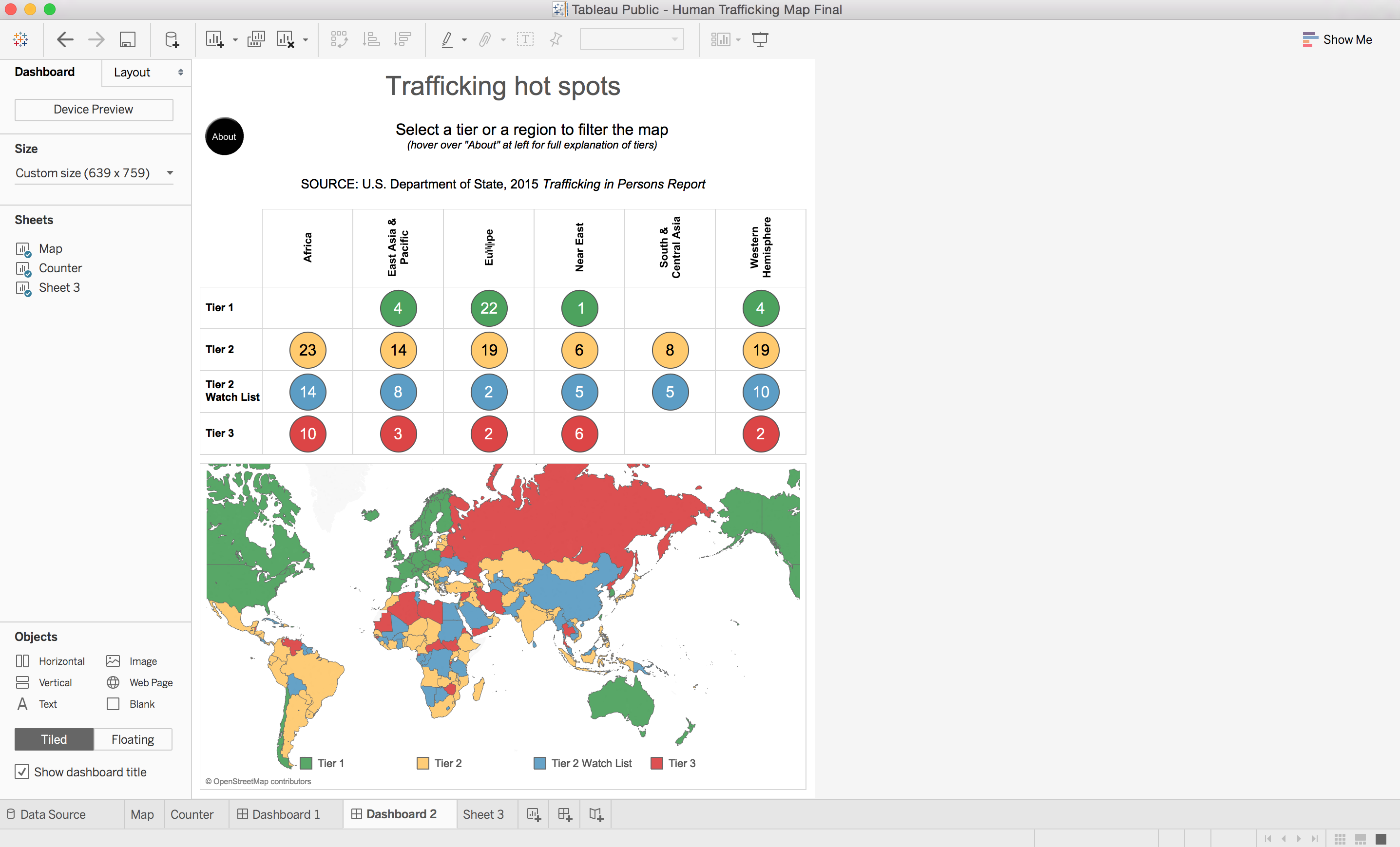
Always Lock Pan and Zoom on Maps
Nothing ruins the experience of consuming a Tableau dashboard on a phone (or tablet, for that matter) more than getting lost and stuck in a forever-panning and -zooming map. Without pan and zoom locked, finger gestures on a map will default to zooming in and out and moving the map around. That often precludes the user from even scrolling at all—not a good experience. To combat this, simply lock pan and zoom under the map options menu. This is always the first thing I do when I’m making a mobile dashboard that includes a map.
Here is an image showing the map options, with pan and zoom locked:
Use Sheets as Filters Instead of Quick Filters
On a phone, it’s hard to switch the small items within a quick filter. The design of the quick filters themselves on the phone don’t tend to look great. So the advice I always give when it comes to filtering on a phone is to try to use sheets as filters instead of quick filters.
Sheet filters have the advantage of being much more customizable than quick filters as well as being much larger and easier to select with your fingers than the dropdown quick filters. Using sheets as filters also forces the viz designer to think more deeply about the nature of interaction on the phone device.
You can see for yourself how I tried to incorporate all of these elements in this mobile-first dashboard about human trafficking:

We are excited to see how you incorporate these tips and others in your mobile-first visualizations. Tweet us your tips and vizzes @tableaupublic using #TableauMobileTips!
関連ストーリー
Iron Viz 2026: Read Between the Data
 2026/05/28

Tableau's Iron Viz Winners

2026 年 Iron Viz 応募作品のご紹介
 2025/12/15