How to Create Visual Tooltips


Note: The following is a guest post by Tableau Ambassador Alexander Mou.
Text tooltips can be a little dull. With visual tooltips, we have more options for data visualization. Drilldown is an easy option.
My Tableau Ambassador 2016 viz offers a great example. Hover over a person's picture, and you get a bigger picture and details about the person. (First click on the image for the interactive version.)

My fellow Tableau Ambassador Rody Zakovich asked me to write about it. I am so obliged.
To illustrate the technique, I came up with a simple example.

Here are the steps to creating the visual tooltips in the above example.
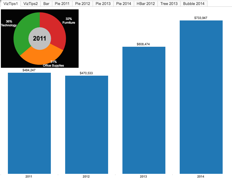
1. Create the Chart
Using the superstore data set (which ships with Tableau), create a bar chart for the sales in 2011-2014.
2. Create the Tooltip Sheets
Create one tooltip sheet for the year 2011, which shows the breakdown of product categories..
Drag filter Year2011 to the Filters shelf and select “true.” See picture below for the filter formula.
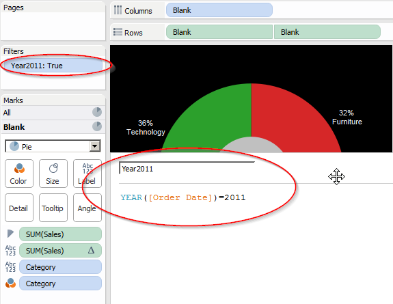
Duplicate the sheet three times for each of the remaining years (2012, 2013, 2014) with the filters adjusted accordingly (Year=2012, =2013, =2014) for one tooltip sheet per year. Note that the filters are mutually exclusive; only one of the filters will be true at one time.
3. Put Them Together
Start a new dashboard and put the bar chart on it. Remove the title and legends for simplicity.
Drag each of the tips chart (in floating mode) to the dashboard and place it near the bar of the same year.
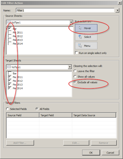
4. Add a Dashboard Action
Create a dashboard action that runs on hover. And select "exclude all values" when clearing all the selections.
And voila! We just built a dashboard with visual tooltips. I used this technique to create my Ambassador viz. (My inspiration came from a VizWiz post on sheet popping.)
The tooltips charts don't have to be uniform. Since each tips chart is independent of the others, we can use a different chart for each year. See example 2 in the viz.
A Few Caveats
As you start brainstorming your own visual tooltips, do keep in mind these caveats about the example outlined above:
1. The data marks under the tooltip sheets won't be sensitive to mouse hovering. In other words, the tooltip sheets have to be carefully positioned.
2. The technique is suitable for dashboards with relatively sparse data marks.
3. The positions of the visual tooltips are fixed.
4.When the user hovers over one data mark, the frames of all tooltips will briefly light up. This is is a transitional effect. If possible, lay the tooltips sheets on top of each other like in the Ambassador viz as a way to minimize the effect.
5. You can either turn off the regular text tooltips or use them alongside these visual ones.
There have been other options to put visual charts directly within Tableau's tooltips. Here's a Knowledge Base article on using bars in tooltips. And this VizWiz guest post by Rody Zakovich is also a great example.
Last but not the least, I would challenge you to come up with vizzes using the technique described here. Let me know what you come up with in the comments below.
Enjoy Tableau!