Tutte le storie di Visualizations
 Visualizations
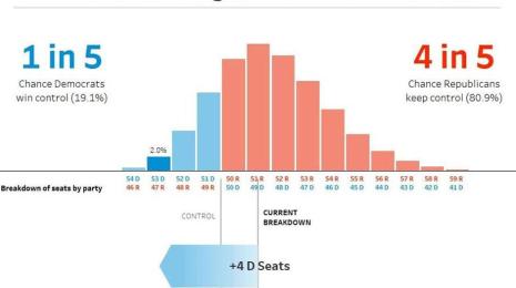
Creating FiveThirtyEight's election prediction chart in Tableau
 15 Gennaio, 2019
Learn how to recreate FiveThirtyEight’s Election Prediction Chart in Tableau 2018.3. Zen Master Ken Flerlage breaks down how.
15 Gennaio, 2019
Learn how to recreate FiveThirtyEight’s Election Prediction Chart in Tableau 2018.3. Zen Master Ken Flerlage breaks down how. Visualizations
Why design theory should apply to business intelligence
 21 Dicembre, 2018
Did you know there are 3 levels of processing? Learn how to create a successful experience at each level for your dashboard audiences.
21 Dicembre, 2018
Did you know there are 3 levels of processing? Learn how to create a successful experience at each level for your dashboard audiences. Visualizations
Iron Viz at #TC18 took us all over the globe with weather data
 26 Ottobre, 2018
The Iron Viz competition at TC18 featured IBM weather data to tell compelling stories through beautiful dashboard designs. Congratulations to winner Timothy Vermeiren from Belgium!
26 Ottobre, 2018
The Iron Viz competition at TC18 featured IBM weather data to tell compelling stories through beautiful dashboard designs. Congratulations to winner Timothy Vermeiren from Belgium! Visualizations
What I learned from recreating the Financial Times’ Visual Vocabulary in Tableau
 27 Settembre, 2018
Zen Master Andy Kriebel reflects on the lessons he learned from recreating the Financial Times’ Visual Vocabulary in Tableau.
27 Settembre, 2018
Zen Master Andy Kriebel reflects on the lessons he learned from recreating the Financial Times’ Visual Vocabulary in Tableau.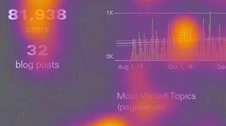 Visualizations
How design thinking will affect today’s analysts
 31 Agosto, 2018
User research manager, Amy Alberts, explains the import of an eye-tracking survey, focused on understanding how humans consume dashboards.
31 Agosto, 2018
User research manager, Amy Alberts, explains the import of an eye-tracking survey, focused on understanding how humans consume dashboards. Visualizations
France and Croatia: What data tells us about the 2018 World Cup Final matchup
14 Luglio, 2018
Here is a roundup of World Cup vizzes from Tableau Public, with some key metrics for the 2018 World Cup final matchup.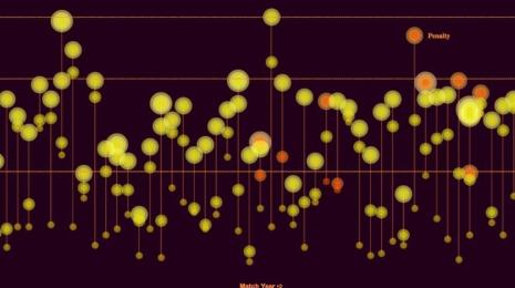 Visualizations
4 ways the Tableau Community visualizes World Cup data
29 Giugno, 2018
Calling all World Cup fans! Here are a few visualizations that demonstrate just how rich the World Cup is with data.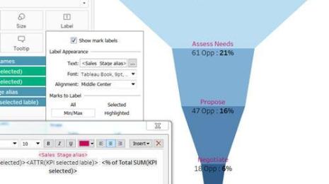 Visualizations
Three different ways to build funnels in Tableau—and why
 18 Giugno, 2018
Want to create funnels in Tableau? Here are 3 different ways you can build them.
18 Giugno, 2018
Want to create funnels in Tableau? Here are 3 different ways you can build them. Visualizations
Why is sport such a good topic for visualisations?
15 Giugno, 2018Join Zen Master Neil Ricahrds as he breaks down why sports data is such a good topic for visualisations.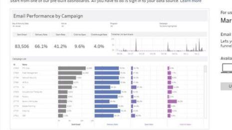 Visualizations
Announcing Dashboard Starters—the fastest way to visualize your business data
 3 Maggio, 2018
Learn how Dashboard Starters are designed to help you hit the ground running with actionable data in minutes.
3 Maggio, 2018
Learn how Dashboard Starters are designed to help you hit the ground running with actionable data in minutes.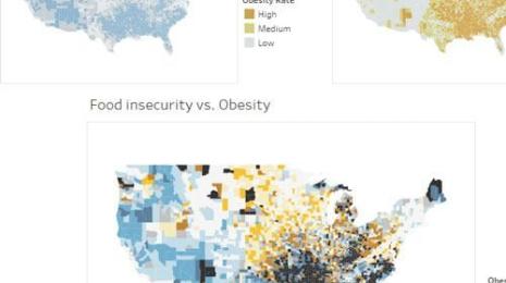 Visualizations
How to make effective bivariate choropleth maps with Tableau
 1 Marzo, 2018
Maps are a great type of viz for exploring how your data changes across space. In Tableau, it’s easy to make a map to explore any attribute in your dataset—but what about the occasion where you want to compare multiple attributes with the visualization?
 Visualizations
Bars or circles: A chart choice challenge derived from witchcraft trials
30 Gennaio, 2018
It's a challenge as old as witchcraft - will you choose a bar chart or a circle chart? Andy Cotgreave breaks down the chart choice challenge that derived from witchcraft trials.