Rutgers University Students Analyze the "Danceability" of Songs Over the Decades Using Tableau
Tableau for Teaching (TfT) is a program that offers free classroom use of Tableau for instructors aiming to help their students better analyze and visualize data. Participants vary in discipline, from business administration, computer science, to public health. Recently, students at the Rutgers University School of Communication and Information shared their class project with us. Their instructor, Professor Anselm Spoerri assigned the class to evaluate and design innovative visualizations.
Tasked with this assignment, two students, Shaun Ellis and Thomas Engelhardt decided to create a dashboard where you can search songs by danceability. Danceability? Yes. Now what makes a particular song danceable? See what Shaun and Thomas had to say:
How do you define danceability?
Danceability is measured using a mixture of song features such as beat strength, tempo stability, and overall tempo. The value returned determines the ease with which a person could dance to a song over the course of the whole song.
Where did the idea for your project come from?
With all this wonderful technology present in the 21st century, and boatloads of data sitting on servers all around the world, we wondered if we could analyze hit U.S. pop songs using visualization software and see if there are any formulas/best practices/other cool stuff associated with creating a hit song.
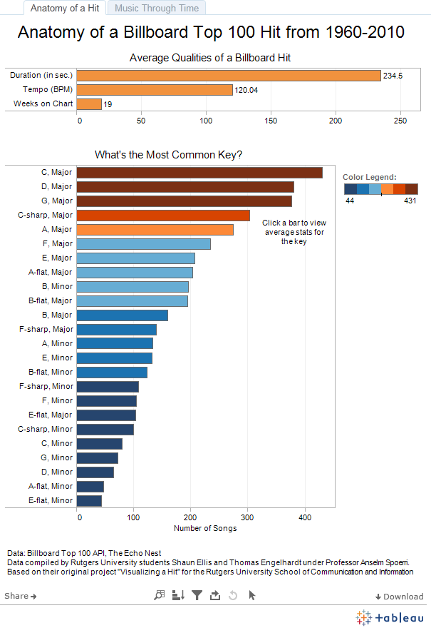
How many songs did you analyze?
Based on sales and radio play, Billboard's Hot 100 chart data generally started to stabilize around the 1960s, so we decided that we would pull data for any song that peaked on the Hot 100 between positions 1 through 10 starting in January of 1960 and ending until the week we started this project, which was October 2, 2010. This turned out to be over 4,200 songs!
I enjoyed accidentally finding interesting visualizations. The software is so feature-rich... I would find myself just trying things out and getting surprisingly excited when stumbling upon a data relationship that I wasn't particularly looking for, all because a dynamic visualization would appear.
I enjoyed accidentally finding interesting visualizations. The software is so feature-rich, and we didn't have much time to really dive into it and learn as much as we wanted to during the semester. I would find myself just trying things out and getting surprisingly excited when stumbling upon a data relationship that I wasn't particularly looking for, all because a dynamic visualization would appear. It's a great program for exploring abstract data sets.
What did you enjoy least about using Tableau?
When we were looking for exposure, the best we could do was take screenshots and urge people to download Tableau Reader (unlikely). Now, however, I have seen what people are able to achieve through Tableau Public!
Click here to see the results of the study - such as average danceability by year.
Click here to see Tableau's own analysis of the data.