Pie Charts
Understanding and using Pie Charts
How do I read a Pie Chart?
To read a pie chart, you must consider the area, arc length, and angle of every slice. Because it can be hard to compare the slices, meaningful organization is key. Slices in a pie chart should be organized in a coherent way, usually the biggest to smallest, to make it easier for the user to interpret. Start at the biggest piece and work your way down to the smallest to properly digest the data. The colors of the slices should match their respective blocks in the legend, so that viewers do not need to consult the legend as much.
Generally, the whole (or total of the quantitative values or slices) is not listed within the pie chart. Typically, it can be listed in the text near the chart, the table explaining specific data measurements, or as a separate BAN in another dashboard.
Three-dimensional pie charts are difficult to read and misleading. Since the interpretation of a pie chart relies on the area, arc length, and angle of each slice, a three-dimensional representation of this chart type will tilt the pie and skew your visual perception of its slices.The use of a three-dimensional pie chart can make an accurate comparison of categories nearly impossible due to the visual imbalance that can exist between slices.
What type of analysis do Pie Charts support?
Pie charts should be used to show the relationship of different parts to the whole. They work best with dimensions that have a limited number of categories. If you need to emphasize that one section of the whole is overrepresented or underrepresented, a pie chart can make that story within the data stand out. Pie charts do not work well for comparing exact numbers
When and how to use Pie Charts for Visual Analysis
If you have a dimension with just a couple of categories to compare, then a pie chart can help display each value of a category within the whole. The chart should read as a comparison of each group to each other, forming a whole category. The “whole” could be anything so long as the category can be split into separate slices that are distinguishable from each other.
Use a pie chart if:
- You have a total number that can be split up into 2-5 categories.
- One category outweighs the other by a significant margin.
Do not use a pie chart if:
- Your dimension has too many categories.
- Similar percentages/numbers exist between different values within the chosen dimension.
- Data doesn’t represent a uniform “whole”, or the percentages don’t measure to 100 percent.
- There are negative values or complex fractions in your measure value.
Pie Chart Best Practices:
- Each pie slice should be labeled appropriately, with the right number or percentage attached to the corresponding slice. The slices should be ordered by size, either from biggest to smallest or smallest to biggest to make the comparison of slices easy for the user.
- Limit the use of legends and external references as they make it harder to recall the dimensions.
- Labels should be attached to the slices themselves whenever possible.
- When the chart has more than 5 slices you may want to begin considering a different chart type, however if you want to continue make sure to use a legend, list, or table to provide additional context for the reader.
- NEVER complicate the visual display. A 3-dimensional pie chart is much harder to analyze. Obfuscating the chart with unnecessary graphics or logos can make it overwhelming.
If there is a comparison to be made between multiple categories, consider a line chart instead. Line charts provide an easy overview of the patterns and trends found in multiple sets of data, as well as the effect they have on each other.
Great examples of Pie Charts
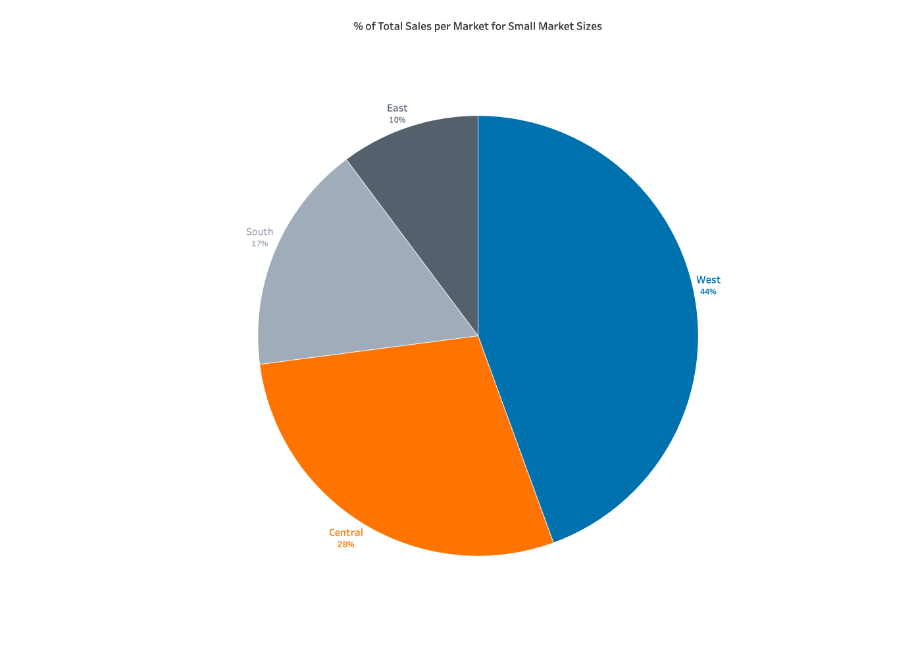
This pie chart shows the percentage of total sales per regional market.
- No more than five slices were used.
- The largest slice starts from the top of the circle.
- Slices are colored with distinct, vivid colors. Consider using colors friendly to colorblind users.
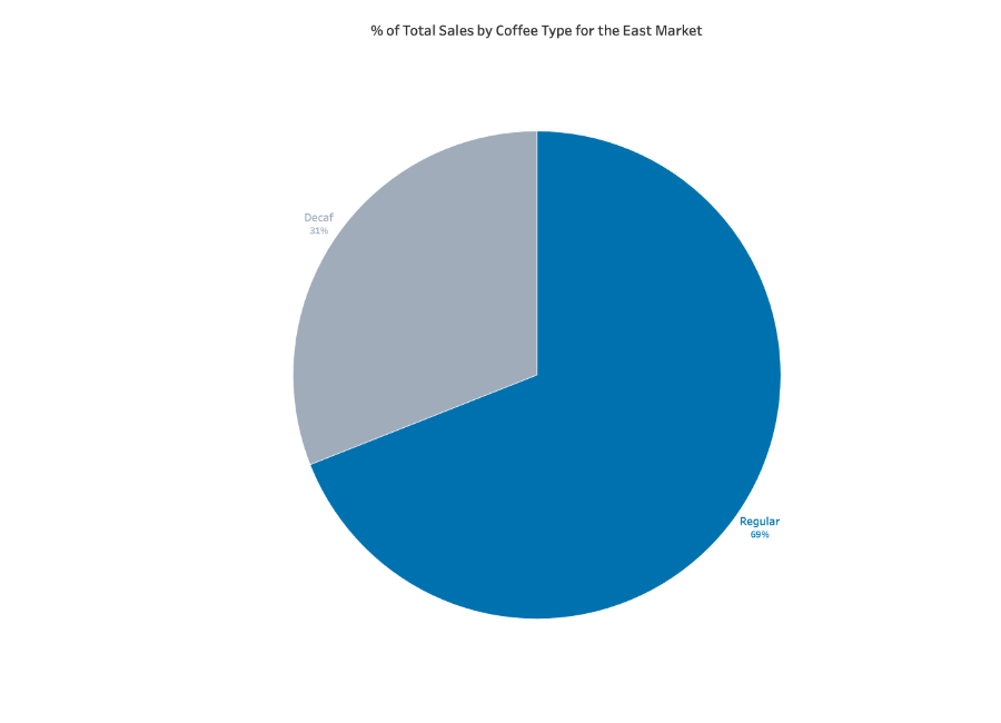
This pie chart takes data from the east market sales and splits them by the variety of coffee purchased.
- This chart shows two radically different data points easily distinguished from each other
- The dominant slice has a bold color
- The smaller slice has a neutral/subdued color
Ineffective examples of Pie Charts and Alternatives

Further considerations and supplemental material
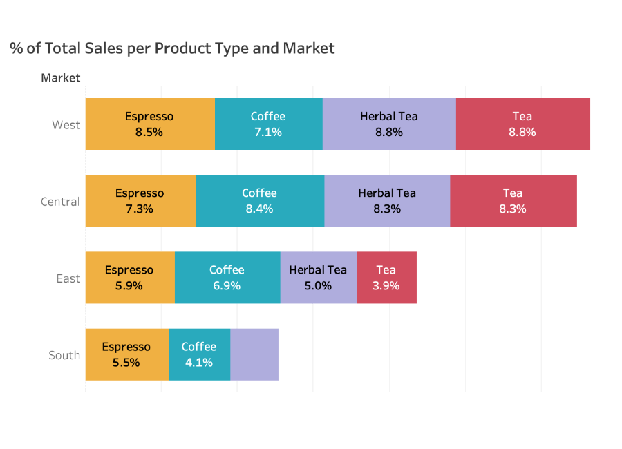
Bar charts and stacked bar charts can be good potential alternatives to pie charts. They can better show the relative size and importance of measure values broken down by the categories of a selected dimension. They are also better equipped to show more categories at one time than a pie chart.