How Maps Help Us Understand the World


Many data sets include location details, such as addresses, country names, or named sales territories. Mapping these location elements allows for visualization, exploration, and communication about the spatial patterns in the data—helping us to better understand the world around us.
In an earlier post, how to answer your data questions with a map in Tableau, I explored the three fundamental types of questions that maps help us answer:
- How to find the value for a specific location of interest
- How to explore general patterns across a region
- How to compare values between locations or attributes
In this post I’ll expand on how to answer these questions by examining two of the core ways to incorporate visual and spatial analysis into Tableau:
- Where is the spatial data located and how is it distributed?
- How are locations related to one another?
1. Where is the spatial data located and how is it distributed?
By definition, spatial data has location, so the first step to understanding the data is putting it on a map to see where it’s located. Whether you’re working with data represented as points, lines, or polygons, this is always the first step—just look at it! Do you see an even distribution of the locations or values in the data? Or are there clusters of points? Are there groups of polygons with high or low values?
There are many ways to look at distributions to find these patterns. To really understand what is happening in your data, look at more than one type of distribution map, because they are likely to show you different patterns.
For example, the image below shows six different ways to map a point distribution. While there are similarities between the maps’ identifiable patterns, they each tell a slightly different story about the distribution.
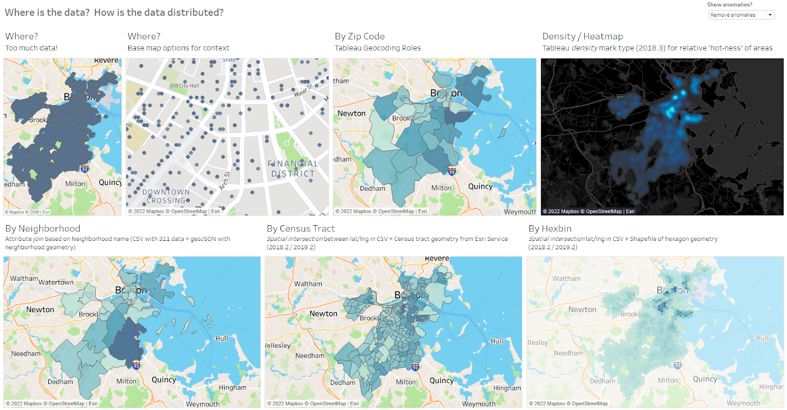
Each of the six maps tell a slightly different story about the distribution. Clockwise, from top left: Where (too much data); where (base map options for context); by ZIP code; density/heatmap; by neighborhood; by Census tract; by Hexbin
We’ll explore these maps and how to make them in the next blog in this series.
2. How are locations related to one another?
Exploring distributions is a great first step in analyzing spatial data, but sometimes we need to move beyond visual analysis of patterns in single data sets (or between multiple data sets) and formalize the spatial relationships between the data sets.
For example, you may need to:
- count exactly how many customers are in each sales territory polygon,
- find all patients within 10 miles of hospitals, or
- find service gaps and identify all the patients that are not within 10 miles of the hospitals.
Two Tableau features allow you to look at the relationships between multiple data sets: multi-data source layering and spatial intersections. Multi-data source layering makes it easy to visually analyze data sets on the same map, and spatial intersections go a step further to quantify the relationships between our data sets.
For instance, in the example below we can see the relationship between farmer’s markets and neighboring US Census tracts. We can then explore the attributes of all of the nearby locations to quantitatively understand the region being served. This involves a polygon-to-polygon spatial intersection—find all Census tract polygons that intersect the circular buffer polygon around the farmer’s market.
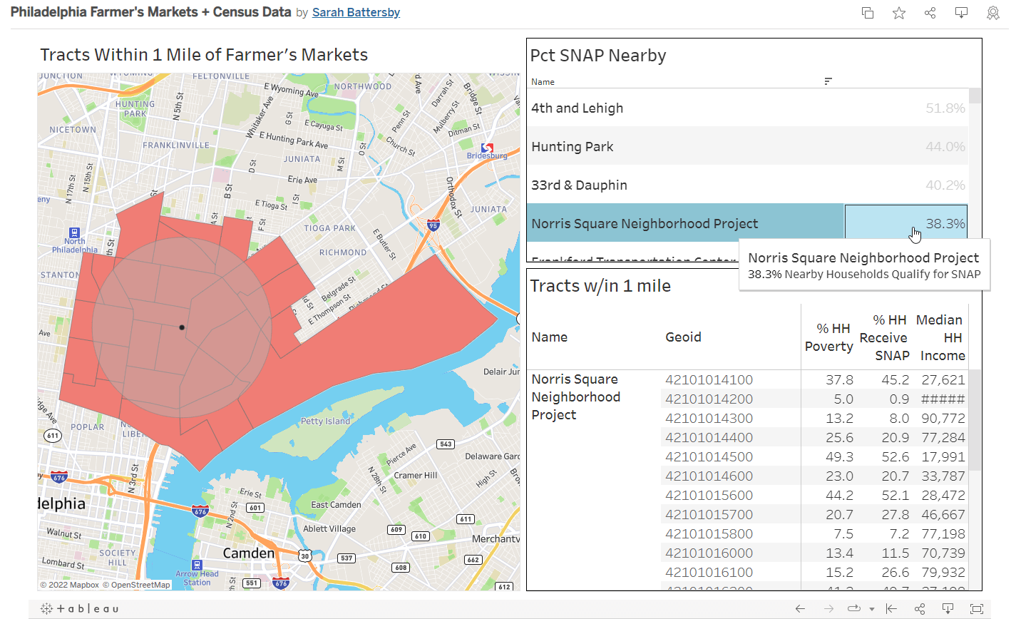
Using multi-data source layering and spatial intersections to explore the relationship between farmer’s marketings and nearby neighborhoods.
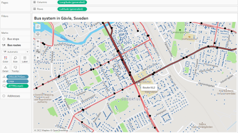
Or, we can look at other spatial relationships like point-in-polygon for user-controlled dynamic analyses. For instance, the example below shows how to identify all addresses near to bus stops and how to adjust a distance parameter to control exactly how we define “near.”
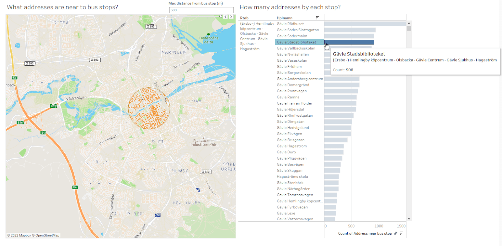
Using a spatial intersection between addresses and bus stops to quantitatively examine the areas within walking distance.
In the next posts in this series, we’ll explore how to use Tableau to see and understand more about your spatial data. Let’s unlock the analytic potential in your data sets by learning how to answer these key spatial questions.
Articles sur des sujets connexes

A Guide to Mapping and Geographical Analysis in Tableau
 novembre 15, 2024

Spatial Parameters and Calculations: Make More Dynamic, Interactive Maps
 octobre 18, 2024
Exploring Spatial Relationships in Tableau
 octobre 13, 2022