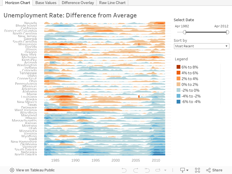
Measure states' unemployment rates against the national average
Unemployment is one of the most fundamental economic measures, but its meaning can be difficult to communicate. Tableau makes it simple, as in this powerful, elegant visualization by Tableau Visionary Joe Mako. Orange lines indicate a state where unemployment rates exceeded the national average. Blue lines indicate states with rates that were below the national average.